The network for creativity
Join 1.25M professional creatives like you
Connect with clients, get discovered, and run your business 100% commission-free
Creatives on Contra have earned over $150M and we are just getting started
Back to feedPost
Making travel booking feel simpler. ✈️
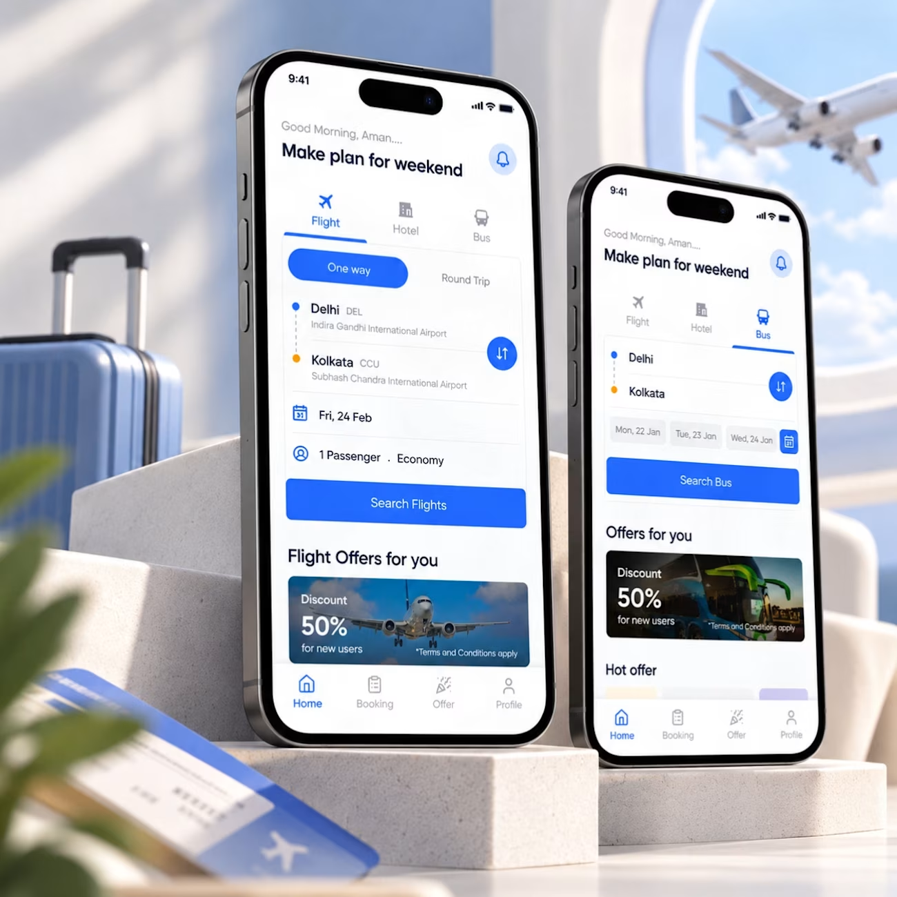
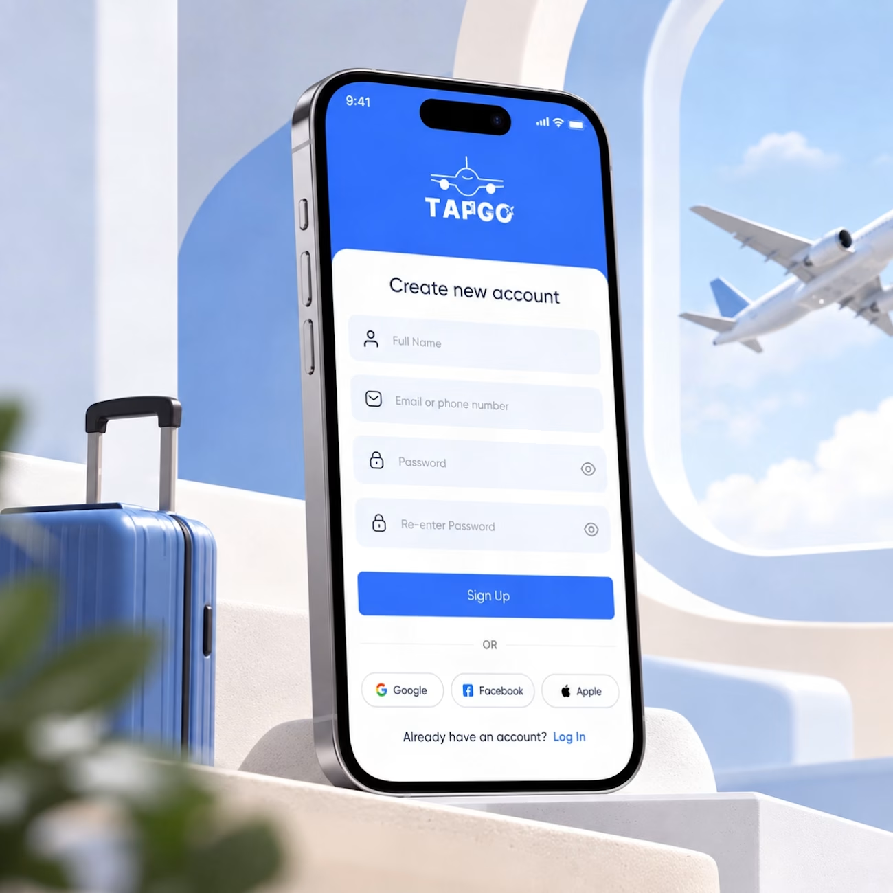
A small look at a travel app concept I worked on, covering flight and bus booking experiences.
The focus was simple: keep the booking flow clear, make important information easy to scan, and give users a consistent experience across different travel options.
From route selection and dates to offers and navigation, every element is designed around helping users move through the experience without unnecessary friction.
A few things I focused on:
→ Clear visual hierarchy
→ Simple booking flows
→ Consistent components
→ Easy-to-scan information
→ Familiar mobile interactions
Good UI isn't about adding more. It's about making the important things easier to understand.
#ProductDesign #UIDesign #UXDesign #MobileAppDesign #TravelApp #Figma #InteractionDesign



Excellent work 👏🏻

Thank you
The network for creativity
Join 1.25M professional creatives like you
Connect with clients, get discovered, and run your business 100% commission-free
Creatives on Contra have earned over $150M and we are just getting started





Related posts

Hi Contra Community! I'm new here, what do you think about this design? I'll love to have your feedback.

Welcome to the Contra Community Juan!


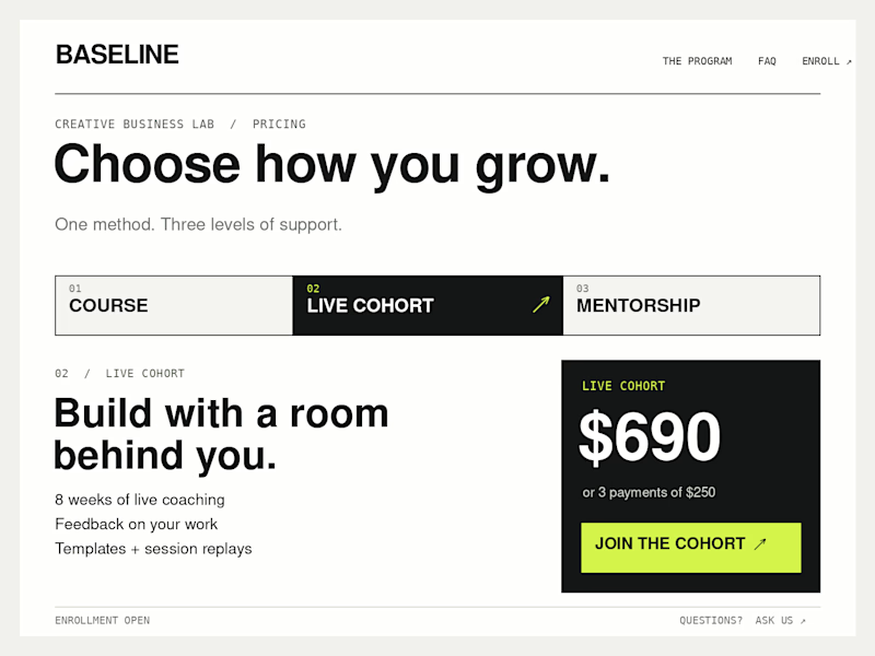
Which Kajabi pricing section would you ship?
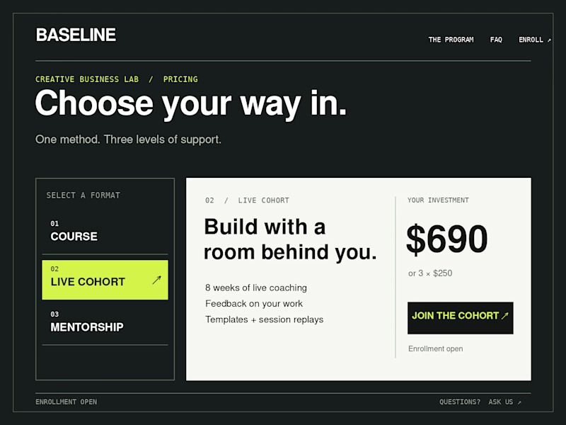
Creative Business Lab has three paths: Course, Live Cohort, and Mentorship. Both designs show the same $690 Live Cohort with the same benefits. Only the presentation changes.
Vote Horizontal tabs or Side tabs, then tell me the one thing you’d improve before launch. Have a stronger third approach? Show it in the replies.

21 voted
50%
21 voted
50%
42 votes
Closed

Horizontal. side tabs read as nav, people skip them. though the stronger third option is no tabs at all, three cards side by side. both of these hide two prices behind a click and comparison is the one job a pricing section has.


The AI handles all routing automatically.
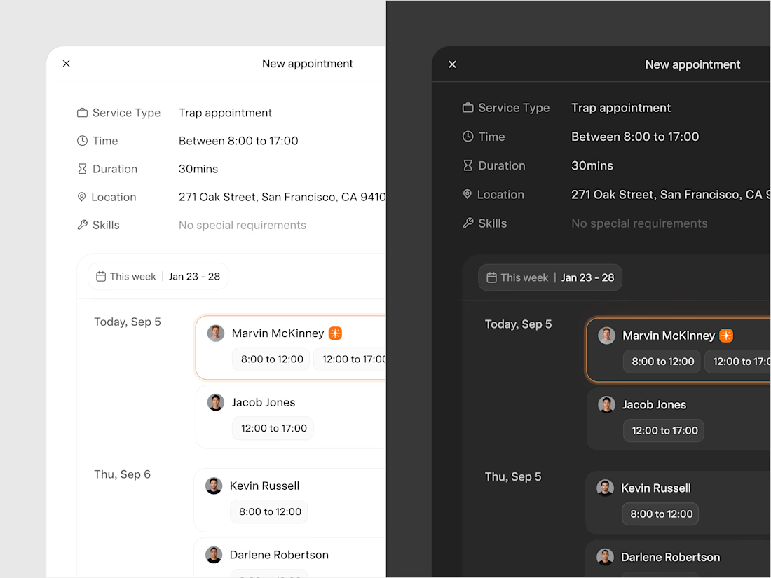
Thus, manual appointment creation is an edge case, something that happens when a specific customer request or exception requires human intervention.
When that happens, the system surfaces available technicians ranked by fit and shows how much distance and time the appointment adds to their route for that day. The manager picks from a ranked list rather than guessing.
The typography and color choices were made with one thing in mind: the platform needs to feel embedded in whatever system the client is already using rather than standing out as something foreign. We kept everything deliberately neutral.
Light and dark mode both follow the user's system preference automatically.