The network for creativity
Join 1.25M professional creatives like you
Connect with clients, get discovered, and run your business 100% commission-free
Creatives on Contra have earned over $150M and we are just getting started
Back to feedPost
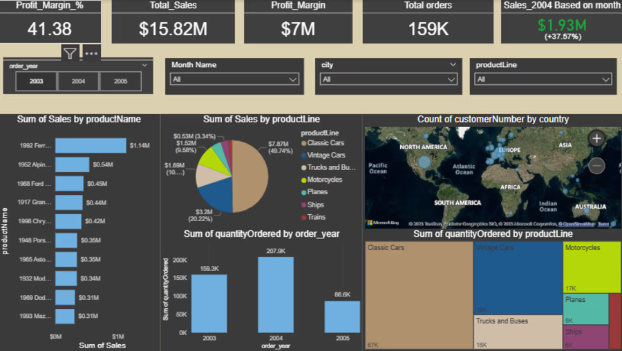
Sales Performance Dashboard
Built this dashboard to turn sales reporting into a clearer management view instead of scattered numbers across separate reports.
The goal was to bring the main performance story into one place through:
- KPI cards for Sales, Profit, Volume, and Dues
- channel contribution analysis
- brand performance breakdown
- customer segment performance
- geographic sales view
- monthly sales and profit trend tracking
What I like most in this type of dashboard is not only the visual side, but the ability to make performance easier to read, compare, and discuss.
A sales dashboard should not just show results. It should help explain where performance is coming from, which segments are driving it, and where attention is needed next.


Glad you like it, thanks for your support

looks great, top class work.
Thanks a lot, glad you liked it
great idea, breaking down the operation expenses
Thanks Istiak for your kind support
The network for creativity
Join 1.25M professional creatives like you
Connect with clients, get discovered, and run your business 100% commission-free
Creatives on Contra have earned over $150M and we are just getting started





Related posts

I Created Microsoft Power BI Dashboard By using many of the Tools
🚀 Data Modelling
🧠 Data Visualization
🚀 Group By
🧠 Data Cleaning



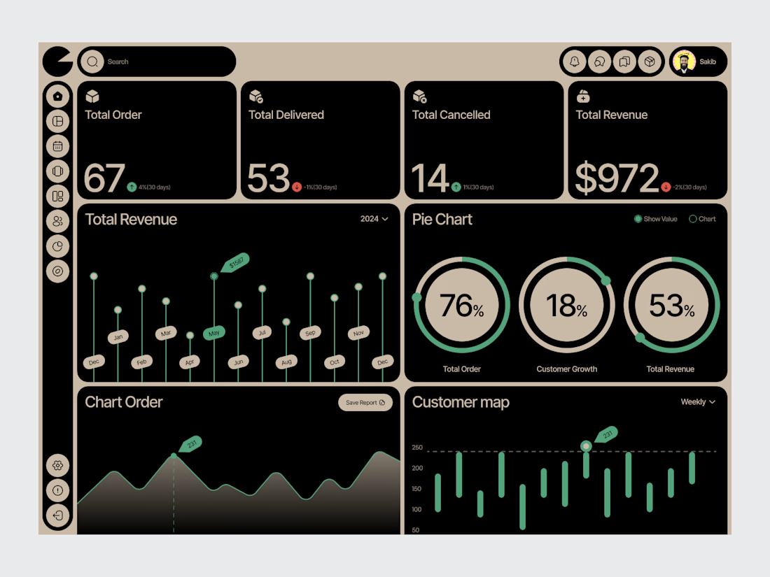
Food Restaurant SaaS Dashboard
A SaaS dashboard concept designed for restaurant businesses to manage and understand their day-to-day operations.
The interface brings key business information into a structured workspace, with clear sections for performance, orders, sales and operational data.
The design approach focuses on hierarchy first — helping users find important information quickly without overwhelming them with unnecessary detail.
Design focus:
• SaaS Dashboard Design
• Restaurant Management UX
• Data Visualization
• Business Analytics
• UI/UX Design
• Product Design
Designed by WaxyWeb.


great

Renewable energy production changes constantly, and grid operators need faster ways to understand what is happening across load, generation, storage, and market conditions.
Gridora explores a SaaS dashboard experience built for energy forecasting and balancing.
The dashboard surfaces forecasted peak load, curtailment risk, available storage, spot market price, generation sources, and recommended next actions in one clear workspace.
Natural imagery, soft neutral surfaces, and green accents connect the interface to the renewable energy context while keeping the product practical and easy to scan.