The network for creativity
Join 1.25M professional creatives like you
Connect with clients, get discovered, and run your business 100% commission-free
Creatives on Contra have earned over $150M and we are just getting started

The network for creativity
Join 1.25M professional creatives like you
Connect with clients, get discovered, and run your business 100% commission-free
Creatives on Contra have earned over $150M and we are just getting started

Challenges
View all


Related posts

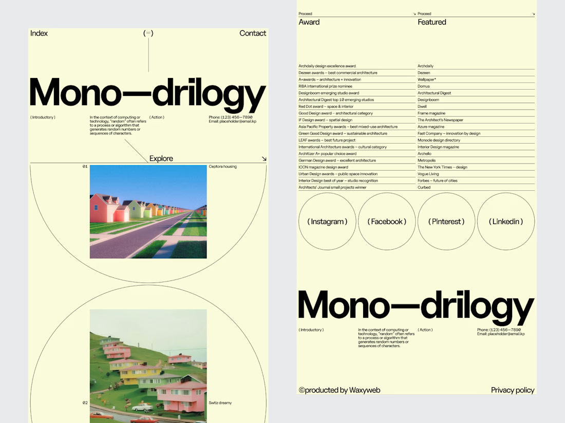
An architecture studio's website shouldn't compete with its projects.
It should give them the right environment to be seen.
For this editorial architectural website, we explored a digital experience inspired by the visual language of architecture publications.
Large-scale photography creates the first impression. Typography establishes the tone. Generous spacing keeps the interface calm, while restrained navigation makes the portfolio easy to explore.
The design deliberately avoids filling every space with information.
Instead, each project gets room to communicate through imagery, composition and editorial pacing.
Services: Architecture Website Design · UI/UX Design · Editorial Web Design · Architectural Portfolio Design · Web Development
The goal was to create a website that feels like an extension of the studio's creative thinking quiet, confident and focused on the work.
Designed by WaxyWeb.


excellent

Finished a template this week — MAKIR, a Framer portfolio for brand studios/agencies or even individual freelancers who has their own brand.
Full page set, CMS-driven case studies and blog, and I wrote the demo content rather than shipping it with filler text which made a real difference to how it reads.
A portfolio you're using to land clients shouldn't feel unfinished in the parts people actually click into and should feel trust worthy.


Incredible work

Generated these looks in Midjourney — but the layout is what really pulls it together.
Grid, crosshairs, typography, detail callouts: same images, but the presentation makes them read like an actual editorial spread instead of just pretty pictures.

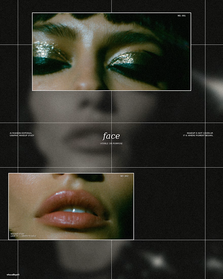
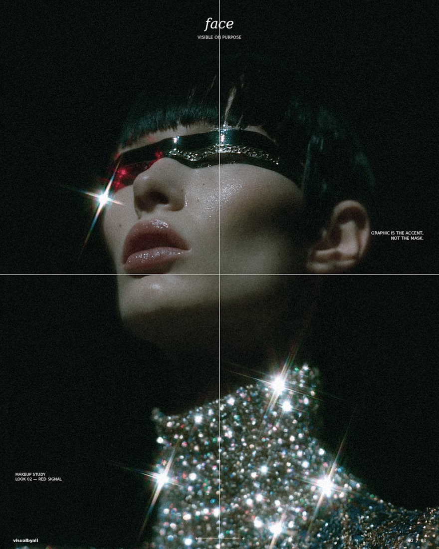
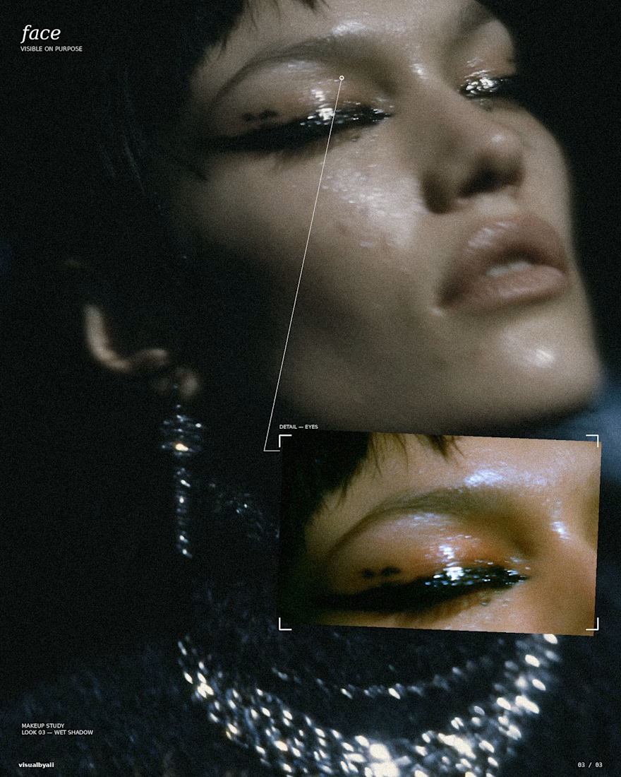

The grid, crosshairs, and detail callouts do more than decorate the Midjourney output—they turn it into an editorial system. Great example of how art direction can make a set feel like a coherent campaign.