The network for creativity
Join 1.25M professional creatives like you
Connect with clients, get discovered, and run your business 100% commission-free
Creatives on Contra have earned over $150M and we are just getting started
Back to feedPost
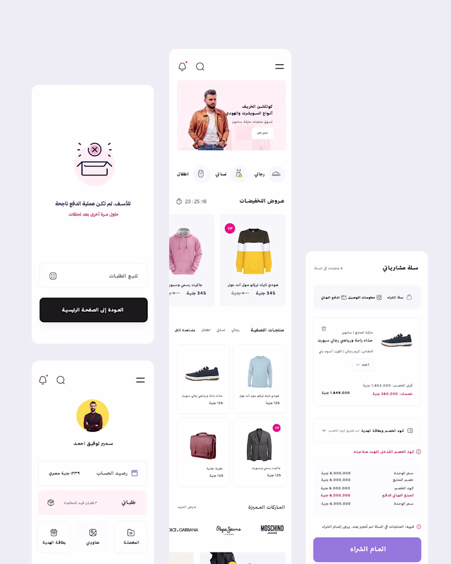
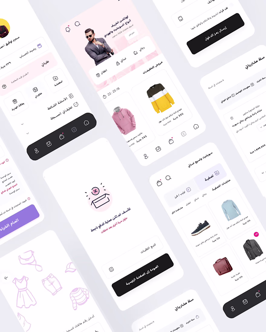
The mobile version was engineered as a web app following a rigorous Mobile-First methodology. In this context, screen real estate constraints didn't lead to feature reduction; instead, they drove intelligent content prioritization. The primary objective was to architect a swift, frictionless shopping flow optimized for on-the-go users.
Crucially, the mobile UX was not merely a downscaled version of the desktop interface. By implementing a persistent Bottom Navigation, streamlined interaction patterns, and optimized category access alongside strategic Micro-Interactions we delivered a lightweight, high-performance web experience that closely mimics the fluidity and responsiveness of a native application.
تم تصميم النسخة الخاصة بالهواتف المحمولة كتطبيق ويب وفق منهجية Mobile-First صارمة. وفي هذا السياق، لم تؤدِّ محدودية مساحة الشاشة إلى تقليل الميزات، بل كانت دافعًا لاعتماد أسلوب ذكي في ترتيب أولويات المحتوى وعرضه. وكان الهدف الأساسي هو بناء تجربة تسوق سريعة وسلسة وخالية من التعقيدات، ومصممة خصيصًا للمستخدمين أثناء التنقل.
والأهم من ذلك، أن تجربة المستخدم على الهاتف لم تكن مجرد نسخة مصغّرة من واجهة سطح المكتب. فمن خلال تطبيق شريط تنقل سفلي ثابت (Bottom Navigation)، وأنماط تفاعل مبسطة، ووصول أسرع إلى الفئات والأقسام، إلى جانب استخدام تفاعلات دقيقة ومدروسة (Micro-Interactions)، تمكّنا من تقديم تجربة ويب خفيفة وعالية الأداء تحاكي بشكل كبير سلاسة واستجابة التطبيقات الأصلية (Native Apps).
The network for creativity
Join 1.25M professional creatives like you
Connect with clients, get discovered, and run your business 100% commission-free
Creatives on Contra have earned over $150M and we are just getting started
Related posts
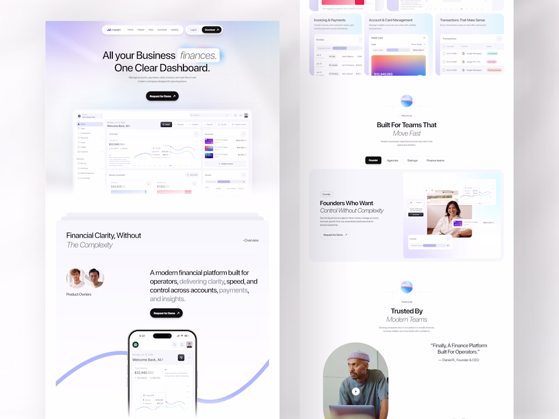
Every growing business has the same problem: finances spread across too many tools, too many tabs, and too much noise.
Maven was designed to end that. A finance SaaS landing page built for operators, founders, agencies, and startups who need one clear dashboard where accounts, payments, invoicing, card management, and cash flow all live together without fighting for attention.
All your business finances. One clear dashboard. The headline says everything, and the design proves it.
This is what a SaaS landing page looks like when it respects the intelligence of the people it's selling to.
Does this feel like a dashboard your finance team would actually trust? 👇
Tools: Figma , Jitter
#SaaSDesign #LandingPage #WebDesign #FintechUI #UIDesign #ContraFreelance #ProductDesign #DashboardDesign
Nice use of whitespace. It keeps everything focused.
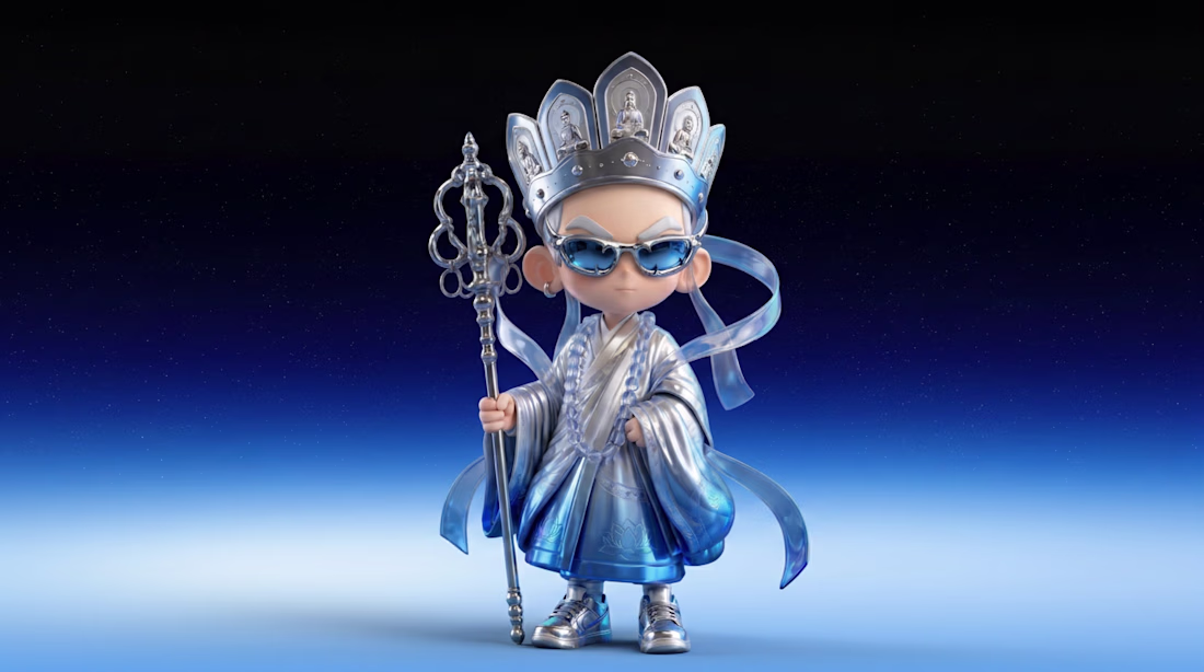
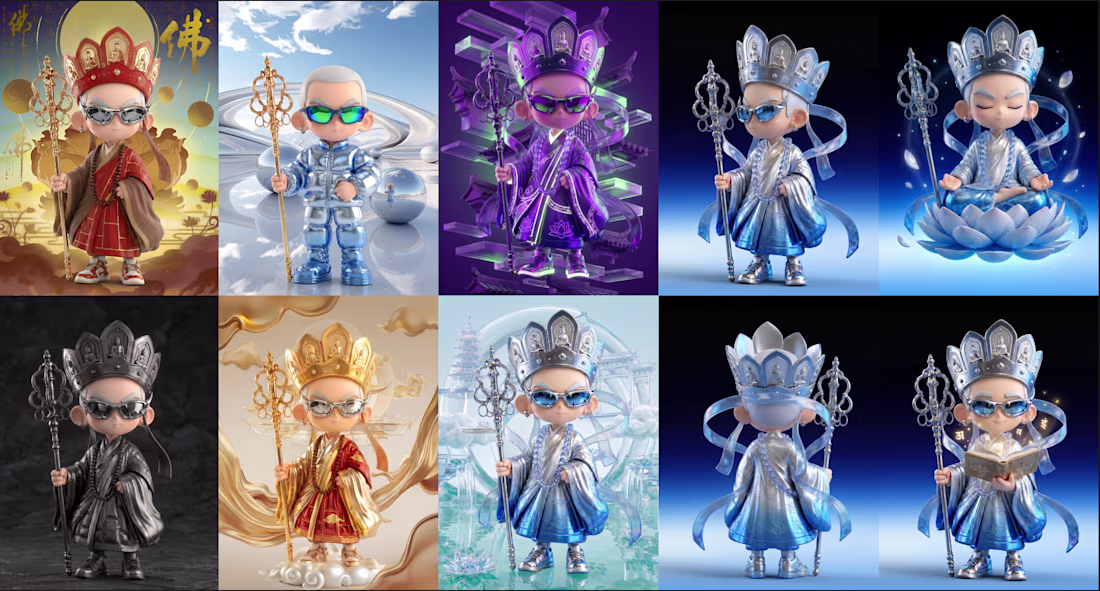
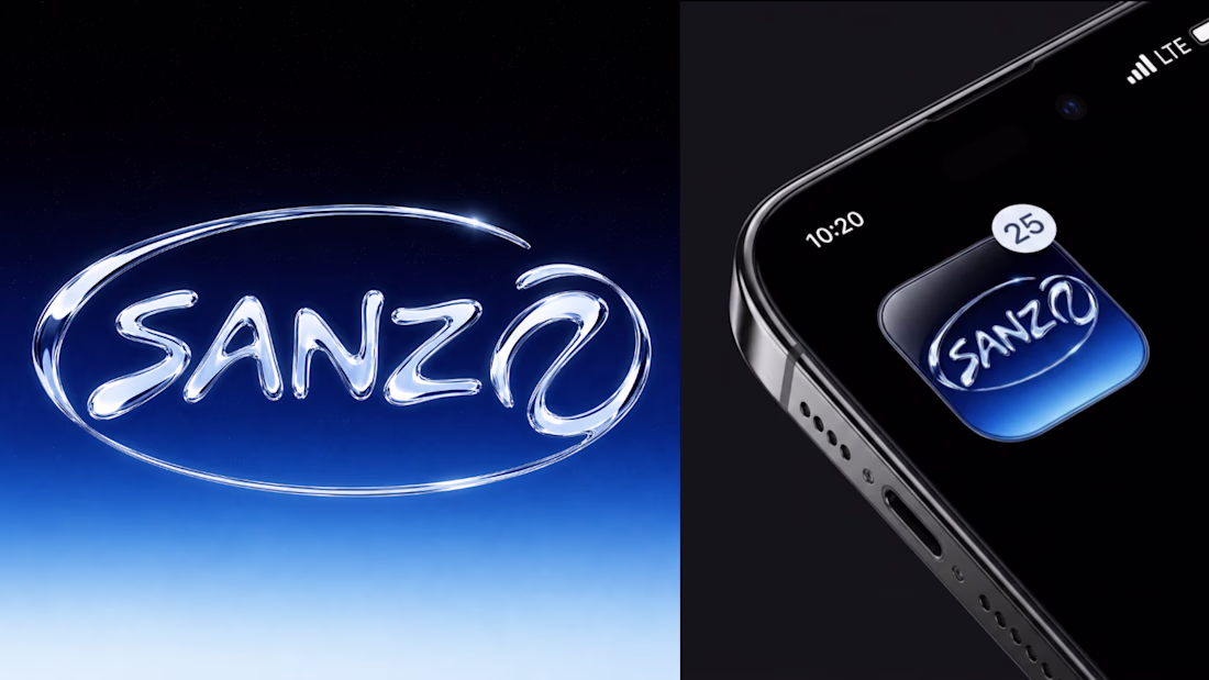
SANZØ™ is the AI guardian of the Future Temple—a virtual sanctuary where technology meets inner peace.
Designed to guide travelers through immersive VR experiences, SANZØ™ helps you slow down, reflect, and reconnect with yourself in a futuristic world beyond reality.
Would you enter the Future Temple with SANZØ™?
Link: https://www.recraft.ai/project/e892a8ae-d800-4a26-af2f-e85091178ec1

Just delivered this landing page for a premium surrogacy brand.
Budget: $2,800
Deliverables:
✅ Figma Design - $1500
✅ Framer Development - $1300
Creative direction:
Premium, trustworthy, and built to reduce uncertainty
Nicely priced
Trending
Claude
Claude has entered the design space. How are you using Claude Design?
Contra University
Learn from expert creatives how to earn more using next-gen AI tools.
fifaworldcup2026
The World Cup is here and the whole world's watching. How are you designing for the world stage?
creativeaiflow
Creative AI workflows are evolving. What tools do you use, and what are their strengths and weaknesses?
freelancerlife
Freelancer life is wins, pivots, and everything in between. What’s yours right now?
