The network for creativity
Join 1.25M professional creatives like you
Connect with clients, get discovered, and run your business 100% commission-free
Creatives on Contra have earned over $150M and we are just getting started
Back to feedPost

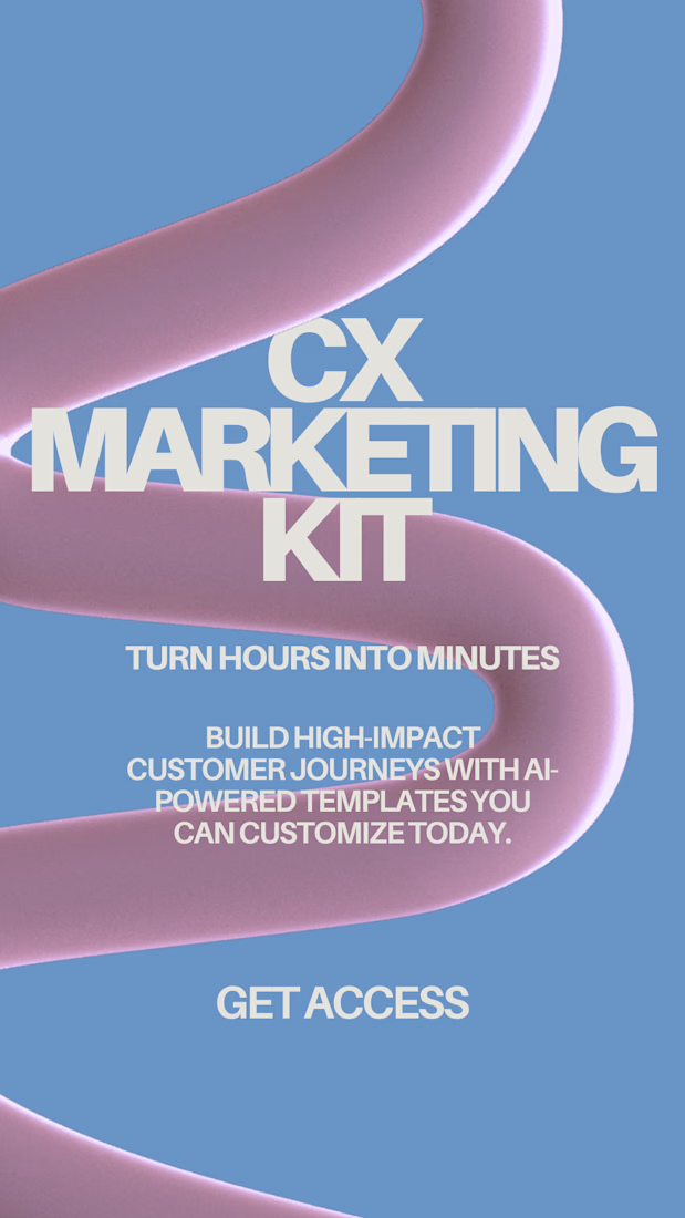
The CX Marketing Kit is a structured lifecycle marketing framework designed for startups and growth-stage teams that need clarity, automation, and retention strategy without hiring a full internal lifecycle team.
It provides AI plug and play foundational templates, journey maps, segmentation logic, and QA systems needed to launch scalable customer engagement programs across email, SMS, and in-app channels.


The network for creativity
Join 1.25M professional creatives like you
Connect with clients, get discovered, and run your business 100% commission-free
Creatives on Contra have earned over $150M and we are just getting started










Related posts


😍

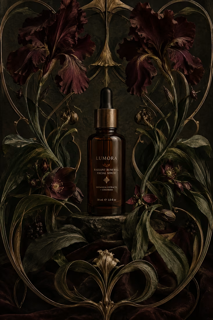
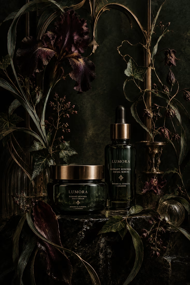
What would happen if a modern skincare product had to communicate without the visual language we associate with beauty today?
Instead, I went back to Art Nouveau, where typography, illustration, architecture, and ornament were treated as one visual system.
The subject actually...


thanks for sharing!


🖤❤️ Client Spotlight | SMAILIN TATTOO
Where art meets identity.
A creative branding and visual presentation project featuring SMAILIN TATTOO, its unique tattoo artistry, and a bold black-and-red visual identity.
This project explores how creative content, product presentation, and digital storytelling can bring a brand's personality to life.
Featured client: SMAILIN TATTOO
Instagram: @sha2wtattoo_ink
Creative presentation by TuServicio_admin ✨
#ClientSpotlight #TattooBranding #CreativePortfolio #VisualIdentity #ContentDesign #TuServicioAdmin

4 voted
57%
3 voted
43%
7 votes
Closed

This is amazing work Estephania! 🔥 Love the black-and-red identity, so bold and clean! The visual presentation is top tier. Great job! 🖤❤️

A short-form promotional video for Greyhaven Architecture, combining cinematic imagery, layered typography, and surreal motion to bring the brand's refined, purposeful identity to life.


The Greyhaven serif laid over that cinematic pen close-up is an elegant frame, Francesca. Cinematic imagery with layered type is exactly the kind of refined identity an architecture brand deserves. Building it in Canva makes it all the more impressive.