The network for creativity
Join 1.25M professional creatives like you
Connect with clients, get discovered, and run your business 100% commission-free
Creatives on Contra have earned over $150M and we are just getting started
Back to feedPost
Taste Test
Hero Section Review
Which would you pick if I was designing for you ?

3 voted
38%
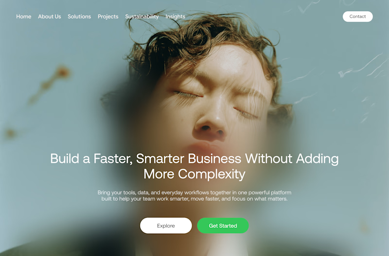
5 voted
62%
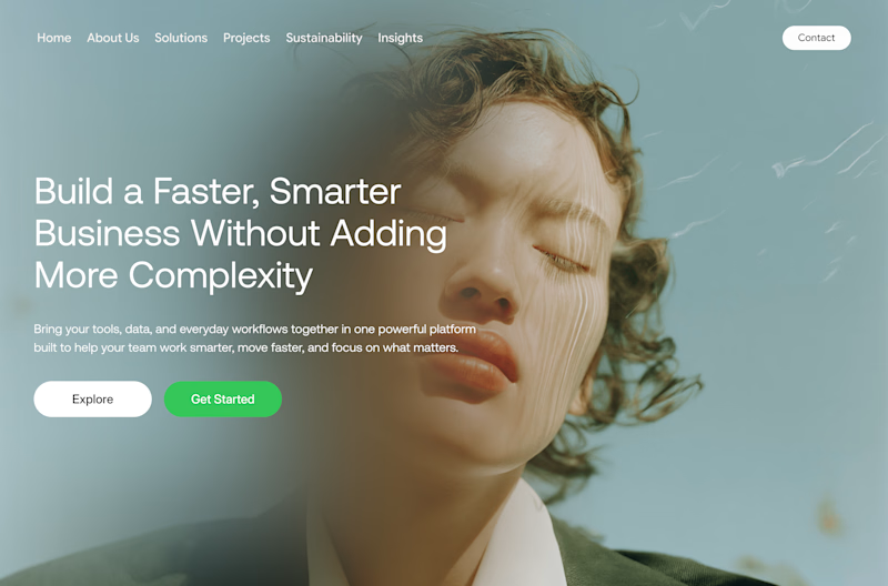
8 votes
Closed


Great observation, I personally go with B

Design B feels more dynamic and engaging—the left-aligned layout creates a stronger visual hierarchy and makes the hero content easier to scan.
Exactly easy scanning of the hero section

I’d go with B. The hierarchy feels stronger and the CTA placement works really well.
Wow nice so B does it better
The network for creativity
Join 1.25M professional creatives like you
Connect with clients, get discovered, and run your business 100% commission-free
Creatives on Contra have earned over $150M and we are just getting started











Related posts

Same content, different experience. A few thoughtful design choices can completely change how a presentation feels, flows, and communicates. Which version would you choose?

11 voted
31%
24 voted
69%
35 votes
Closed

Verde Vista 1 is more modern and futuristic specially with blue colors and robotic hand❤️
Great job Rasid🎉🎉🔥🔥

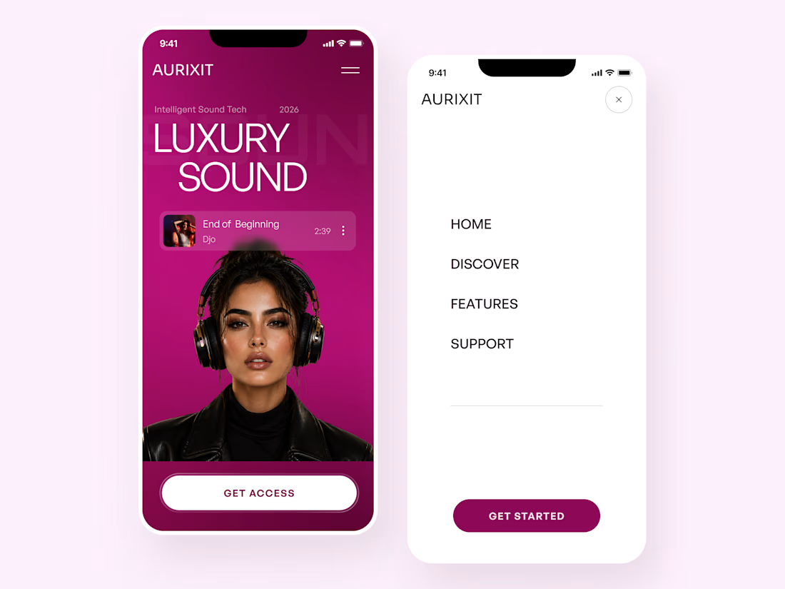
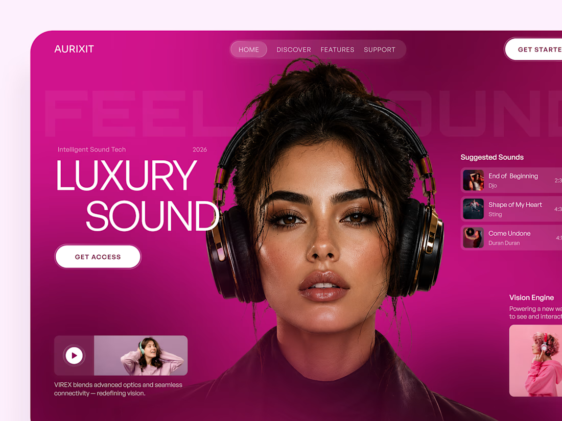
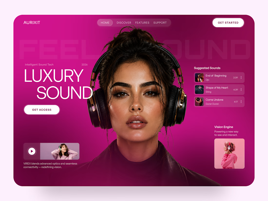
AURIXIT — Luxury Headphones Landing Page 🎧💗
A vibrant landing page concept for a premium audio brand, combining luxury sound, fashion-inspired visuals, and a bold digital experience
The design brings together bright magenta tones, oversized typography, lifestyle photography, and clean UI elements to create a modern, eye-catching aesthetic
Special attention was given to:
• Bold lifestyle-focused hero composition
• Vibrant pink and magenta color palette
• Clean, oversized typography
• Music playlist and suggested tracks
• Premium headphone presentation
• Clear CTA and minimal navigation
• Responsive mobile experience
The result is a fresh, stylish landing page that connects premium audio technology with fashion, music, and personal expression ✨


Magenta with the black headphones really pops. Was the small playlist text on pink tricky for contrast?

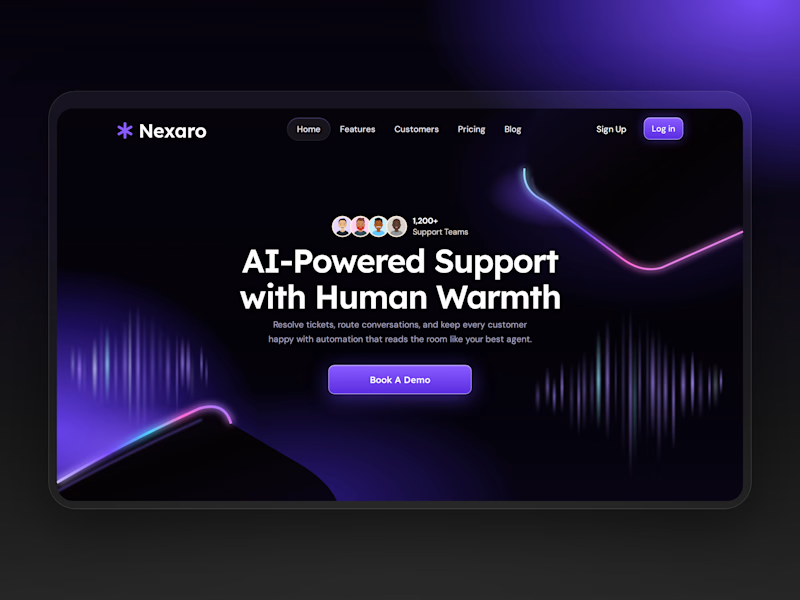
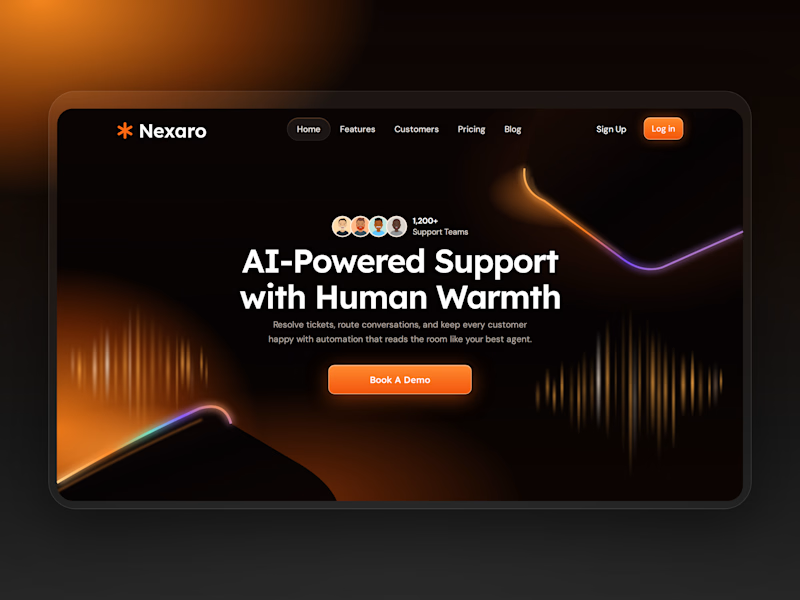
Same design, different energy.
Which one wins? 👇

5 voted
56%
4 voted
44%
9 votes
Closed

Both are fire but Violet Pulse hits different! 💜 That energy feels more modern and premium. Ember Glow is warm though - tough choice!