The network for creativity
Join 1.25M professional creatives like you
Connect with clients, get discovered, and run your business 100% commission-free
Creatives on Contra have earned over $150M and we are just getting started
Back to feedPost


The network for creativity
Join 1.25M professional creatives like you
Connect with clients, get discovered, and run your business 100% commission-free
Creatives on Contra have earned over $150M and we are just getting started








Related posts

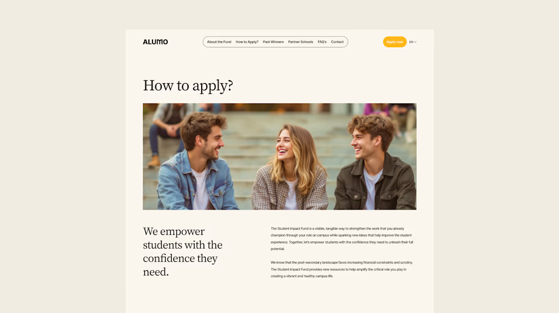
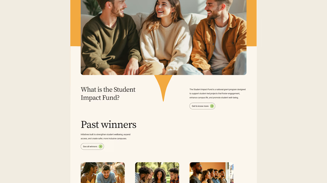
The Client: Alumo is a student impact fund that pools collective influence from influencers and partner schools to deliver a $250,000 annual grant program for student-led projects across Canada.
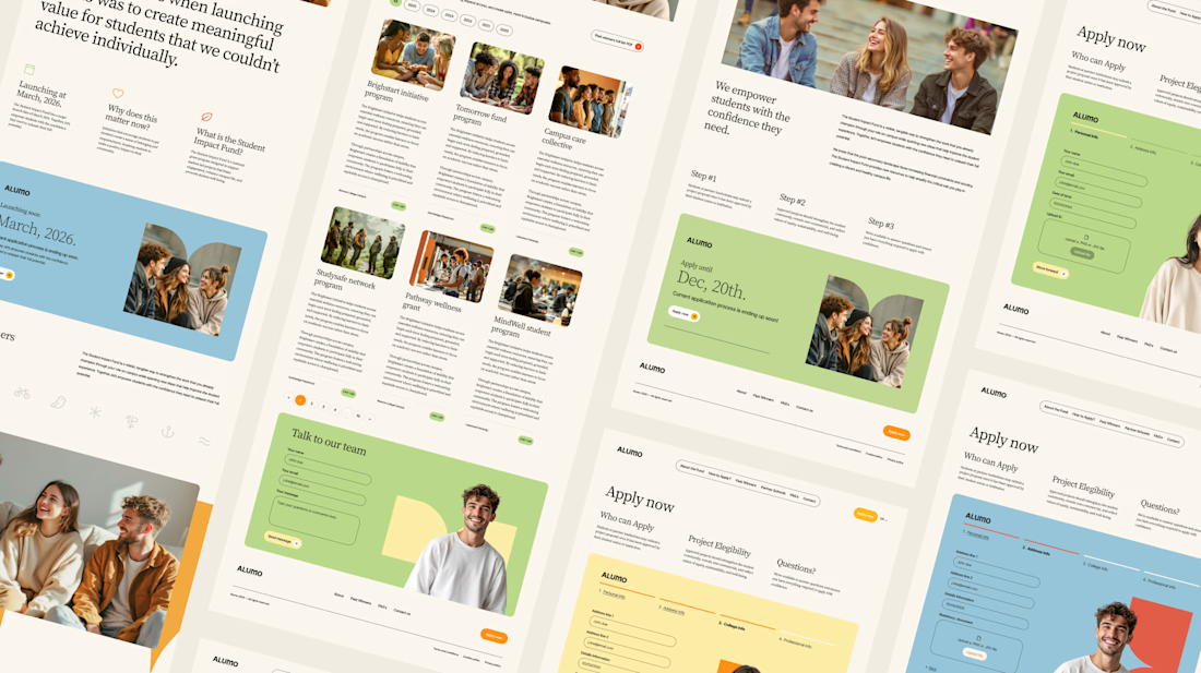
The Issue: The fund needed a website that could communicate trust and purpose to two very different audiences — students applying for grants and partner schools or influencers considering joining — while also showcasing past winners and guiding applicants through the process clearly.
The Solution: A multi-page website was designed with a warm, approachable visual identity using earthy tones, generous imagery, and clear information hierarchy. Each section — About, Past Winners, and How to Apply — was structured to reduce friction and build confidence, making it easy for students to understand eligibility and take action before the deadline.



Love how you're tackling trust + purpose for a $250K fund - that's a tough balance with two audiences. Communicating credibility for a student-led initiative across Canada is huge. Would love to see how you solved it!



I like the Clarity and neatness in your work

I've been working on Cervia, a @Framer website for a single product.
A good single-product site combines the landing page and the store in one page, so the call to action is the purchase itself. Visitors learn what the product is, see why it’s better, and add it to the cart without leaving the page.
The challenge is making one page do both jobs. It has to look like a landing page, with room to explain the product and show it well, and still work like a store product page, with the price, colors and Add to cart always close at hand.
Every extra step between arriving and paying loses some buyers, so I kept the steps to a minimum.
This is so well put Heron! 🔥 Single-product site logic is spot on - landing + store in one page removes friction, CTA is purchase itself. No wandering around. Visitors learn what it is, why it's better, add to cart without scrolling through 5 pages - that's conversion gold!...