The network for creativity
Join 1.25M professional creatives like you
Connect with clients, get discovered, and run your business 100% commission-free
Creatives on Contra have earned over $150M and we are just getting started
Back to feedPost

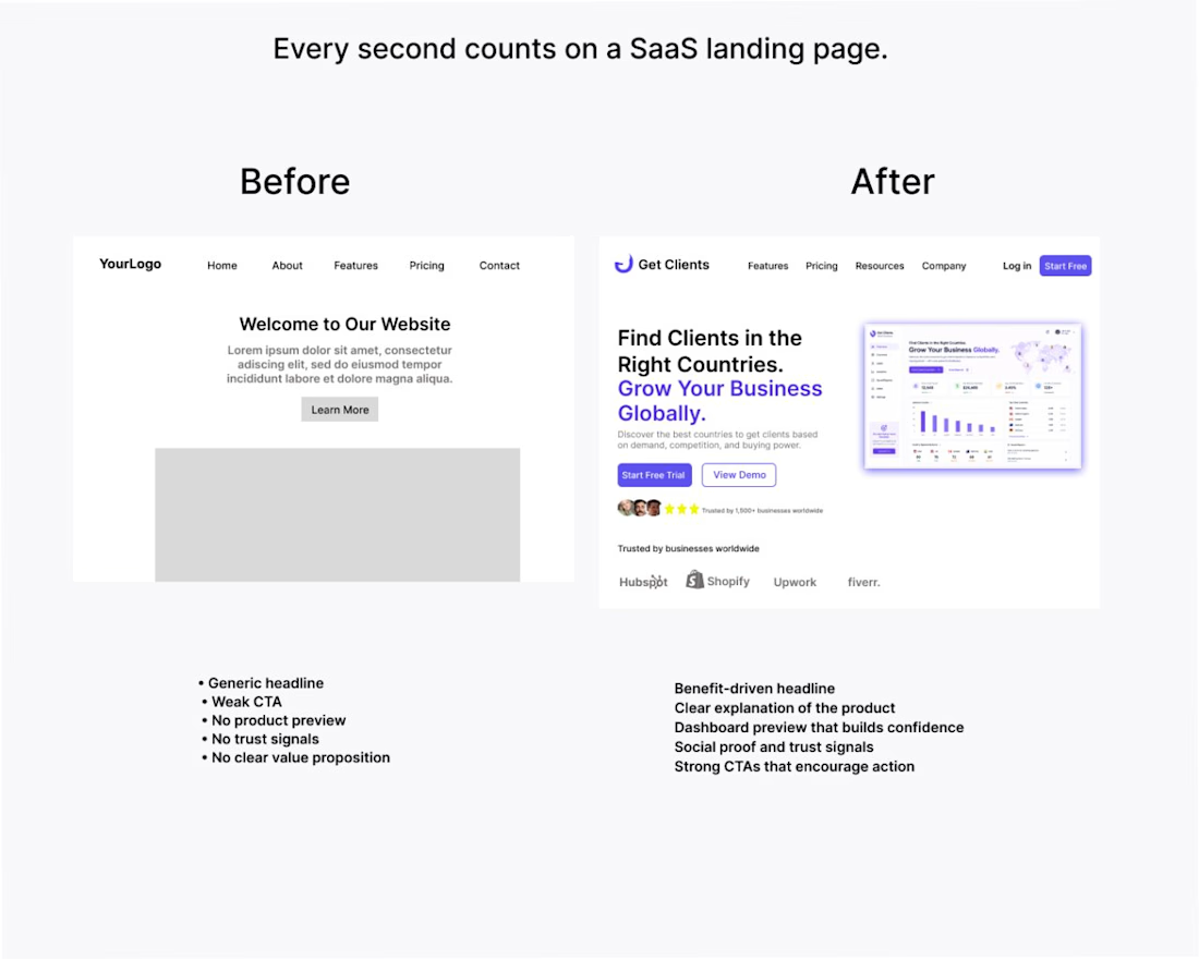
Every second counts on a SaaS landing page.
When someone visits your website, they should immediately understand:
• What your product does
• Who it's for
• Why they should care
• What to do next
In this redesign, I focused on improving communication instead of just making the interface look better.
Before
• Generic headline
• Weak call-to-action
• No product preview
• No trust signals
• Unclear value proposition
After
Clear benefit-driven headline
Product dashboard preview
Strong CTAs
Social proof
Key benefits highlighted
Good design isn't only about aesthetics.
It's about helping users make decisions with confidence and helping businesses increase conversions.
Which version would you trust more as a first-time visitor?
The network for creativity
Join 1.25M professional creatives like you
Connect with clients, get discovered, and run your business 100% commission-free
Creatives on Contra have earned over $150M and we are just getting started
Related posts



Looks great! What about readability though?
Text seems low contrast to me. Although I have a poor vision and most things seem too small and low contrast to me.

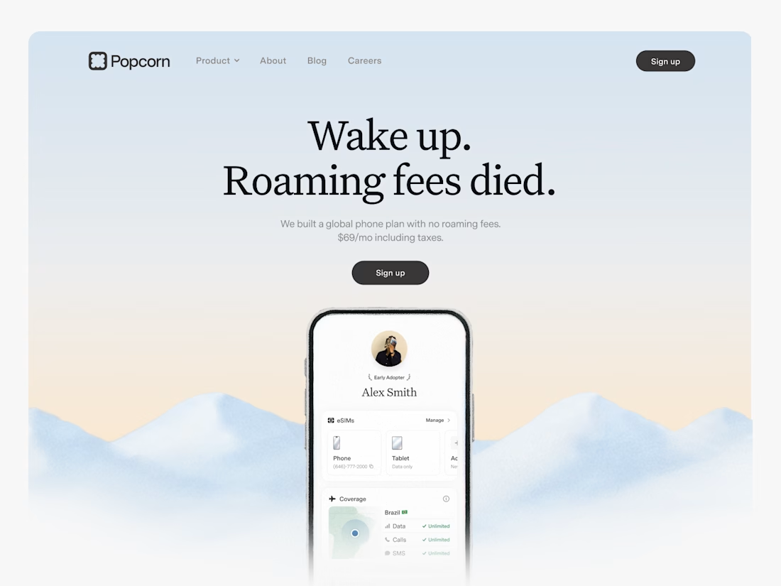
2nd variation of a landing page for a B2B search analytics platform
For this variation, I went with a lighter background where the CTA is visually focused instantly.
You might have 3~5 seconds to get the user's attention, so it's very important how the design looks and feels.
Full landing page coming tomorrow.


Your website looks good. So why isn’t anyone getting in touch?
Most websites are built to impress. Not to move people forward.
There’s a difference. And it starts with the brief.
Most founders brief their designer on aesthetics. Colours, fonts, feeling. Nobody briefs on the journey. What should someone feel in the first three seconds? What’s the one action you want them to take?
If those questions aren’t answered before design starts, the website will look right and work wrong.
I’ve spent years studying how people behave on websites before I started designing them. The biggest thing I learned: conversion isn’t a feature you add at the end. It’s what the design is for from the beginning.
Does your website move visitors forward or just describe what you do?