The network for creativity
Join 1.25M professional creatives like you
Connect with clients, get discovered, and run your business 100% commission-free
Creatives on Contra have earned over $150M and we are just getting started
Back to feedPost

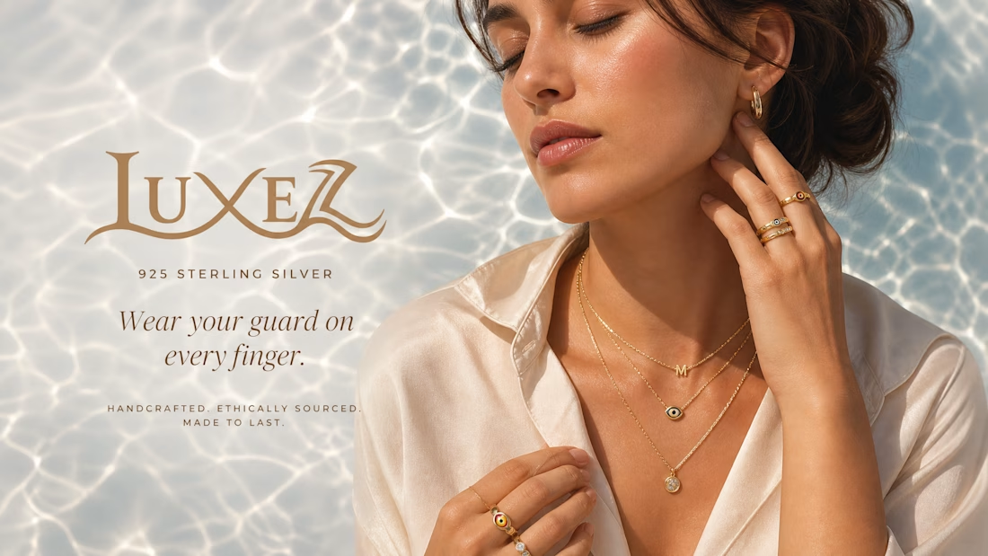
Luxury Jewelry Brand Social Media Concept
This is a self-initiated portfolio project created to demonstrate my approach to brand strategy, creative direction, and social media marketing for luxury brands.
Project Brief
Design a premium social media campaign for a fictional 925 sterling silver jewelry brand that communicates elegance, craftsmanship, and modern femininity.
Objective
The goal was to create a visually cohesive campaign that positions the brand as aspirational while maintaining a clean and sophisticated identity.
My Approach
Conducted market research on luxury jewelry brands.
Defined the brand’s visual direction using neutral tones and elegant typography.
Crafted messaging focused on quality, timeless style, and emotional appeal.
Designed a social media creative optimized for Instagram engagement and brand awareness.
Services Demonstrated
Brand Strategy
Social Media Strategy
Creative Direction
Graphic Design
Copywriting
Content Marketing
Tools
Canva • Adobe Photoshop • Figma
Note
This is a conceptual project created for portfolio purposes and does not represent work completed for a real client.


The network for creativity
Join 1.25M professional creatives like you
Connect with clients, get discovered, and run your business 100% commission-free
Creatives on Contra have earned over $150M and we are just getting started







Related posts

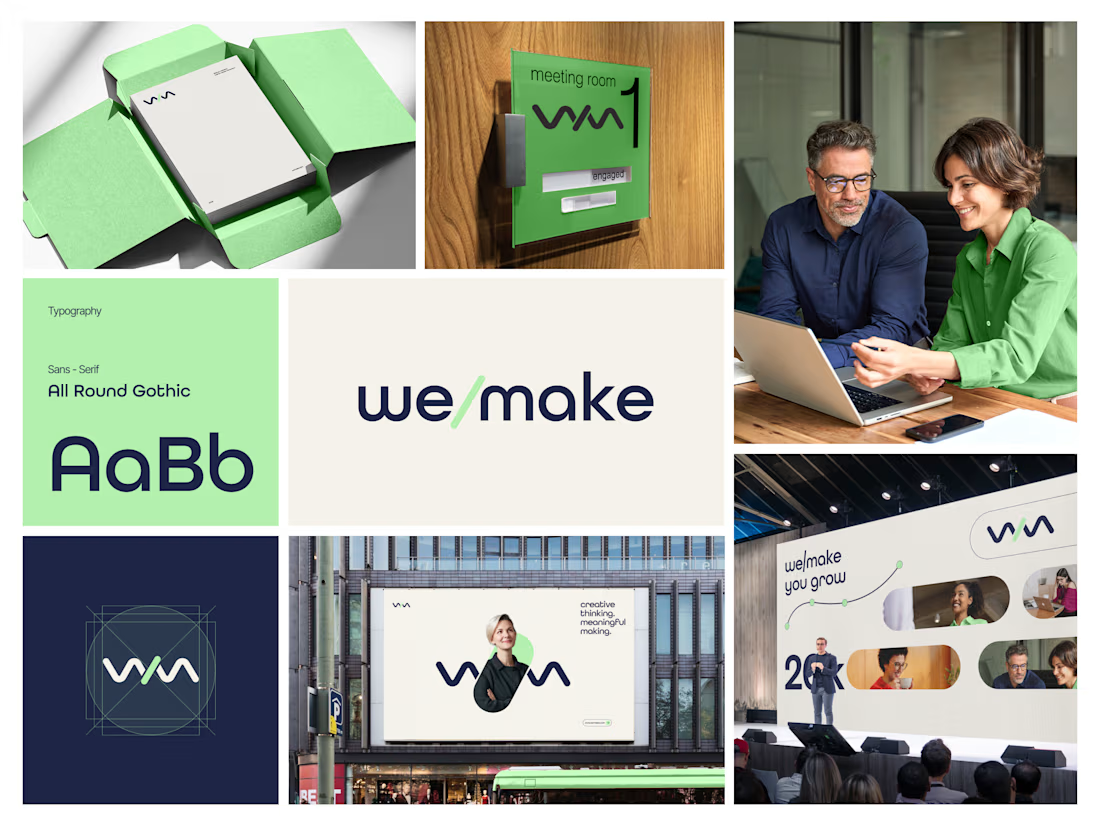
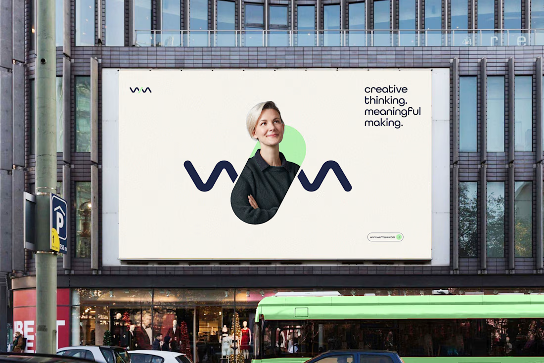
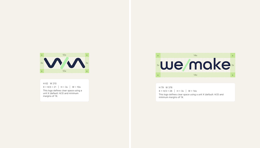
We/Make - Brand Identity Designed for Business Growth
A strategic brand identity for We/Make, built to create a stronger market presence, communicate credibility, and give the business a clear, recognizable visual position.
Rather than creating a logo in isolation, we developed a scalable identity system that helps the brand communicate consistently across digital touchpoints and build stronger recognition as the business grows.
The focus:
→ Clearer brand positioning
→ Stronger visual recognition
→ More credible & professional presence
→ Consistent communication across touchpoints
→ A flexible identity system built for long-term growth
Deliverables: Logo Identity · Visual System · Typography · Color Direction · Brand Guidelines · Logo Construction & Clear Space
Brand Strategy | Brand Identity | Logo Design | Visual Identity | Brand Guidelines | Business Branding
#BrandIdentity #BrandStrategy #LogoDesign #VisualIdentity #Branding #BrandGuidelines #BusinessBranding #BrandDesign #ContraDesigner #CreativeStrategy



This is brilliant

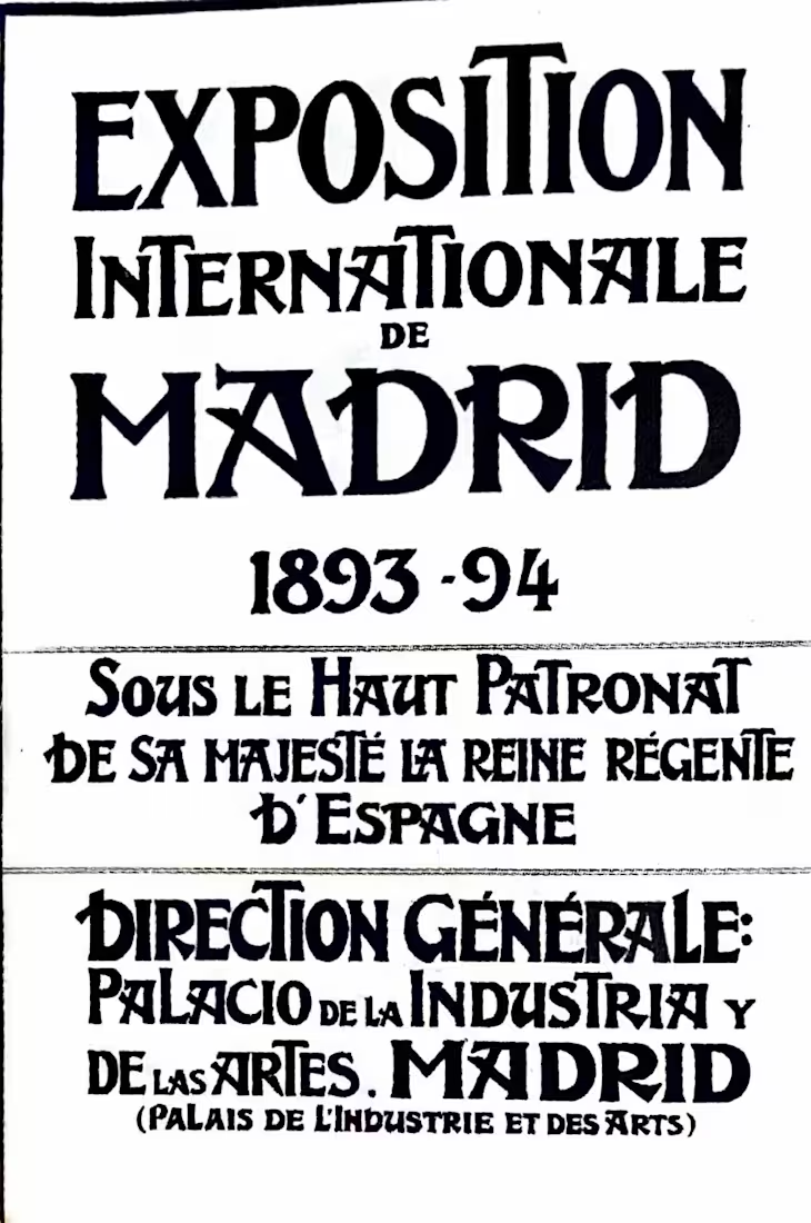
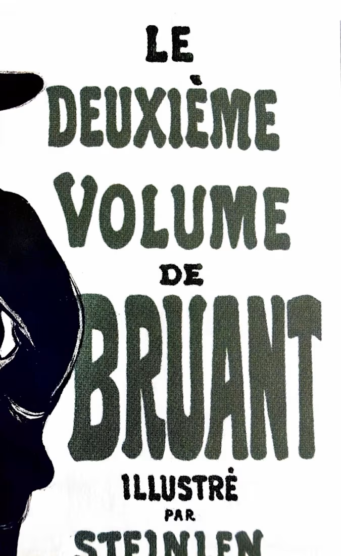
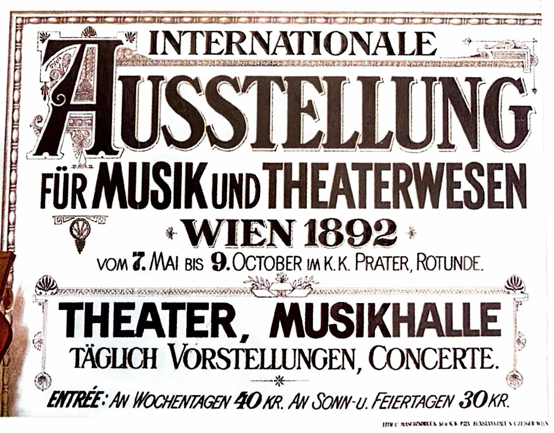
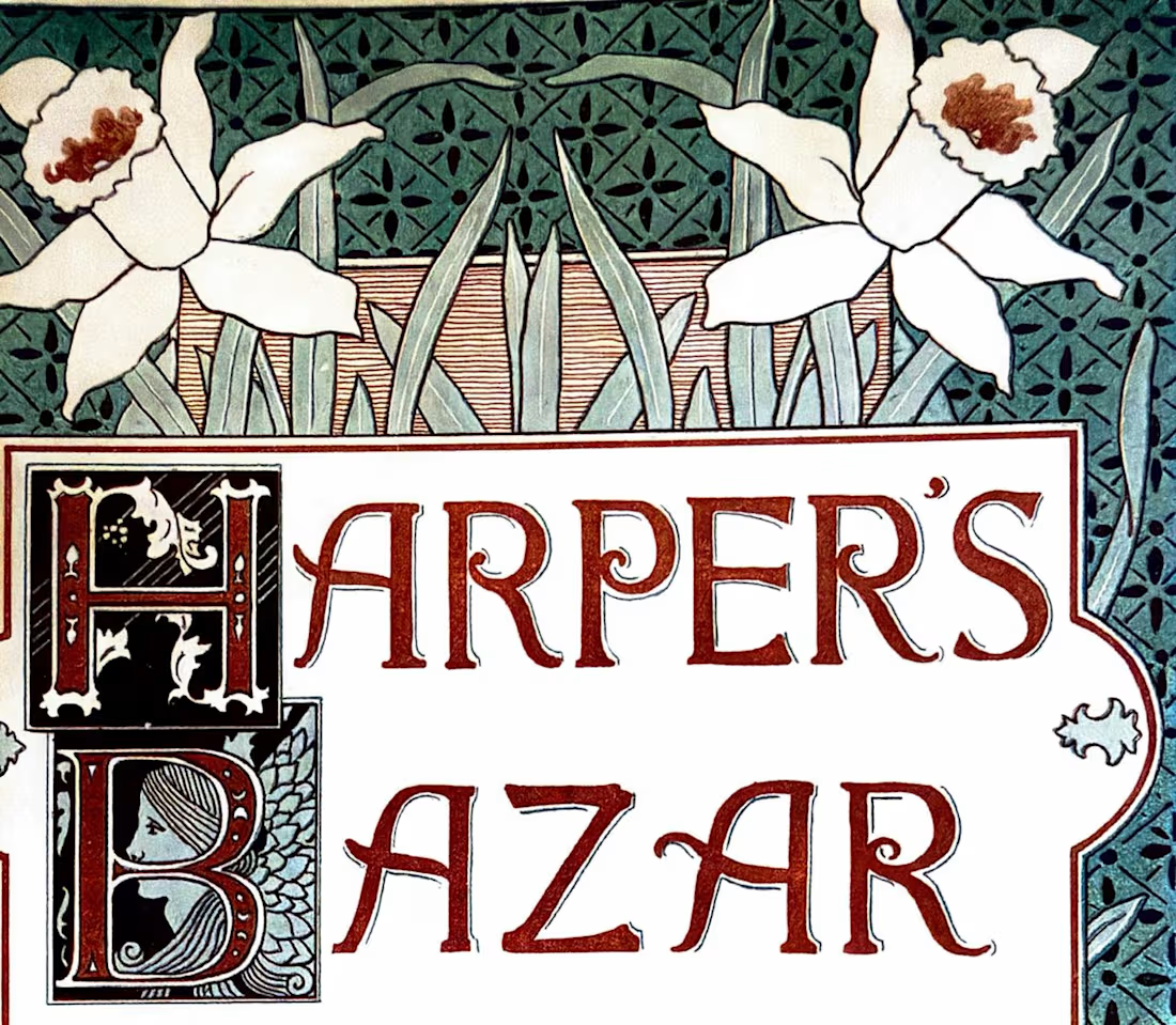
What did ads look like before typograhy was a file you could have in your computer and replicate multiple times?
Another little tour through The History of Design 1890–1959, this time looking specifically at how designers were treating type as an image rather than simply information. Previous post here.
Eugène Grasset, 1893 — beautifully controlled lettering and organic forms.
Toulouse-Lautrec, 1903 — expressive lettering becoming part of the energy of the poster.
Ernst Klimt, 1892 — decorative type working alongside illustration.
Louis Rhead, Harper's Bazar, 1892 — type, image, and ornament interacting as one visual system.
What I love about these references is that the type is part of the image.
Show me one historical typographic composition you’d steal inspiration from today. 👀

The Beggarstaffs' cut-paper posters from the late 1890s — the lettering sits in the gaps the shapes leave rather than on top of them. I still think about that when a wordmark has to live inside a busy pack layout: let the silhouette decide where the type goes instead of the grid.

AI & Tech YouTube Thumbnail - Designed for Maximum Views
I designed this thumbnail for an AI / Tech YouTube channel to compete with big channels like Think Media, MrBeast-style tech, etc.
Design Strategy:
Futuristic look with neon blue, electric purple, and dark background for AI feeling
Huge bold text: "AI WILL REPLACE YOU?!" or "This AI is INSANE!" (Curiosity gap)
Shocked / excited facial expression + AI robot / ChatGPT logo visual
Glowing effects, arrows, and icons to make it pop in YouTube feed
Optimized for mobile - text readable even on small phone screen
Why it works: Tech viewers click on fear + curiosity + new technology. This design uses all 3.
Perfect for: AI channels, Tech reviews, ChatGPT tutorials, Make money with AI, Tech news
Tools: Canva Pro, Photoshop, Adobe Photoshop, Illustrator
Skills: High-CTR Thumbnail Strategy, Tech Branding, YouTube Growth
Delivery: 24h delivery + 2 free revisions + Source file
I help AI & Tech YouTubers go from 0 to 100K views with thumbnails that the algorithm loves. Let's make your channel blow up!
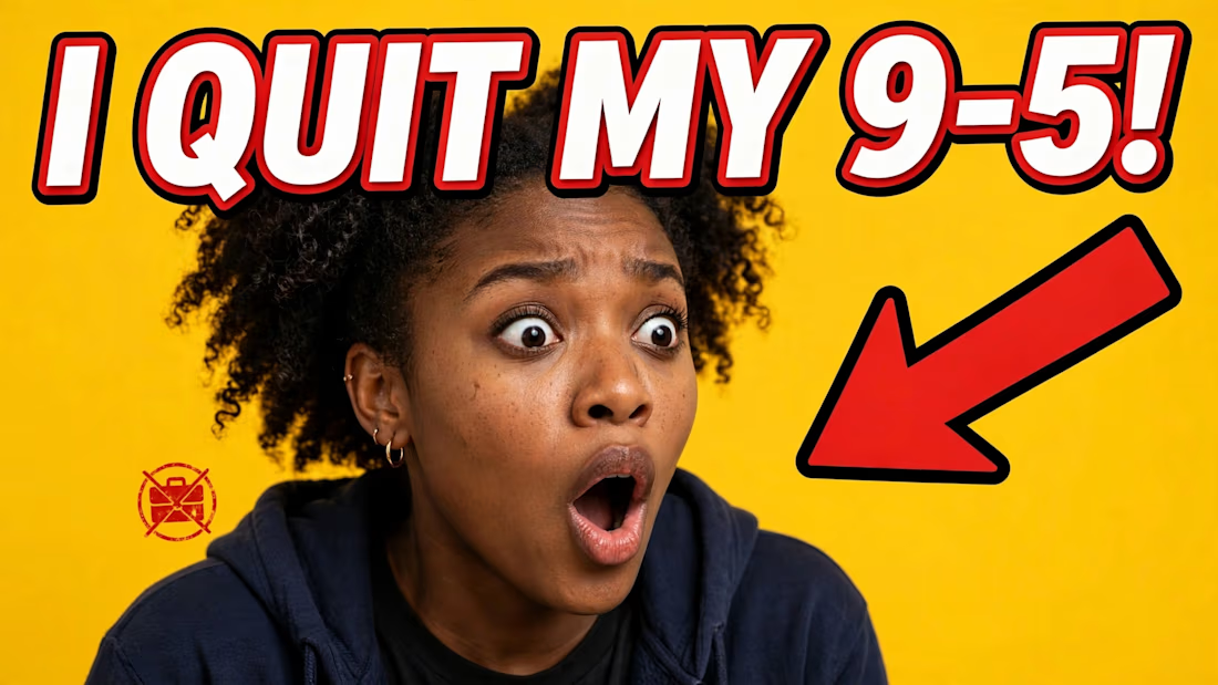
The dark-background rule is the one I'd want numbers on before committing to it. A big share of the audience is browsing in dark mode, where a dark thumbnail sits against a dark UI and loses its outer edge entirely, whereas the yellow one here keeps its shape in both themes. Do...