The network for creativity
Join 1.25M professional creatives like you
Connect with clients, get discovered, and run your business 100% commission-free
Creatives on Contra have earned over $150M and we are just getting started
Back to feedPost
Taste Test

A couple of months ago, I worked on a very exciting project that I hadn't done before. Make a mobile billboard ad.
The billboard needs to accomplish two critical objectives: immediately communicate what Exaforce does to security leaders unfamiliar with the company, and create differentiation against.
Which concept do you think serves best the objective?
3 voted
38%
5 voted
62%
8 votes
Closed
Detail case study here


Both looks awesome thats some great design eye right there!

Concept B for me. Billboards get maybe two seconds of attention from a car, and that light beam shape reads instantly at a distance without needing to parse a hand and phone first. It also just feels more security brand than lifestyle tech ad.


Wonderful design !
The network for creativity
Join 1.25M professional creatives like you
Connect with clients, get discovered, and run your business 100% commission-free
Creatives on Contra have earned over $150M and we are just getting started



Related posts


Should a personal brand hero lead with the name or the promise?
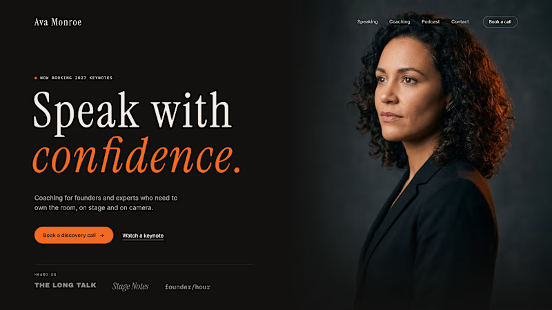
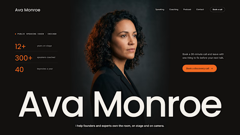
A client of ours is a speaking coach. People find her by name: podcasts, stages, word of mouth. Yet her first hero hid that name in the top-left corner.
We tested two directions:
The promise first. "Speak with confidence" in big type, the name small in the nav. Clear, but it could be any coach on the internet.
The name first. Her name at billboard scale, the promise in one line above it, her face right behind. Someone arriving from a podcast knows instantly they're in the right place.
When people search for you, your name is the headline.
Which one would you ship for a personal brand?
43 voted
51%
42 voted
49%
85 votes
Closed

Name first — podcast listeners arrive looking for her.

Same 13-second app ad, two versions.
Left is my first try: neon rings, emoji-style icons, light rays, every number in a different color. Busy, and honestly a bit AI-looking.
Right is the redo. One accent color, line icons, and a camera that never stops: it films the phone in 3D and pulls focus to whatever matters in that second. Fewer things on screen, so each one lands.
Latido is a fictional fitness app I use as a sample. I make animated ads and App Store previews for apps and SaaS.
Which one would you ship?

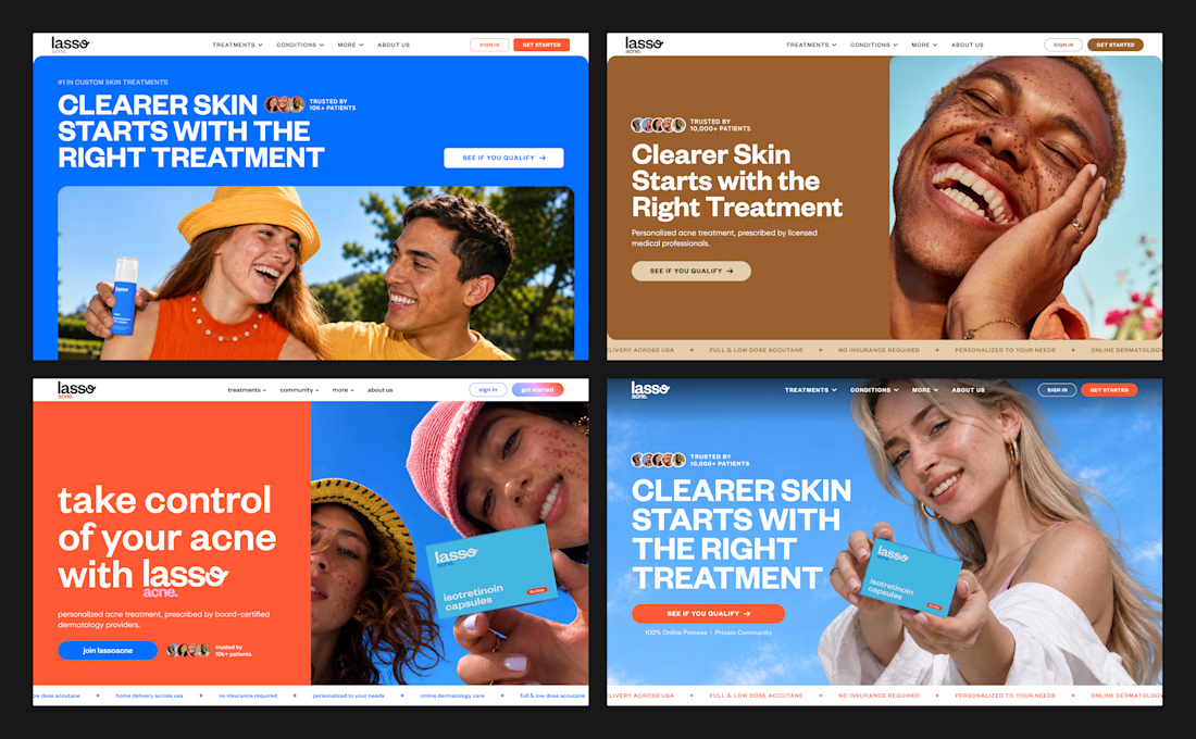
4 hero options I presented to a client for a dermatology skincare ecommerce website.
The goal: a modern, bold, colorful, personality-driven design for a young audience.
Which one do you think the client chose?
#ecommercedesign #crodesigner #skincarebrand

Loving option 4! A full-width image always carries more emotion, and here it makes “clearer skin” feel real instead of just promised. That orange CTA against the blue is 🔥