The network for creativity
Join 1.25M professional creatives like you
Connect with clients, get discovered, and run your business 100% commission-free
Creatives on Contra have earned over $150M and we are just getting started
Back to feedPost


A logo for "One for Tree", where cypress trees and a lightless sky create a rare visual silence.
Would you lean more towards nature or astronomy in the identity?
Brand DesignVisual System DesignerAdobe IllustratorAdobe PhotoshoplogobrandingvisualidentityLogo Design


The network for creativity
Join 1.25M professional creatives like you
Connect with clients, get discovered, and run your business 100% commission-free
Creatives on Contra have earned over $150M and we are just getting started



Related posts




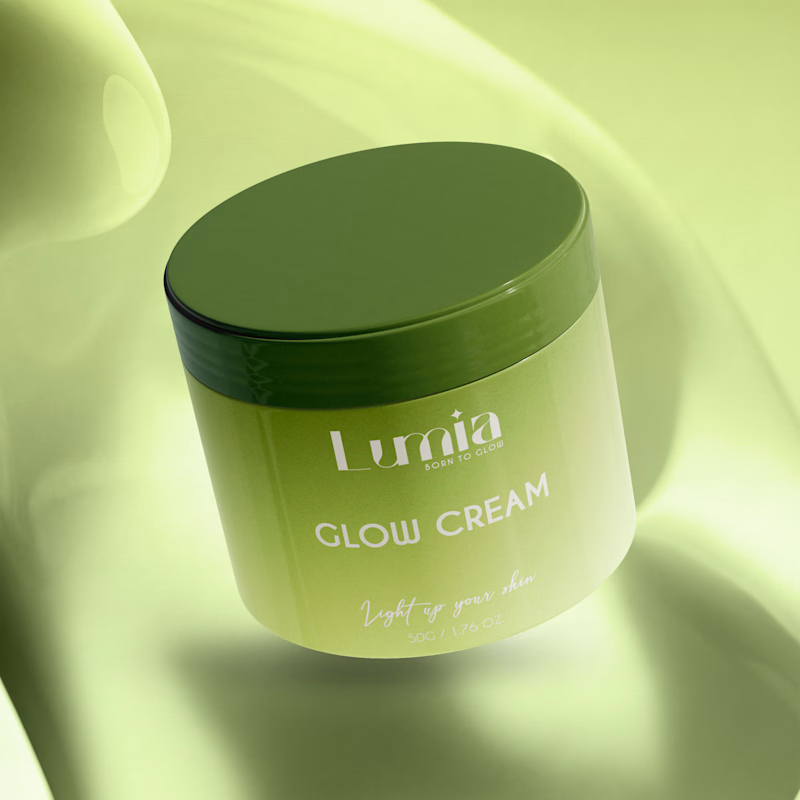
Which packaging color catches your eye first?
6 voted
46%
7 voted
54%

13 votes
Closed

The green version catches my eye first: the dark olive lid gives the lighter jar a clear focal point. I would also test the small white label text at thumbnail size, since the soft lighting reduces its contrast in both versions.

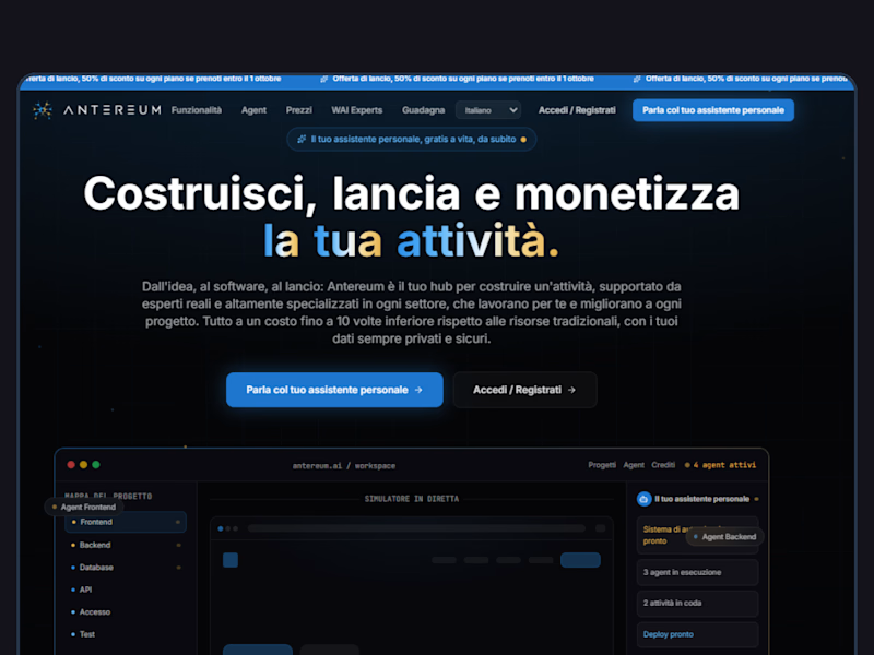
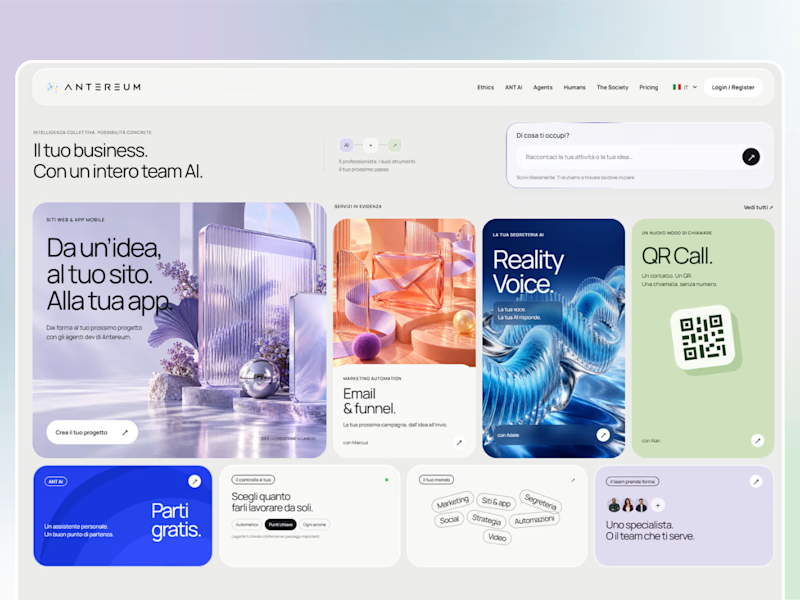
Webiste redesign for Saas company


2 voted
4%
44 voted
96%
46 votes
Closed
