The network for creativity
Join 1.25M professional creatives like you
Connect with clients, get discovered, and run your business 100% commission-free
Creatives on Contra have earned over $150M and we are just getting started
Back to feedPost
Taste Test


Which Plushie Email Verification Design Do You Prefer?
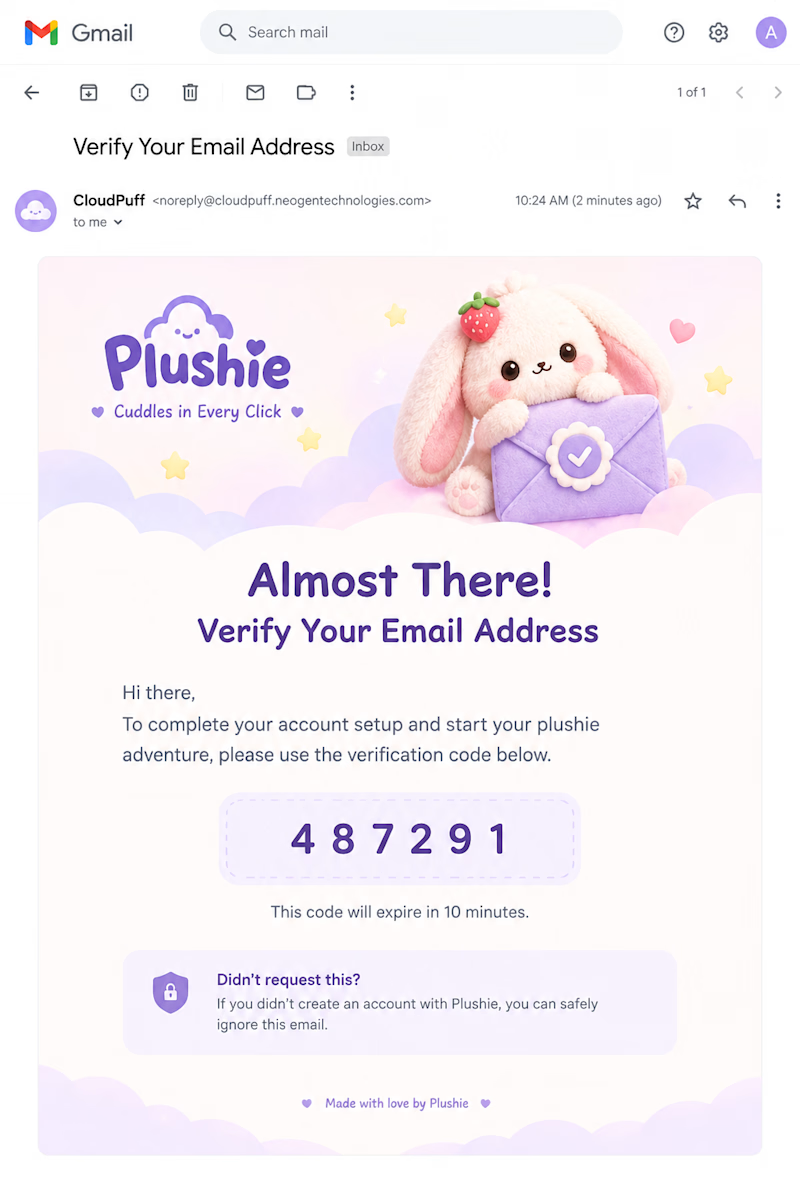
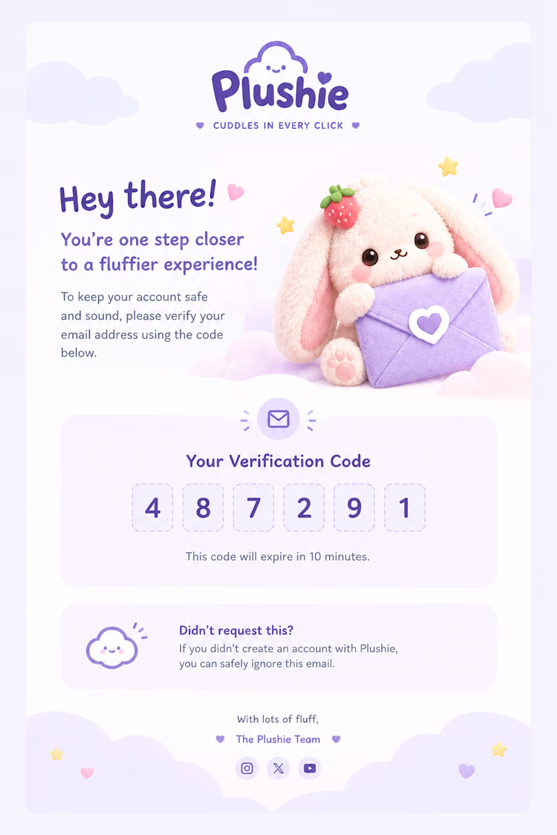
I explored a couple of directions for Plushie’s email verification experience, keeping the core idea the same while experimenting with different layouts, visual hierarchy, and ways to make the verification code feel more playful.
Version 01 - Visual-first, with a strong hero illustration
Version 02 - More structured, clean, and email-focused
Both follow the same soft, plushie-inspired visual language.
Which version would you choose for Plushie? 👀
Drop your pick below, 1 or 2?
0 voted
0%
5 voted
100%
5 votes
Closed

Pro design 🤩
Thank you. 😊 Don't forget to vote, will help to argue with the client. 😂

Version 02, mostly because showing it inside the actual email client chrome builds more trust that this is really landing in the inbox. Version 01's illustration is charming but it's competing with the code for attention.
Agreed. Version 02 feels more authentic because showing the design within the actual email client chrome reinforces that this is a real inbox experience rather than just a standalone mockup.
I also agree that while Version 01’s illustration adds personality, it competes with the code for attention.
The network for creativity
Join 1.25M professional creatives like you
Connect with clients, get discovered, and run your business 100% commission-free
Creatives on Contra have earned over $150M and we are just getting started





Related posts


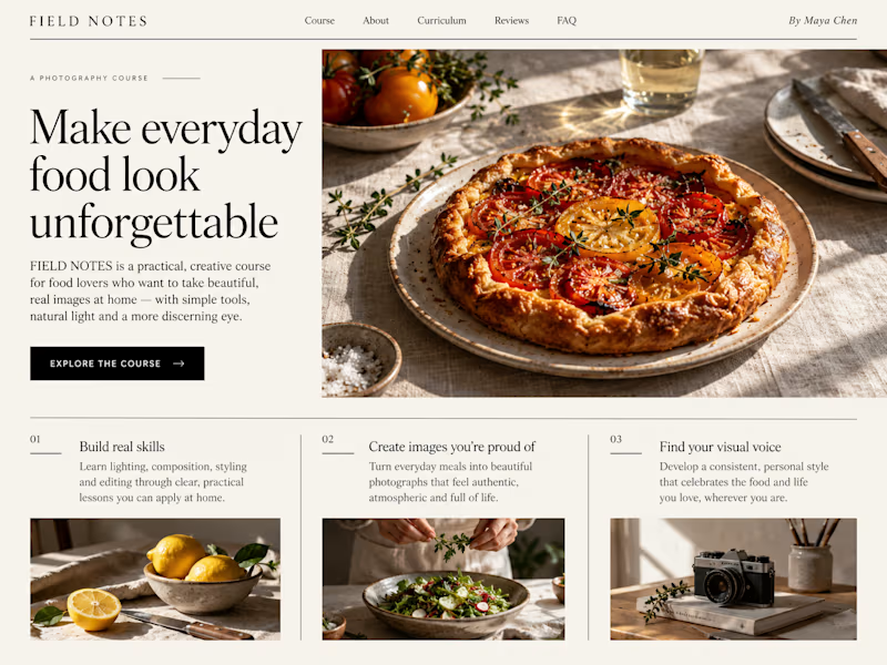
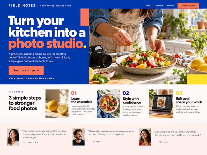
Which Kajabi sales page design would you choose for this course? Vote for A or B and tell me what made the difference.

23 voted
50%
23 voted
50%
46 votes
Closed

B still could be polished though...maybe try giving the text section little bit more real estate..I don't know



Which brand style fits Yicora?
I'm crafting a brand book for an AI platform targeting for creators.
16 voted
53%
14 voted
47%
30 votes
Closed

A feels more professional great job 🎉🎉