The network for creativity
Join 1.25M professional creatives like you
Connect with clients, get discovered, and run your business 100% commission-free
Creatives on Contra have earned over $150M and we are just getting started
Back to feedPost


The network for creativity
Join 1.25M professional creatives like you
Connect with clients, get discovered, and run your business 100% commission-free
Creatives on Contra have earned over $150M and we are just getting started

Challenges
View all


Related posts


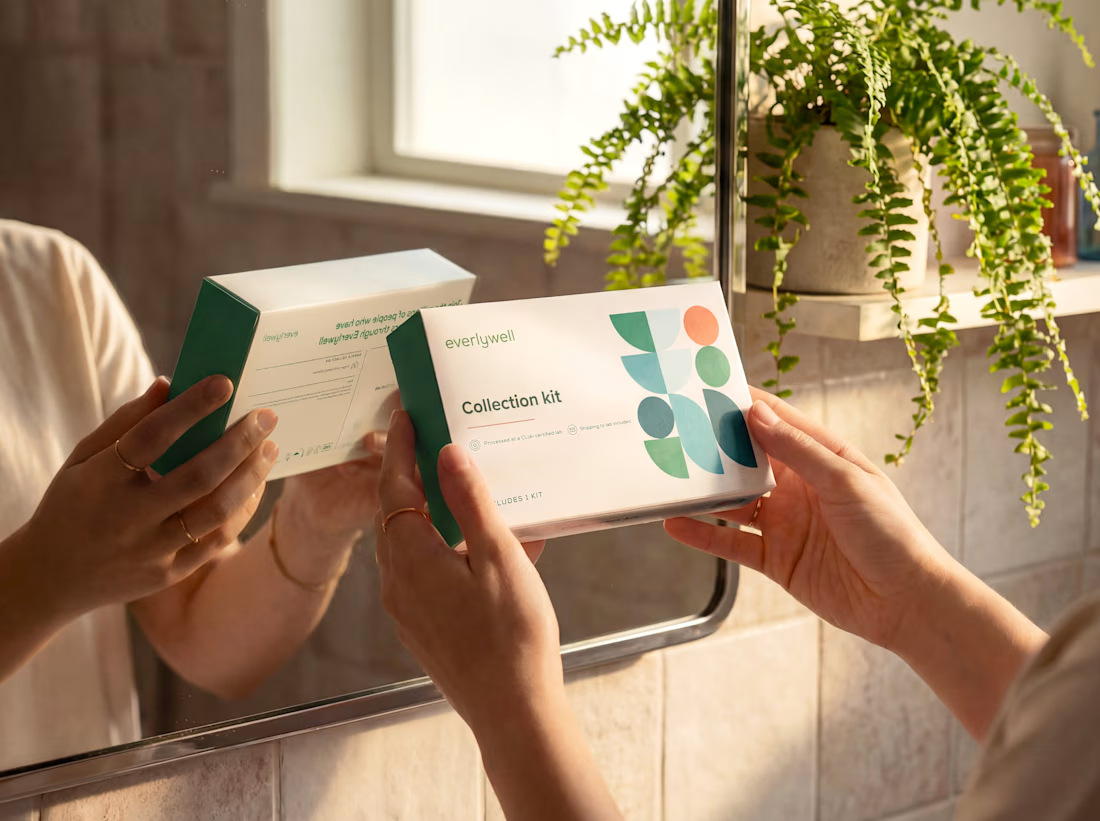
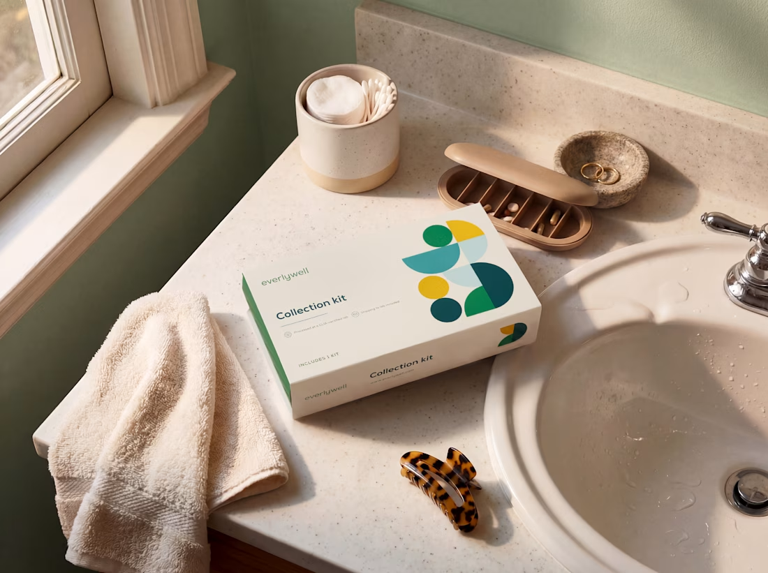

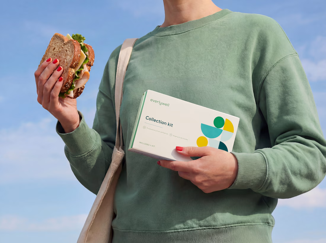

The warm props and natural light make these feel like real lifestyle shots rather than product renders. That's the hard part to nail when you're blending photography with AI art.


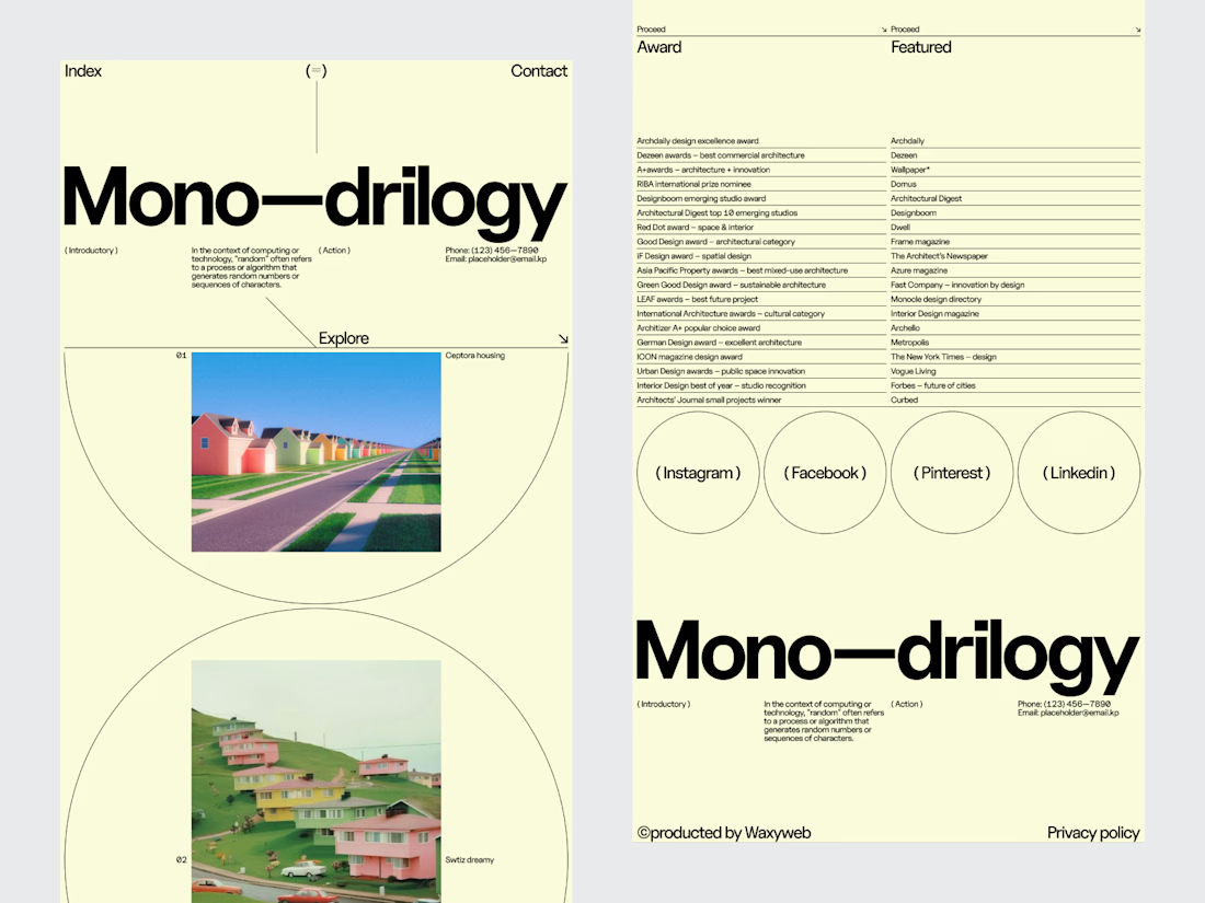
Engaging website for a New York–based architecture and construction studio, balancing bold typography, immersive imagery and a minimal editorial layout.


An architecture studio's website shouldn't compete with its projects.
It should give them the right environment to be seen.
For this editorial architectural website, we explored a digital experience inspired by the visual language of architecture publications.
Large-scale photography creates the first impression. Typography establishes the tone. Generous spacing keeps the interface calm, while restrained navigation makes the portfolio easy to explore.
The design deliberately avoids filling every space with information.
Instead, each project gets room to communicate through imagery, composition and editorial pacing.
Services: Architecture Website Design · UI/UX Design · Editorial Web Design · Architectural Portfolio Design · Web Development
The goal was to create a website that feels like an extension of the studio's creative thinking quiet, confident and focused on the work.
Designed by WaxyWeb.

excellent


