The network for creativity
Join 1.25M professional creatives like you
Connect with clients, get discovered, and run your business 100% commission-free
Creatives on Contra have earned over $150M and we are just getting started
Back to feedPost
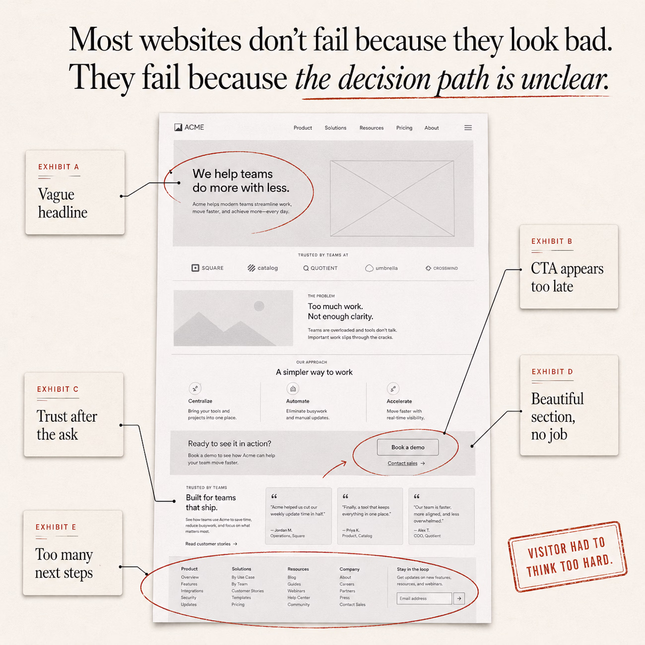
The website looked good.
Clean layout.
Nice typography.
Strong visuals.
Modern sections.
But the visitor still had to work too hard.
They had to:
figure out what the company actually does
search for proof
guess which action mattered most
connect the offer, the value, and the next step by themselves
That is where many websites fail.
Not because the design is ugly.
Because the page is asking the visitor to solve the structure.
A good website does not just present information.
It controls the order in which the visitor understands it:
What is this?
Why should I care?
Can I trust it?
What should I do next?
That sequence matters more than decoration.
This is why I don’t judge a homepage only by how it looks in a mockup.
I look at:
what the visitor has to decide
how much effort the page asks from them
where trust appears
whether the next step is clear
whether the structure helps them feel confident enough to act
Most websites don’t need more sections.
They need a stronger decision path.
The network for creativity
Join 1.25M professional creatives like you
Connect with clients, get discovered, and run your business 100% commission-free
Creatives on Contra have earned over $150M and we are just getting started
Related posts
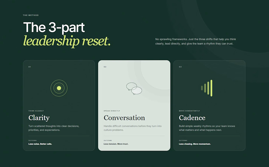
Coach websites do not need to explain the whole brain on the homepage.
This concept uses 3 words:
Clarity.
Conversation.
Cadence.
Easy to remember, trust and talk about on a sales call.
Modern and intuitive
Built my website so people don't have to ask what I do.
Still got asked what I do... maybe I need a bigger font. 😅
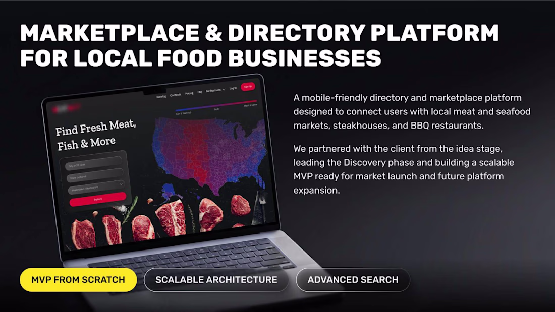
One of our favorite projects started with nothing more than an idea.
We helped define the product, design the architecture and launch a scalable marketplace MVP ready for future growth.
Always exciting to build products from day one 🚀
Check it out
I really like how this case highlights the product journey, not just the final interface. Great work!
Trending
Claude
Claude has entered the design space. How are you using Claude Design?
Contra University
Learn from expert creatives how to earn more using next-gen AI tools.
fifaworldcup2026
The World Cup is here and the whole world's watching. How are you designing for the world stage?
creativeaiflow
Creative AI workflows are evolving. What tools do you use, and what are their strengths and weaknesses?
freelancerlife
Freelancer life is wins, pivots, and everything in between. What’s yours right now?