The network for creativity
Join 1.25M professional creatives like you
Connect with clients, get discovered, and run your business 100% commission-free
Creatives on Contra have earned over $150M and we are just getting started
Back to feedPost

Hello Everyonee !!!
i am very excited to share my latest passion project: An advertising redesign and visual recreation for the iPhone 18 Pro campaign!
For this concept, I wanted to challenge traditional smartphone marketing, which heavily relies on isolated, clean product renders.
I wanted to introduce human form, dramatic shadow play, and expressive typography.
The project features two distinct visual directions driven by the exact same core concept:
1️⃣ The Cinematic Editorial Edition: A premium, monochrome landscape layout designed for an understated, luxury fashion aesthetic.
2️⃣ The High Performance Edition: An aggressive, vertical crimson red layout engineered for high impact urban billboards and skyscraper wraps.
Check out the full case study, including the full breakdown, comparisons, and implementations over on my Behance! I’d love to hear your thoughts on which variant you prefer.
Full project case study link is available in first comment !!
Here is the sample of 2nd edition -
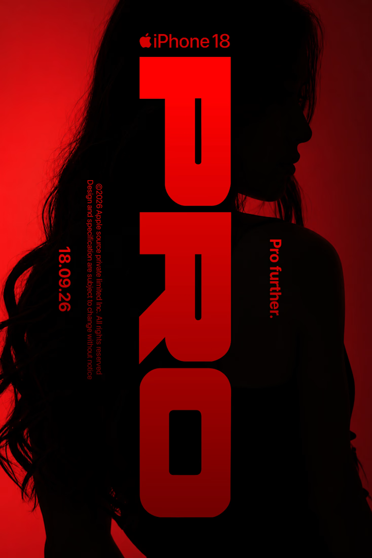
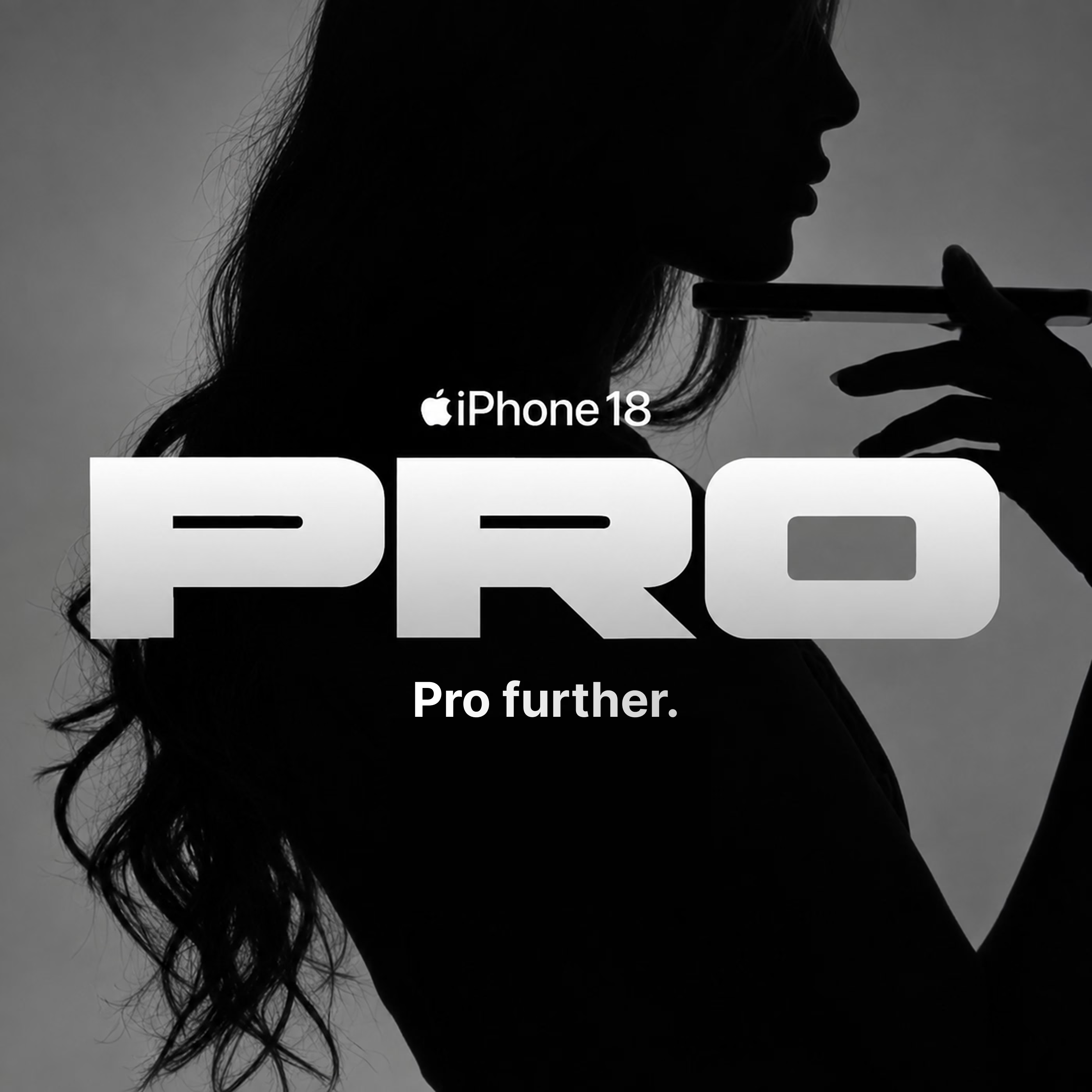

The crimson one, mostly because you scoped it for billboards and skyscraper wraps - at that viewing distance the monochrome edition's tonal range flattens out and the silhouette stops separating from the background. The editorial version reads better where someone is standing still with it, like a spread.
The network for creativity
Join 1.25M professional creatives like you
Connect with clients, get discovered, and run your business 100% commission-free
Creatives on Contra have earned over $150M and we are just getting started







Related posts

What happens when propaganda designed to erase the self gets pointed at the self instead?
Soviet propaganda spent 70 years trying to erase the individual soul in favour of the collective machine. I pointed that exact visual language at the thing it was built to suppress.
I kept flat 2–3 colour print, no gradients, no softness, ink-on-paper style, and honestly, I didn't expect it to come out this cool.
Does it give spirituality or propaganda vibes for you?
What other era and modern theme you think would be an interesting blend?
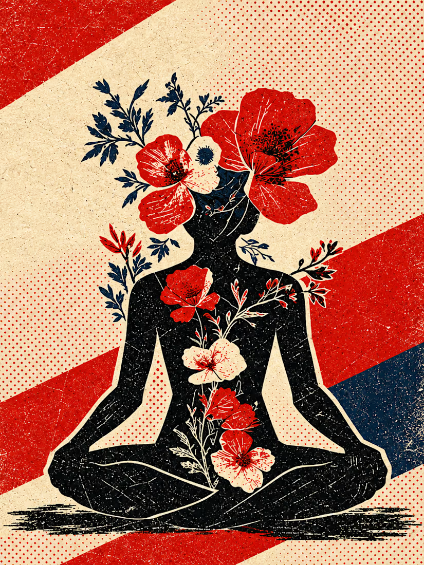
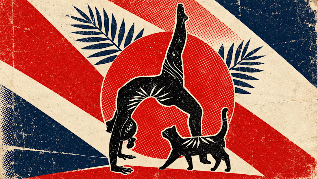
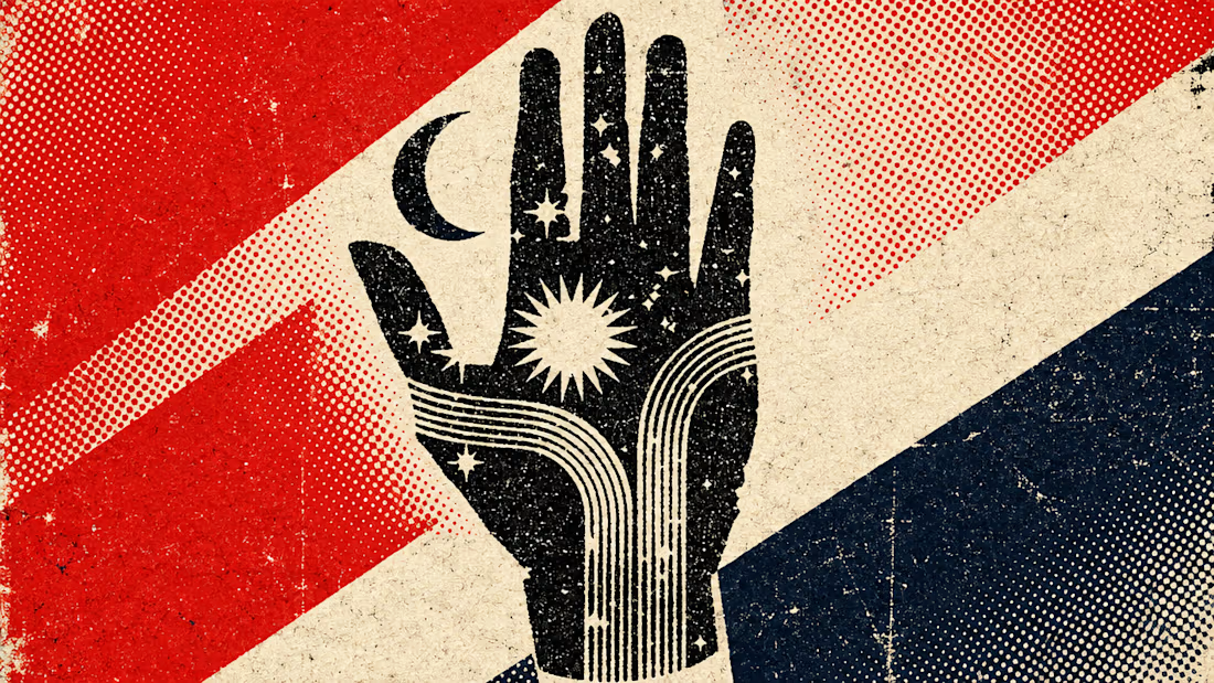

Reads more propaganda to me honestly, the flat color-blocking keeps it too graphic to feel purely spiritual even with the lotus pose. I'd love to see this same treatment turned on social media aesthetics, that curated "perfect life" feed culture feels like its own quiet kind of erasure.

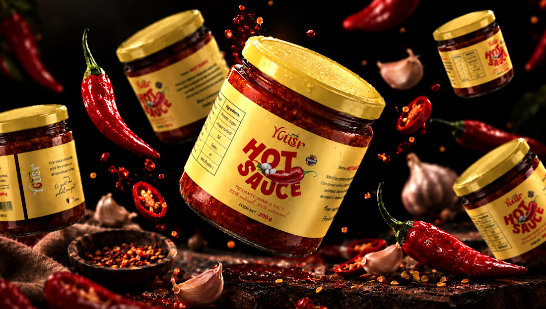
Yousr — Hot Sauce Brand Identity & Packaging Design
Turning bold flavor into a bold visual identity.
Yusr Hot Sauce is a food packaging project created to translate the intensity, heat, and character of the product into a striking visual experience.
The packaging combines a warm, distinctive color palette with bold typography and expressive graphic elements, creating an identity that immediately communicates the product's spicy and authentic character.
The visual direction was developed around the contrast between the rich red tones of the chili sauce and the warm cream of the label, creating a strong and recognizable presence across the product range.
From the label design to the final product presentation, every element was carefully considered to enhance the product's personality while maintaining clarity and brand consistency.
The final art direction brings the packaging to life through a dramatic food-focused environment, using rich textures, controlled lighting, and carefully composed ingredients to create an appetizing and memorable product experience.
A packaging identity designed to capture attention, communicate flavor, and give Yusr Hot Sauce a distinctive presence.
View the full project : https://www.behance.net/gallery/255675391/Yousr-Hot-Sauce-Brand-Identity-Packaging-Design
#PackagingDesign #FoodPackaging #HotSauce #LabelDesign #FoodBranding #ProductDesign #ArtDirection




I’m testing two different creative directions and would love your honest opinion.
Version A focuses on a bright, minimal gallery experience with circular visual experiments.
Version B explores a darker, more cinematic product direction for Montairé with hardware-focused visuals.
Which one feels cooler, more premium, and more memorable — A or B?
I’d also love feedback on the typography, layout, animation, and overall art direction.
10 voted
53%
9 voted
47%
19 votes
Closed

I’d lean toward Version B. The darker direction gives the hardware more presence and makes the whole experience feel more intentional and engineered. Version A is visually interesting, but B gives Montairé a much clearer identity at first glance.