The network for creativity
Join 1.25M professional creatives like you
Connect with clients, get discovered, and run your business 100% commission-free
Creatives on Contra have earned over $150M and we are just getting started
Back to feedPost

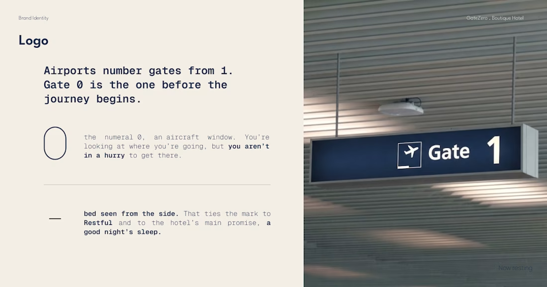
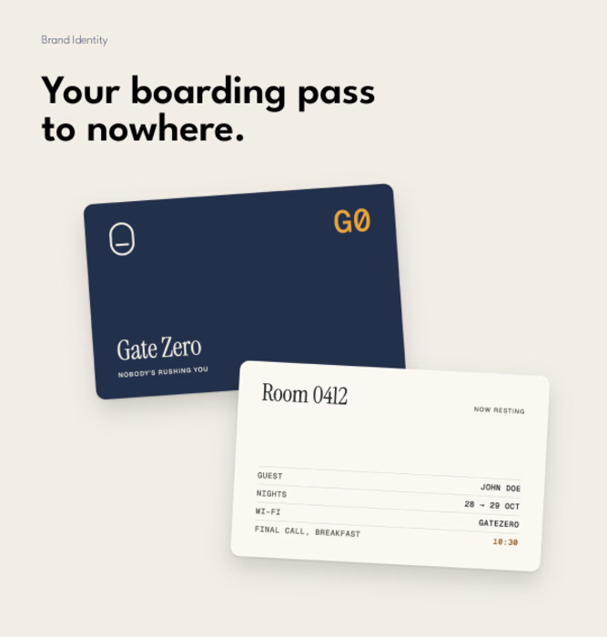
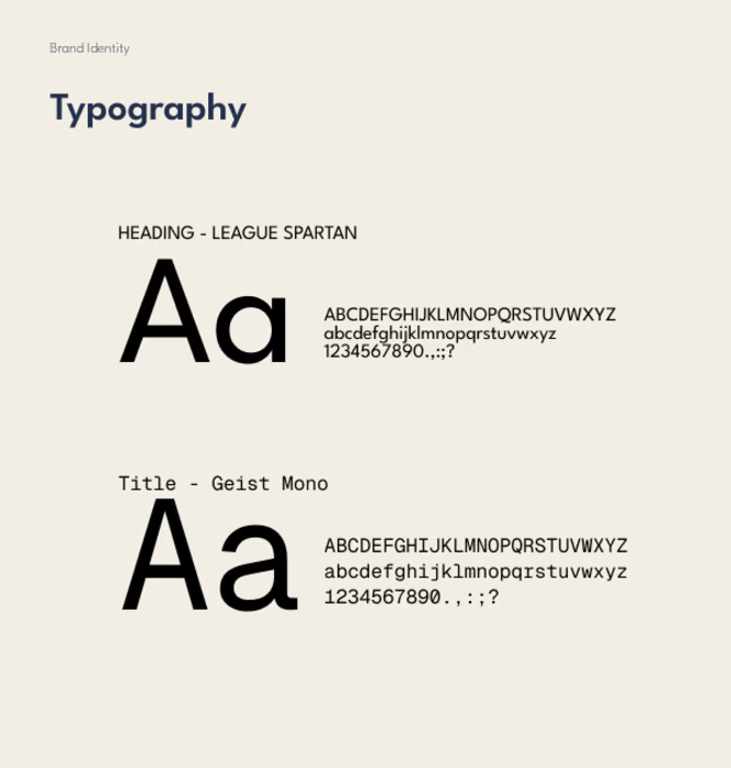
Brand Visual - Boutique Hotel


The network for creativity
Join 1.25M professional creatives like you
Connect with clients, get discovered, and run your business 100% commission-free
Creatives on Contra have earned over $150M and we are just getting started



Related posts

What happens when a hummingbird gets translated into thread, then into pixels, then dropped into the sky?
Design exploration of the day: Relic Signal.
Bayer dithering, difference blend, five brand colors, one tiny messenger.
Craft on one side, static on the other.

Just launched: Faro, a luxury travel website template for Framer.
Travel agencies and tour operators do not sell with a checkout. They sell with conversation. So Faro is built around one goal: turn visitors into enquiries.
What makes it work
Cinematic flight-window hero that plays your video as visitors scroll
Enquiry-first pages: every button leads to your contact form, with no cart to set up
Tour packages with pricing cards, a comparison table, add-ons and FAQs
Destination and journey pages with itineraries, highlights and quick facts
What's inside
11 pages, including Home, Destinations, Journeys, About, Contact, Thank You, 404 and legal pages
2 CMS collections (Destinations and Signature Journeys) with sample content
Reusable components, color styles and text styles for fast rebranding
Fully responsive, with a mobile menu, Back button and Back To Top button
SEO-ready structure and a built-in documentation page
Design: deep navy, brass gold, Fraunces and Inter. Calm, premium and easy to edit.
Launch price: $39 through November 2026.
Live preview: [https://farotravel.framer.website/ ]
Get Faro on Framer: [https://www.framer.com/marketplace/templates/faro/ ]
I'd love your feedback. If you build with it, tag me so I can see what you make.


The airplane window opening on the hero says travel without a single stock photo, and the gold Start Planning button stays in the nav the whole time. Does that hero animation add noticeable load time on mobile?

I fixed a logo in 10 minutes.
A client sent me an MS logo that looked cheap.
Problem: letters were too far apart, no overlap, wrong gold.
Fix: Interlocked the M + S, tightened the spacing, used metallic gold #D4AF37.
Same letters. Luxury feel.

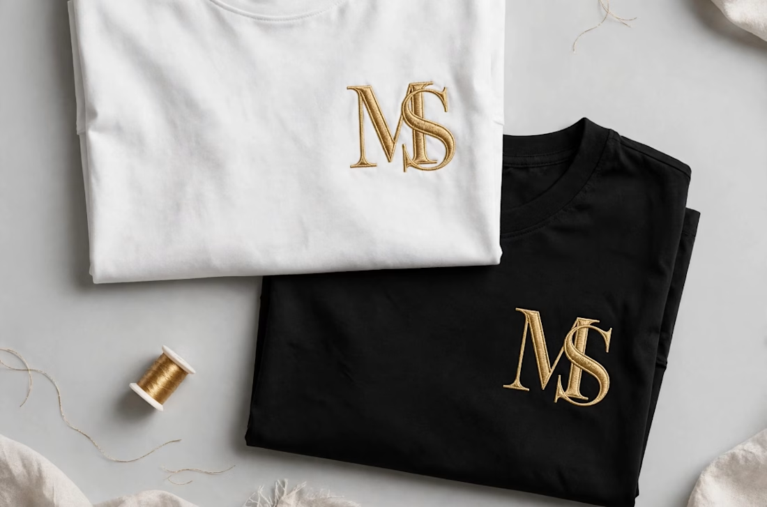

Interlocking the M and S also gives the embroidery one continuous shape to stitch, which tends to hold up better than two separate letters. Did you test how the overlap reads at chest-logo size, around 3 cm?