The network for creativity
Join 1.25M professional creatives like you
Connect with clients, get discovered, and run your business 100% commission-free
Creatives on Contra have earned over $150M and we are just getting started
Back to feedPost
🚀 Seeking feedback on my clothing brand logo!
Which design looks the most modern, memorable, and premium? Your suggestions will help finalize the brand identity.
Share your thoughts below! 👇
#LogoDesign #FashionBrand #BrandIdentity #DesignFeedback #StartupJourney
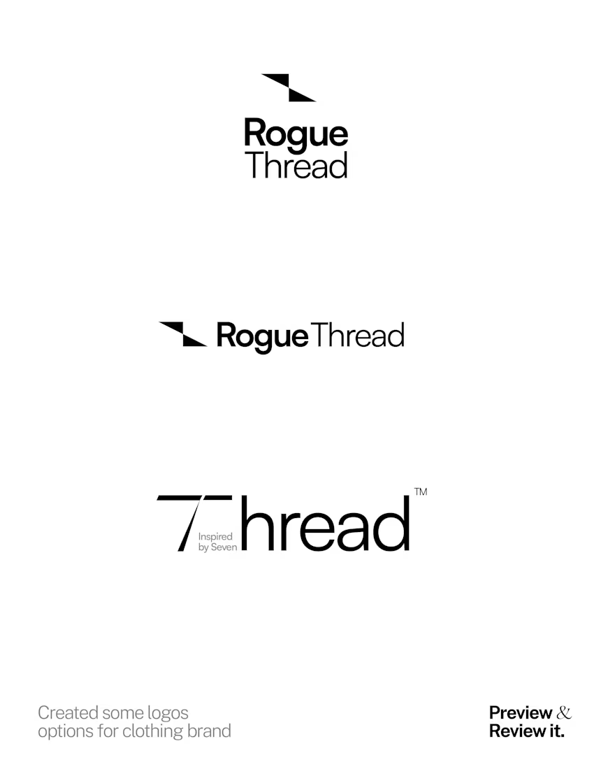
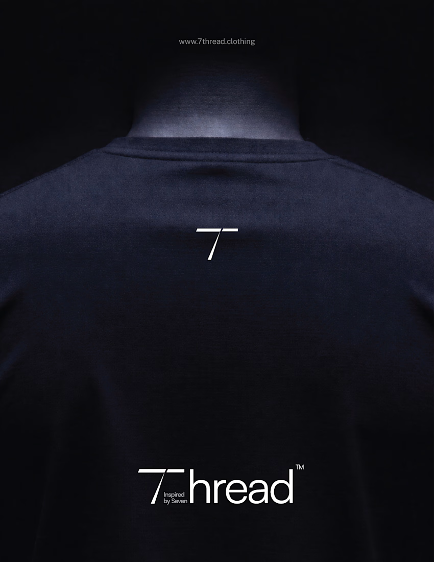
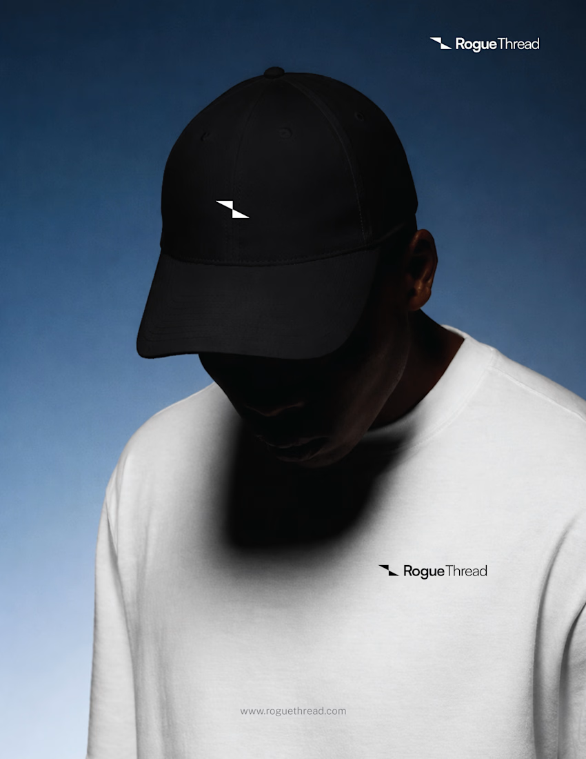
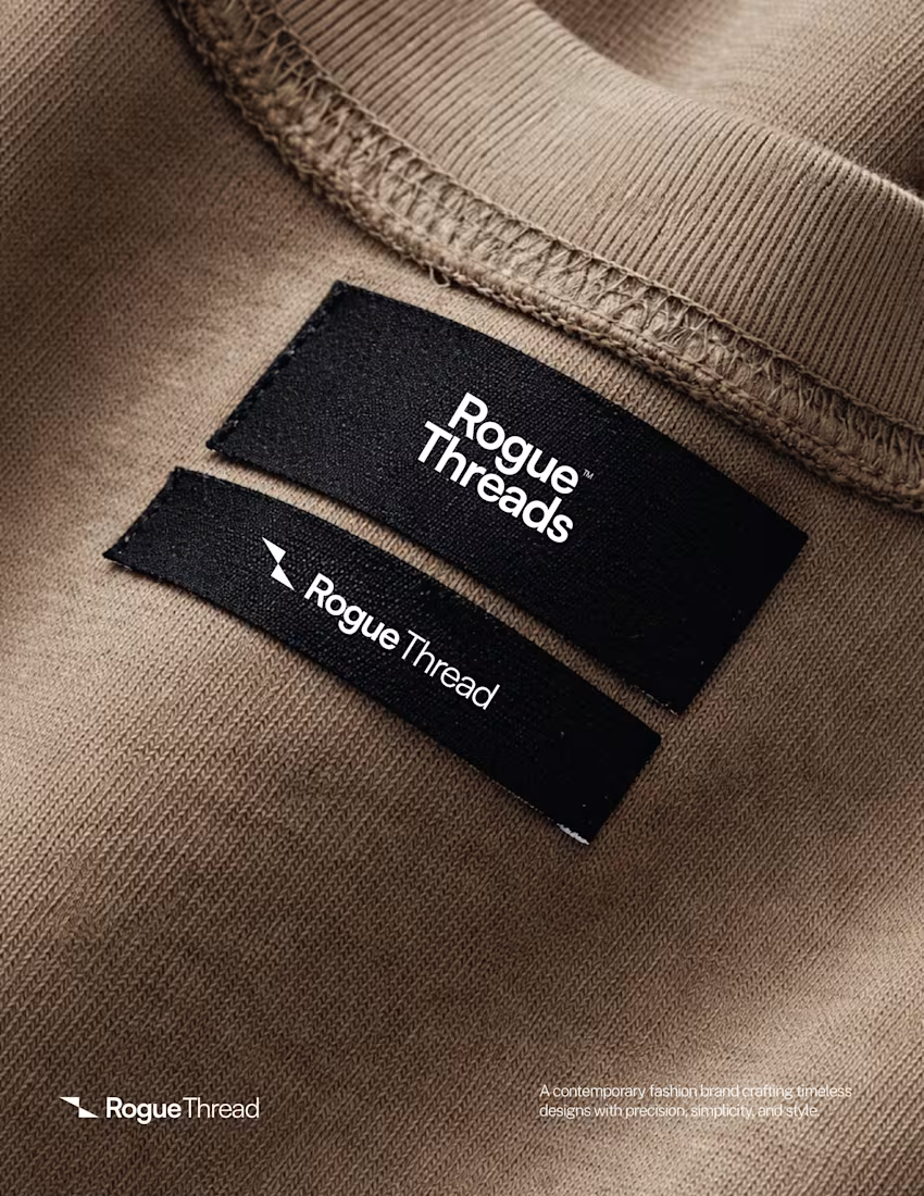

For me it will be the slanted T.
I think the symbol with Rogue Thread is too generic, looks more common when you compared to the very big baskets of sharp cut geometric logos we have in the market. Every other branding is now too geometric.
The T has a character, its...

Thanks for the valueable feedback...
The network for creativity
Join 1.25M professional creatives like you
Connect with clients, get discovered, and run your business 100% commission-free
Creatives on Contra have earned over $150M and we are just getting started





Related posts


Collage

I'm excited to share the full case study from our collaboration on the Unik Mindz logo design and branding, completed in August 2026.
Unik Mindz is a creative design studio born from the legacy of the Unik family brand. Founded on the belief that every idea begins with a unique mind, the studio needed an identity that could carry that message and become the face of the brand.
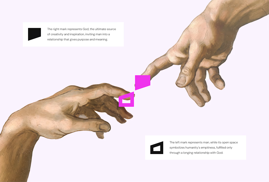
The logo draws inspiration from Michelangelo’s The Creation of Adam, focusing on the idea of connection. It captures the moment two minds meet to create something greater, reflecting the brand’s conviction that meaningful creativity starts with connection.
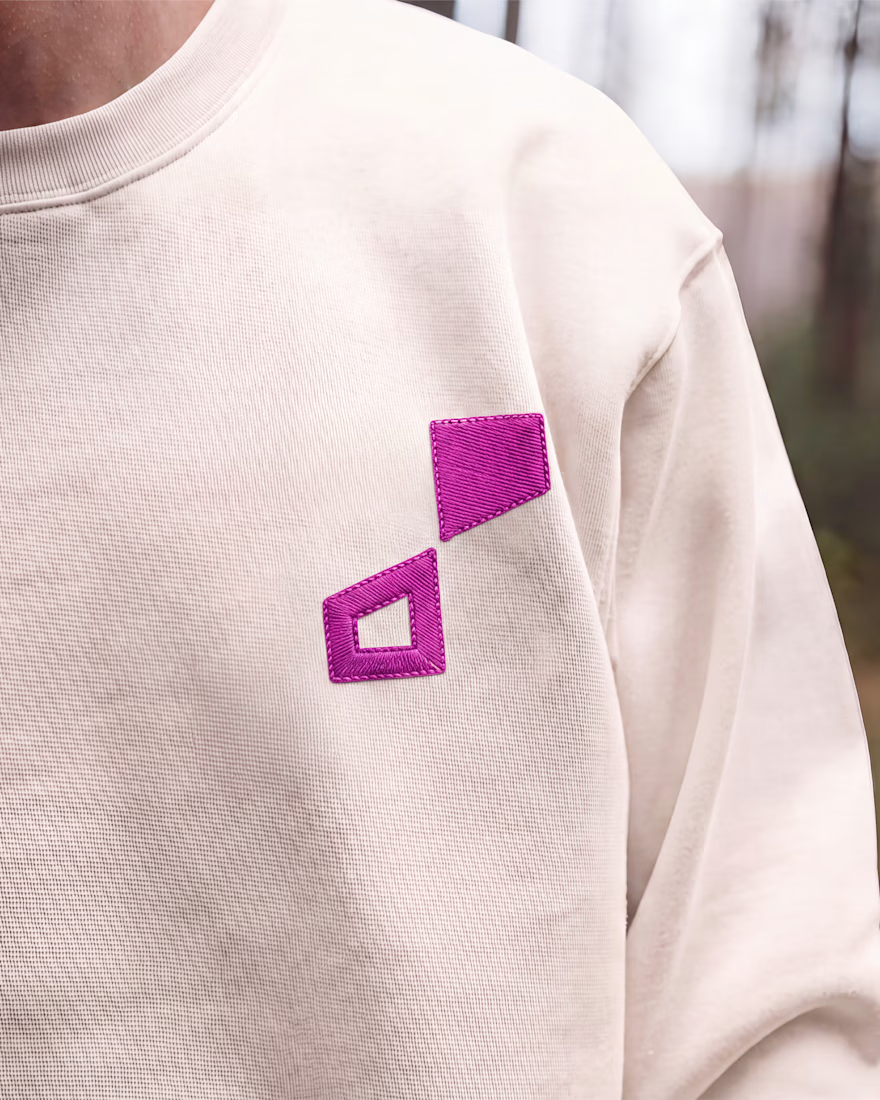
We wrapped the project with a clear system and guide for how the brand assets should be used going forward.
Want to work with us? Send a DM or email to info@donatus.agency


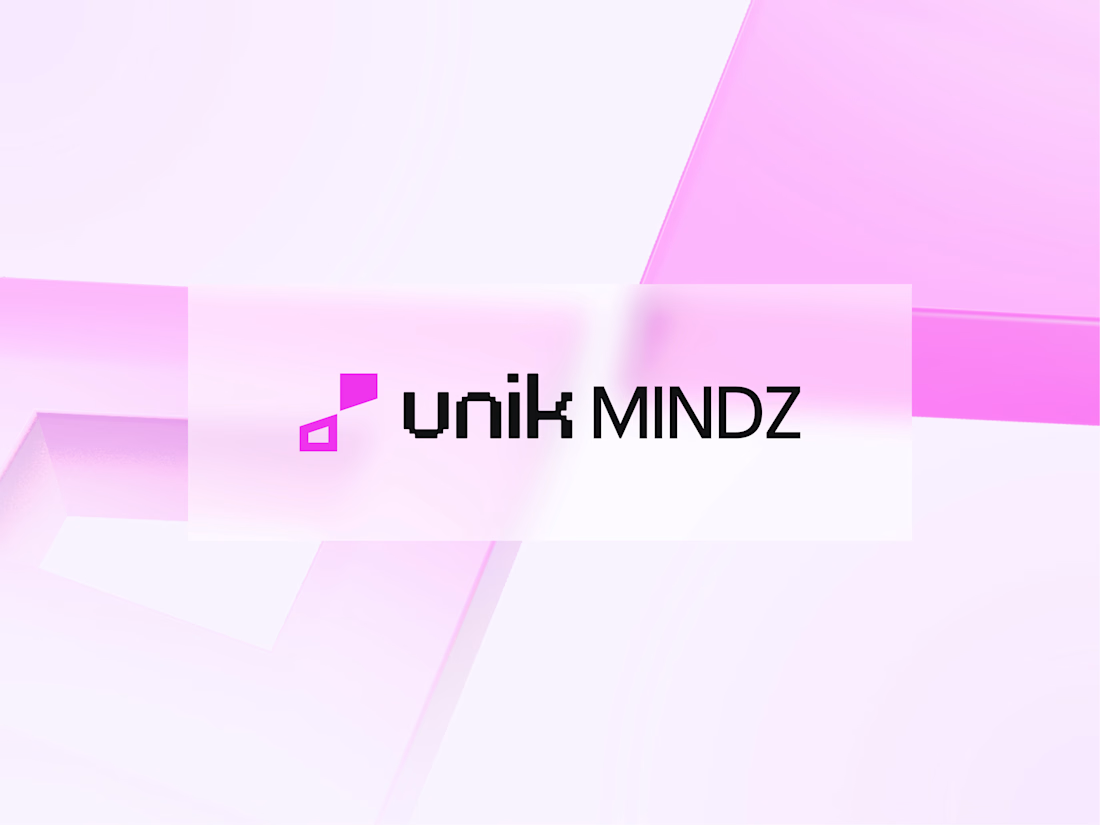
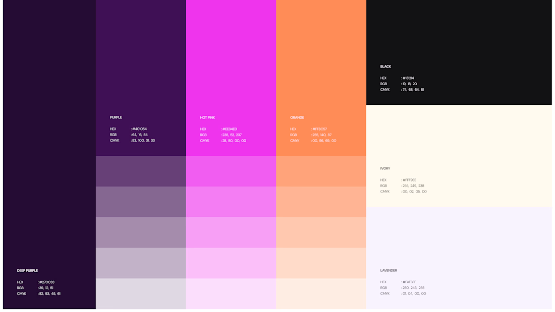

Honestly I never see something like this before I love the uniqueness of the design and it's vibrant color palette great job 🎉🎉

Good Terms -- Logo Design