The network for creativity
Join 1.25M professional creatives like you
Connect with clients, get discovered, and run your business 100% commission-free
Creatives on Contra have earned over $150M and we are just getting started
Back to feedPost

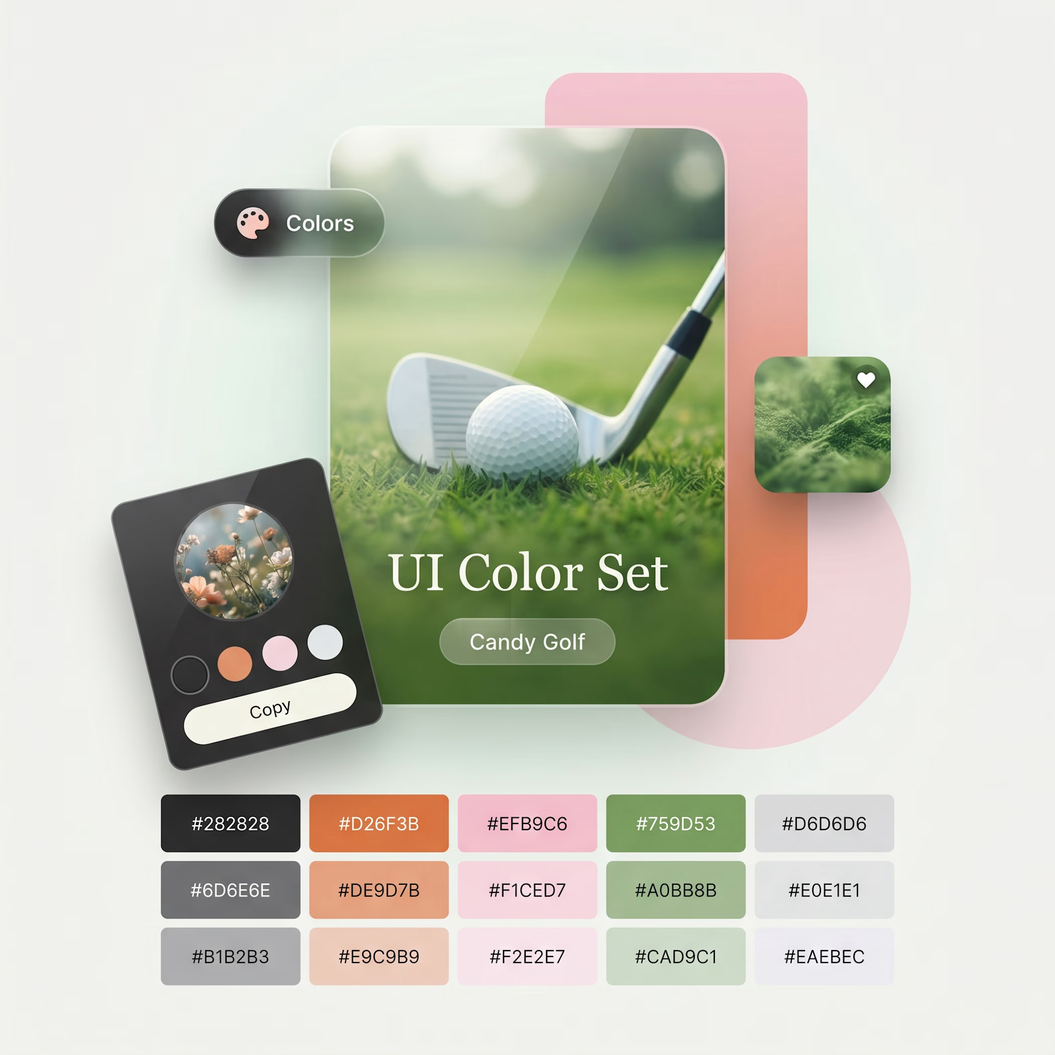
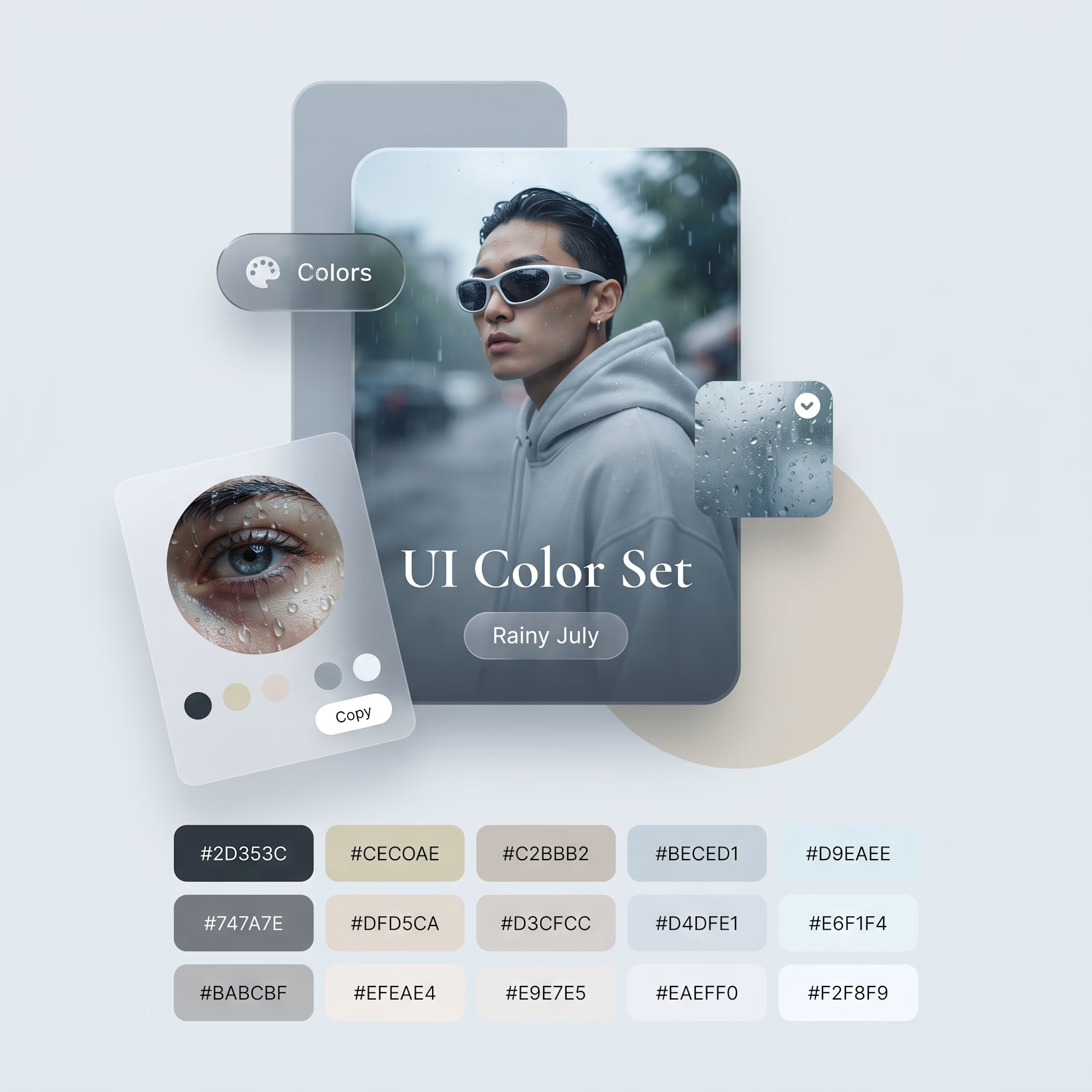
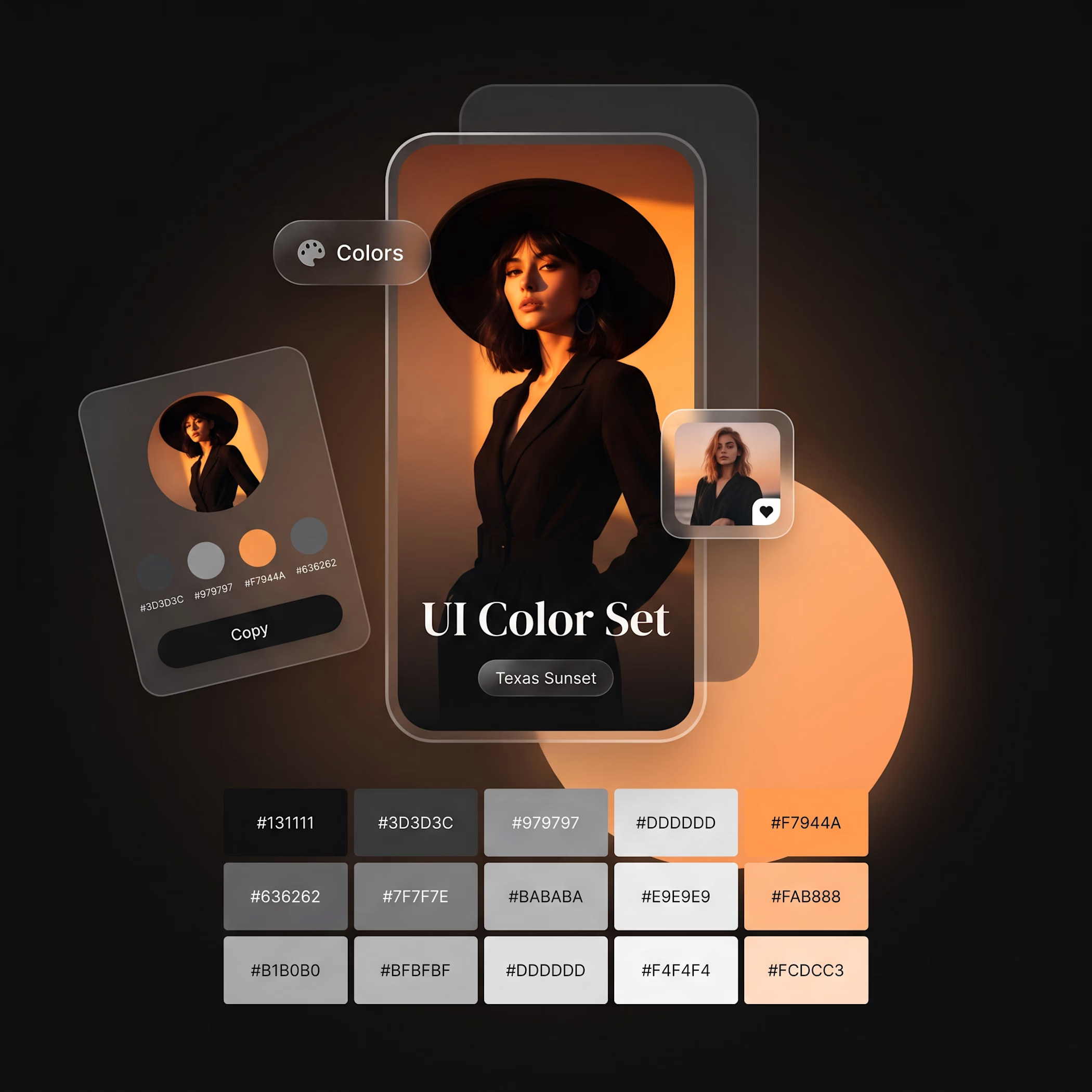
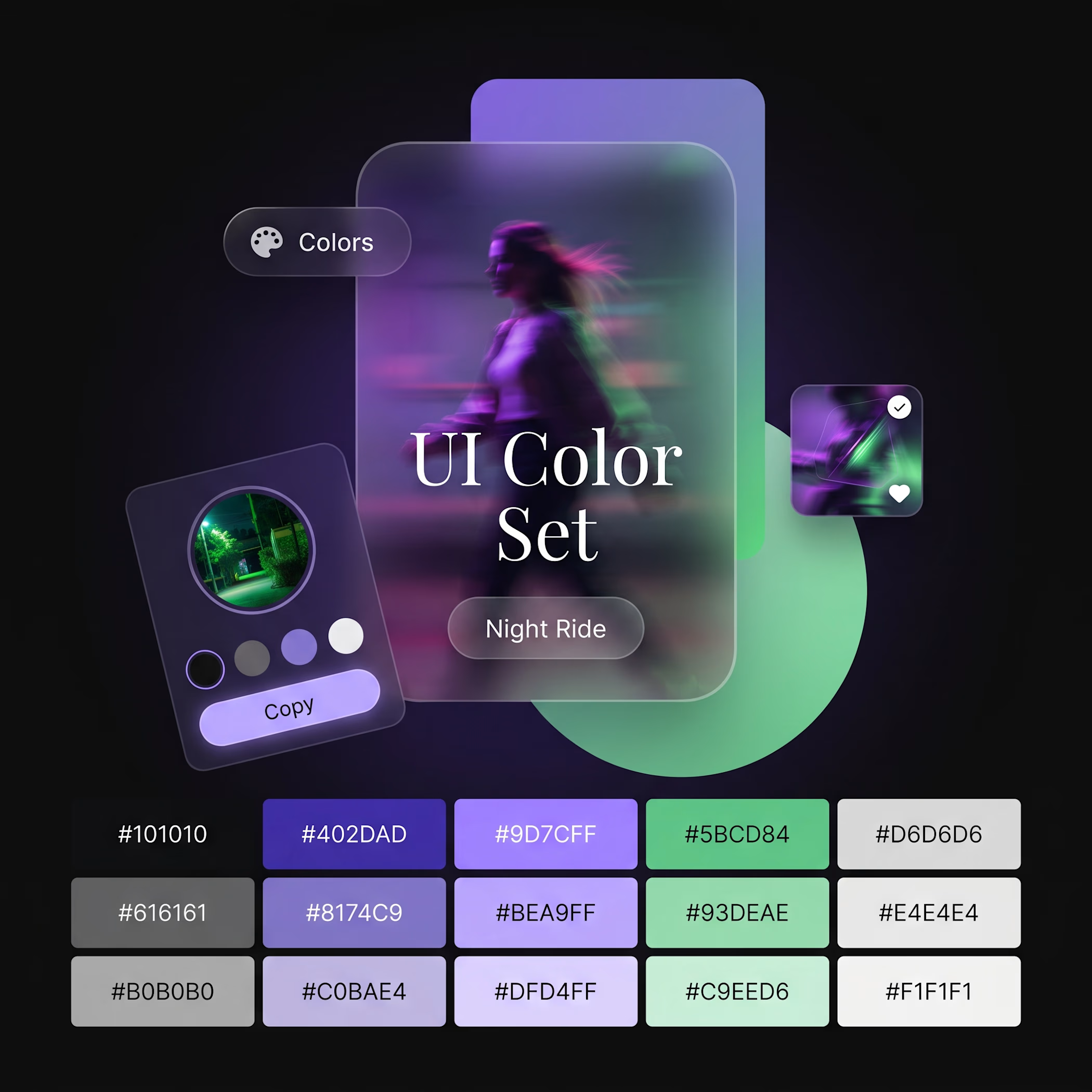
A good color palette can completely change how a product feels. 🎨
The same UI structure can feel luxurious, playful, futuristic, calm, or fresh — simply by changing the color system.
I created these 4 UI color palettes to explore different visual moods:
🌅 Texas Sunset — bold & cinematic
🍃 Candy Golf — playful & fresh
🌌 Night Ride — futuristic & energetic
🌧️ Rainy July — calm & sophisticated
But here's the important part:
Don't choose colors just because they look good together.
Think about:
→ What emotion should the product create?
→ Who is the target audience?
→ Which color should attract attention?
→ Which colors should stay in the background?
→ Is the contrast accessible?
That's how a color palette becomes a UI color system, not just a collection of pretty colors.
Which one is your favorite — 1, 2, 3, or 4? 👇
retrofuturismcolorgradinghaltoneBrand DesignColoristCreative Design Adobe IllustratorAdobe PhotoshopFigma


The network for creativity
Join 1.25M professional creatives like you
Connect with clients, get discovered, and run your business 100% commission-free
Creatives on Contra have earned over $150M and we are just getting started





Related posts

Brand identity work for WesoftAI


Solene: skincare e commerce website, built in Framer
Skincare shopping should feel as good as the routine itself. For Solene, I designed and built a full online store with a soft, warm identity: a bold maroon and pink palette, big expressive type and real-skin photography.
What's inside:
A hero that sets the brand tone straight away
A Bestsellers section for quick browsing
Category pages for Cleanse, Hydrate and Protect
A shop page with price slider, filters, sorting and hover image previews
An Our Story page with brand values
A clean, confident footer
Need a website for your beauty or lifestyle brand? Let's talk.


The hover image previews on the shop page caught my eye - they let shoppers sense texture instantly without an extra click.

I think I’d go for cooler looks

You have done well Agustin! Exploring different sector of creative get to intrigue some creative part of us. Would have go with Cooler