The network for creativity
Join 1.25M professional creatives like you
Connect with clients, get discovered, and run your business 100% commission-free
Creatives on Contra have earned over $150M and we are just getting started
Back to feedPost

I think I’d go for cooler looks

You have done well Agustin! Exploring different sector of creative get to intrigue some creative part of us. Would have go with Cooler

I agree! Cooler looks can bring a fresh and distinctive feel to the brand while still keeping the creativity and personality intact. Great work exploring different directions! 👏
The network for creativity
Join 1.25M professional creatives like you
Connect with clients, get discovered, and run your business 100% commission-free
Creatives on Contra have earned over $150M and we are just getting started











Related posts


What do you guys think? Which one do you think would be the best option? Honestly, my personal favorite is the first one, but I’d love to hear your thoughts and opinions too! Let me know which one you like the most.
2 voted
29%

5 voted
71%

7 votes
Closed

Ye le Jani tere wali post ke liye — Umer ki post pe comment karne ke liye:
I’d go with the first one too! The realistic photo on green background feels more trustworthy and professional for Contra, especially for client work. The illustrated one is cool and stylized but the...

What would you want to see first from my next round of projects?
Teaser’s up now.
Tell me what catches your eye.

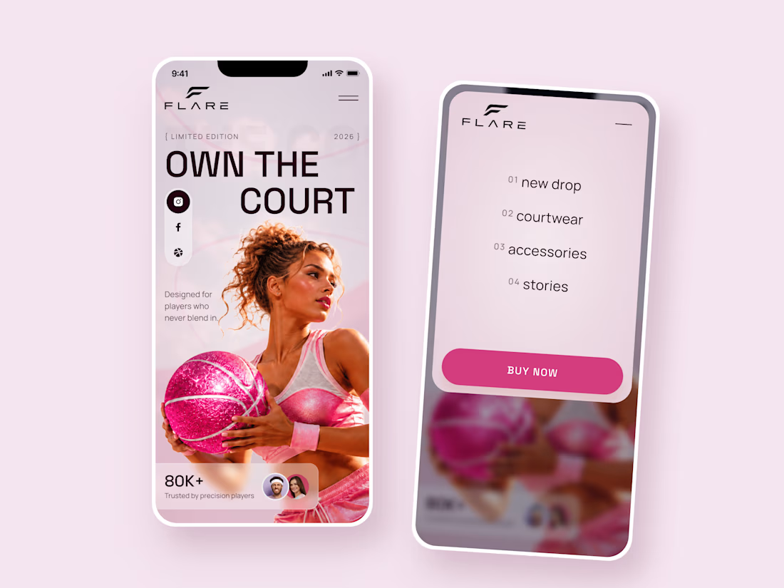
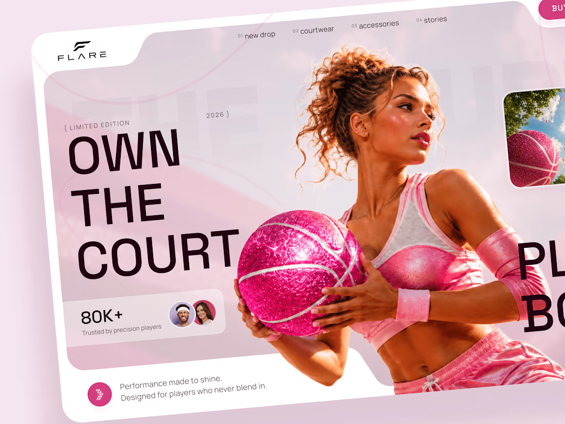
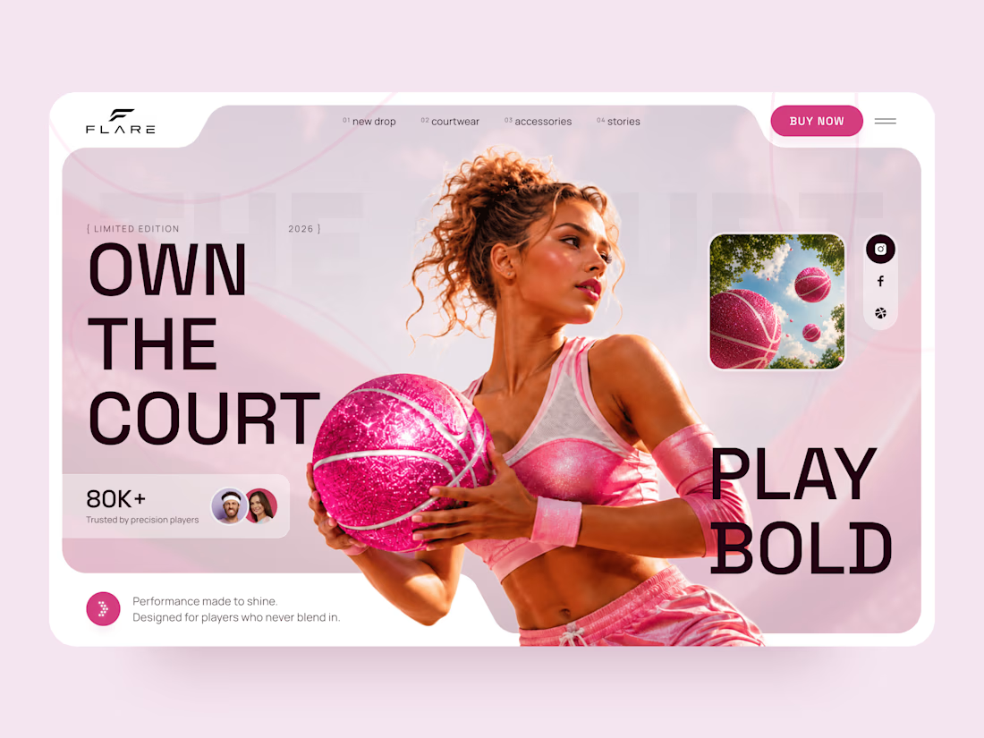
FLARE — Bold Basketball & Courtwear Landing Page 🏀
A fresh landing page concept for a basketball-inspired sportswear brand that brings together performance, fashion, and a bold pink aesthetic.
The design combines energetic sports visuals, oversized typography, and soft pink tones to create a playful yet confident look.
Special attention was given to:
• Bold hero section with strong visual impact
• Pink-inspired color palette and sporty aesthetic
• Oversized typography and clean layout
• Fashion-focused basketball imagery
• Responsive desktop and mobile design
• Simple mobile navigation and clear CTA
The result is a vibrant landing page that feels sporty, stylish, and full of personality.
Looking to create a standout website for a sportswear, fashion, or lifestyle brand? Let's connect 🚀



Cool 😎