The network for creativity
Join 1.25M professional creatives like you
Connect with clients, get discovered, and run your business 100% commission-free
Creatives on Contra have earned over $150M and we are just getting started
Back to feedPost
Project is now live 🍽️✨
Had an amazing time designing Réserve a modern dining reservation experience focused on seamless bookings, real-time availability, and immersive restaurant discovery.
If you enjoyed the project, show some love ❤️


Thank you for the Appreciation @Nagaraj M
The network for creativity
Join 1.25M professional creatives like you
Connect with clients, get discovered, and run your business 100% commission-free
Creatives on Contra have earned over $150M and we are just getting started











Related posts

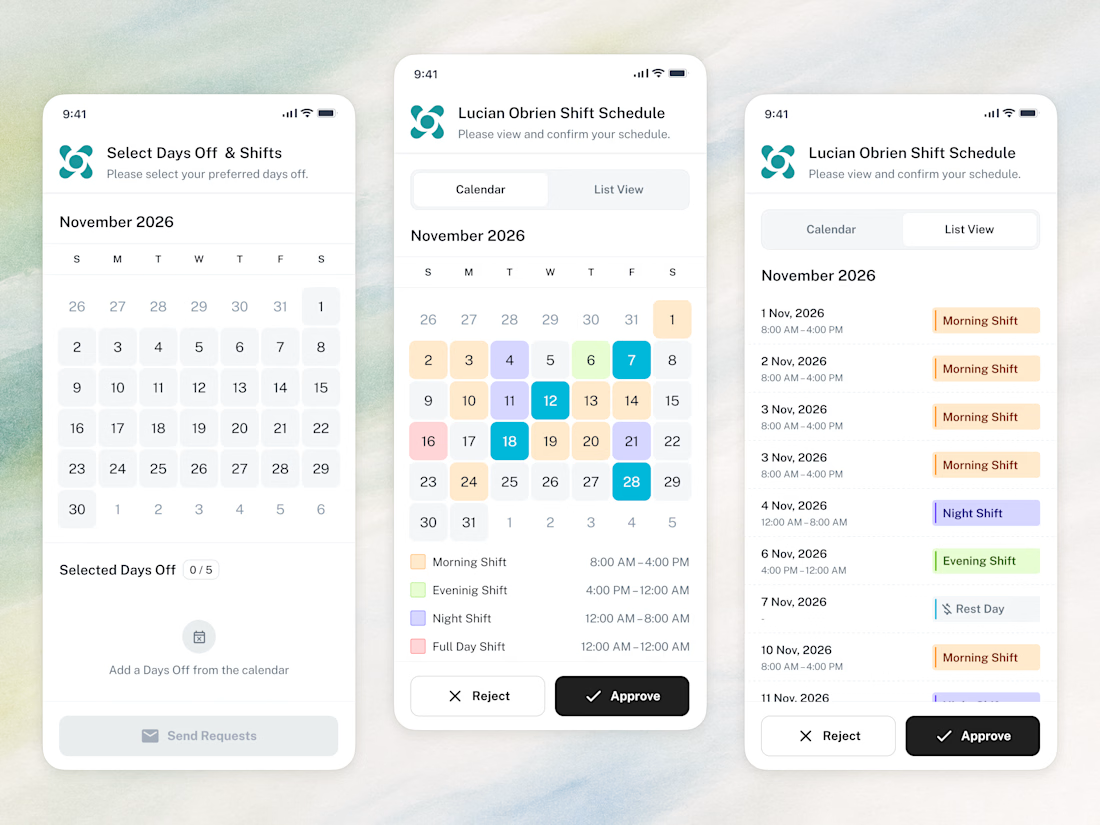
📱 The whole employee experience, right on the phone. Scheduling that goes wherever the team goes.



Amazing work

15 seconds of smooth UI, editorial layouts, and micro-interactions.
Kept the micro-interactions snappy, typography expressive, and transitions buttery smooth.
Rate this UI animation from 1 to 10 in the comments, or tell me what you’d improve! 😉


Solid 10/10 bro! 🔥 Micro-interactions are super snappy and transitions are buttery smooth indeed. Editorial layout game is strong. Keep it up!

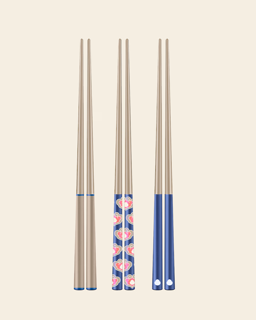
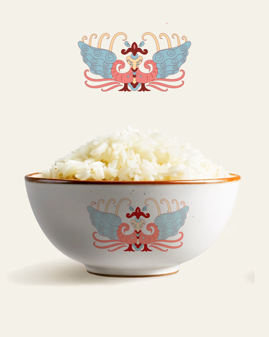
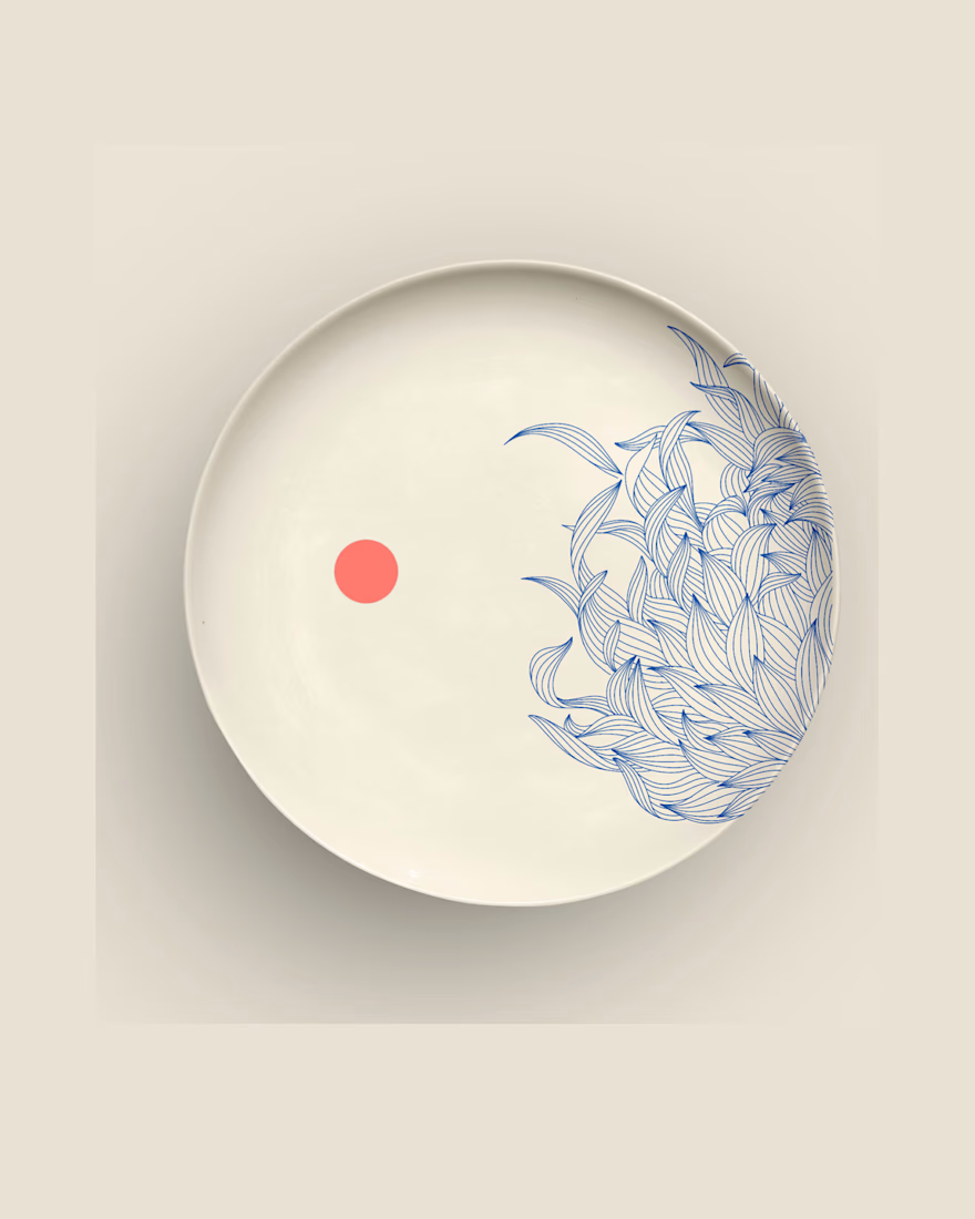
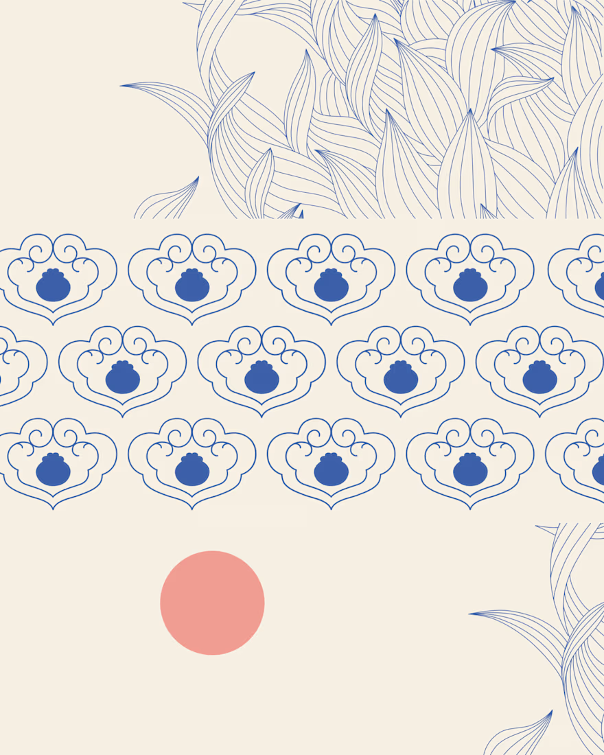
A closer look at The Art of Dining, a collection of original illustrations, decorative patterns, and product designs inspired by traditional Chinese dining culture


Great design it feels soft❤️
Great job Anja🎉🎉🔥🔥