The network for creativity
Join 1.25M professional creatives like you
Connect with clients, get discovered, and run your business 100% commission-free
Creatives on Contra have earned over $150M and we are just getting started
Back to feedPost
Taste Test
Website Redesign: GrowLegally – Trust & Conversion Overhaul
Optimized a medical clinic landing page into a high-converting digital platform, maximizing user trust and reducing onboarding friction.
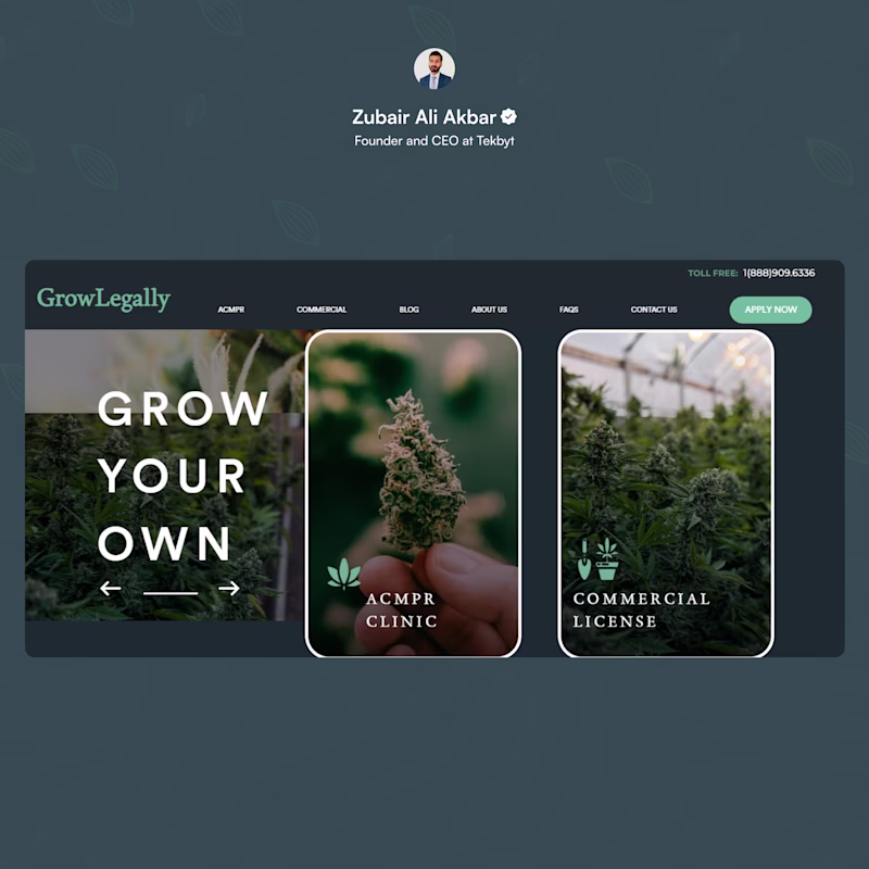
Before: Image-heavy layout with centered blocks shown in Before post. It lacked an authoritative headline, clear value proposition, and an immediate booking path above the fold.
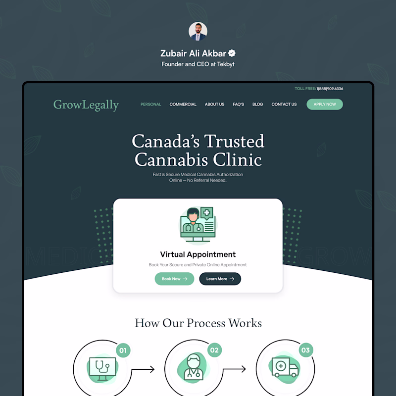
After: Trust-centric layout featuring a prominent virtual booking card, bold left-aligned typography, explicit trust signals, and a strategic process walkthrough as seen in After Post.
Which approach drives superior conversion rates for digital health platforms? The image-centric aesthetic or the friction-free, patient-driven layout?
3 voted
33%
6 voted
67%
9 votes
Closed
Voted After. Putting the virtual booking card above the fold with left-aligned type is the right call for a healthcare site. People land on these pages with a specific intent, and the image-heavy layout makes them work too hard to find it. The process walkthrough adds nice trust context too.
Best upgrade I will see on the platform today
The network for creativity
Join 1.25M professional creatives like you
Connect with clients, get discovered, and run your business 100% commission-free
Creatives on Contra have earned over $150M and we are just getting started
Related posts
I love the dark version. It's cool
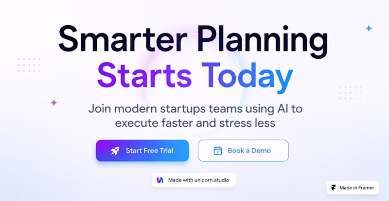
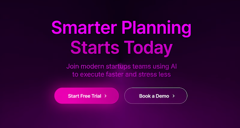
SaaS Workflow Section for desktop, explored both light and dark modes.
Which one would you choose for a modern startup SaaS?
☀️ Light Mode
🌙 Dark Mode
3 voted
17%
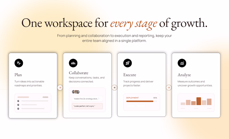
15 voted
83%
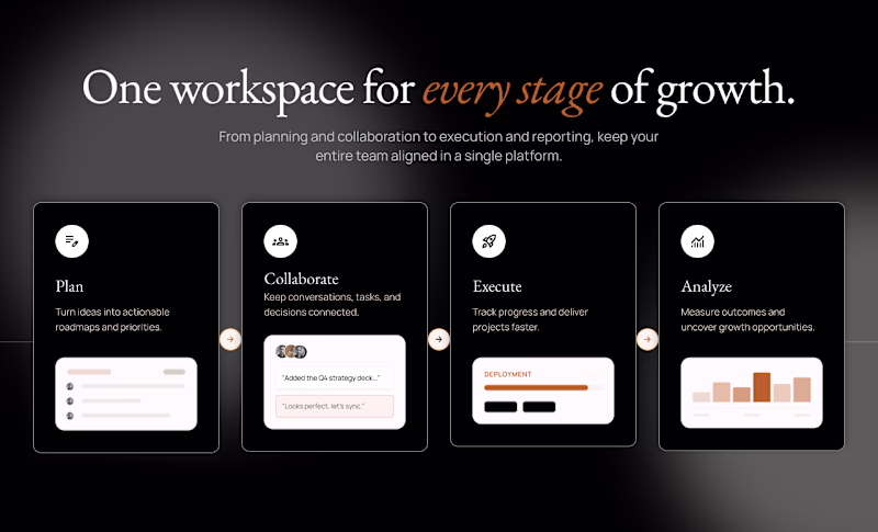
18 votes
Closed
I prefer the dark mode
I’m exploring two homepage hero directions for a Coffeebar concept and testing which one feels stronger for the brand.
Direction 1 leans more editorial and product-focused, with a cleaner cream layout, image grid, and a stronger emphasis on coffee culture and product discovery.
Direction 2 feels more immersive and lifestyle-driven, using full-bleed photography, darker overlays, and a warmer coffeehouse atmosphere to create more emotion and brand personality.
Both directions can work, but they communicate slightly different things:
Direction 1: clean, curated, product-forward
Direction 2: warm, emotional, lifestyle-focused
I’m leaning toward the second direction because it feels more human and memorable, but I’d love to hear which one feels stronger at first glance.
11 voted
41%
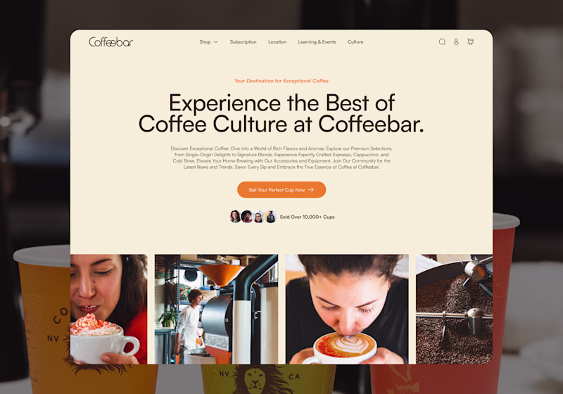
16 voted
59%
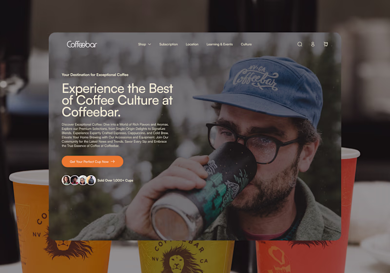
27 votes
Closed
Direction 2 for me — full-bleed photography creates that 'I want to be there' feeling instantly. Direction 1 is clean but Direction 2 has soul.
Trending
Claude
Claude has entered the design space. How are you using Claude Design?
Contra University
Learn from expert creatives how to earn more using next-gen AI tools.
MagicPath
The canvas is infinite, and exploration is becoming the workflow. How are you using MagicPath?
creativeaiflow
Creative AI workflows are evolving. What tools do you use, and what are their strengths and weaknesses?
freelancerlife
Freelancer life is wins, pivots, and everything in between. What’s yours right now?