The network for creativity
Join 1.25M professional creatives like you
Connect with clients, get discovered, and run your business 100% commission-free
Creatives on Contra have earned over $150M and we are just getting started
Back to feedPost
Taste Test

I'm exploring new hero sections for the NEUMA facial treatments space in Singapore. Help me choose please - which one creates more luxury / minimal / aspirational feeling?

4 voted
57%
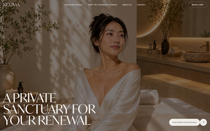
3 voted
43%
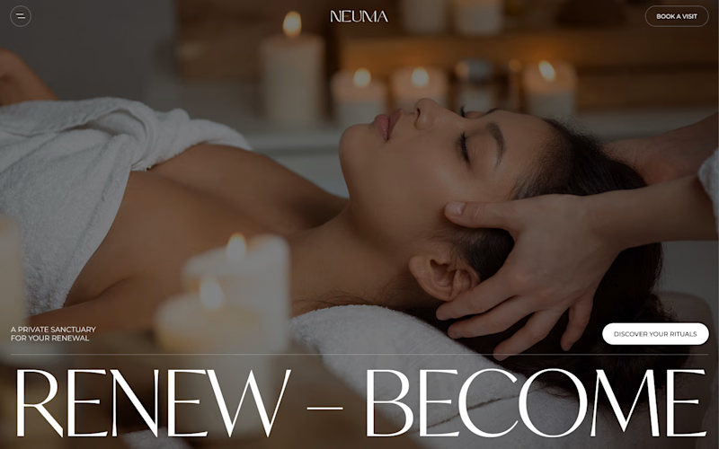
7 votes
Closed

Option 2's "Renew, Become" framing feels a touch more aspirational to me, Option 1 leans harder into pure privacy and luxury. Is NEUMA's clientele more the escape-and-relax type or the transformation-focused type?

Option 1 for me. "A private sanctuary" reads more luxury, while the massage shot in 2 feels closer to a regular spa listing. Happy to be argued out of it though, does NEUMA's clientele lean more toward the pampering side?

I’d go with Option 2. It feels more immersive and premium
The network for creativity
Join 1.25M professional creatives like you
Connect with clients, get discovered, and run your business 100% commission-free
Creatives on Contra have earned over $150M and we are just getting started




Related posts


You only get to keep one. Which stays?
The circular layout has a bit of playfulness to it. The landscape gives you a much bigger sense of place.
I can see a case for both. Curious where you land.

93 voted
78%
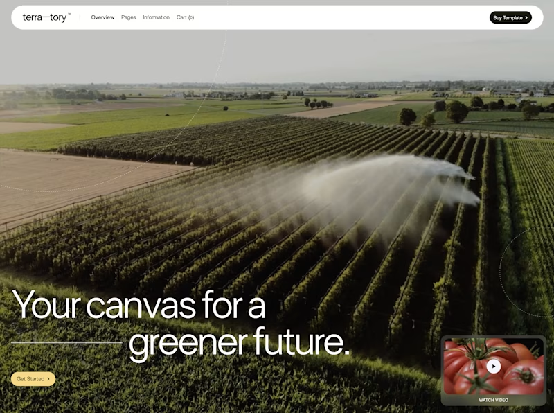
27 voted
22%
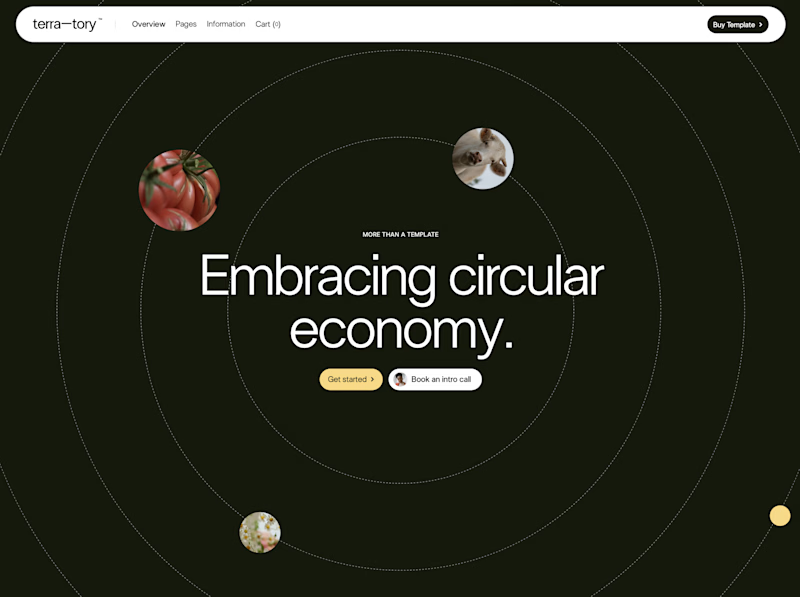
120 votes
Closed
I'd keep the landscape one honestly, that sense of scale feels right for anything talking about sustainability at an industry level. Did the client push back on the crop at all, or were they on board with circular from the start?

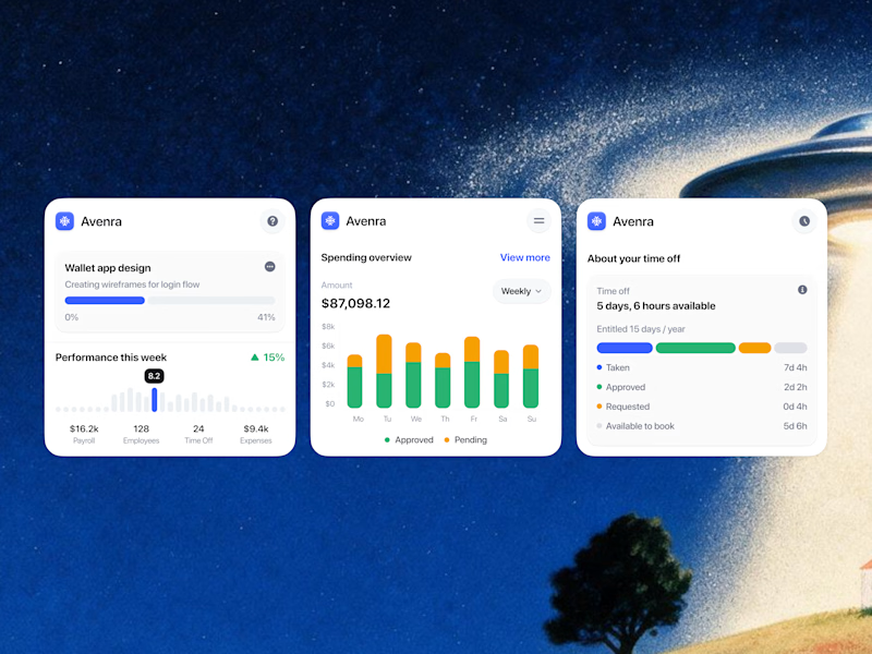
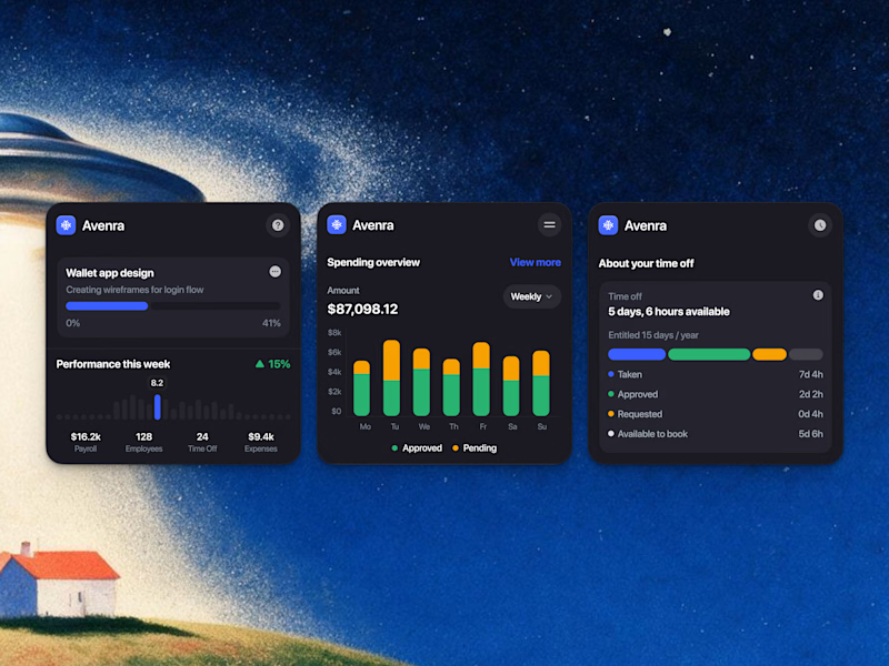
Which style wins for you? 🤔
We’re testing out two theme directions for Avenra’s dashboard component cards; featuring real-time spending breakdowns, project progress metrics, and time-off tracking.
Curious to hear your thoughts! 💬
8 voted
42%
11 voted
58%
19 votes
Closed

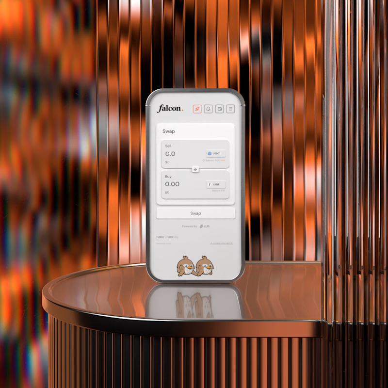
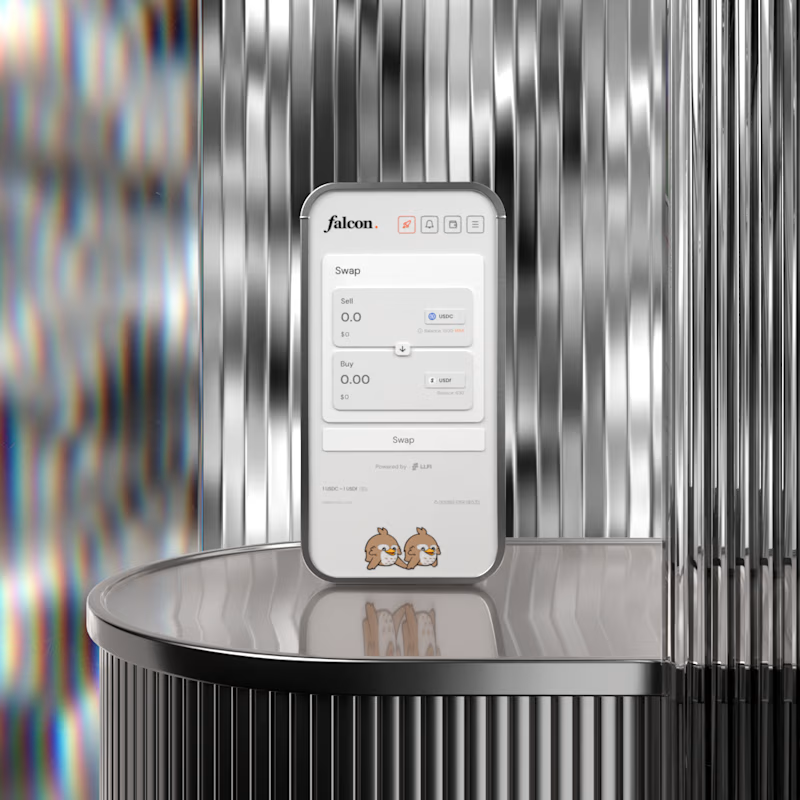

A for me. The warm copper gives the product some heat and makes it feel premium rather than clinical. B is cleaner but silver on silver almost hides the device, the copper actually frames it. Wild that this is no AI.