The network for creativity
Join 1.25M professional creatives like you
Connect with clients, get discovered, and run your business 100% commission-free
Creatives on Contra have earned over $150M and we are just getting started
Back to feedPost

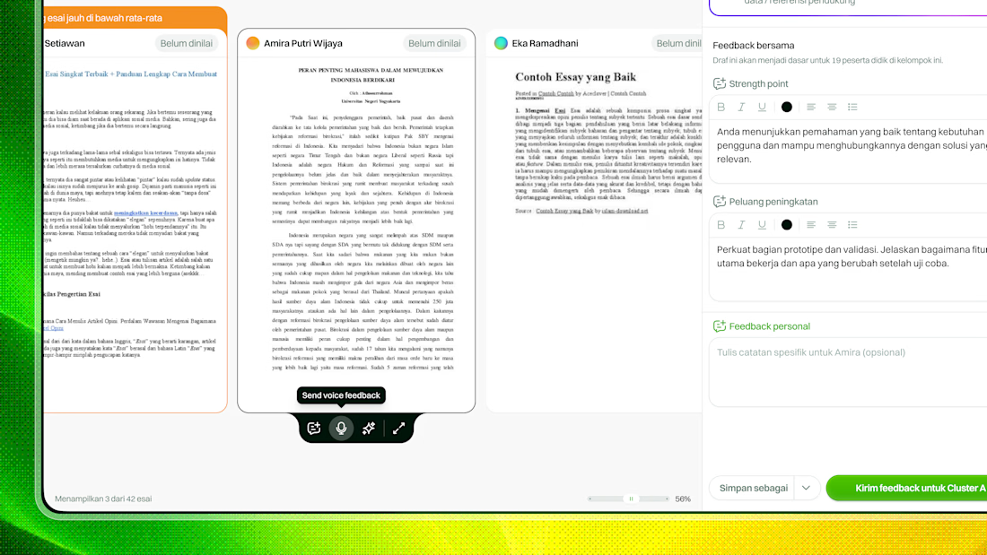
Unused concept for a teacher feedback loop in an LMS.
The challenge was straightforward on paper: make it easier for teachers to give meaningful feedback across multiple classes, often with 100+ students.
But the real friction happened before they even started.
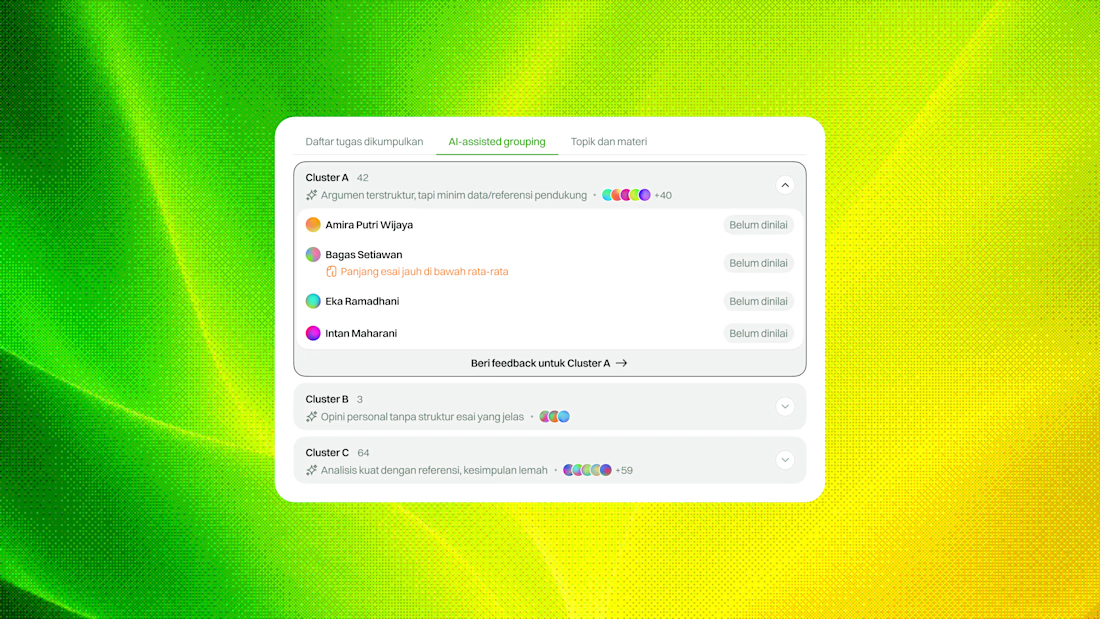
From our findings, teachers often felt overwhelmed by the amount of work waiting for them, so they defaulted to bulk feedback using templates.
It was faster, but it created another problem: students received feedback that felt vague, repetitive, and disconnected from their actual work.
For this concept, I explored two ways to help teachers get started without forcing them into one workflow:
— Focus manually on flagged assignments that need the most attention
— Use AI-assisted grouping to cluster assignments with similar patterns, so teachers can review them in context and respond more efficiently
The idea wasn’t to automate the feedback itself, but to reduce the friction around deciding where to start.
Still an unused concept, but I liked the direction.
What do you think?


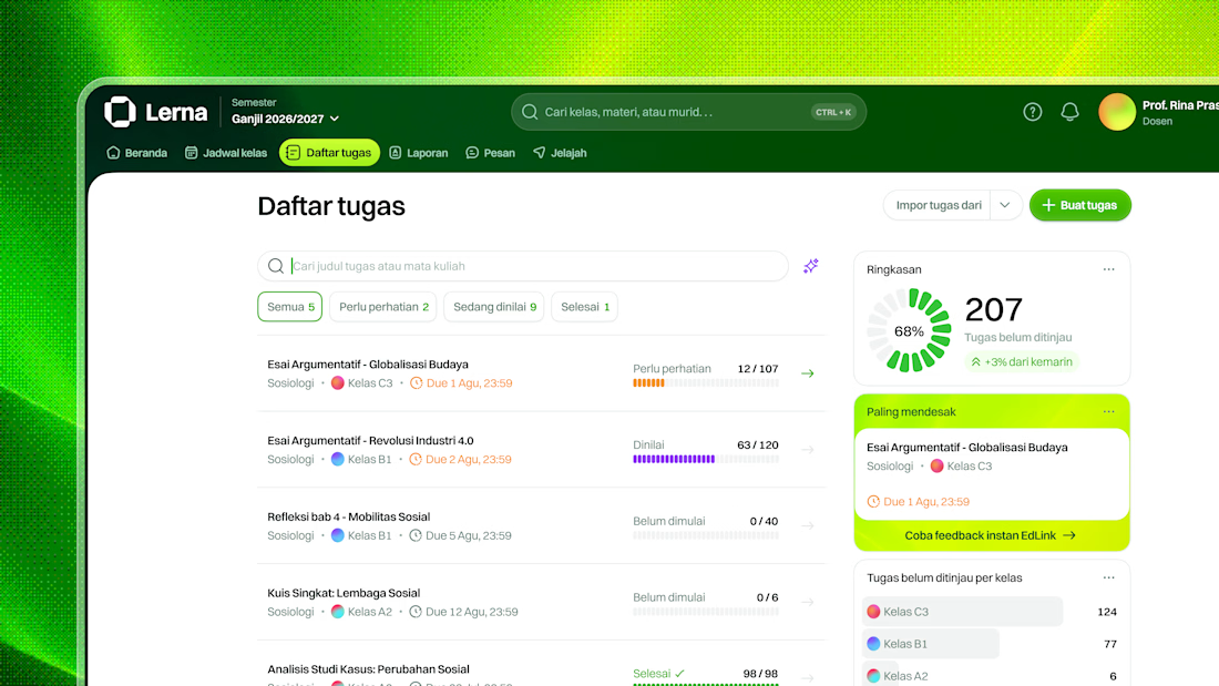
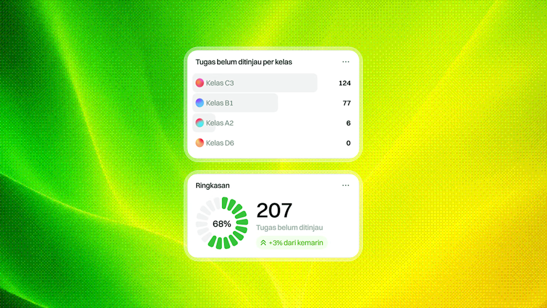

The high-priority task section really grabs attention 🔥
The network for creativity
Join 1.25M professional creatives like you
Connect with clients, get discovered, and run your business 100% commission-free
Creatives on Contra have earned over $150M and we are just getting started


Related posts


When you forget that it's not 2005 and you don't work for 2Advanced... 😅
Designed and animated in Figma.
(it's about time to finally discover these new animation features).

That looks like an underwater design😊 Great Work!

Same product, same button, two ways to say "added to cart". Which one makes you buy?
Burst: springy, the bottle flies into the cart. Calm: a quick spinner, then a tick.
Vote, and tell me what you'd change. Both built from scratch in code.
4 voted
57%
3 voted
43%
7 votes
Closed

Burst — the flying bottle makes adding feel fun.

Interior Design Website
The white flowers on the mantel overlap the headline.
Thin Noto Serif Display capitals step down across one warm photo of a paneled room, so the space stays in view between the words. On the phone, the three words stack in a centered column, with Menu and Contact on either side of the monogram.
The palette runs from soft white to near black, which leaves the color to the photo: orange tulips and warm light on the walls.
The headline reads "Designed Around You", and the hero takes it literally, with the wall behind the type and the flowers in front of it.
Designed by the Hue & Machine team.
#InteriorDesign #InteriorStudio #WebsiteDesign #HomepageDesign #WebDesign #ResponsiveDesign #Typography #EditorialDesign #UIDesign #FigmaDesign


Nice!