The network for creativity
Join 1.25M professional creatives like you
Connect with clients, get discovered, and run your business 100% commission-free
Creatives on Contra have earned over $150M and we are just getting started
Back to feedPost
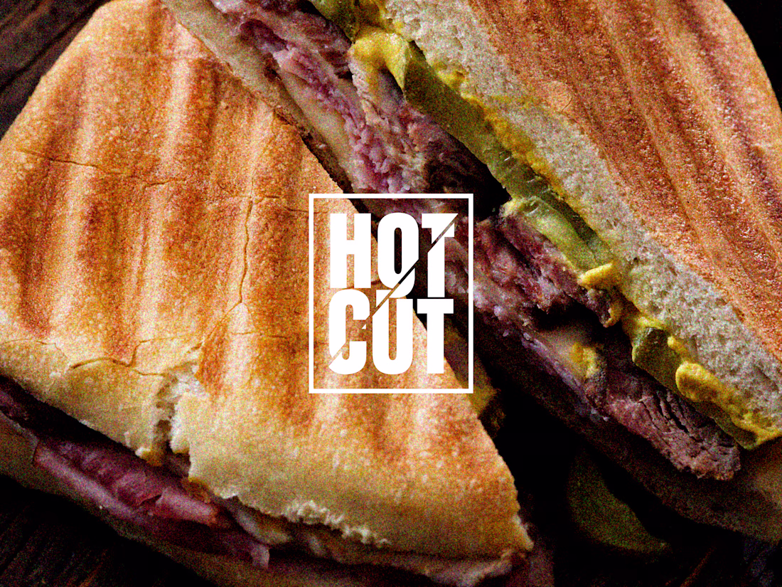
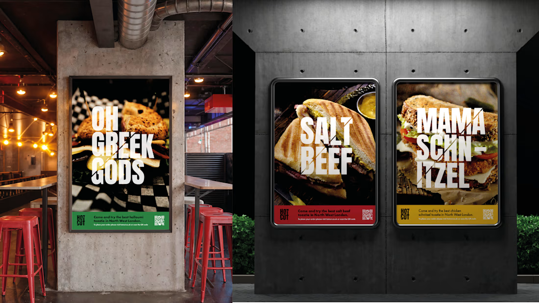
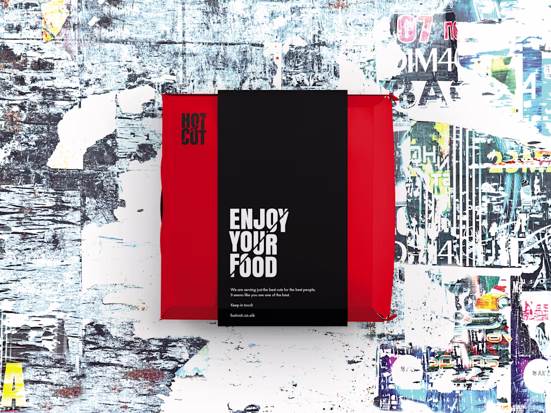
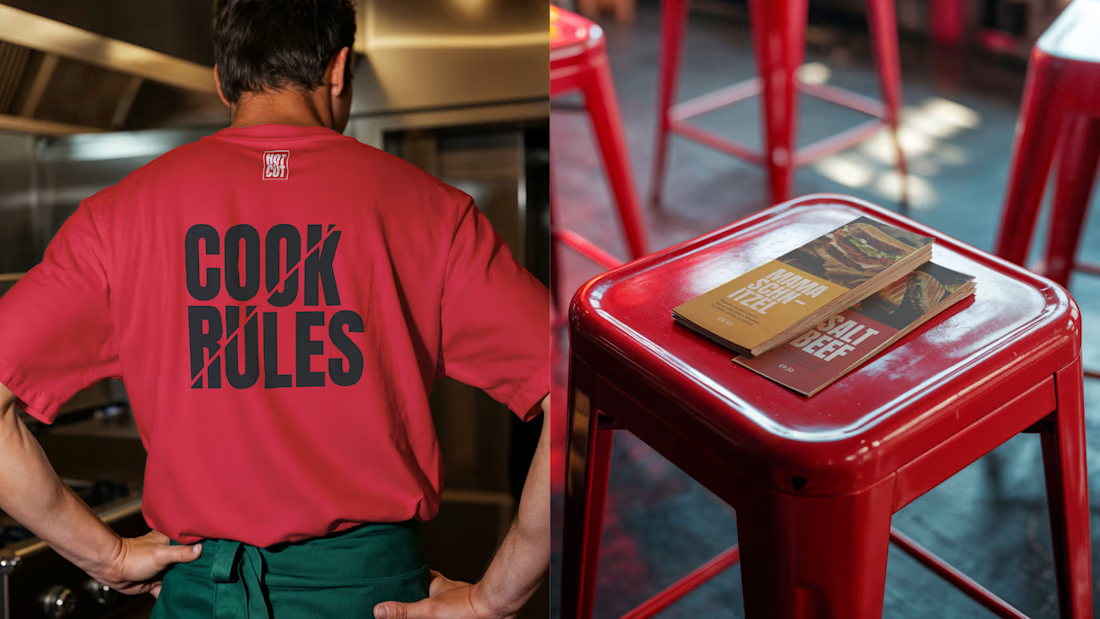
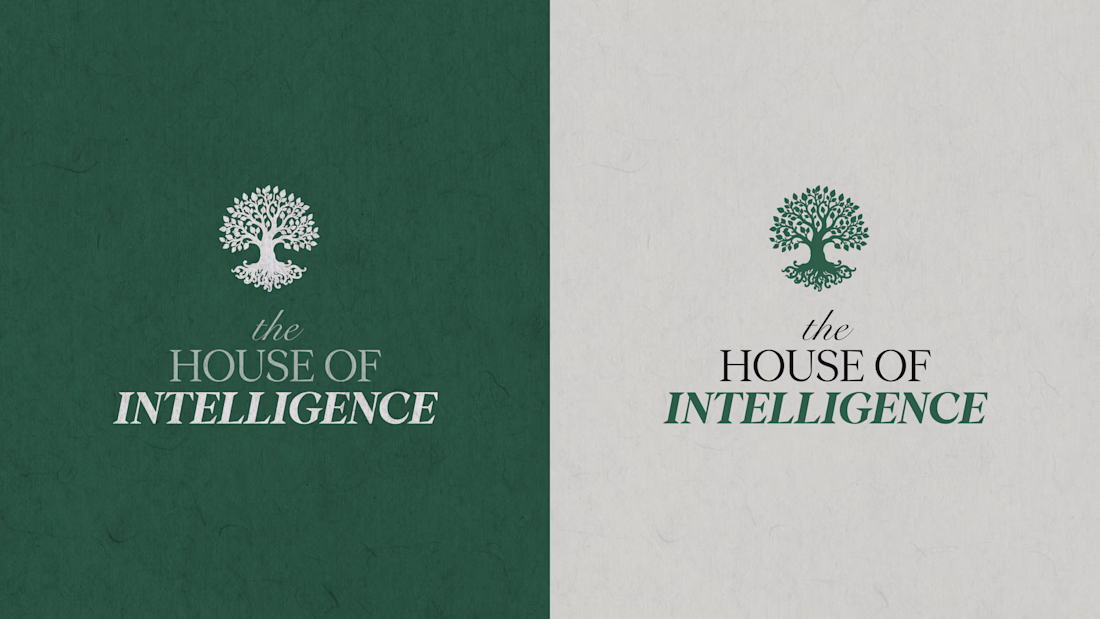
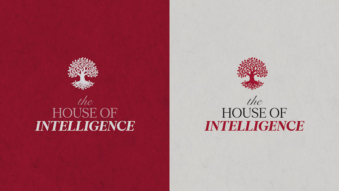
Brand identity for a business based in the heart of North London.
Designed to feel sharp, direct, and grounded in urban culture, the brand strips everything back to the essentials while maintaining a bold and intriguing edge.
Clear language and strong visual cues are used to communicate with confidence, highlighting the simplicity of the offering: Bread. Meat. Sauce.
An honest, no-nonsense identity that embraces the idea of “it is what it is,” delivering something familiar yet distinctly different. 🔥 🔪
Love this man!
Love the cut theme! Evokes the satisfaction of the most satisfying cut of a sandwhich :)
Thank you!
Amazing, love sharpness!🙌 😊
The network for creativity
Join 1.25M professional creatives like you
Connect with clients, get discovered, and run your business 100% commission-free
Creatives on Contra have earned over $150M and we are just getting started
Related posts
WE INTERVIEW AND INTRODUCE OUR PRODUCT TO REAL LOCAL BARBERSHOP BUSINESS.
Yes! you read it right. We are confident with the product and show it to public.
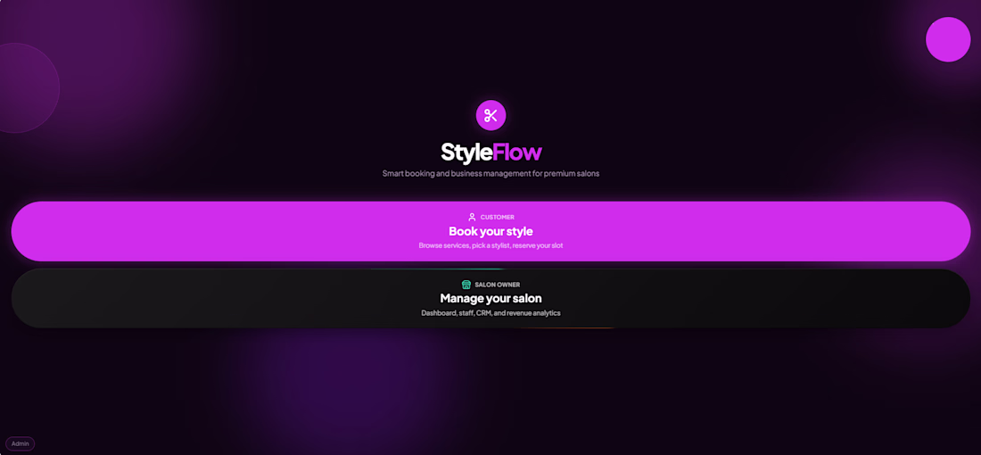
Introducing - "StyleFlow" powered with Ai and built in @Base44
I made an website where it will help the Hair salon/Barbershop for fast bookings or Drop in with also help of Ai.
🚀 PROBLEM:
The problem i see there are no Rewards for loyal customers, Ai integration and in Drop-In customer have no idea how many are in queue.
🧠 IDEA:
Keep the app simple and focused on what matters: Smooth for booking, Drop-ins, and showcasing the barbershop's services.
When i go to barbershop i usually google what hairstyle i want so now in Styleflow you can do it before and the staffs will see details about the bookings/Drop-in (Upload images about the haircut)
For DROP-IN customers, StyleFlow displays the current queue and provides real-time updates, so they know how many people are ahead of them and when it's their turn. Customer can do book DROP IN even they are at home/anywhere.
━━━━━━━━━━━━━━━━━━━━
😊 Automation:
Reservations/Booking
Email notifications
Customer and owner support
Daily report
Find hairstyles
Check bookings
Ai business insights
Customers receive email confirmations and appointment reminders. Drop-in customers are also notified when their turn is approaching.
━━━━━━━━━━━━━━━━━━━━
🎉 STYFLOW FEATURES:
Email reminder
Fast booking
Drop in & Booking
Loyalty program with rewards
Image input
Ai booking
Ai hairstyle helper
Ai support
Ai owner support
Announcement
Tip/Bonus points
Revenue tracker
Staff settings
Salon owner settings
Waitlist
Google map
Dark and light mode
Customer history
Owner/staff Dashboard & settings
━━━━━━━━━━━━━━━━━━━━
🙌 BEFORE:
it was just a simple app/website where customer would Book Appointments, simple Ui design, show the Salon services and a bit help with Ai.
💯 AFTER:
Improve the Ui & UX design
Faster booking.
Add DROP IN feature.
More Automations and Ai.
Announcement banner.
Loyalty program.
Google map
Adjusted staff services
Settings
Improve the buttons
Add a bit color in background
VERSION:
Mobile and Desktop.
Live :https://styleflow-hub.base44.app/
Video below: Walkthrough, Before & after, Interview
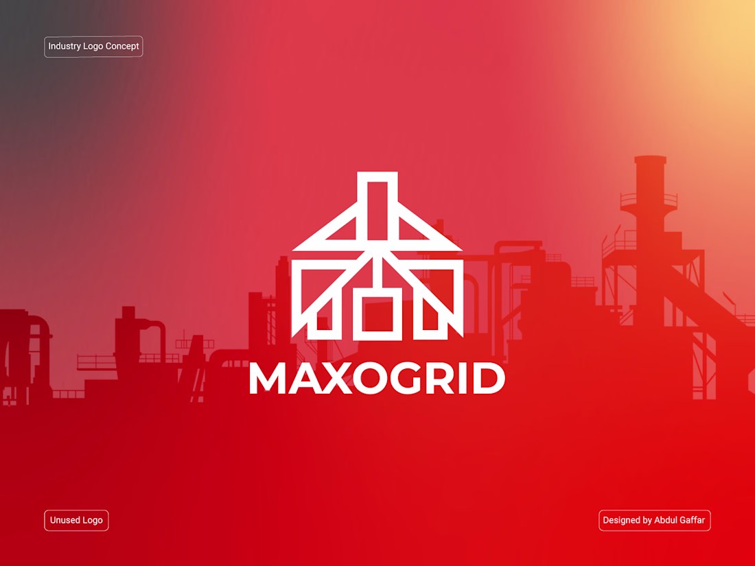
Maxogrid | Industrial Construction & Logistics Logo Design.
Looking Nice
Trending
Claude
Claude has entered the design space. How are you using Claude Design?
Contra University
Learn from expert creatives how to earn more using next-gen AI tools.
fifaworldcup2026
The World Cup is here and the whole world's watching. How are you designing for the world stage?
creativeaiflow
Creative AI workflows are evolving. What tools do you use, and what are their strengths and weaknesses?
freelancerlife
Freelancer life is wins, pivots, and everything in between. What’s yours right now?