The network for creativity
Join 1.25M professional creatives like you
Connect with clients, get discovered, and run your business 100% commission-free
Creatives on Contra have earned over $150M and we are just getting started
Back to feedPost
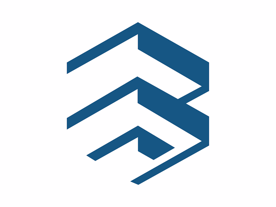
The logo you shared is a modern, geometric design that visually suggests the letter “B” through abstraction. Here’s how it works:
Shape & Structure: It’s composed of three blue parallelograms stacked vertically. Each one is angled diagonally, creating a sense of motion and dynamism.
Letterform Suggestion: The negative space between the shapes forms curves and breaks that resemble the outline of the letter B, though in a stylized, minimalist way.
Style & Tone: Clean lines and symmetry give it a professional, contemporary feel. The angular design conveys strength, precision, and innovation.
Branding Potential: Because it’s abstract yet recognizable, it could serve as a versatile corporate identity mark—working well across digital platforms, print, and even physical applications like signage or embroidery.
The network for creativity
Join 1.25M professional creatives like you
Connect with clients, get discovered, and run your business 100% commission-free
Creatives on Contra have earned over $150M and we are just getting started
Related posts
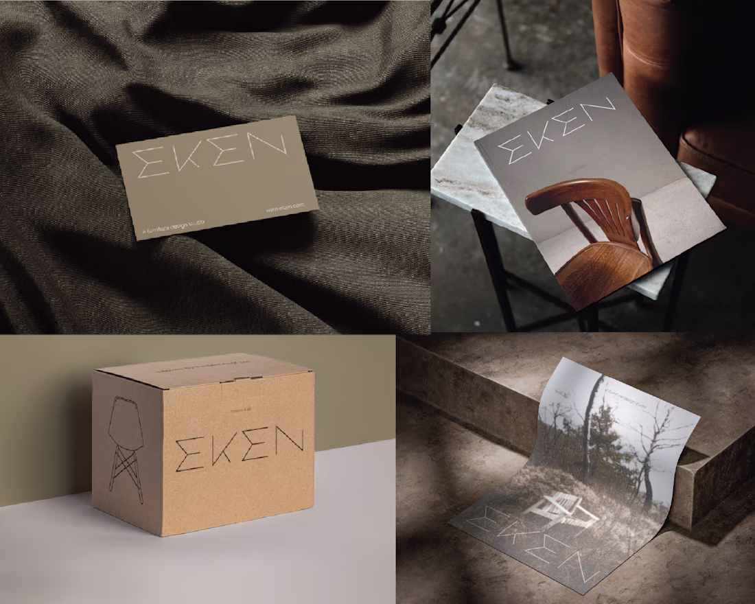
Eken is Scandinavian furniture brand in need of a new logo design.
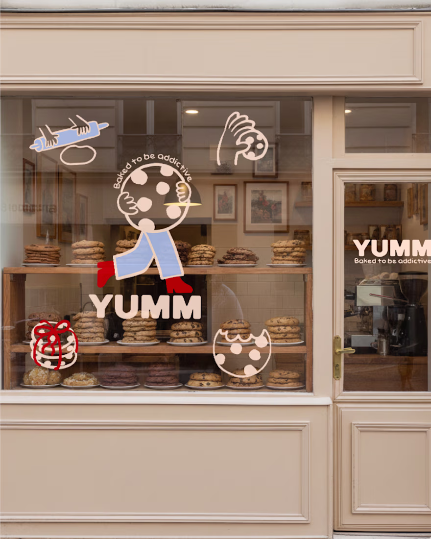
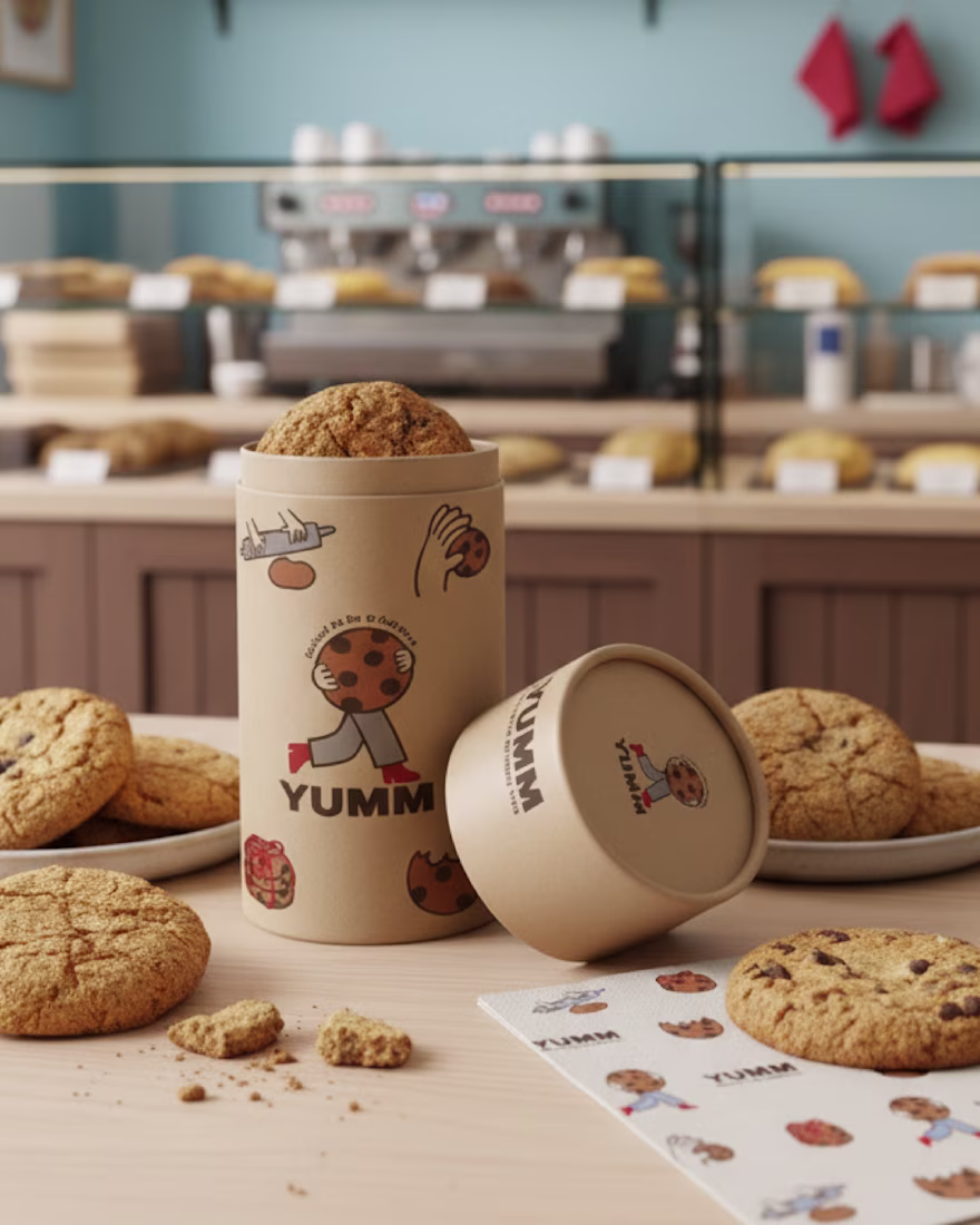
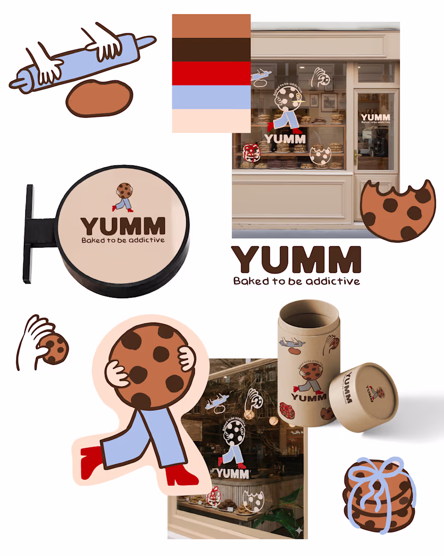
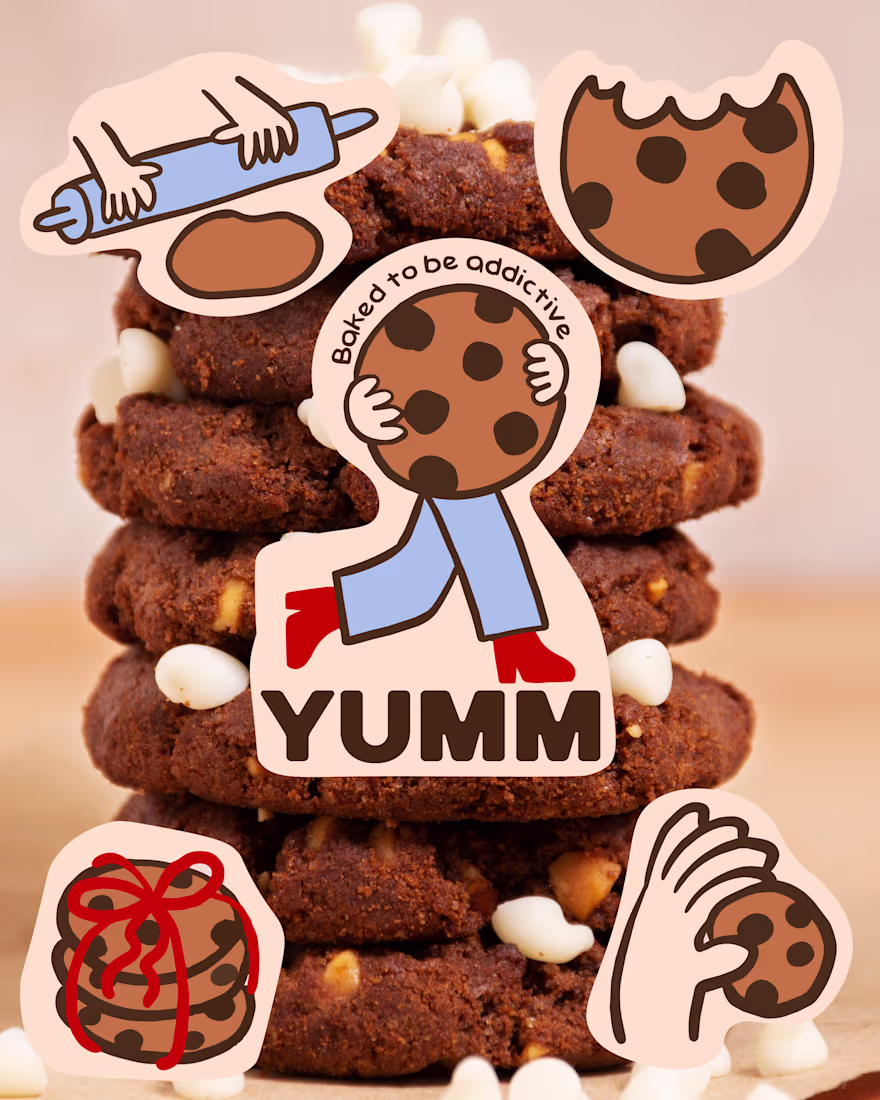
YUMM 🍪 is a brand identity project for a cookie bakery built around the idea that a brand can be experienced as a story, not just a logo.
For this concept, I developed a visual system that combines graphic design and illustration, creating a playful and narrative-driven world. Instead of treating the logo as a static element, I integrated it into a sequence that follows the entire journey of the cookies—from mixing the dough, to baking, packaging, purchasing, and finally enjoying them.
Illustration becomes the main storytelling tool, turning each phase into expressive and engaging scenes. The result is a visual identity that not only communicates what YUMM is, but also how it feels: soft, indulgent, and slightly addictive.
This project was an opportunity to experiment with a more illustrative and narrative approach to branding, where visual identity becomes an experience rather than just a system.
I’m excited to continue exploring this direction and bring it into future projects where storytelling and design blend seamlessly.
This is so fun - I love it!
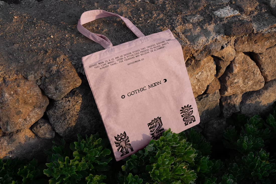
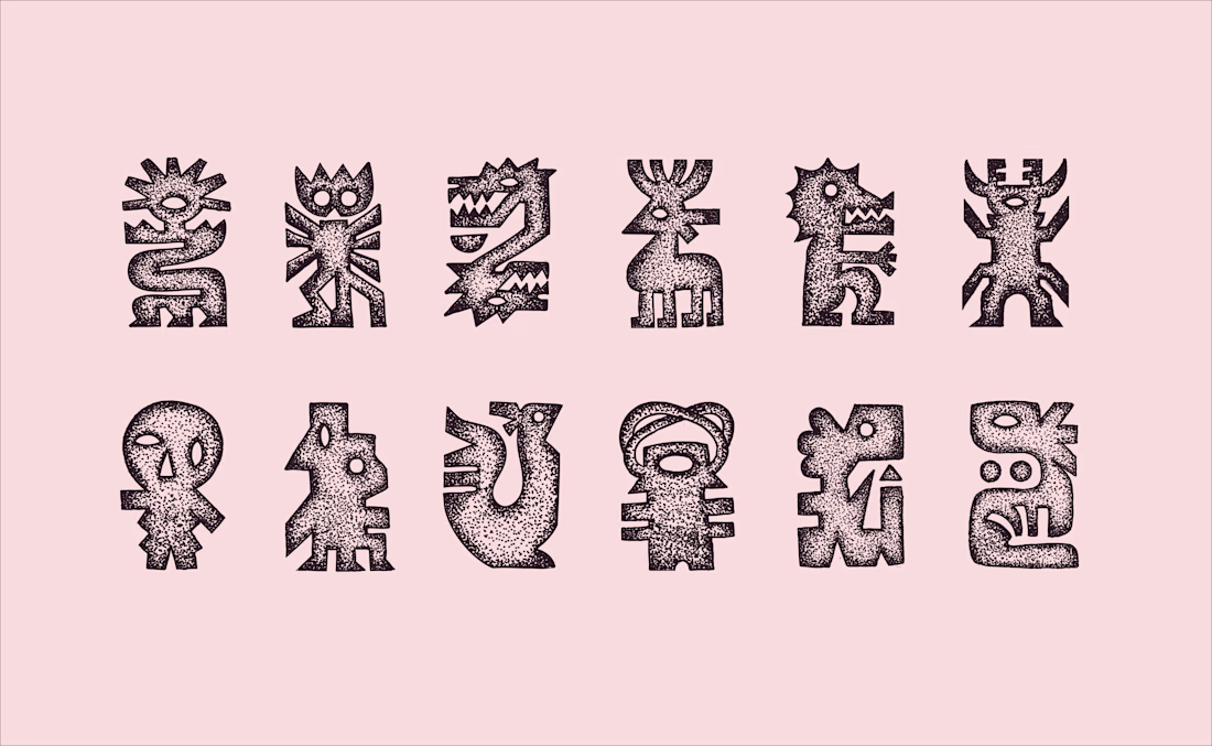
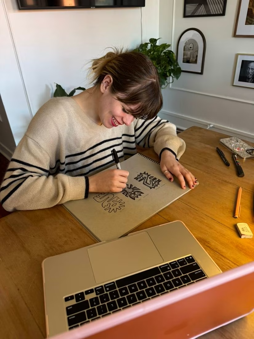
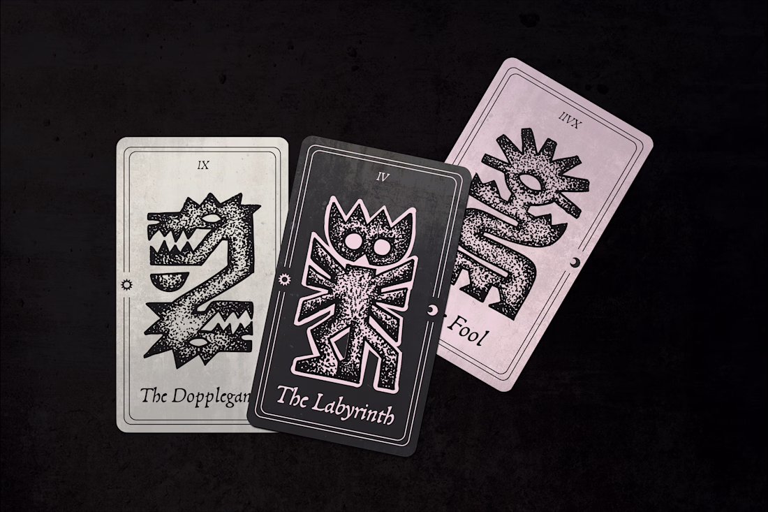
Stippled Illustrations and Identity Design for Gothic Moon, a a UI and UX design studio. Work done through Anchovies Agency within my role as Illustrative Art Director.
This looks clean and well thought out. How long did it take you to bring everything together?
Trending
Claude
Claude has entered the design space. How are you using Claude Design?
Contra University
Learn from expert creatives how to earn more using next-gen AI tools.
creativeaiflow
Creative AI workflows are evolving. What tools do you use, and what are their strengths and weaknesses?
portfolioreview
The best portfolios tell a story, not just show a grid. Share yours for feedback.
freelancerlife
Freelancer life is wins, pivots, and everything in between. What’s yours right now?