Laura Gentili
Visual Designer & Illustrator | Branding, Social Campaigns
New to Contra
Laura is ready for their next project!
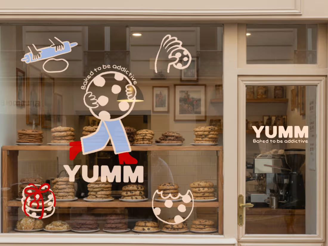
YUMM 🍪 is a brand identity project for a cookie bakery built around the idea that a brand can be experienced as a story, not just a logo.
For this concept, I developed a visual system that combines graphic design and illustration, creating a playful and narrative-driven world. Instead of treating the logo as a static element, I integrated it into a sequence that follows the entire journey of the cookies—from mixing the dough, to baking, packaging, purchasing, and finally enjoying them.
Illustration becomes the main storytelling tool, turning each phase into expressive and engaging scenes. The result is a visual identity that not only communicates what YUMM is, but also how it feels: soft, indulgent, and slightly addictive.
This project was an opportunity to experiment with a more illustrative and narrative approach to branding, where visual identity becomes an experience rather than just a system.
I’m excited to continue exploring this direction and bring it into future projects where storytelling and design blend seamlessly.
11
27
247
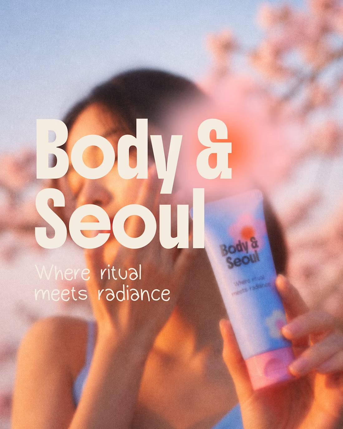
BODY & SEOUL is a brand identity project for a high-performance skincare line that blends traditional Korean fermentation with modern bio-science to achieve a luminous glass-skin effect. The visual system was designed to translate the idea of skincare as a ritual into a clean, contemporary language. Built on balance, softness, and a sense of calm, the identity reflects the product’s sensorial and transformative nature.
A key part of the project was exploring gradients and subtle grain to add depth and character, creating an aesthetic that feels both delicate and distinctive. More than communicating product performance, the identity aims to capture the experience itself—a daily ritual of care, precision, and glow.
1
1
65
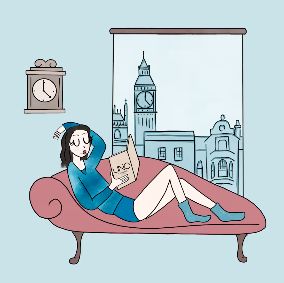
This project features a series of illustrations created for the winter collection of Uno Cashmere, a brand specializing in cashmere garments.
The visual storytelling, designed for social media, revolves around three female characters inspired by the models from the original photoshoot. Each character is defined by her own personality and interests, which are reflected in her style and way of dressing.
Through illustration, the project translates the brand’s aesthetic into a narrative dimension, adding depth and identity to the collection while maintaining a soft, refined and cohesive visual language.
1
134
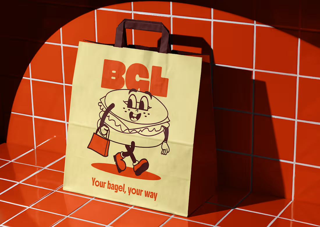
As part of a creative brief, I developed the branding and menu design for BGL 🥯, a modern bagel bar concept where customers can build their own combinations from a wide range of ingredients.
The goal was to create a visual identity that felt flexible, approachable and playful, reflecting the customizable nature of the experience.
To support this, I designed an illustrated bagel mascot, experimenting with a more expressive and unconventional style compared to my usual work.
This project was a great opportunity to explore a lighter, more character-driven direction while maintaining a clear and cohesive design system.
14
34
396
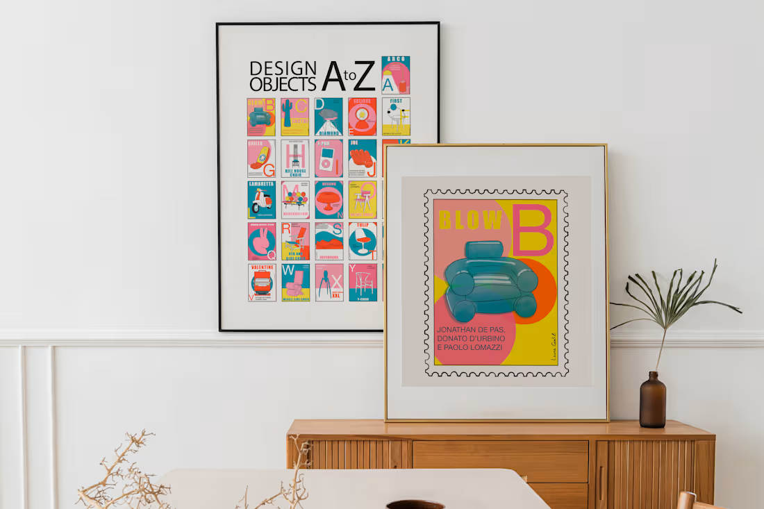
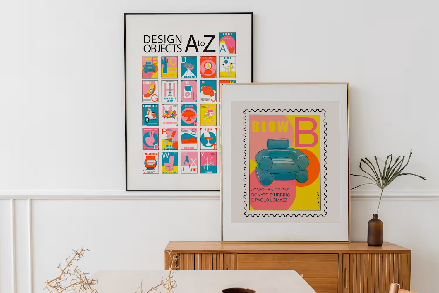
This is a personal illustration project featuring an alphabet composed of iconic design objects.
Each letter is paired with a piece that has made its mark in design history — whether for its innovative form, originality, or simply for its playful character.
From A to Z, the project brings together some of the most recognizable and influential objects, reinterpreted through illustration.
1
133
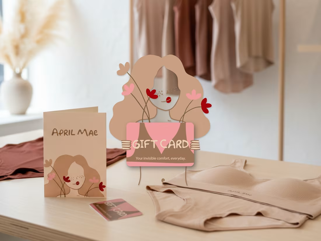
April Mae is a branding project developed from a creative brief, focused on designing the visual identity and a gift card for a seamless underwear brand.The concept is built around a “barely there” feeling, translated into a soft, minimal and refined visual language.
For this project, I combined illustration and graphic design to create a unique gift card, adding an expressive element within a clean and cohesive system. A project that allowed me to explore a more delicate aesthetic and expand my creative approach.
1
148