The network for creativity
Join 1.25M professional creatives like you
Connect with clients, get discovered, and run your business 100% commission-free
Creatives on Contra have earned over $150M and we are just getting started
Back to feedPost

I only started being more active on Contra recently, so this is less of a re-introduction and more of a fresh one — Hi, I'm Keke, a freelance designer, illustrator, and food lover 🍅
I specialize in branding and web design (Framer & Webflow are my go-tos, though I work with Wordpress too), and I'm particularly passionate about food brands (unsurprisingly!). As someone who grew up in Asia and now lives in Europe, I also love working with brands that bridge cultures and celebrate cross-cultural stories.
2025 was actually my first year freelancing, so I made this showreel to reflect on the journey. For me, it was a year of "slowly starting up from pause" after being laid off in 2024. Here's hoping 2026 will be a year of bigger strides — or maybe even breaking into a run! 🏃♀️➡️

Hi Keke👋 Love the video


Hi Keke! Nice to meet you. Your show reel is so fun to watch—I love the music too! Fellow food lover here😊 It's cool to see that passion in your designs!

Loooove the projects! Really nice typographic work. Welcome again and nice to meet you!

Nice to meet you! Love your projects!!

The network for creativity
Join 1.25M professional creatives like you
Connect with clients, get discovered, and run your business 100% commission-free
Creatives on Contra have earned over $150M and we are just getting started






Related posts

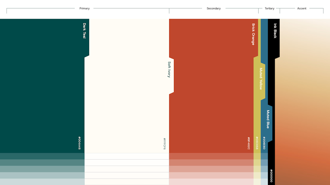
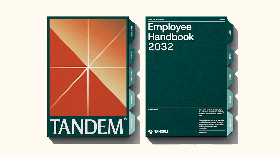
The new brand identity for Tandem is live!
Quite a lot of thought and work went into building this one, and I'm excited to finally share it. Would love to hear your thoughts!
We developed a complete brand experience for Tandem, covering:
1. Brand Strategy
2. Brand Naming
3. Logo Desig
4. Visual Identity
5. Brand Collaterals
6. Brand Guidelines
7. Motion Design
The complete project is now live. Take a look and explore the full identity here



Great work!!


Some of my recent works. As you can see I have pretty wide range of styles and topics 😅


the range is real

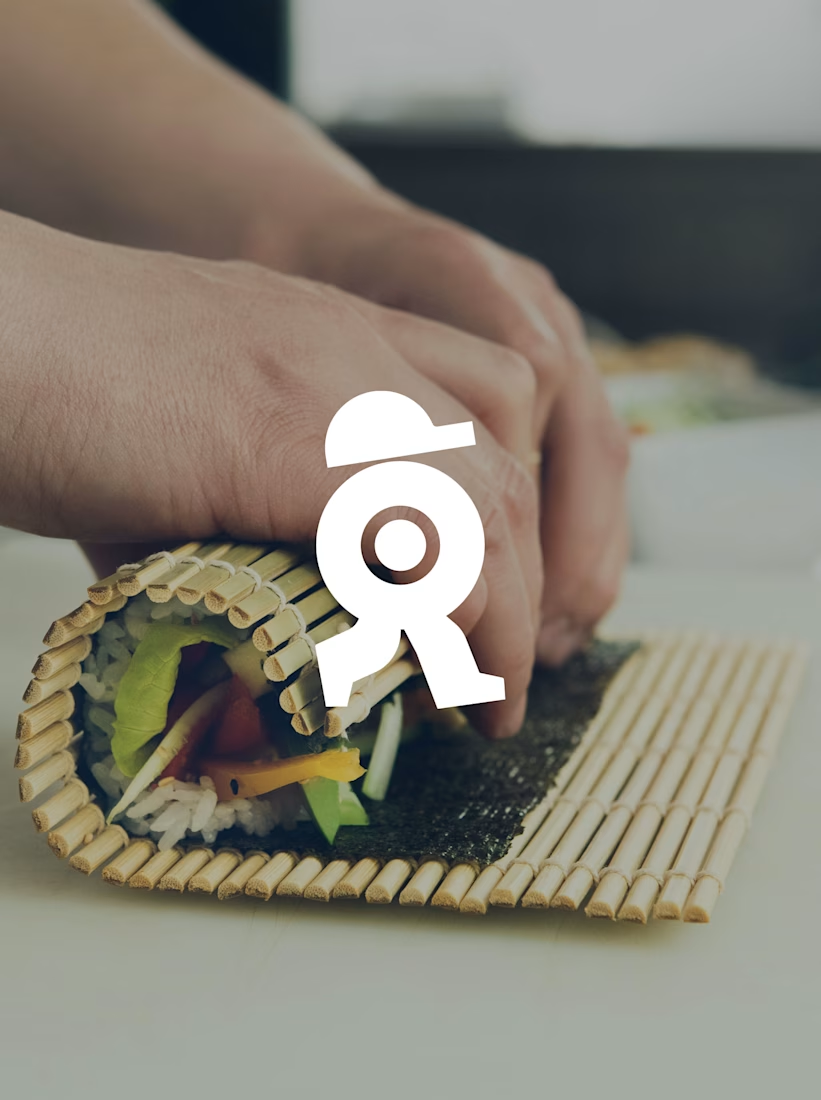
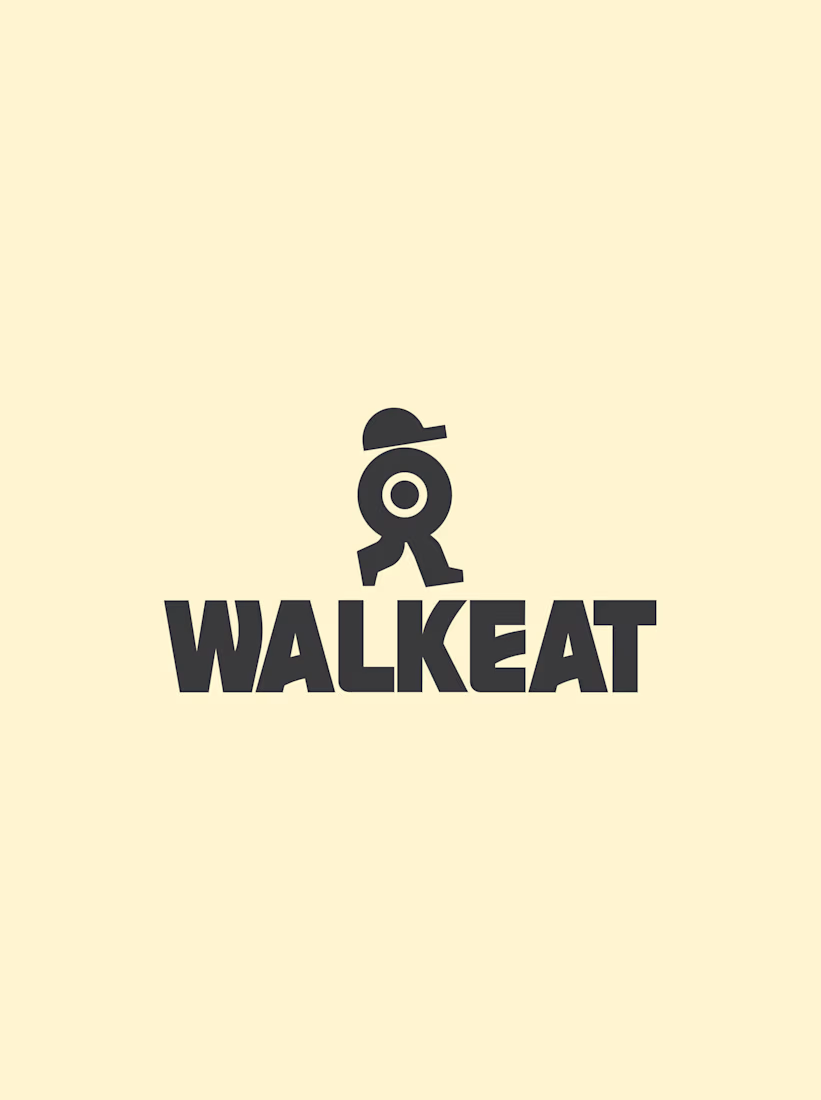
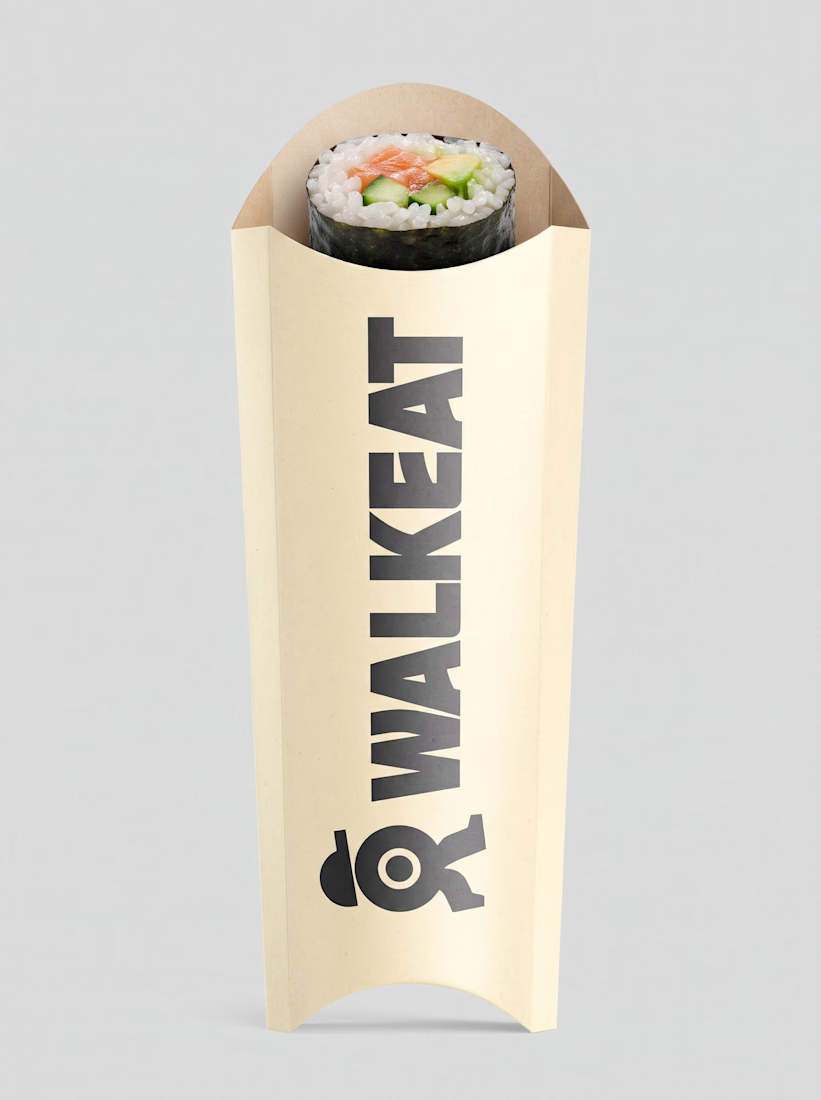
A sushi roll with a life of its own.
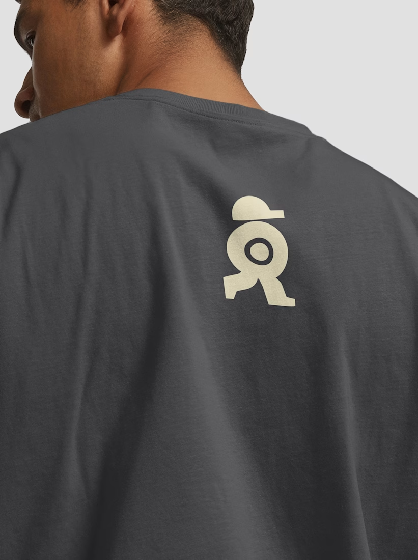
The WALKEAT identity transforms the shape of a sushi roll into a walking character. Its circular center references the cross-section of the roll, while the cap and legs bring movement and personality to the figure.
The custom-designed wordmark reinforces this concept through subtle modifications to the W, A, and E, creating a visual connection between typography and symbol.
A simple, playful and contemporary identity that communicates the product without relying on literal Japanese imagery or an overly cartoonish character.


Great work!!