The network for creativity
Join 1.25M professional creatives like you
Connect with clients, get discovered, and run your business 100% commission-free
Creatives on Contra have earned over $150M and we are just getting started
Back to feedPost


The close-up composition makes the fintech interface feel precise and premium.
The network for creativity
Join 1.25M professional creatives like you
Connect with clients, get discovered, and run your business 100% commission-free
Creatives on Contra have earned over $150M and we are just getting started



Related posts

People don’t just want a banking app. They want to feel in control of their money.
Great fintech design doesn’t just look premium. It makes money feel simpler, safer, and easier to control.
Meet Ziko, a mobile banking concept where every interaction is designed to reduce friction and build trust.
What wins your trust first: 🔒 Security, ✨ Simplicity, or ⚡ Speed?


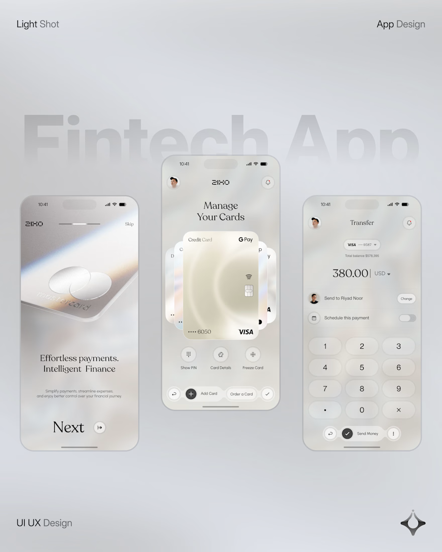
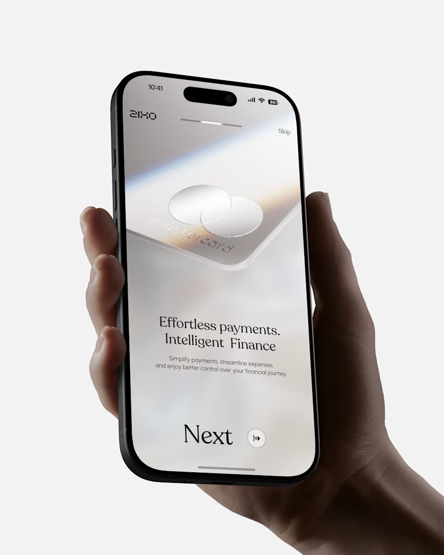
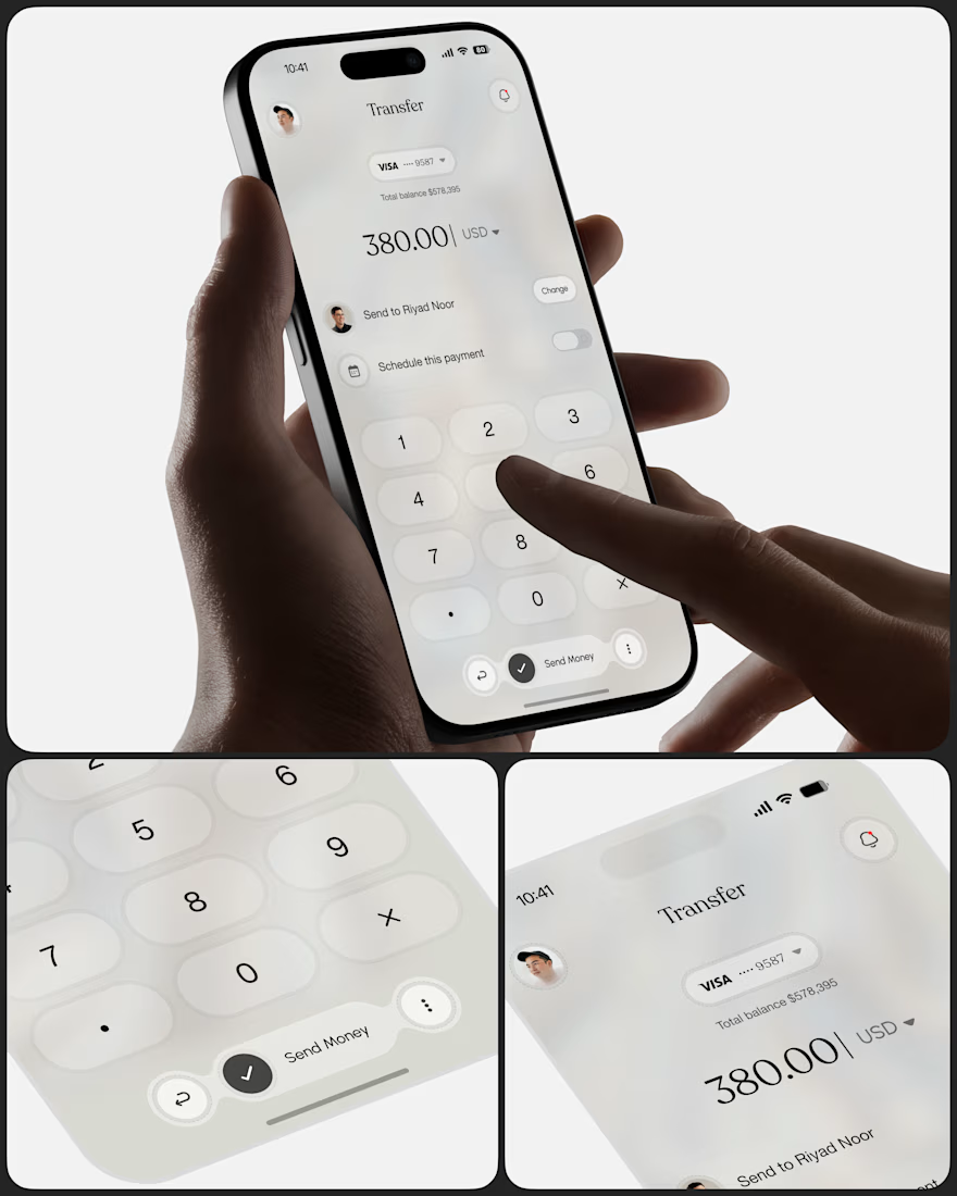
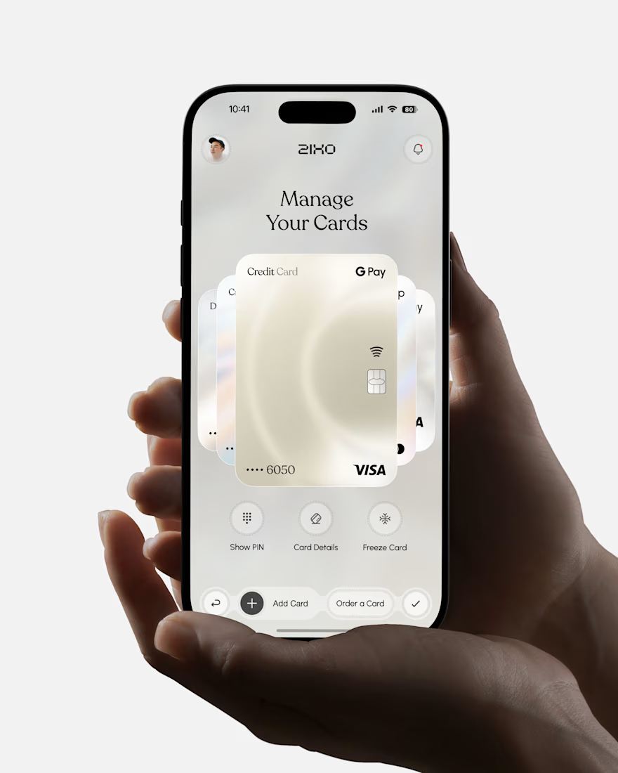

Absolutely love this Fintech App design! The minimal soft 3D elements with the clean UI is such a premium combo — feels very Apple-like and trustworthy. The interaction "designed to reduce" cognitive load really shows in the execution. Super polished work, that "Effortless payments. Intelligent Finance." screen is my fav!

What if one of the most meaningful messages you ever receive… is written by a version of you that no longer exists?
That question became Dear Future my submission for the #Base44Challenge.
We save photos.
We save messages.
We save memories.
But we rarely preserve who we were in that exact moment what we were thinking, hoping for, afraid of, or becoming.
So I designed a digital time capsule where your words don’t just get stored.
They wait for you.
With Dear Future, you can:
✦ Write a letter to your future self or someone else
✦ Add memories and images
✦ Choose the exact future date it should return
✦ Personalize your capsule with colours and seals
✦ Seal it so it can’t be read or edited before its opening date
✦ Watch the countdown inside your personal archive
✦ Return later and experience the letter as something preserved not just another notification
But the biggest design challenge wasn’t creating a way to send a letter later.
It was designing the wait.
As a Senior Product & UI/UX Designer, I wanted every interaction to support that idea.
The archive.
The physical capsule metaphor.
The vintage television.
The sealing ritual.
The countdown.
The responsive mobile experience.
None of them are there just for decoration. Together, they turn anticipation into part of the product.
I designed the UX, visual system, interaction language, responsive experience, storytelling, and complete product flow then built and shipped the working experience with @Base44.
This project reminded me why I love product design:
A good interface helps someone complete a task.
A meaningful experience makes them feel something while doing it.
Dear Future Words outlive the moment.
Experience the project ↓
Dear future capsule
Would you write something for yourself five years from now?


Exploring mobile app onboarding options for a Fintech app. Which version should I lock?
8 voted
44%
10 voted
56%
18 votes
Closed
Version 2 is stronger for Fintech. More clear, trustworthy & explains value instantly. Version 1 looks bold but feels vague for onboarding. I'd lock Version 2.