The network for creativity
Join 1.25M professional creatives like you
Connect with clients, get discovered, and run your business 100% commission-free
Creatives on Contra have earned over $150M and we are just getting started
Back to feedPost

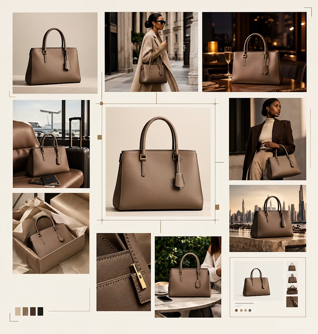
I wanted to see how far I could take one simple product idea.
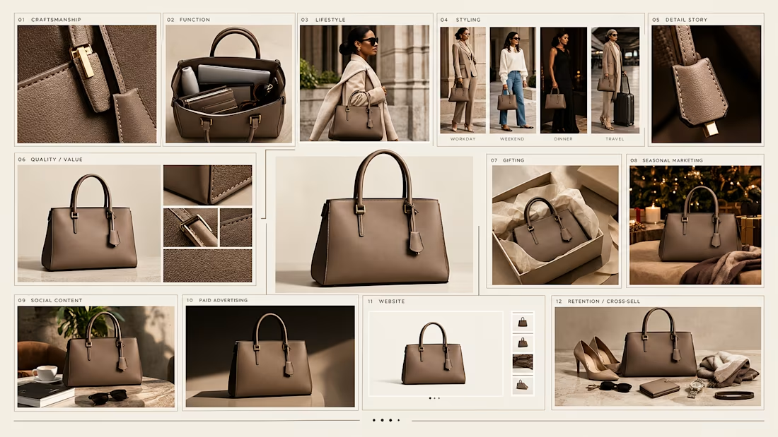
So I used a bag as the starting point and built a small visual branding system around it — the product shot, lifestyle direction, campaign feel, and the different ways the same product could show up across a brand’s marketing.
Being able to explore ideas quickly, keep the product feeling consistent, and build visuals that actually make sense for the brand.
A single product can have a lot more stories to tell.
This is the kind of work I enjoy helping brands with: taking a product or idea, finding the right angle for it, and turning it into visuals and marketing content that feel intentional rather than just “more content.”
I’m especially interested in working with fashion, beauty, lifestyle and ecommerce brands that want to improve how they present and market their products.
If that sounds like something your brand could use, let’s talk.
#Ecommerce #EcommerceMarketing #Branding #CreativeStrategy #AIForBusiness #FashionMarketing #DTC #ProductMarketing #VisualBranding #DigitalMarketing #Contra


The network for creativity
Join 1.25M professional creatives like you
Connect with clients, get discovered, and run your business 100% commission-free
Creatives on Contra have earned over $150M and we are just getting started










Related posts

An existing brand identity showcased across a new campaign. This was one of my favourite projects ever!

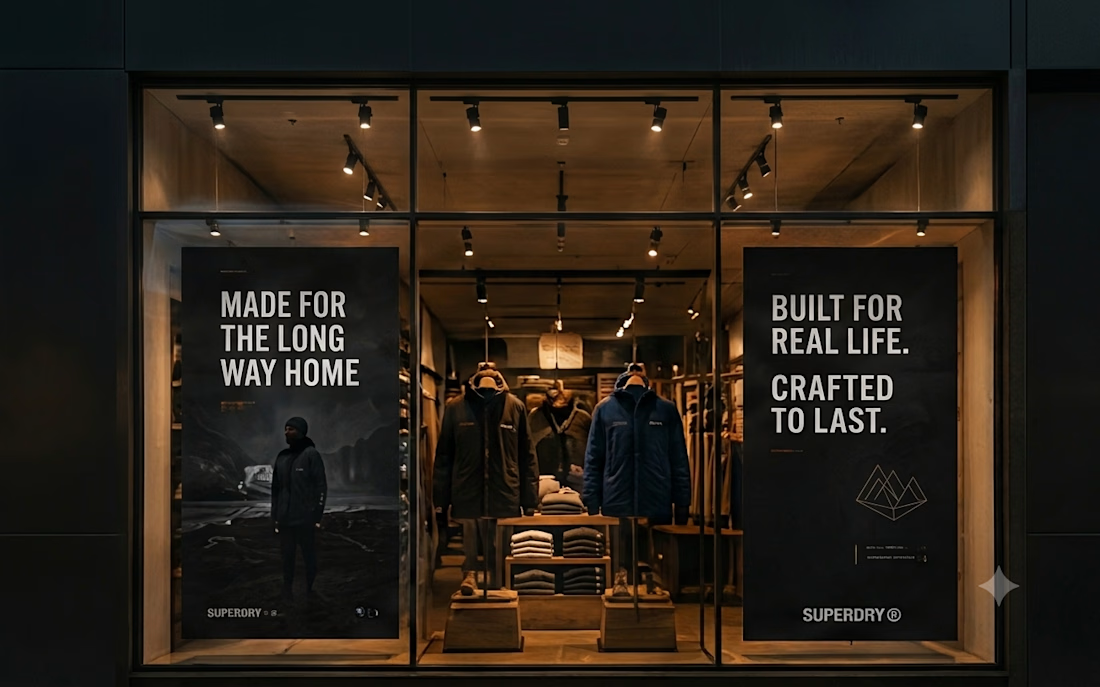
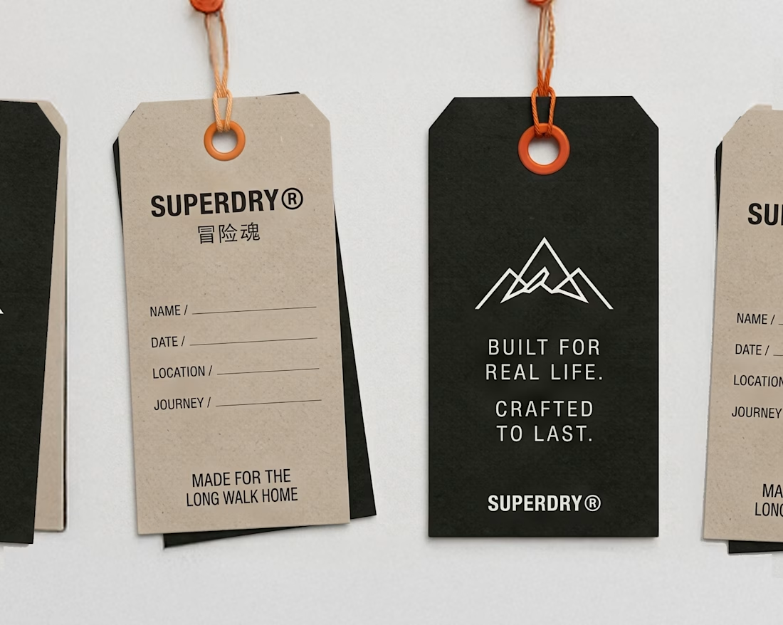
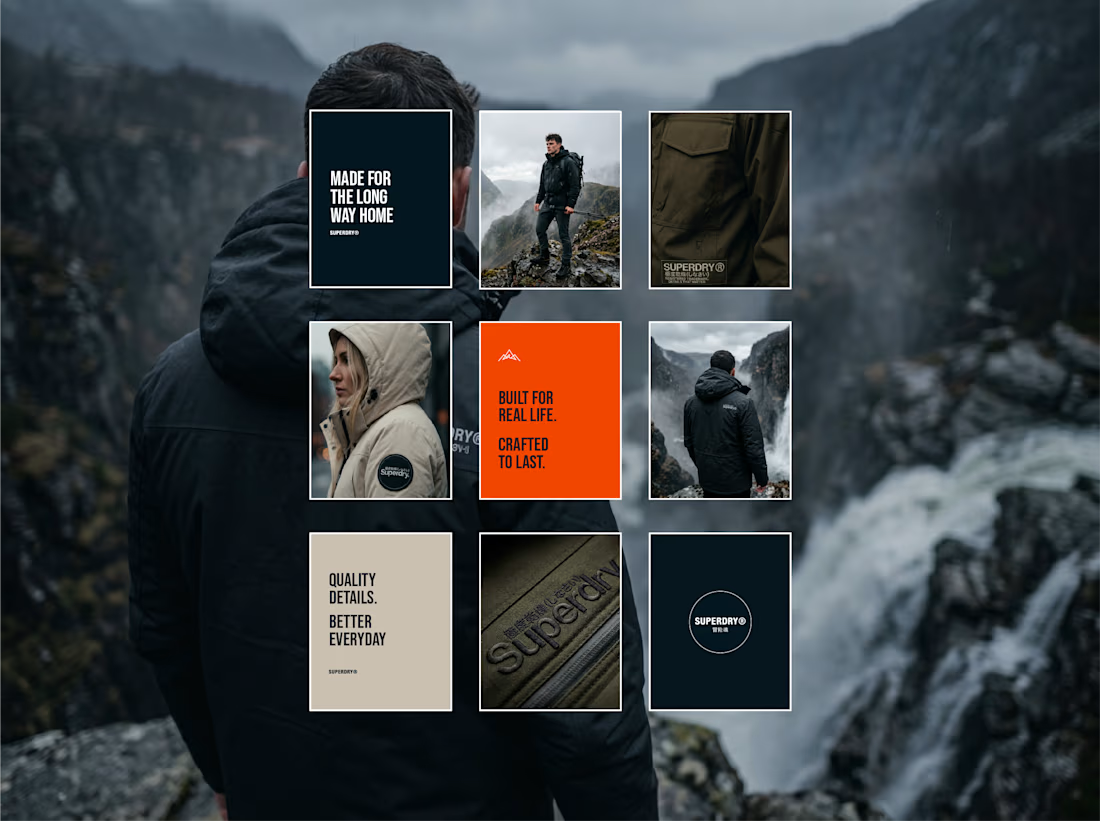
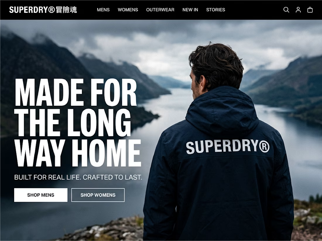

Taking an existing identity and stretching it across a whole new campaign is such a good test of a system. This looks like one of those projects where everything just clicked.

Figma Football
An unofficial football concept inspired by Figma and its visual language.
The ball was created using a custom 3D generator I built in ChatGPT, with animated interface icons and graphics developed with Claude.
Part design experiment, part exploration of how custom AI-powered tools can become part of the creative process.


The interface icons translate surprisingly well into a football identity.


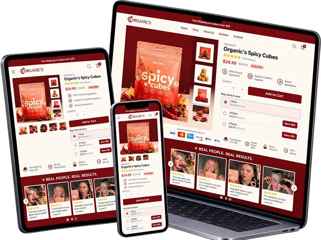
A conversion-focused Shopify product page featuring a clean, modern layout and an intuitive shopping experience.
The page brings together an engaging product gallery, bundle selection, clear Add to Cart actions, customer testimonials, product education, comparison tables, and FAQs.
The design emphasizes visual hierarchy, product discovery, purchase clarity, and trust-building elements to help shoppers make informed decisions.
Focus: Shopify UI/UX, product page design, and conversion rate optimization.


Clean layout. Keeping the bundle options, comparison table and FAQs on the same page really helps buyers decide without extra clicks. Great work on the product page structure.