The network for creativity
Join 1.25M professional creatives like you
Connect with clients, get discovered, and run your business 100% commission-free
Creatives on Contra have earned over $150M and we are just getting started
Back to feedPost
Taste Test

fof — Freshness Meets Luxury.
A vs. B — Which Design Would You Choose?
One brand. One product. Two creative directions.
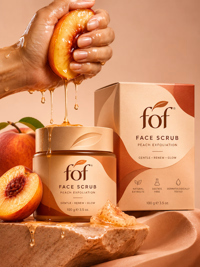
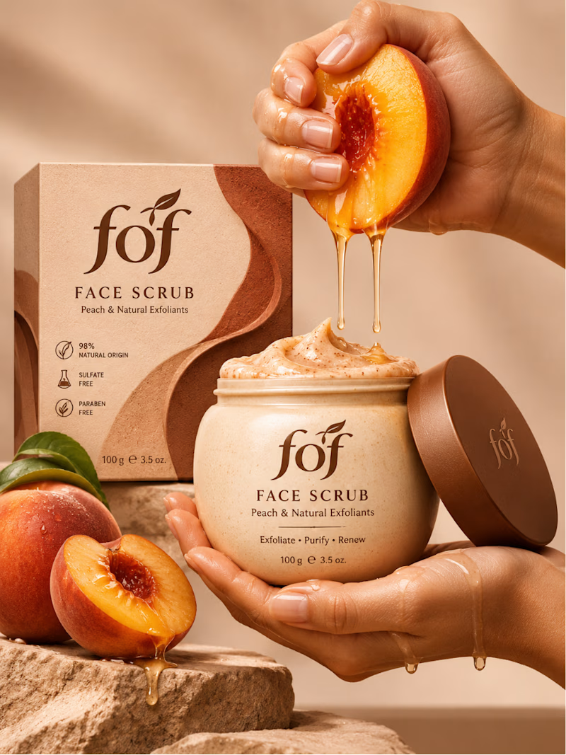
Introducing a conceptual packaging design for fof, a premium peach-inspired face scrub that combines natural aesthetics with sophisticated skincare branding.
Concept A — Refined Luxury
Elegant packaging, sculptural graphics, and a polished editorial composition.
Concept B — Sensory Beauty
Organic forms, rich textures, and an immersive product experience.
Which concept would make you reach for the product first?
Vote A or B — I'd love to hear your perspective!
Creative Direction & Design Concept by GraphAdda Studio.
1 vote
Ends in 1d

Voted B. The jar in hand feels more premium, and the cream tones are calmer than the orange box.
The network for creativity
Join 1.25M professional creatives like you
Connect with clients, get discovered, and run your business 100% commission-free
Creatives on Contra have earned over $150M and we are just getting started




Related posts

Need a second pair of eyes 👀
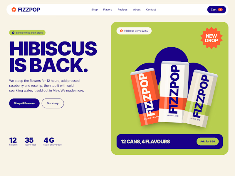
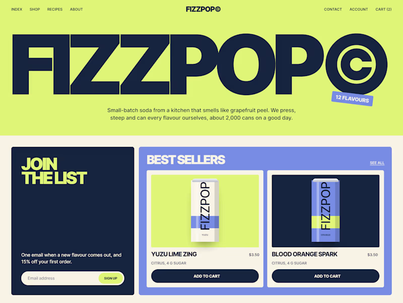
I'm designing the online store for FizzPop, a craft soda brand: all-natural sodas, sparkling waters and botanical tonics.
Flower Fizz(A): eggshell, tiger orange and deep ultramarine, with flower shapes and stacked colour swatches for the flavours
Corner Shop(B): lime, soft blues and navy, editorial layout with a giant wordmark and menu-style flavour tiles

38 voted
44%
48 voted
56%
86 votes
Closed


Which can would you have picked?
Guud Energy is an organic, zero-sugar energy drink from San Diego. Good product, but the can wasn’t helping it: white type on bright gradients, too many messages competing, and the hero ingredient buried in a list.
We presented three directions, each across the full flavor range:
But I'm sharing two here, as the system allows me to share only two
The client picked one. Which would you have gone with, and why? I’ll share their choice in the comments.
3 voted
75%
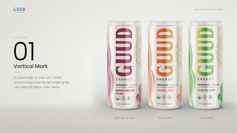
1 voted
25%
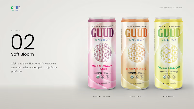
4 votes
Closed

Upcoming card design for a Picnic App 🥞🧺🍎
Do we like the idea of images or predefined avatars more?:)
20 voted
83%
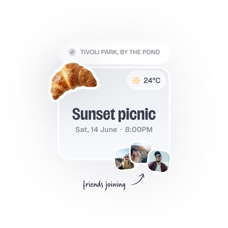
4 voted
17%
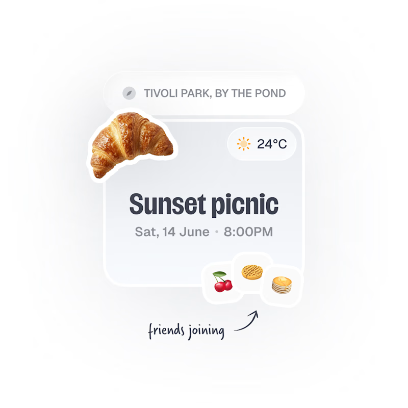
24 votes
Closed

Images, with the fruit avatars as the fallback for anyone without a photo. Faces are how you spot your friends at a glance, and the croissant already gives the card plenty of personality.