The network for creativity
Join 1.25M professional creatives like you
Connect with clients, get discovered, and run your business 100% commission-free
Creatives on Contra have earned over $150M and we are just getting started
Back to feedPost

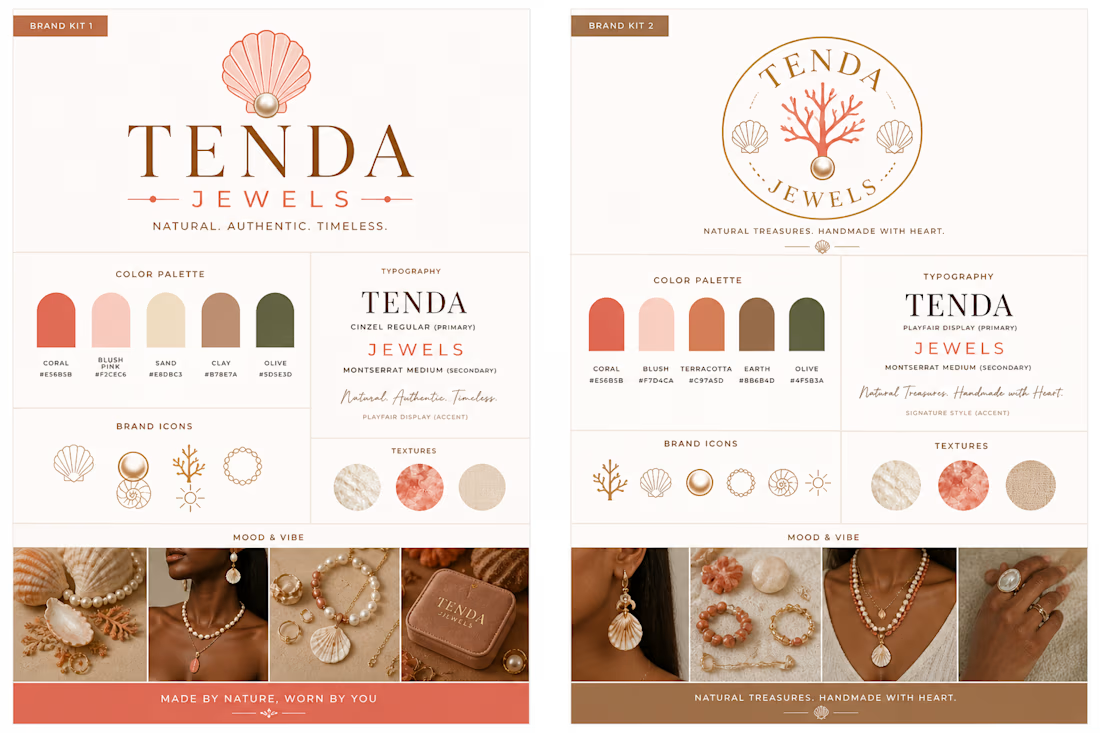
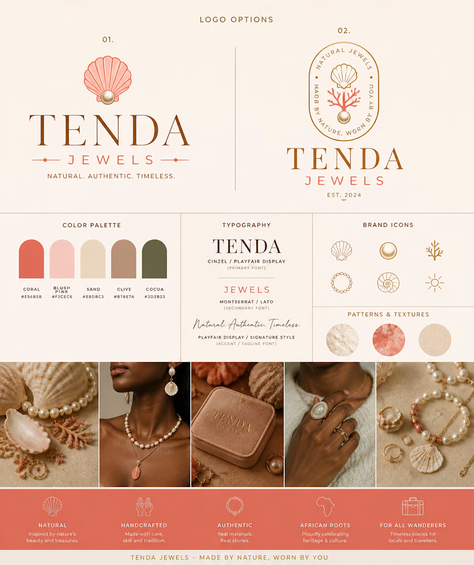
working on this brand kit for a jewellery brand, Yaay Or Naay?


The network for creativity
Join 1.25M professional creatives like you
Connect with clients, get discovered, and run your business 100% commission-free
Creatives on Contra have earned over $150M and we are just getting started





Related posts

Same prompt. Same concept. Two AI tools. 👀
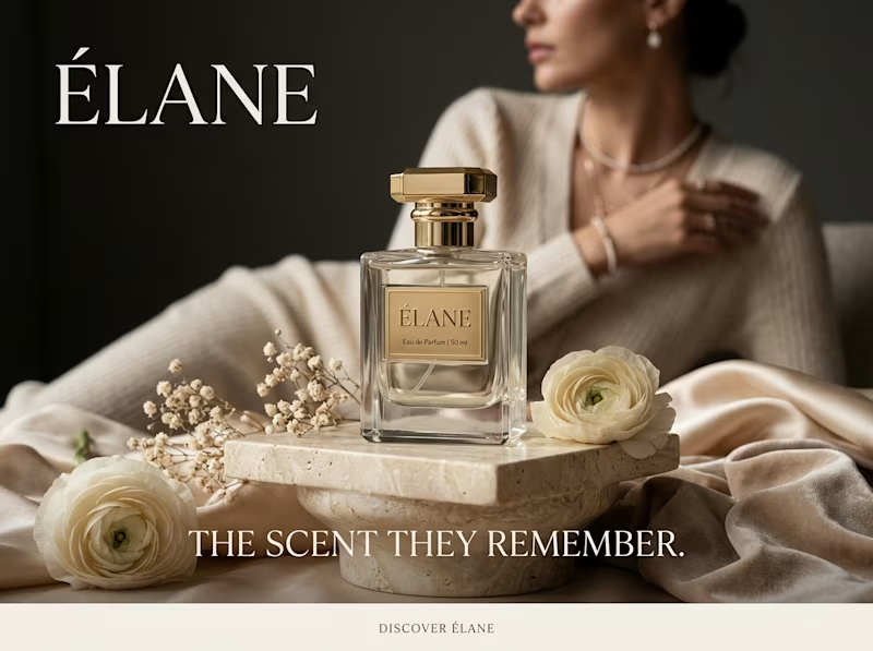
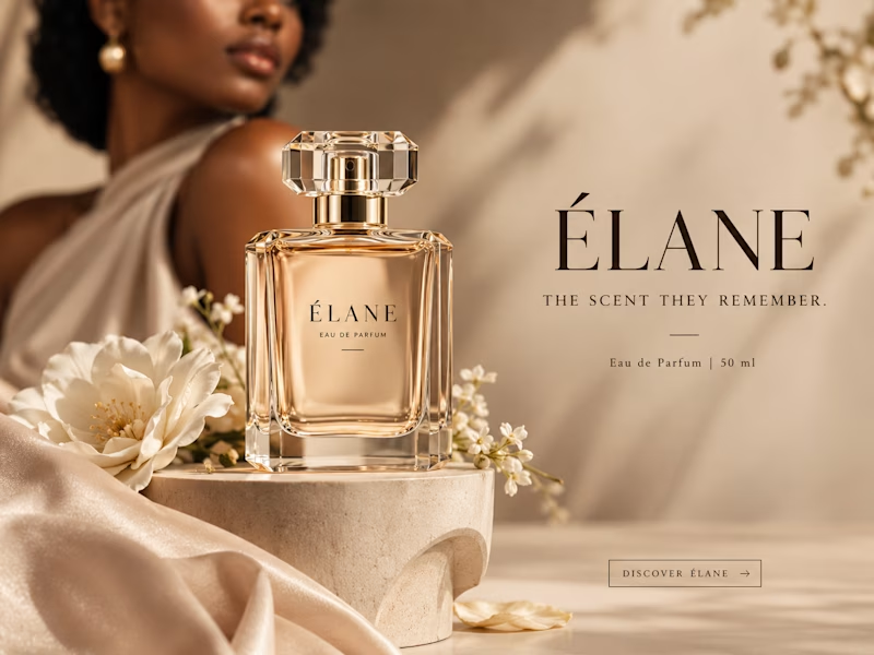
I gave ChatGPT and Gemini the exact same prompt to create a luxury perfume ad creative.
No changes. No extra instructions.
Now I want to know what YOU think:
Which creative did it better?
🔵 A— Gemini
🟣 B— ChatGPT
Look at the overall concept, visual quality, composition, typography, and how “ad-ready” it feels.
Who wins this round? 👀
Vote below and tell me what made you choose your answer.
#AIContent #AIAdvertising #AdCreative #CreativeStrategy #ChatGPT #Gemini #SocialMediaManager #SocialMediaStrategy #SocialMediaMarketing #MarketingStrategy #DigitalMarketing #ContentCreation

11 voted
39%
17 voted
61%
28 votes
Closed


Then: 1 month, 1 template.
Now: 1 week, 15 templates.
Same designer, different workflow.
I wrote up how I built no-code.supply: fifteen website templates, each with its own brand, in HTML and React, and some in Framer too. Claude Code did most of the typing. I did the directing.
no-code.supply
How I built 15 website templates with an AI coding agent in a week
How I built 15 AI-ready website templates with Claude Code in a week: the workflow, the quality bar, and why a template is only the starting point.

Going from one template a month to fifteen a week is wild. How much of the design direction did you still do by hand?


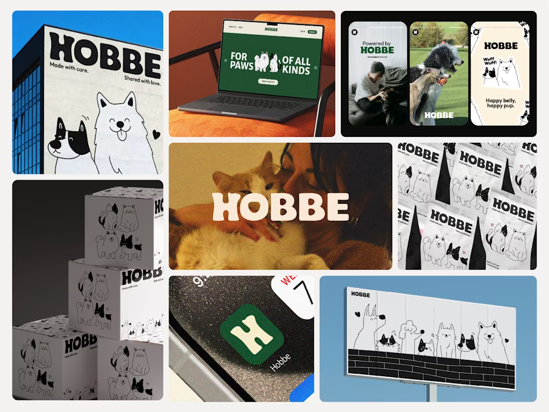

Like the branding and illustrations