The network for creativity
Join 1.25M professional creatives like you
Connect with clients, get discovered, and run your business 100% commission-free
Creatives on Contra have earned over $150M and we are just getting started
Back to feedPost

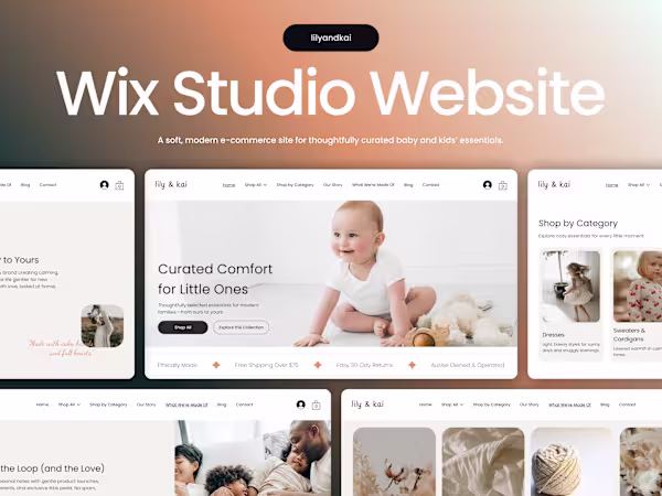
Most baby & kids stores rely on pastel colors and adorable visuals… but forget the tired parent shopping one-handed at 2AM.
If the path to “Shop Now” isn’t obvious, they leave.
For Lily & Kai, I redesigned the homepage and splash screen to focus on conversion:
✔ calm, trustworthy first impression
✔ clear shop journey from the first screen
✔ mobile-first, one-hand navigation
✔ clean CTAs that reduce decision fatigue
Built in Wix Studio and optimized for real parent behavior.
Check it out


Clean Design! 👍

Thanks!

Good Work

top notch

Indeed clean design with soft colors, matching the concept! 👍

Neat work
The network for creativity
Join 1.25M professional creatives like you
Connect with clients, get discovered, and run your business 100% commission-free
Creatives on Contra have earned over $150M and we are just getting started

Related posts


Made sure that the first impression is unforgettable.


That login screen transition with the dither effect is genuinely gorgeous. First impression delivered for real


Planning for tomorrow is difficult when important details are missing.
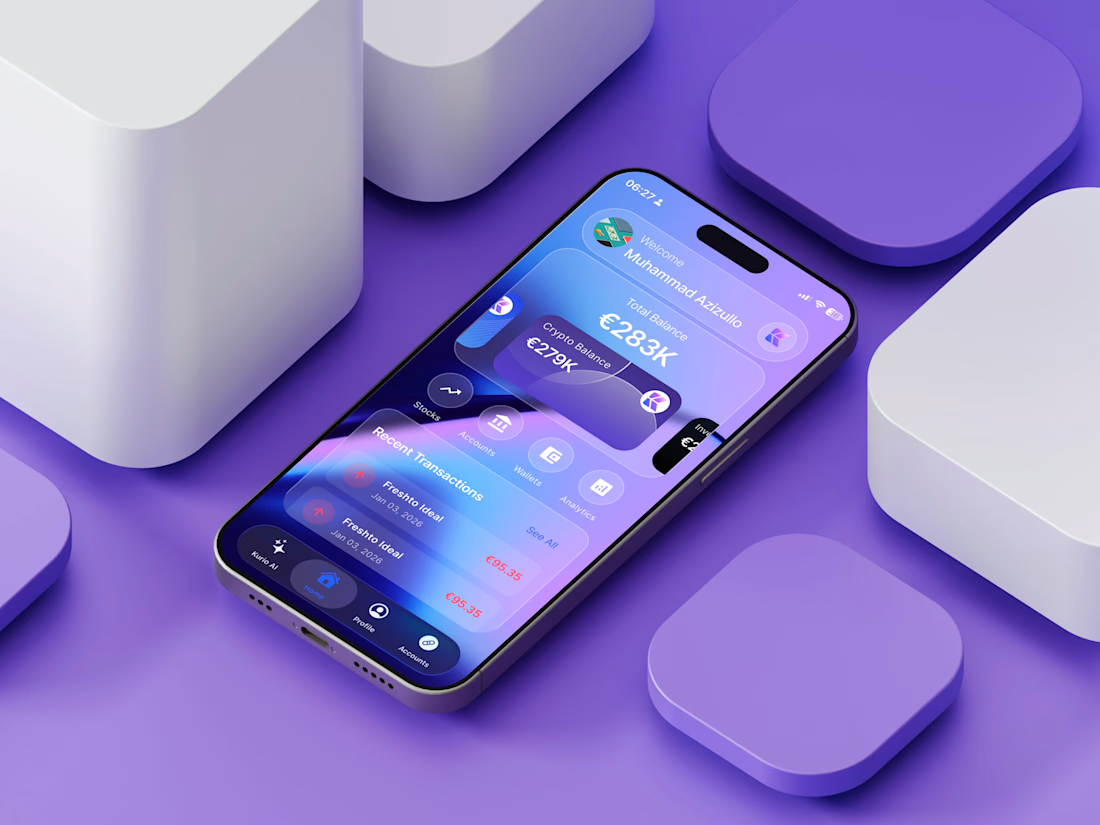
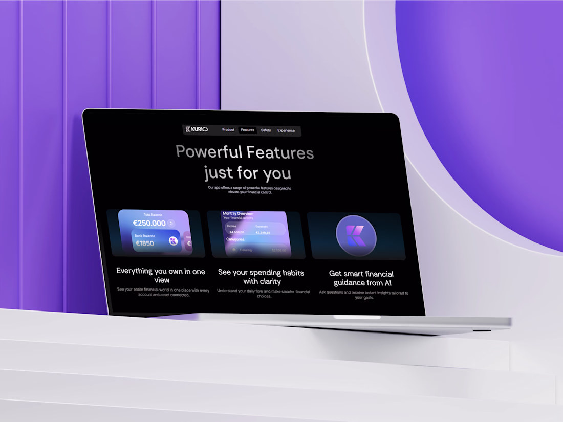
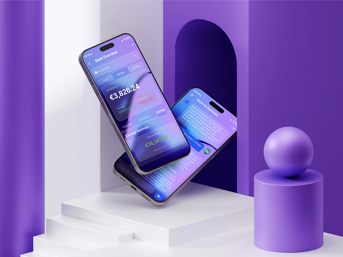
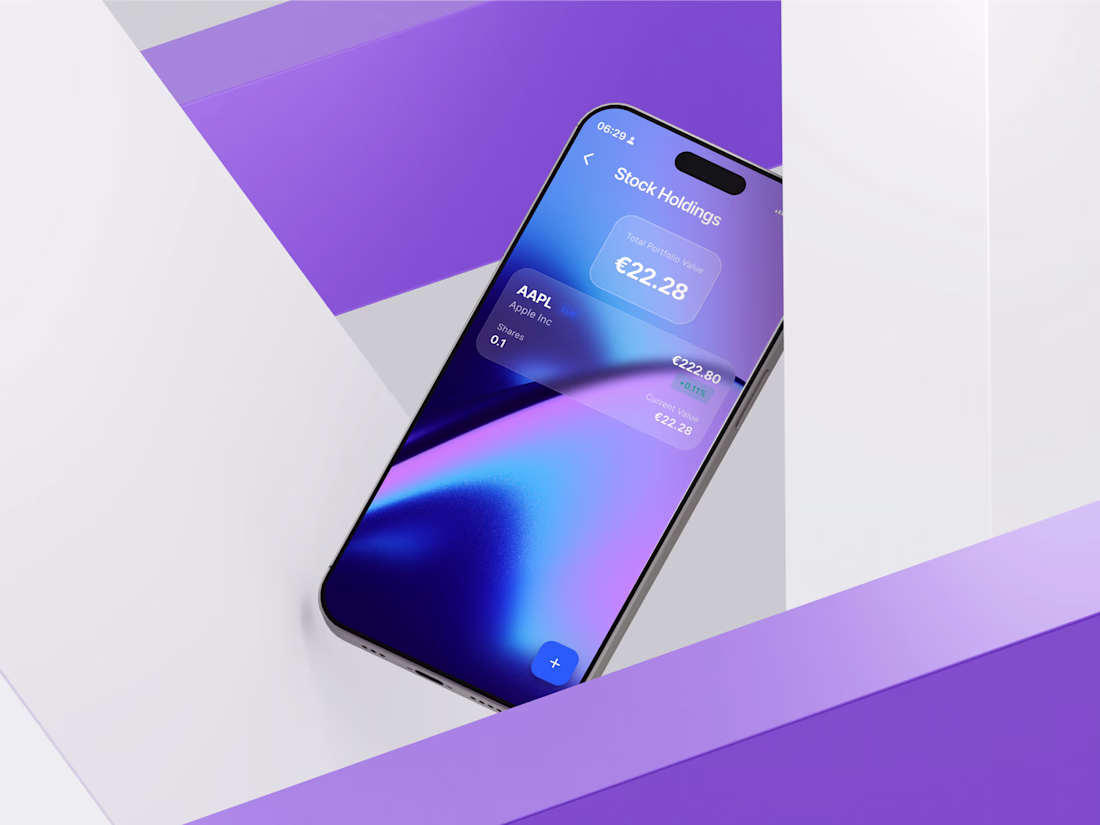
We recently finished working on Kurio.
This platform provides users with a complete view of their financial health. A single dashboard brings everything together so you always know exactly what you have.
Key features to help manage money:
🏦 Link active bank accounts
📈 Follow current stocks
🪙 Watch crypto investments
📊 Consult with the built-in AI assistant
Having accurate information enables people to act confidently.


Great!!


Trending


Notion
Notion isn’t just where you work, it’s starting to work for you. What agents are you building?
portfolioreview
The best portfolios tell a story, not just show a grid. Share yours for feedback.
brandguidelines
Brand guidelines are becoming living systems, not static documents. What are you building for your clients?
aivideo
AI video tools are moving at warp speed. Which ones are you experimenting with?
freelancerlife
Freelancer life is wins, pivots, and everything in between. What’s yours right now?