The network for creativity
Join 1.25M professional creatives like you
Connect with clients, get discovered, and run your business 100% commission-free
Creatives on Contra have earned over $150M and we are just getting started
Back to feedPost

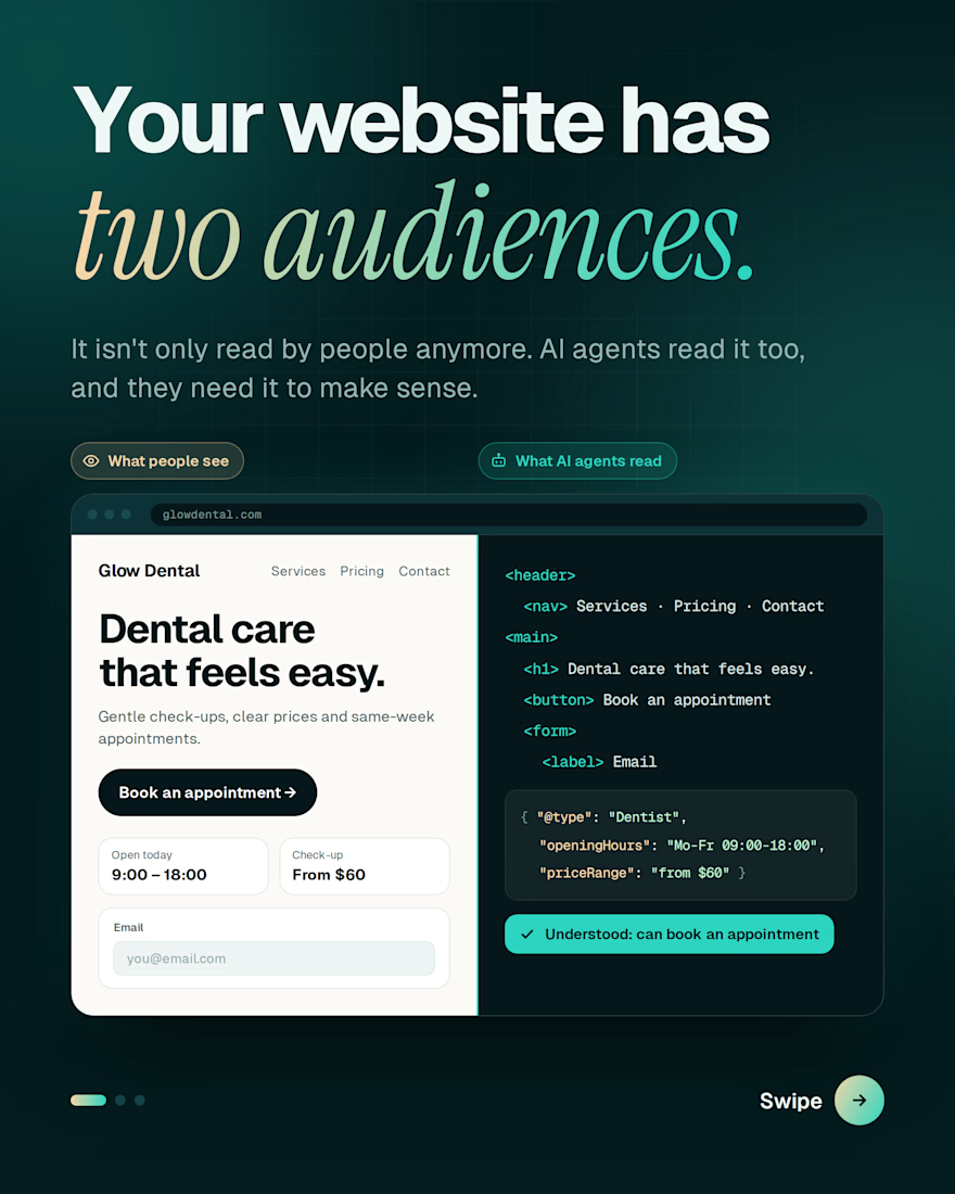
Your website isn't only being read by people anymore. AI agents are reading it too.
When someone asks an AI assistant to find a dentist, compare prices or book an appointment, that assistant visits websites and tries to make sense of them. It doesn't see your design. It reads your structure.
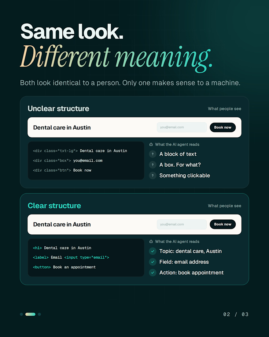
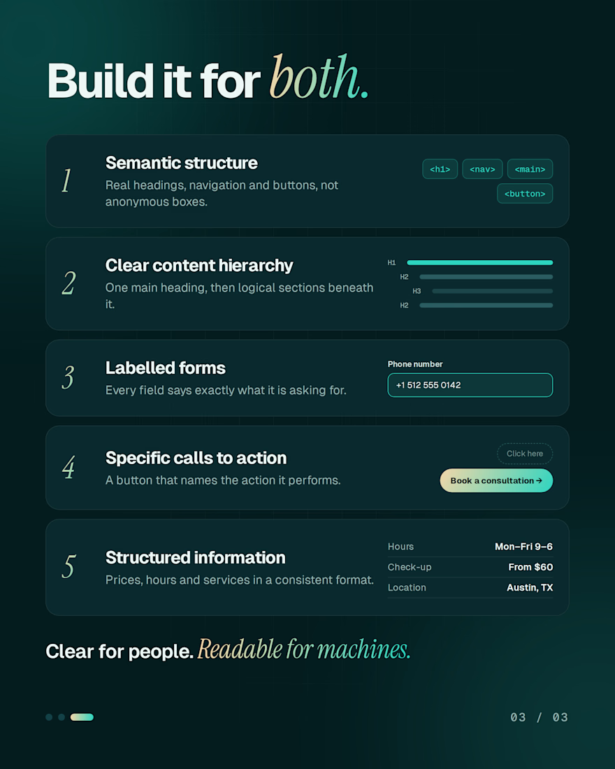
A page can look perfect to a person and still be a puzzle to a machine. What makes the difference:
→ Real headings, navigation and buttons
→ One clear content hierarchy
→ Form fields with proper labels
→ Buttons that name the action
→ Prices, hours and services in a consistent format
Build for both audiences and your site stays clear for people and readable for machines.
Is your website ready for both?


Buttons that name the action is the one most sites still get wrong. Clean split in the carousel too.
100%. Clear buttons help humans know what to do and give AI better context about the intent of the page. It’s one of those small UX details that gets overlooked way too often.
The network for creativity
Join 1.25M professional creatives like you
Connect with clients, get discovered, and run your business 100% commission-free
Creatives on Contra have earned over $150M and we are just getting started











Related posts


Three weeks into building the Pasted website, after the design was approved, an 11-page document arrived with a whole new vision.
It was beautiful work, and it described a different project at the agreed price.
I asked them to decide: keep the approved scope, or pause and price the new idea separately. On day six, they chose the original. We shipped two weeks later.


Offering to price the new vision as its own phase also lets the client see what the idea costs without it feeling like a no. Was a change-order process already written into your contract, or did you build that path on the spot?


This is the kind of work I want to do more of.
A strong visual direction and plenty of room to get creative with the development. Built in Webflow, animated with GSAP.
Here’s a look around.


Outstanding Work❤️

Designing a fragrance website with 2 sections that feels as premium as the product.
Built a fragrance experience where the product takes center stage.
I wanted the website to feel as refined as the fragrances themselves minimal layout, strong typography, immersive product visuals, and subtle interactions that make exploring each scent feel premium.
The goal wasn’t to fill the page with elements, but to give every product enough space to create its own presence.
Built with Next.js, with a focus on responsive design, smooth interactions, and a polished browsing experience.


The product imagery is doing most of the work here. Did you use art-directed mobile crops, or keep one image with a different object position? That can preserve label detail without loading the full desktop asset.