The network for creativity
Join 1.25M professional creatives like you
Connect with clients, get discovered, and run your business 100% commission-free
Creatives on Contra have earned over $150M and we are just getting started
Back to feedPost


Where does your data go when you use AI tools? I checked my own meeting notetaker this morning. The answers were reassuring, and they took an hour to find, because they were spread across a privacy policy, a DPA and a help center.
Today's tarot card is The Fool: stepping off a cliff edge, eyes on the sky. That was me with the notetaker. Clicked accept, never looked down.
So I turned the method into a free guide: how to check any AI tool your team uses, with the settings and links for eight vendors and a printable worksheet.
https://contra.com/products/l3NYerft-where-does-your-data-go
If you're planning an AI project for a client, check before the first byte of real data goes in.

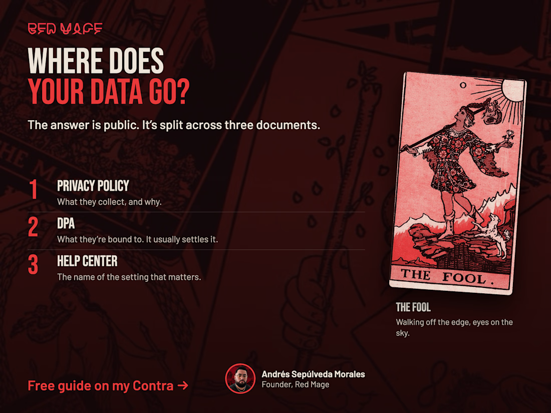

Taking an hour to find the answer across three documents makes the case for the guide. I'd put each vendor's retention period and deletion path on one page, so a team can check both before the first upload.
The network for creativity
Join 1.25M professional creatives like you
Connect with clients, get discovered, and run your business 100% commission-free
Creatives on Contra have earned over $150M and we are just getting started

Challenges
View all


Related posts

How much does it cost to be a designer? Part 2: the hardware edition 💻
After sharing my yearly software costs, here's what my actual setup cost me:
💻 MacBook Pro — $2,000
🖥️ Monitor stand + drawer — $46
💻 Vertical laptop stand — $40
🪑 Desk chair — $349
🖱️ Magic Mouse — $80
🪵 Desk — $0
The desk is actually an old wooden table my family used for Sunday asados. We refurbished it and gave it a second life as my desk.
The drawers? Found on the street. My mom handled the carpenter part, so I'm counting that as $0. 😂
Total ~$2,515 + $843 from essential software cost → $3,358
Turns out my most expensive piece of equipment is also sitting on the most sentimental one.
What's the weirdest or most valuable thing in your setup?

No external monitor? I would add another 450$ for that . And another 100$ for a headset

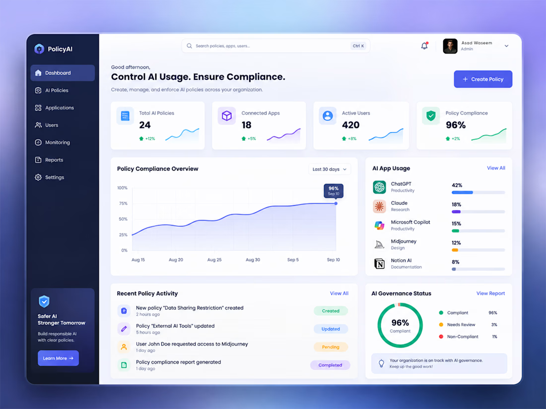
AI Governance Dashboard | Control AI Usage. Ensure Compliance.
AI is becoming part of every organization, but managing how teams use AI tools is becoming a serious challenge.
I designed this AI Governance Dashboard to bring policy management, compliance monitoring, AI application usage, user activity, and governance analytics into one centralized platform.
The goal was to keep a complex enterprise product simple, clear, and actionable through:
• AI Policy Management
• Compliance Monitoring
• AI App Usage Analytics
• User & Access Management
• Governance Status
• Policy Activity
• Compliance Reporting
The interface uses a clean SaaS design system with clear hierarchy, data visualization, subtle gradients, and focused interactions.
Designed in Figma.
If you're building an AI SaaS, enterprise dashboard, or web application, feel free to connect or message me.


Working on a hero section for GenZz, a bold Gen Z eyewear and fashion brand. Testing two color directions for the landing page and honestly torn between them.
Version 2 has a mint to teal gradient background. Version 1 shifts it to a sky blue gradient. Same layout, same typography, same energy, just a different mood in the backdrop.
Which one pulls you in more and why. Curious if the mint feels more playful and on brand for Gen Z, or if the blue reads cleaner and more premium.
Would love your honest take before I lock this in with the client.
10 voted
59%

7 voted
41%

17 votes
Closed


cool, dmytro stands out. how long did this take?