The network for creativity
Join 1.25M professional creatives like you
Connect with clients, get discovered, and run your business 100% commission-free
Creatives on Contra have earned over $150M and we are just getting started
Back to feedPost
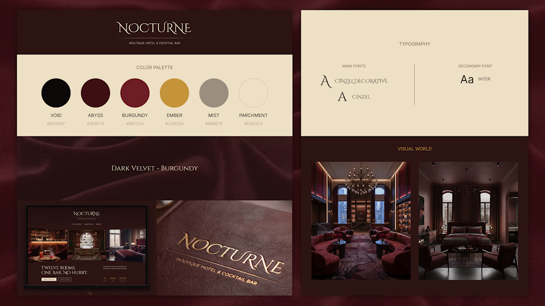
Not every project needs a client. Nocturne started as a question: what would a dark luxury hotel website actually feel like to build? Brand direction below and Framer template coming soon.
Tool stack: Claude for copy, Figma for design, Nano Banana for visual generation, Weave for mockups.




Luxery 💯

Lovely concept


Nice 👍

This deserves more than just a like

This is incredible

Not every project needs a client, but every designer needs a client for sure ahahah

Haha true, but sometimes, working on a personal project can really take away the stress from working with clients.
The network for creativity
Join 1.25M professional creatives like you
Connect with clients, get discovered, and run your business 100% commission-free
Creatives on Contra have earned over $150M and we are just getting started





Related posts

My 3rd Framer template, SKI8, is live on @Framer
I kept landing on ski school websites with jaw-dropping mountains up top, then buried prices, tiny buttons, and no way to book.
Your site is your first lesson. If it feels clunky, people assume the instruction will be too.
So lead with one bold hero, show your courses clearly, and make booking a single tap.
That's exactly what SKI8 does: bold, snow-inspired, fully responsive, no code needed. Built for ski schools, clubs, camps, and instructors.
Grab it free on Framer 👇

Congrats buddy

Next intelligence. A brand you can feel.
Ice blue, deep black and refracted glass bring texture, depth and a sense of touch to an invisible technology. An identity designed to be recognised. And felt.
Brand identity and visual direction for Niwos, a platform that brings AI agents together as a digital workforce.
Five modules. One W. A simple idea at the heart of the identity: working as one.
I’ve really enjoyed working on this project with Muhammed. His trust in my design judgement and openness to new ideas gave me the creative freedom to explore fully.
Here’s hoping this is just the first chapter of an exciting journey with him and his team.


👍 nicely done

Winder is a bold brand identity built around a geometric W-inspired symbol, combining sharp angles and forward movement to represent progress, speed, and direction.
The identity uses a striking red and deep burgundy palette, supported by clean typography and a consistent visual system across brand guidelines, digital applications, and product mockups.
Progress in Motion.


Great logo it feels it really has an identity 🎉🎉