The network for creativity
Join 1.25M professional creatives like you
Connect with clients, get discovered, and run your business 100% commission-free
Creatives on Contra have earned over $150M and we are just getting started
Back to feedPost
Taste Test

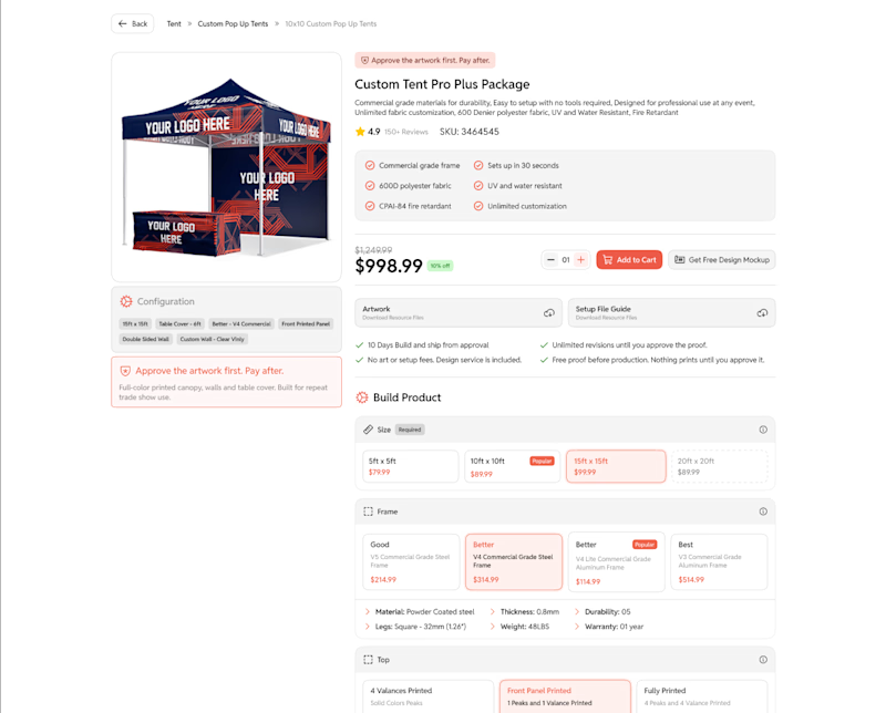
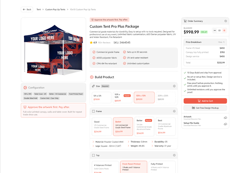
Which approach works better?
I’ve been working on a Product Detail Page (PDP) for an e-commerce platform. The product is highly customizable, but the flow still needs to feel linear and guided, with a few additional features built in.
The main focus is on UX over pure UI specifically how well we can funnel users through the flow and make the experience as smooth as possible.
Note: The higher information density is intentional. The target audience is enterprise/organizational buyers who need detailed specifications, not typical individual consumers.
Open to all kinds of feedback.

1 voted
50%
1 voted
50%
2 votes
Closed
The network for creativity
Join 1.25M professional creatives like you
Connect with clients, get discovered, and run your business 100% commission-free
Creatives on Contra have earned over $150M and we are just getting started





Related posts

Minimal vs Detailed - Which coin design feels more premium for a fintech brand?
9 voted
27%
24 voted
73%
33 votes
Closed

I like the premium gold version

Same prompt. Two builders.
One site made with Lovable, one with Google AI Studio. A Flemish still-life snack brand, gilt frames, GSAP scroll, the works.
Which one is better?
33 voted
67%

16 voted
33%

49 votes
Closed

A few things we’ve been working on this month.
Different industries, different problems, but the same goal: making complex products feel simple, clear, and trustworthy.
Fintech → Investment Banking → Geospatial AI
More projects are still in progress.
Full case studies coming soon.






This is the kind of work I enjoy seeing — simple, focused, and actually thought through.