The network for creativity
Join 1.25M professional creatives like you
Connect with clients, get discovered, and run your business 100% commission-free
Creatives on Contra have earned over $150M and we are just getting started
Back to feedPost
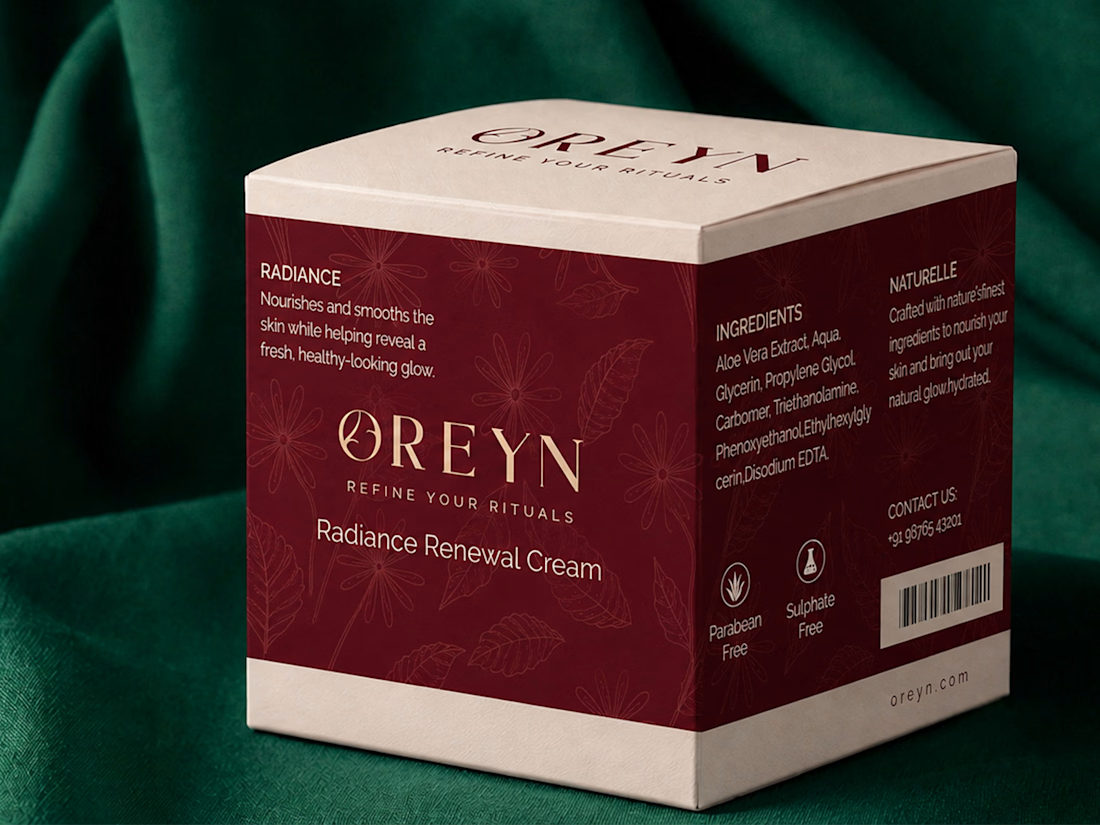
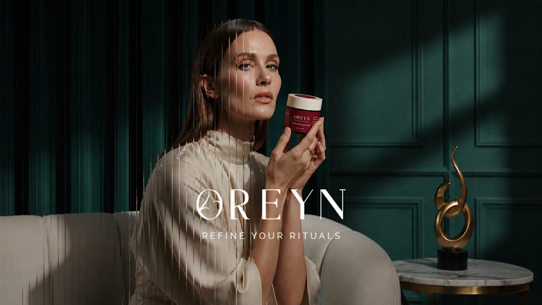
The goal with OREYN was to create a skincare brand that felt luxurious, calm, and refined without making it feel too cold or clinical.
During the moodboard phase, I kept coming back to rich burgundy tones, soft neutrals, botanical details, and elegant typography. That direction felt like the right balance between nature and sophistication.
From there, the visual identity started to take shape around one simple idea: making everyday skincare feel more intentional.
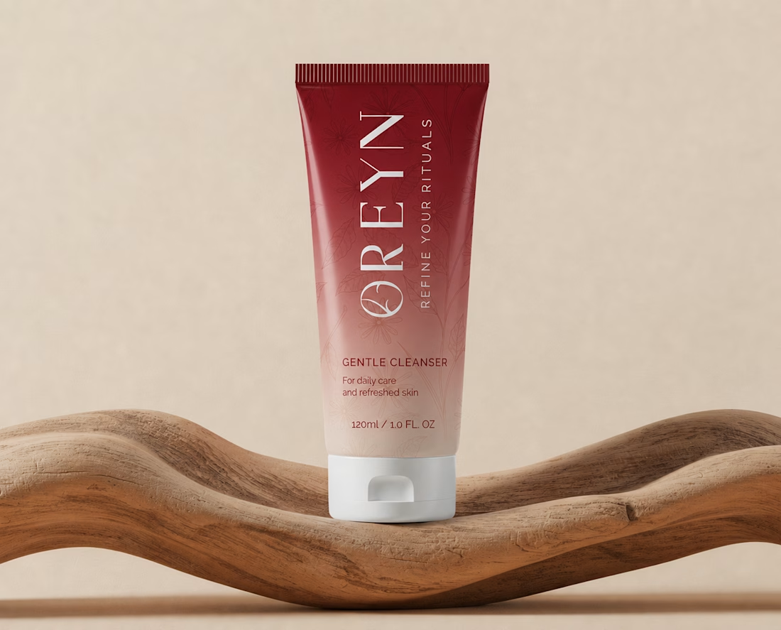
The botanical elements brought in a natural, softer side, while the serif typography and deeper tones helped give the brand a more elevated feel.
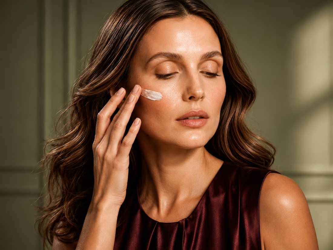
That mix became the foundation for the packaging, campaign visuals, and the overall look of OREYN.

Good 😊 work 💯

Thanks @Divya Raikwar
The network for creativity
Join 1.25M professional creatives like you
Connect with clients, get discovered, and run your business 100% commission-free
Creatives on Contra have earned over $150M and we are just getting started







Related posts

Amazing attention to detail! The gold foil effect looks so luxurious.

AMSW — Brand Art Direction & Visual Identity
A visual direction developed for AMSW, combining premium sportswear with a dark, minimal, and performance-driven aesthetic.
The concept focuses on discipline, intensity, and controlled energy, using cinematic photography, deep blacks, cool blue tones, bold negative space, and minimal typography to create a strong and recognizable visual language.
I developed the art direction across campaign imagery, brand compositions, typography, logo applications, and lifestyle visuals, with the goal of creating a premium identity that can translate across apparel, digital content, packaging, and future collections.
Role: Art Direction · Graphic Design · Brand Identity · Visual Direction · Campaign Design
Tools: Adobe Photoshop · Illustrator


Is this made with AI?

New case study: the landing page for REVAI, a concept AI sales platform.
The brief I gave myself was structural, not decorative: design a page where every section earns the next one. Hero makes one claim and gets out of the way. The value proposition comes before any feature gets named — because a feature nobody understands yet is just noise. Proof (testimonial, logos) sits right before the final ask, not scattered earlier where it does nothing.
Art direction followed the same logic — high contrast where the page needs to make a claim, quieter and more editorial where it needs to build trust. The layout isn't there to look good in isolation. It's there to move someone from "what is this" to "I trust this" in one scroll.

Love the colors dude! Hell of a work🔥