The network for creativity
Join 1.25M professional creatives like you
Connect with clients, get discovered, and run your business 100% commission-free
Creatives on Contra have earned over $150M and we are just getting started
Back to feedPost

A feature is only as valuable as a user's ability to understand what it does for them.
When designing product websites, it's easy to fall into the habit of presenting features as a collection of screenshots, icons, and descriptions.
But a good feature section should do more than tell users what a product can do. It should help them understand why those capabilities matter.
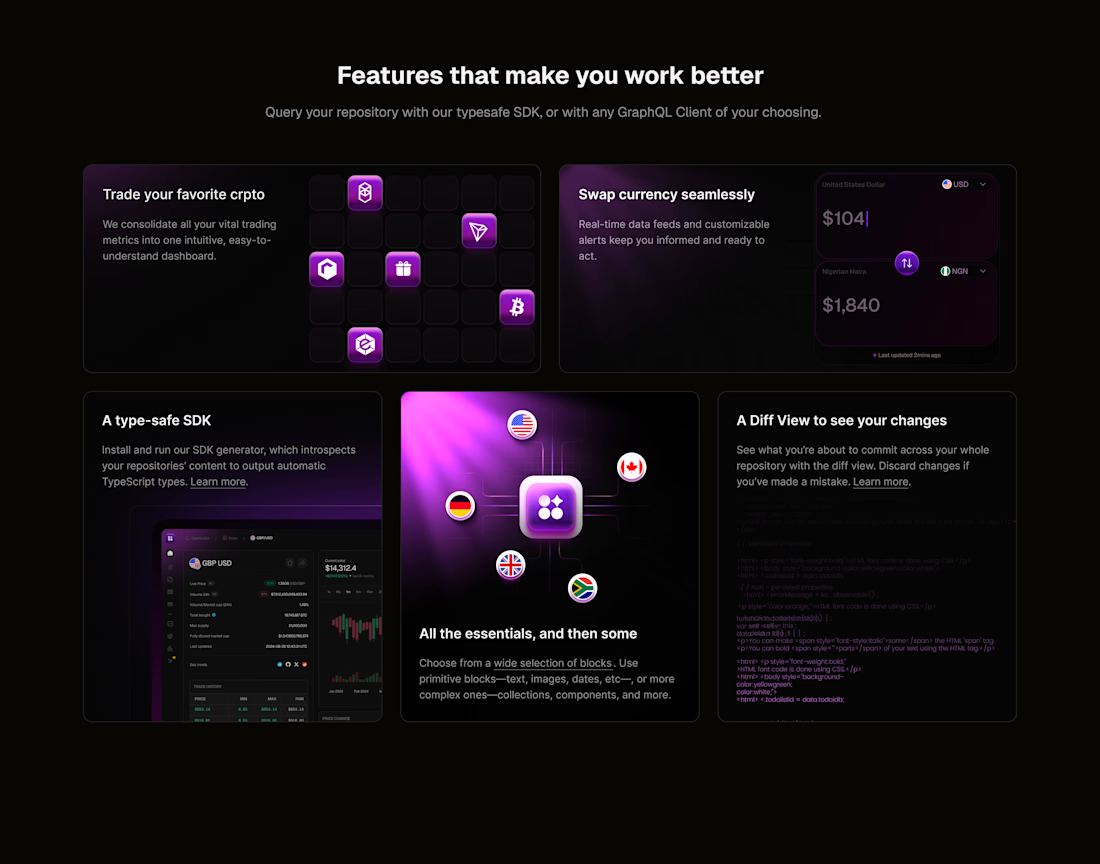
In this exploration for a fintech platform, I experimented with using different visual compositions to communicate different product capabilities.
Some features are better demonstrated through interface previews. Others benefit from illustrations, animations, or simplified visual representations of how they work.
The challenge is bringing these different approaches together without losing consistency across the experience.
That's where a shared design language becomes important. Typography, spacing, color, and component structure create cohesion, even when individual sections have different visual treatments.
Consistency doesn't mean everything has to look the same. It means everything should feel like it belongs together.
#ProductDesign #WebDesign #UIDesign #UXDesign #Fintech
The network for creativity
Join 1.25M professional creatives like you
Connect with clients, get discovered, and run your business 100% commission-free
Creatives on Contra have earned over $150M and we are just getting started

Challenges
View all


Related posts

My team in Monks is hiring! 👀
We’re looking for a Visual Product Designer exclusive in Buenos Aires 🇦🇷 with strong visual craft, a great eye for detail, and a concepting mindset.
You’ll work across digital products and experiences, collaborating with UX, Motion, Engineering, and Design Leads from early concepts through execution. Curiosity, strategic thinking, and an interest in AI and emerging technologies are a big plus.
If this sounds like you, check out the role and apply here: https://www.monks.com/careers/buenos-aires/5992058004/visual-product-designer


New Case 🙈
This time it’s BUDOVA — a next-gen real estate platform we designed from the product UX to the full brand identity and visual system.
Would love to hear what the Contra community thinks — what stands out to you most in this direction: Product Demo or Product Overview?


16 voted
41%
23 voted
59%
39 votes
Closed

PRO Design 😍


Your product is great.
Let’s make it look that way.
A short motion piece exploring how thoughtful animation can turn a product from something you simply see into something you experience.
From SaaS product demos to UI and website animation, Perspective Motion brings products to life.


the easing on the ui feels so smooth man, great work on this