The network for creativity
Join 1.25M professional creatives like you
Connect with clients, get discovered, and run your business 100% commission-free
Creatives on Contra have earned over $150M and we are just getting started
Back to feedPost


Stripping down the mind game behind Nike.
You think you chose it, but it's the opposite. It chooses you.
How does it ensure the buyers see Nike as the confident, modern “default” for athletic identity worldwide?
It is deeper psychology and the usage of neuroscience engraved behind every word, color, design, and choice.
Read full post


The network for creativity
Join 1.25M professional creatives like you
Connect with clients, get discovered, and run your business 100% commission-free
Creatives on Contra have earned over $150M and we are just getting started
Related posts

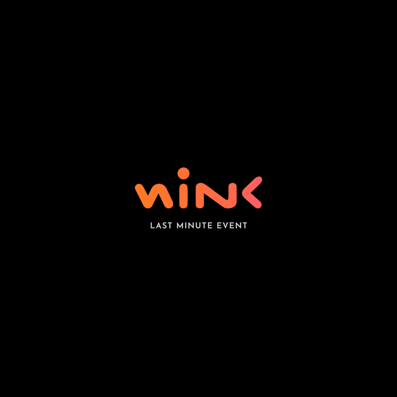
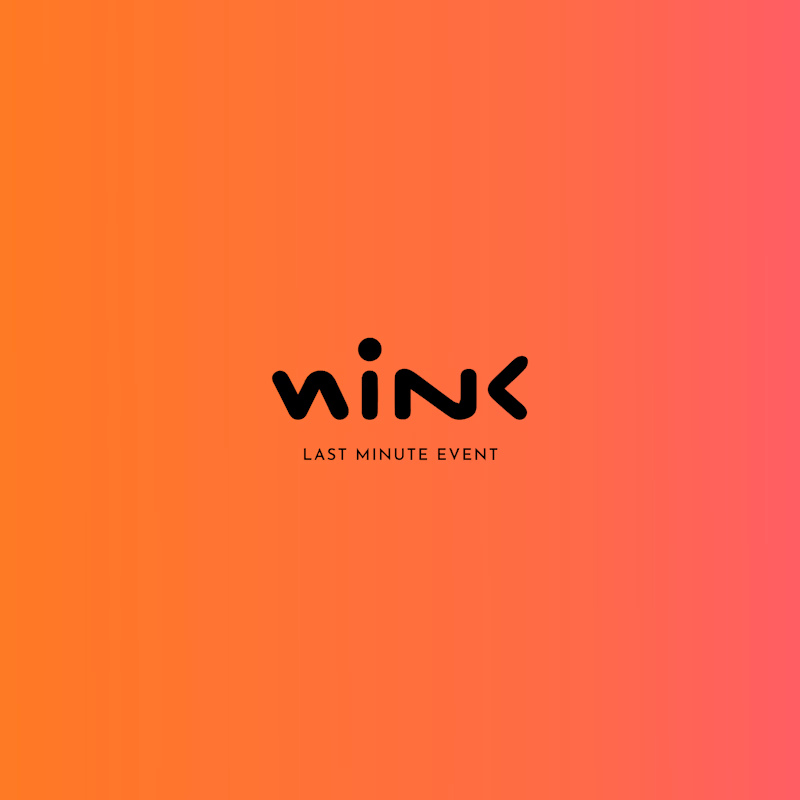
Two different colour directions, one brand identity. 🎨
Which version feels more impactful for this event brand?
🖤 Dark & Bold
🧡 Warm & Vibrant
What's your pick?
7 votes
Ends in 22h

Dark & Bold definitely takes the win for me. For an event brand, that high contrast gives off solid nightlife/exclusive vibes, and the coral accent pops really well against black.


stack is cool but linear is doing the job better :)

A logo can’t spend its whole life on a white background.
Eventually, it has to get dressed, carry a coffee and leave the shop.
A few Tindara applications on cups, bags and uniforms. I like this part of branding: seeing how the identity adapts to different shapes, sizes and materials, while still feeling like itself.