The network for creativity
Join 1.25M professional creatives like you
Connect with clients, get discovered, and run your business 100% commission-free
Creatives on Contra have earned over $150M and we are just getting started
Back to feedPost
Olera · Branding
We built Olera's identity around a single idea: science and nature as one force. The wordmark is set in a serif, a deliberate choice to bring sophistication and heritage into a category often dominated by cold, clinical sans-serifs. Its stroke varies in weight along each letter, thick to thin, echoing the organic, hand-grown nature of the açaí seed at the core of the brand. Deep in the Amazon, this is where the story starts, and where the palette, textures, and typography all point back to. Earthy greens, organic motion, and a mark that reads both clinical and rooted. Beauty as regeneration, not extraction.
Follow the story at instagram.com/oleraskincare

Nice work 🙌


Thanks a lot!
The network for creativity
Join 1.25M professional creatives like you
Connect with clients, get discovered, and run your business 100% commission-free
Creatives on Contra have earned over $150M and we are just getting started
Trending

Claude
Claude has entered the design space. How are you using it?

Contra University
Learn from expert creatives how to earn more using next-gen AI tools.
Brand Design
The best brand designers are on Contra. Scroll to see what's trending in brand design. What are you building?
creativeaiflow
Creative AI workflows are evolving. What tools do you use, and what are their strengths and weaknesses?
freelancerlife
Freelancer life is wins, pivots, and everything in between. What’s yours right now?






Related posts

Custom Brand Illustrations for Lucra
These are what make a brand system feel considered rather than assembled.

Is that a pool illustration I spy there? Very cool!

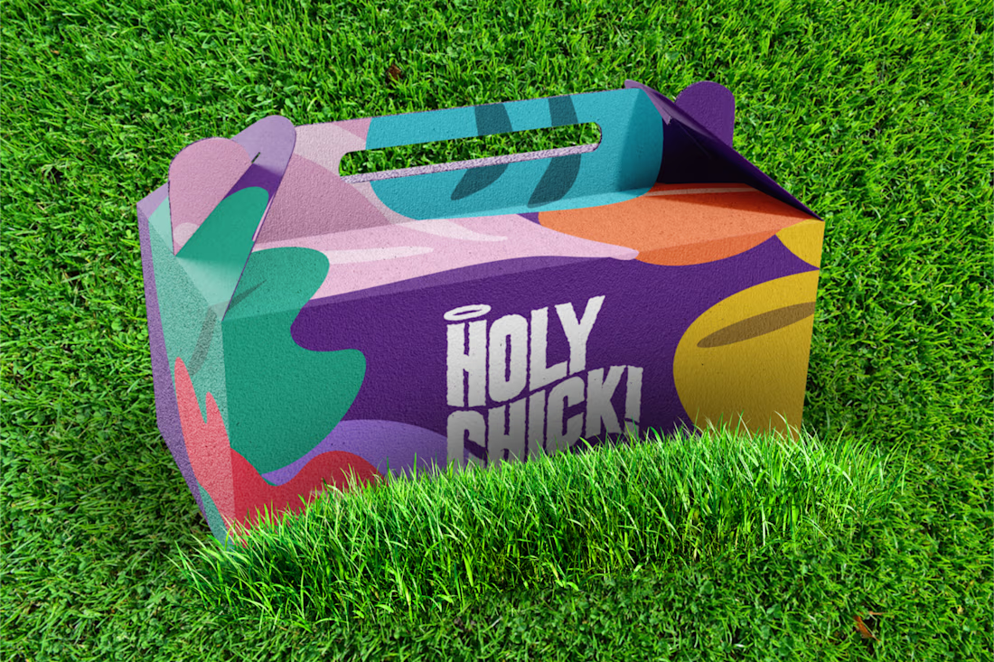
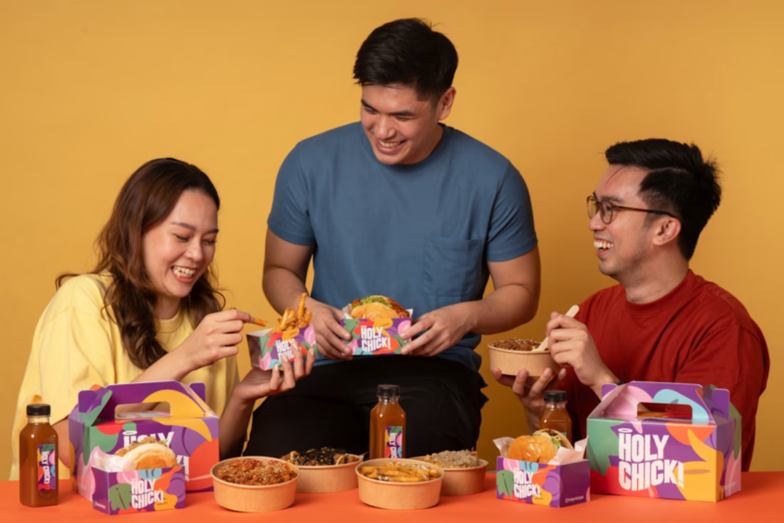
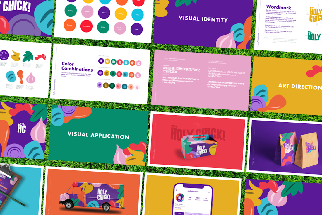
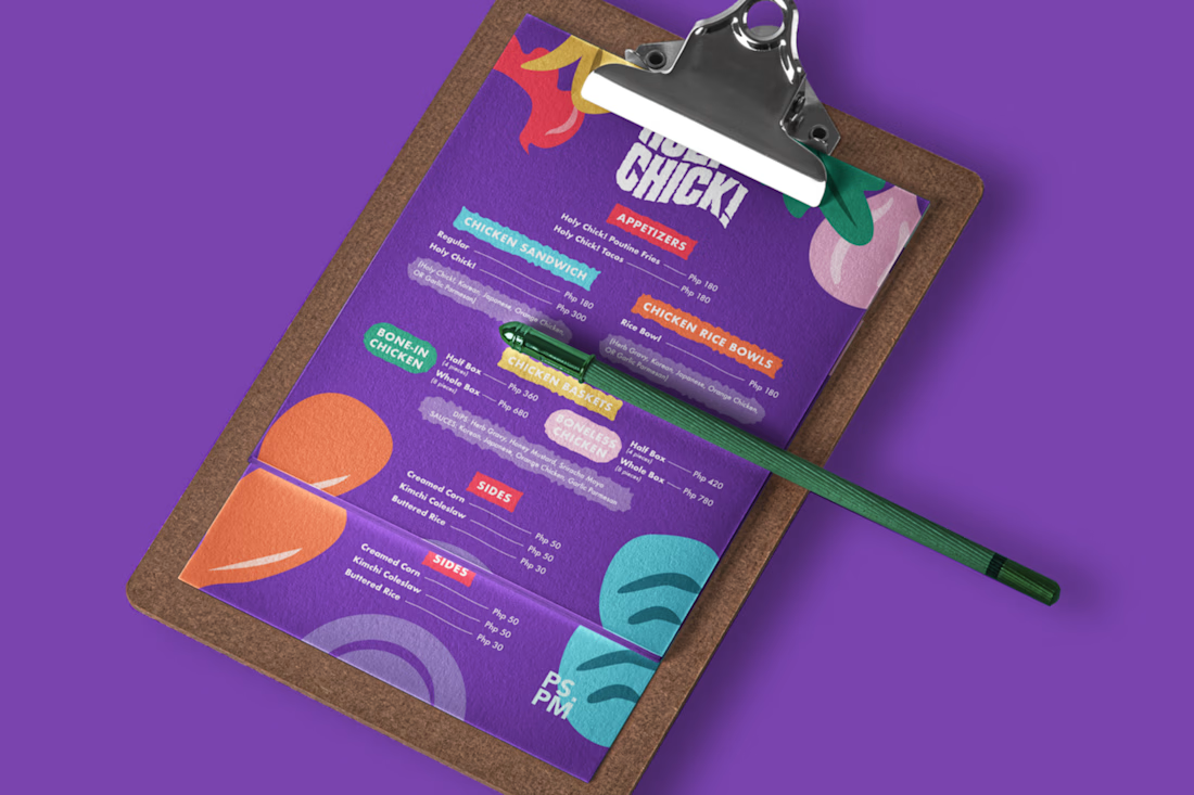
Holy Chick! is the brainchild of a foodie athlete who is on a mission to revolutionize the Filipino fried chicken experience. By bringing a combination of daring flavors and stunning visuals, complementing the same bold and creative tastes of Filipinos. They want to create a modern twist to an age-old food staple and bring it from conventional to contemporary.


Did the client come in already wanting that purple and green combo, or did that direction come from you pushing back on something more traditional? The packaging alone makes me want to try it and I don't even eat fried chicken that often.

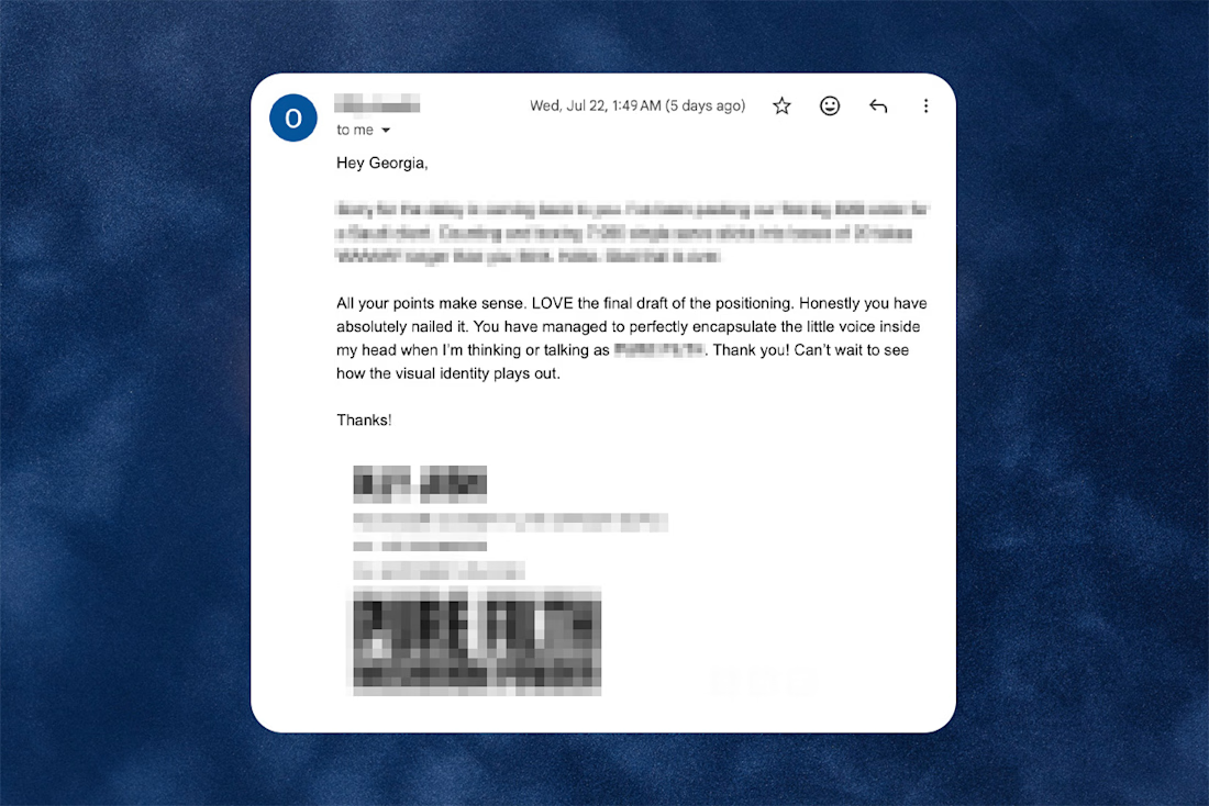
Words like this mid project are the best!! Having so much fun with this brand and I can't wait to share where we get to.


Best feeling ever! Good job Georgia.