The network for creativity
Join 1.25M professional creatives like you
Connect with clients, get discovered, and run your business 100% commission-free
Creatives on Contra have earned over $150M and we are just getting started

The network for creativity
Join 1.25M professional creatives like you
Connect with clients, get discovered, and run your business 100% commission-free
Creatives on Contra have earned over $150M and we are just getting started





Related posts

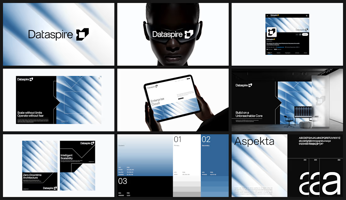


Those diagonal blue light streaks tie every touchpoint together, and pairing them with Aspekta keeps the whole thing crisp and calm

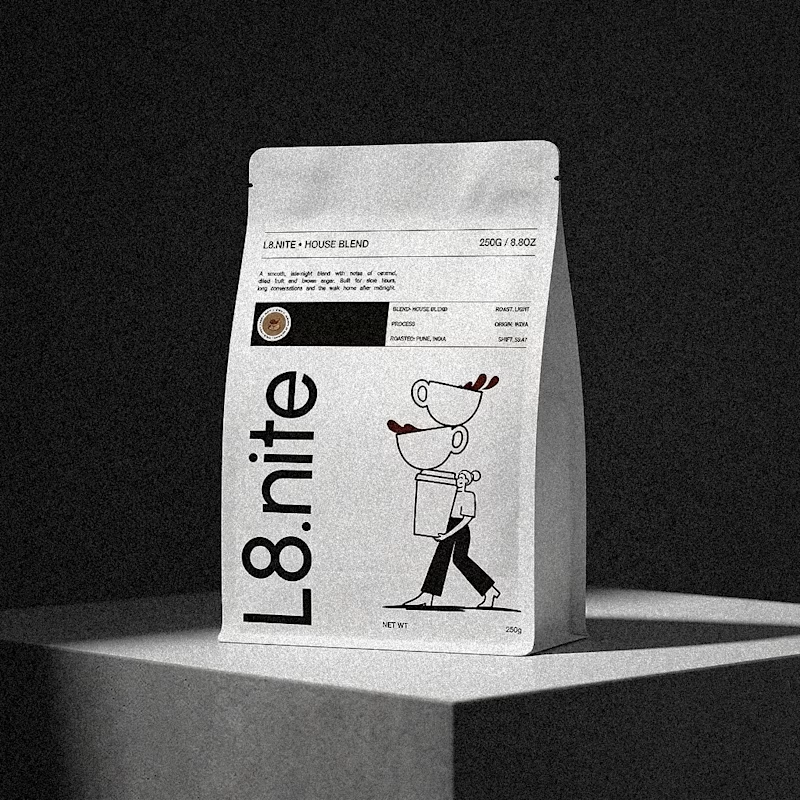
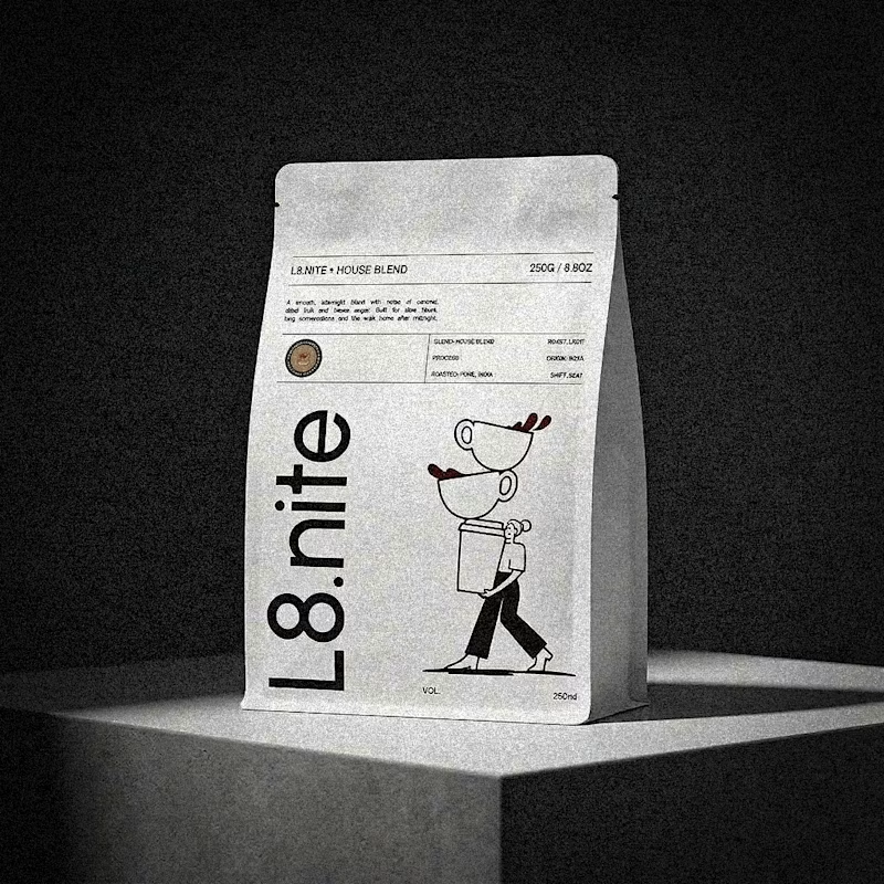
Nailing down the final grid for L8.nite coffee bags.
Left or Right?
Look closely at the central spacing and let me know which arrangement feels more balanced.
6 voted
33%
12 voted
67%
18 votes
Closed



Love to see the case study.