The network for creativity
Join 1.25M professional creatives like you
Connect with clients, get discovered, and run your business 100% commission-free
Creatives on Contra have earned over $150M and we are just getting started
Back to feedPost


Since opening my dedicated personal branding agency… I’ve decided on rebranding my main agency.
The network for creativity
Join 1.25M professional creatives like you
Connect with clients, get discovered, and run your business 100% commission-free
Creatives on Contra have earned over $150M and we are just getting started



Related posts

Sometimes one tiny detail is enough to build an entire brand identity.
Koto just redesigned Giffgaff, and my favourite part is how they've turned the final “f” in the logo into a small arrow.
That simple shape becomes the foundation of the whole visual system, appearing across the website, app, packaging, and marketing materials.
They've also introduced a bold acid-green palette, a custom typeface called Giffsans, and a more natural approach to photography.
What I like most is that the identity doesn't feel like a completely different brand. It's still recognizably Giffgaff, just more confident and expressive.
A good reminder that strong branding doesn't always require reinventing everything.

My favourite use is the arrow turning into the "Next" button in the app, so the logo literally becomes UI. I do something similar in presentation templates, where one shape from the logo ends up as the section divider.

Excited to start working with a new brand, Dragee! ✨
Looking forward to bringing fresh creative ideas, building the brand's digital presence and creating something amazing together.
New beginnings, new challenges and more creative opportunities! 🤝
Follow me on Contra for more updates! 🚀
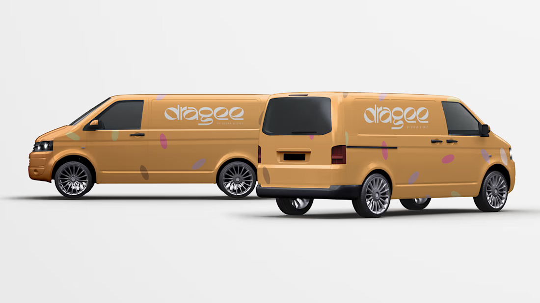
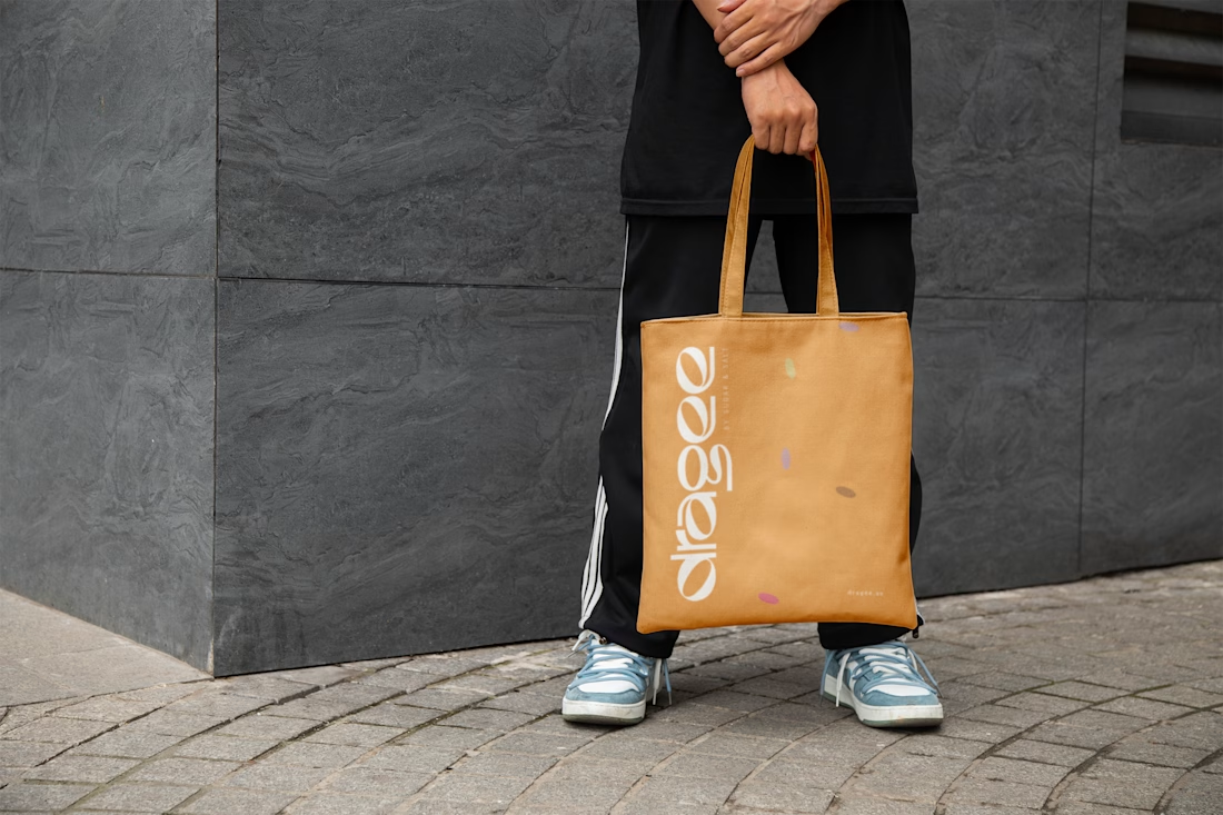
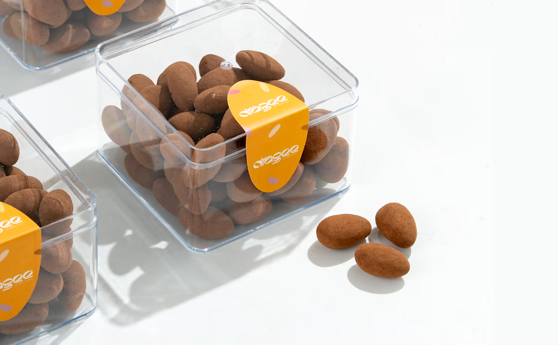
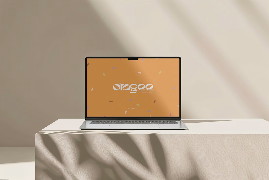

Great concept and a very strong visual direction.

I’m officially on Contra! 👋
I’m Sal a social media designer who builds cohesive, custom-designed feeds for brands. So far I’ve created posts for Margin, a skincare brand, and Sky’s Cafe, a coffee shop, and each one got its own look, voice, and personality.🙌
I’m here to take on more projects with clients who care about how their brand shows up online: style guides, Canva templates, custom posts, and content calendars that are realistic to keep up.
I’m new to the platform, so I’d love to connect with other freelancers and hear what’s worked for you. And if you’re looking for a designer to give your feed a point of view, my portfolio is here

Welcome on board!