The network for creativity
Join 1.25M professional creatives like you
Connect with clients, get discovered, and run your business 100% commission-free
Creatives on Contra have earned over $150M and we are just getting started
Back to feedPost

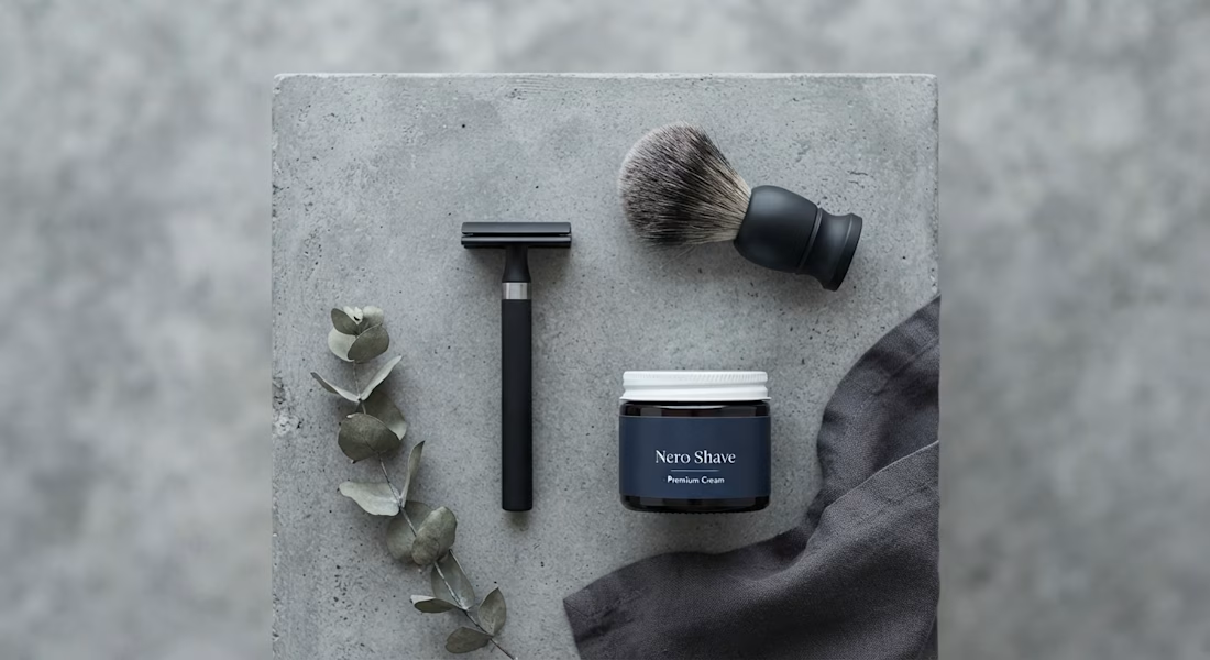
The goal was to establish a premium, minimalist brand identity for a new Direct-to-Consumer (DTC) shaving startup entering a crowded market. This flat lay is part of the foundational launch batch designed to communicate the minimalist and effective pillar. By adhering to a controlled color palette of steel, slate grey, matte black, I created a cohesive visual language.

Steel, slate and matte black avoids the usual chrome-and-blue shaving cliché and still reads as masculine. With a palette this restrained, what carries the brand's recognisability across the launch batch: the label typography, or the shape of the packaging?
The network for creativity
Join 1.25M professional creatives like you
Connect with clients, get discovered, and run your business 100% commission-free
Creatives on Contra have earned over $150M and we are just getting started






Related posts

Had some fun with this one.
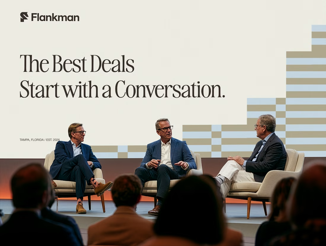
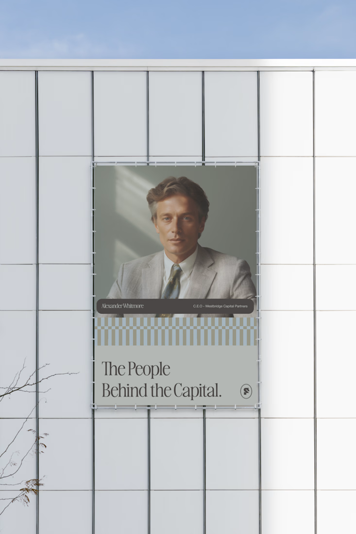
Exploring how typography, colour, and a few unexpected details can give a brand its own personality.
Meet Flankman. Full case study is live! ↓





clean


Love the direction! Feels clean and the product offering comes through nicely.


How far can you take a logo beyond the first draft?
I started with Recraft's Logo Maker and a fictional idea: Bibu's Paws, a cosy little dog rescue and adoption shelter.
I wanted the identity to feel warm, homely and full of character, so I explored a few logo directions before settling on the little dog tucked inside a house.
From there, I took the idea further, building out the visual identity with an earthy colour palette, typography, illustrations and a few real-world applications: the shelter space, dog merchandise and an adoption welcome kit.
I enjoyed seeing how a small starting point could grow into a brand with its own personality and world.
Now I'm curious: if you were building a brand around this logo, what would you create next?






It turned out so cozy, you did great


