The network for creativity
Join 1.25M professional creatives like you
Connect with clients, get discovered, and run your business 100% commission-free
Creatives on Contra have earned over $150M and we are just getting started
Back to feedPost

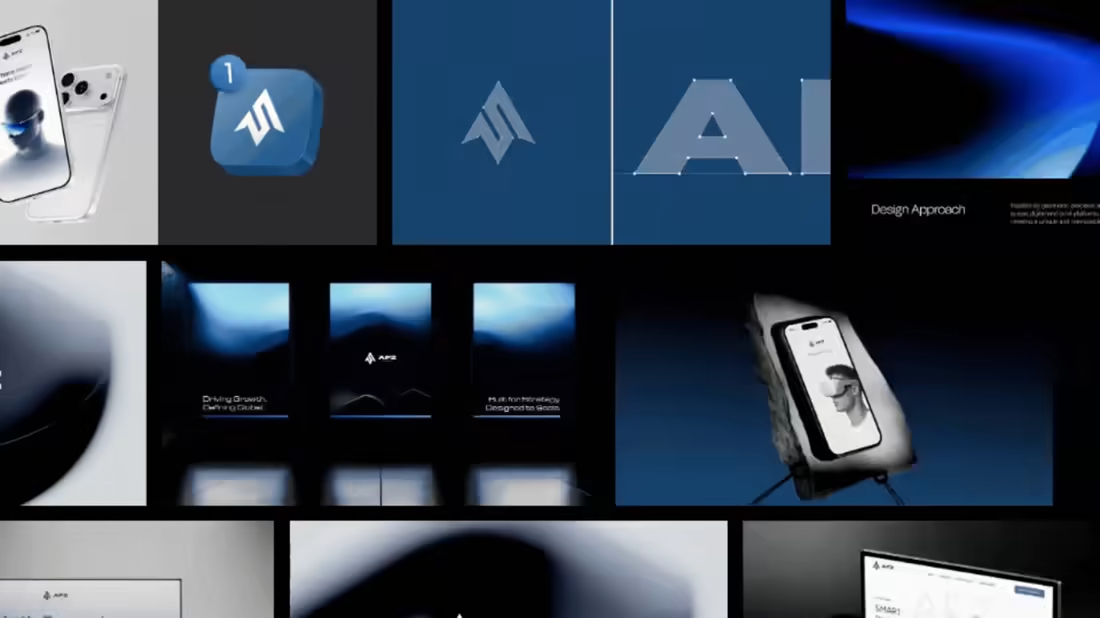
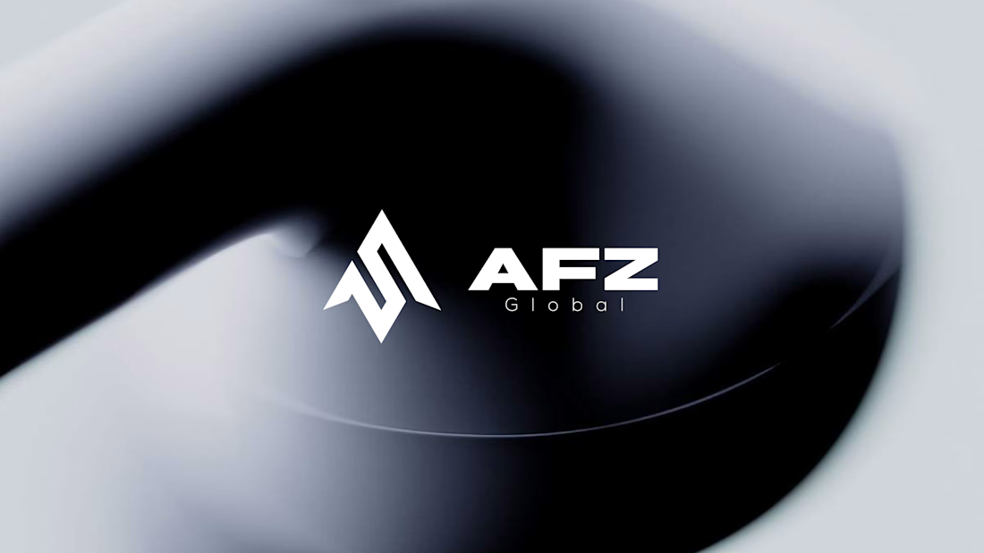
Hi Contra 👋 Here’s the first logo direction I presented for AFZ Global, a US-based tech services company.
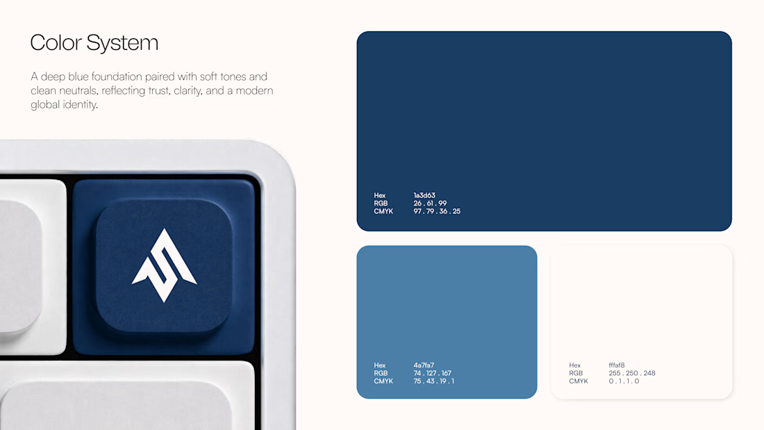
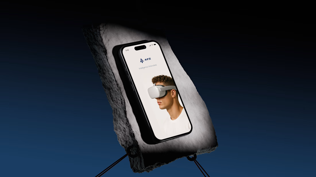
I built the geometric mark around the AFZ initials, using upward-moving forms to suggest progress and forward thinking. I paired it with a bold wordmark and a deep-blue visual identity designed to feel clear and confident across digital applications.
The project is complete now, but I’d love your first impression: if this concept landed in your inbox, would you approve it or ask to see another direction? What would you change?

Looking Good.
The network for creativity
Join 1.25M professional creatives like you
Connect with clients, get discovered, and run your business 100% commission-free
Creatives on Contra have earned over $150M and we are just getting started




Related posts
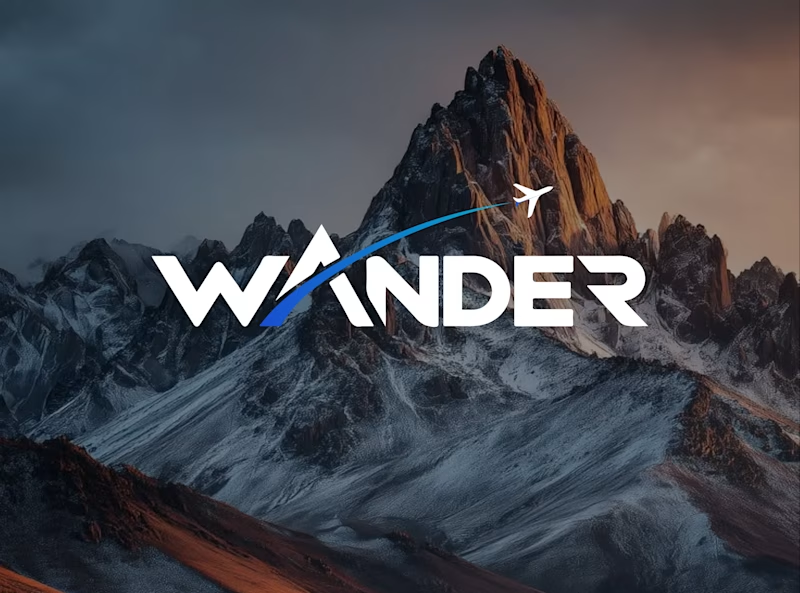
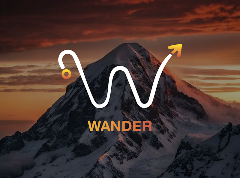
Which WANDER logo would you choose?
A travel brand doesn’t just need a logo —
it needs a visual identity that makes you want to explore.
So I explored 2 different directions for the same brand
Bold & Minimal
Vote in the poll.
And Tell me what made you choose it in the comments.
#LogoDesign #BrandIdentity #GraphicDesign #LogoInspiration #VisualIdentity

11 voted
92%
1 voted
8%
12 votes
Closed

Minimal for me. The W drawn as a winding mountain path is doing double duty, letterform and route in one, exactly what a travel brand wants. Bold is clean but the swoosh W tells a little story before you read a single word.

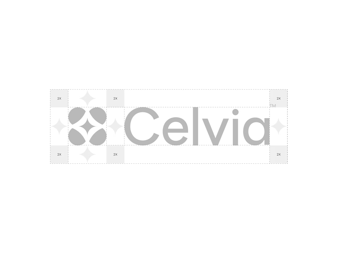
A closer look at the Celvia logo system.
Exploring the construction, spacing, proportions, and how the identity adapts across different brand applications.
Celvia is a skincare brand built around the intersection of biotechnology and nature, so the goal was to create an identity that feels scientific, clean, modern, and approachable.

Beautiful! So clean

Which Virtual Reality Vector Logo You Guys Like Most?
These 100% Handmade Vector Logos Are Also Available For Purchase With Exclusive Copyrights Transfer Ownership, Feel Free To Contact Us.
7 voted
70%
3 voted
30%
10 votes
Closed