The network for creativity
Join 1.25M professional creatives like you
Connect with clients, get discovered, and run your business 100% commission-free
Creatives on Contra have earned over $150M and we are just getting started
Back to feedPost

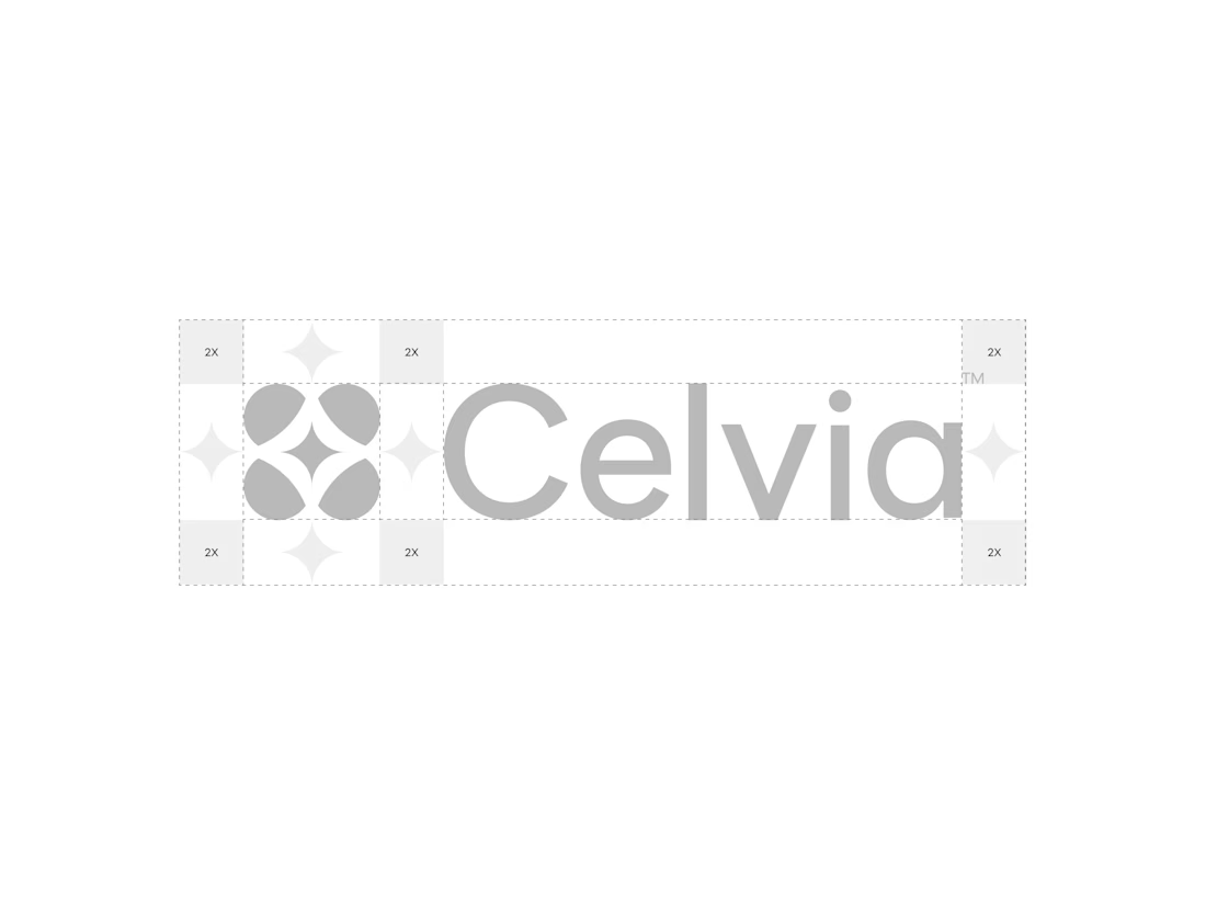
A closer look at the Celvia logo system.
Exploring the construction, spacing, proportions, and how the identity adapts across different brand applications.
Celvia is a skincare brand built around the intersection of biotechnology and nature, so the goal was to create an identity that feels scientific, clean, modern, and approachable.

Beautiful! So clean
The network for creativity
Join 1.25M professional creatives like you
Connect with clients, get discovered, and run your business 100% commission-free
Creatives on Contra have earned over $150M and we are just getting started

Challenges
View all


Related posts

Brand Expressions for Munch


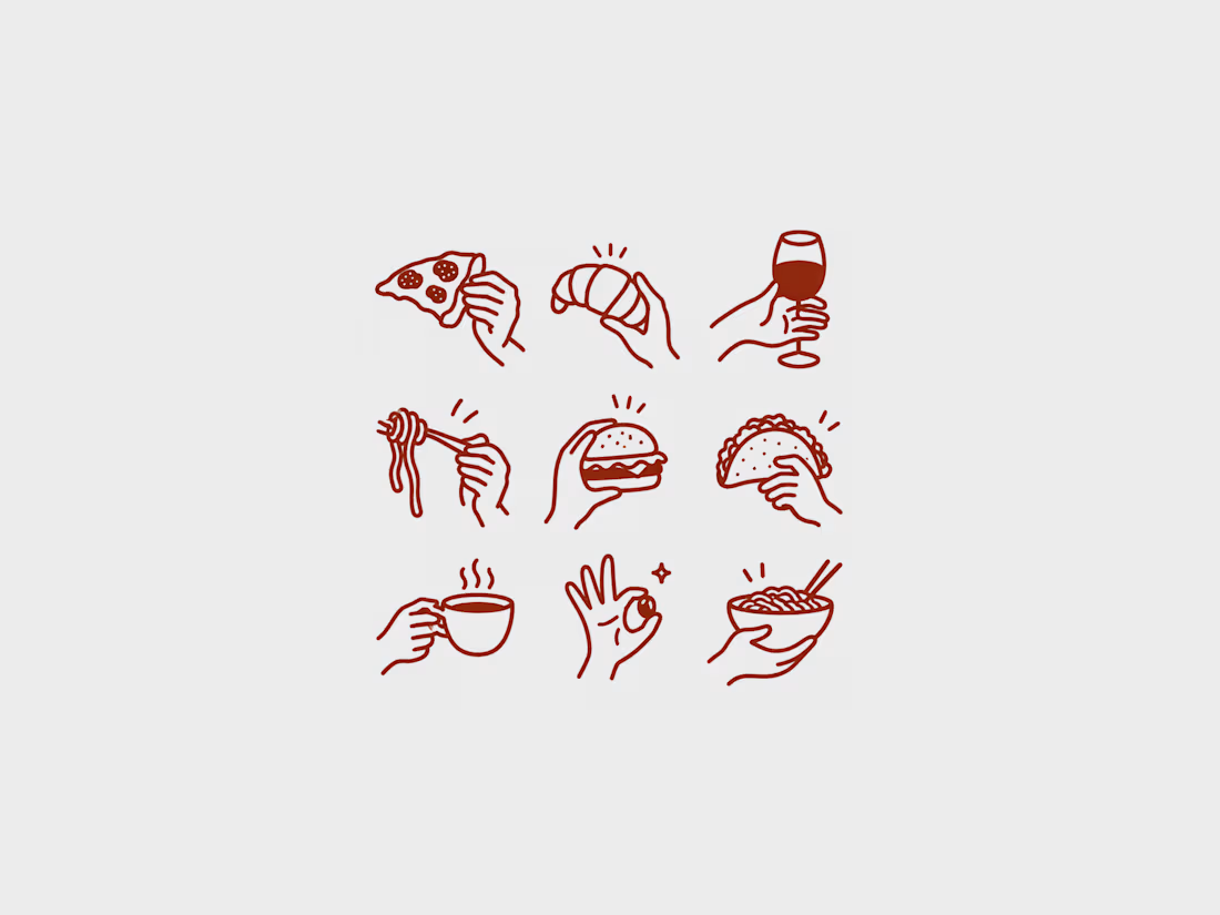
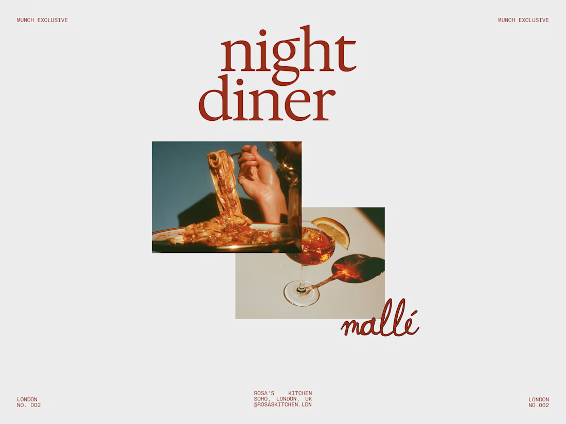
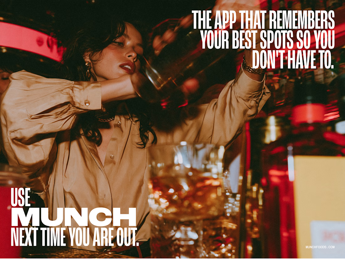
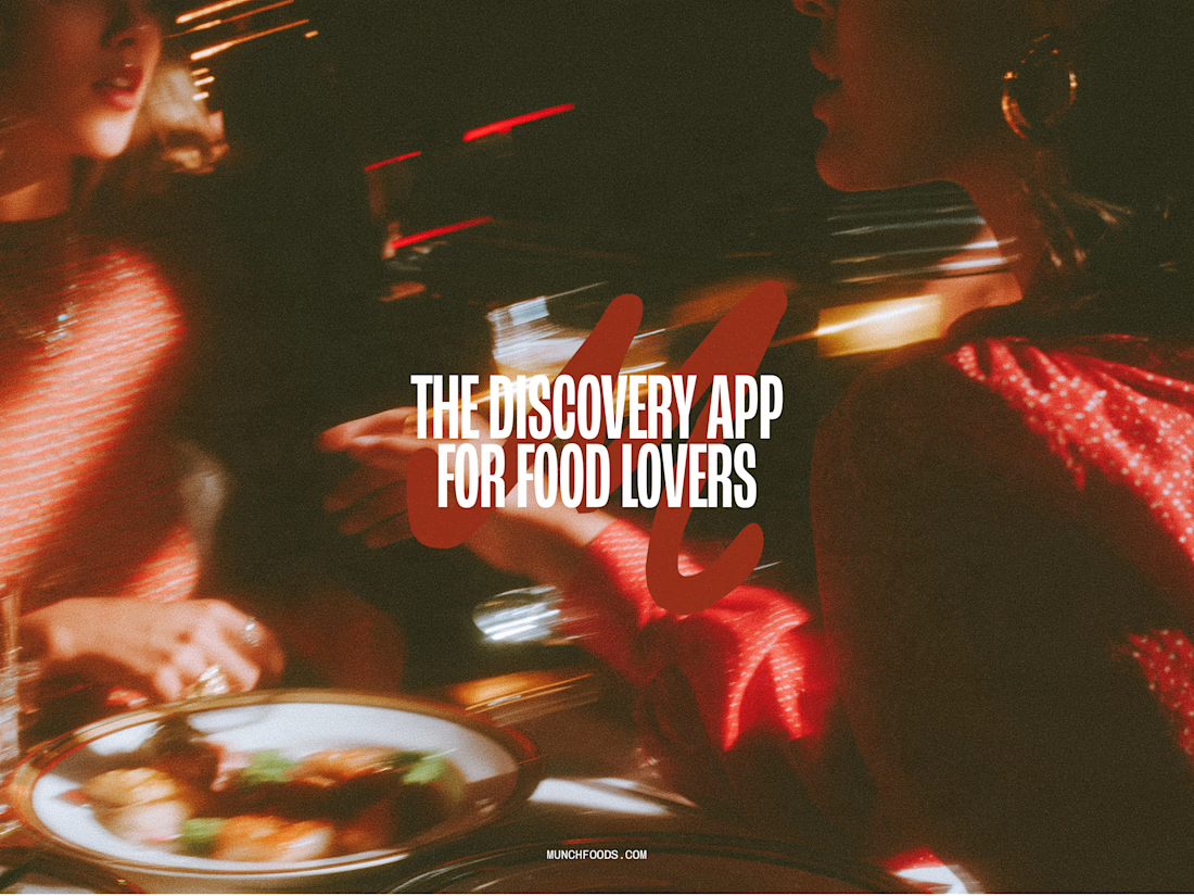

The hand-drawn gesture icons paired with that retro diner script give it real personality, feels less like a generic food app and more like something with a point of view.

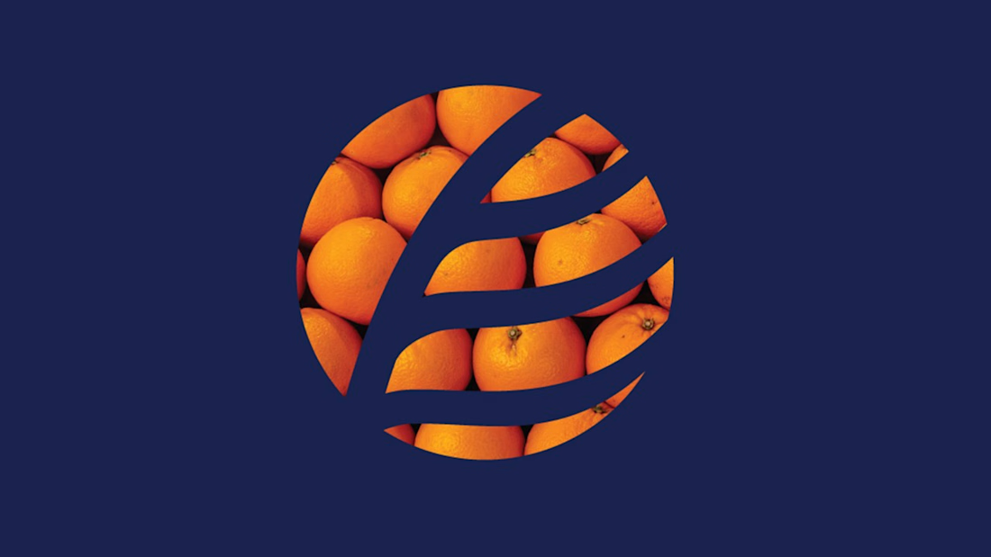
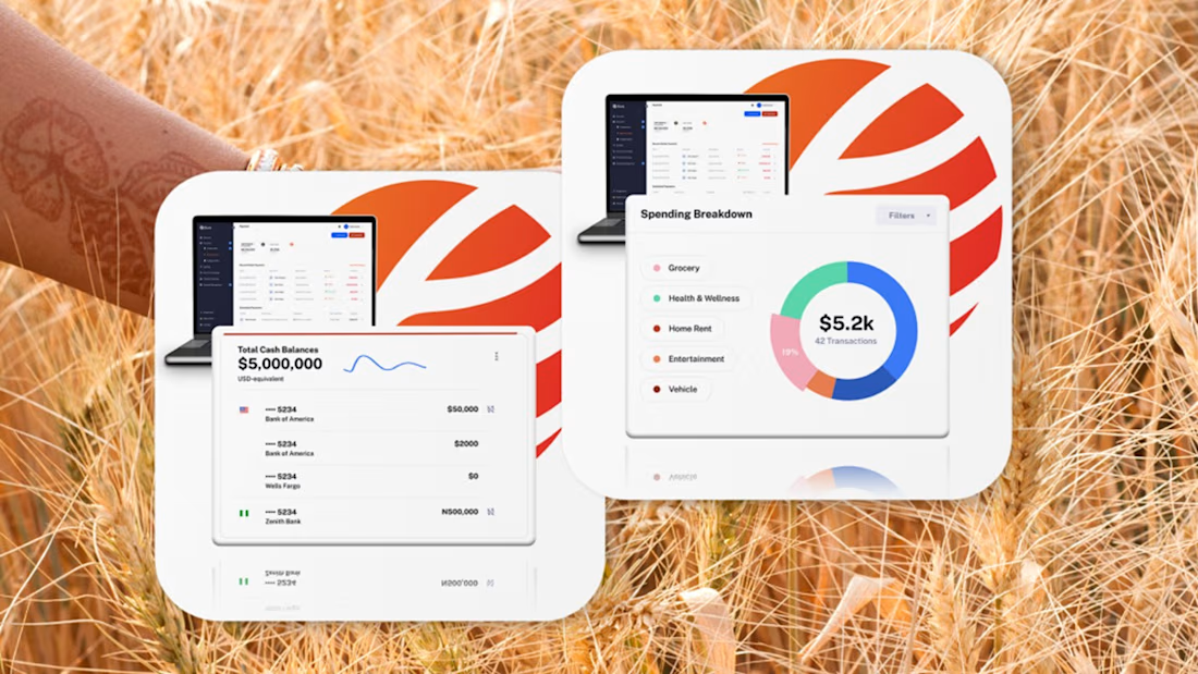
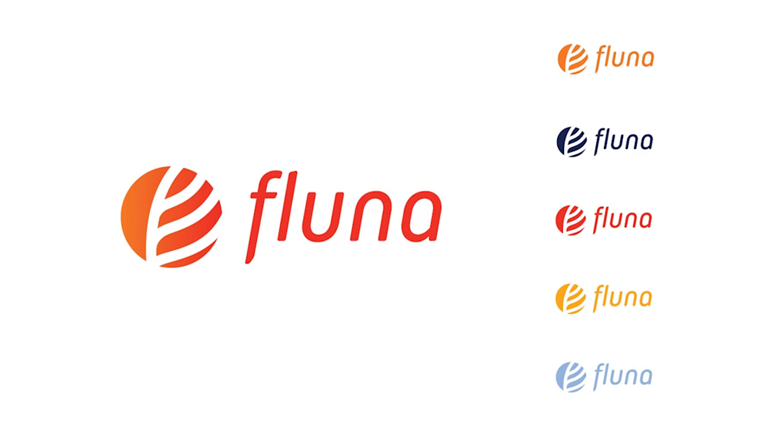
Fintech for agriculture doesn’t have to look earthy, heavy or industrial.
With Fluna, the goal was to create something more premium, distinctive and forward-looking, while still feeling relevant to the market it serves.
What I value most about this project is its longevity. I created this identity four years ago, and the client is still using the logo and visual system today.
For me, good taste in branding is not about following a visual trend. It’s about making choices that still feel right years later, and building a system strong enough to evolve with the company.
#BrandIdentity #BrandDesign #CreativeDirection #FintechBranding


Great work 👍

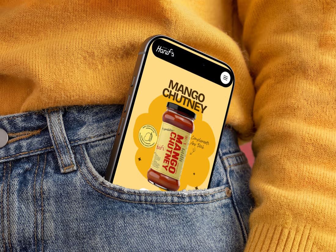
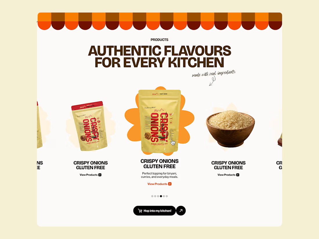
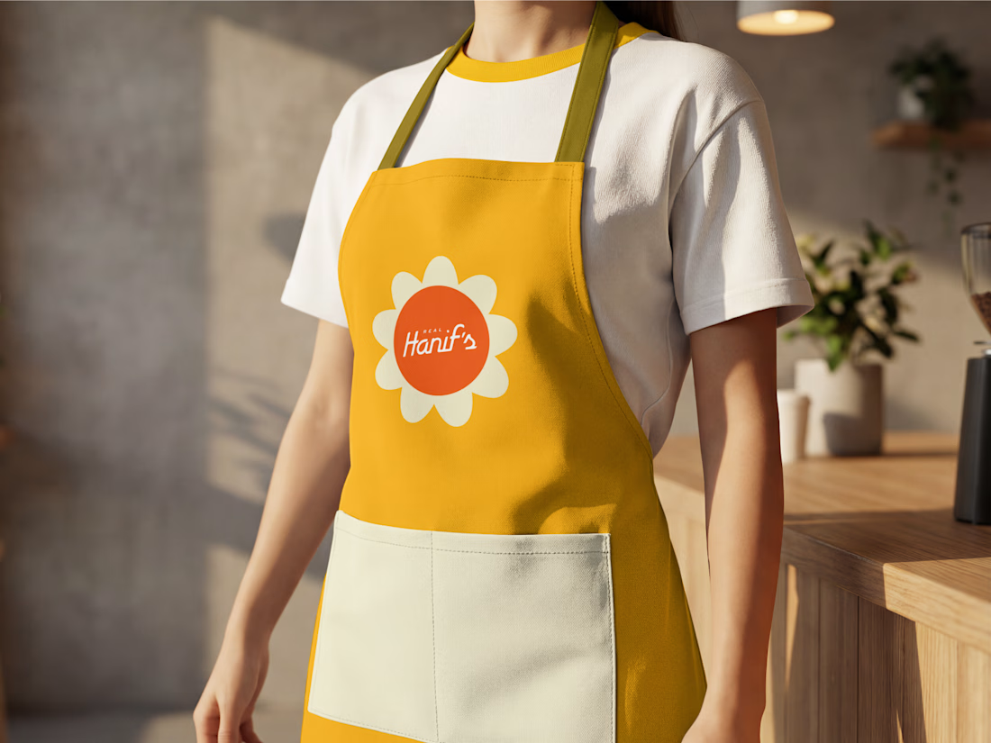
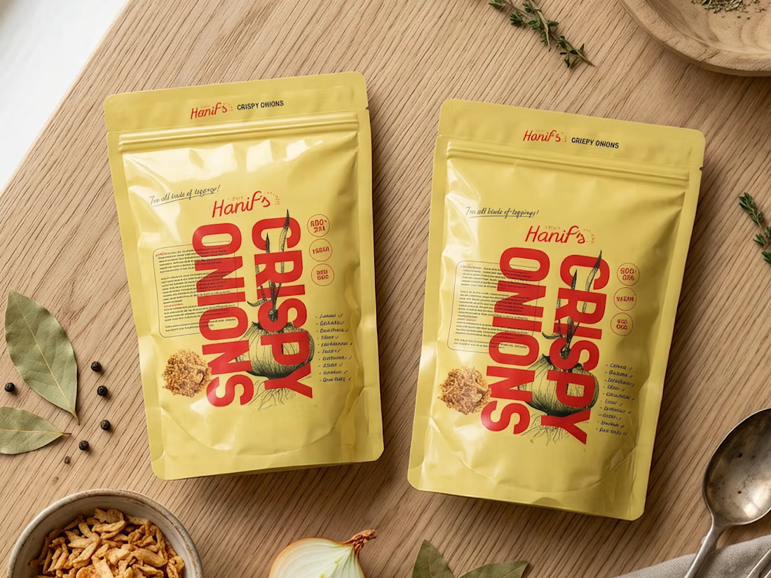
Building Hanif's brand identity packaging, mobile, and apparel, unified by one flower and one flavor story.
.
.
.
More conversion tests, UI breakdowns, and real builds: x.com/rightnextstep