The network for creativity
Join 1.25M professional creatives like you
Connect with clients, get discovered, and run your business 100% commission-free
Creatives on Contra have earned over $150M and we are just getting started
Back to feedPost
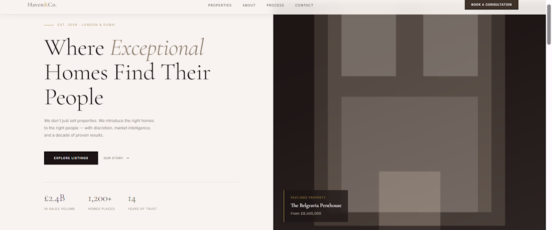
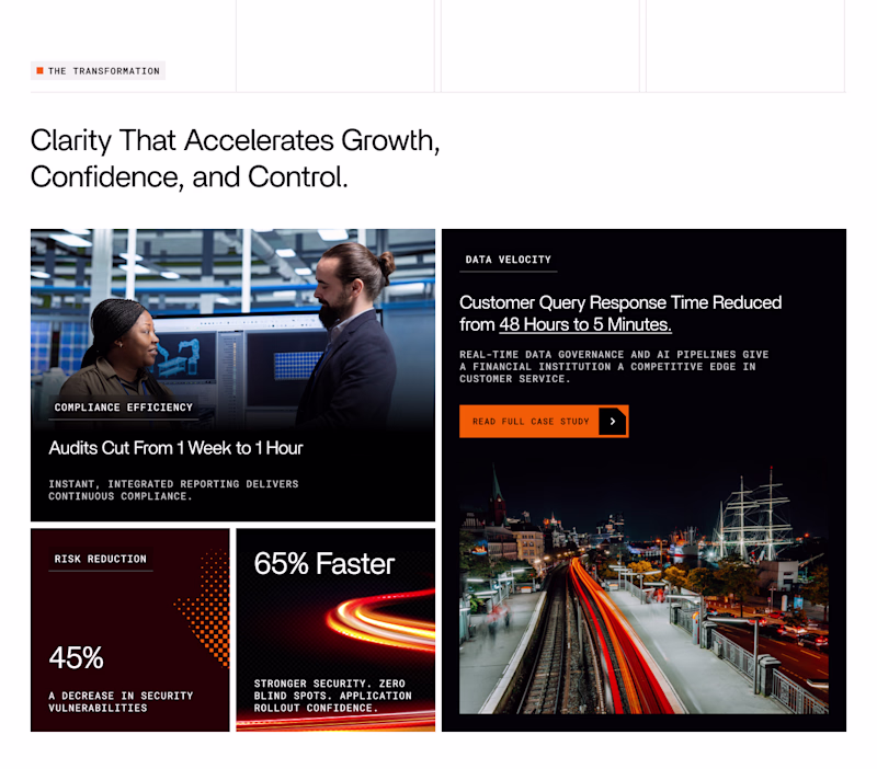
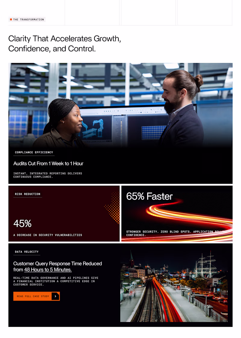
I redesigned a luxury real estate agency's website. Here's what most property sites get wrong;
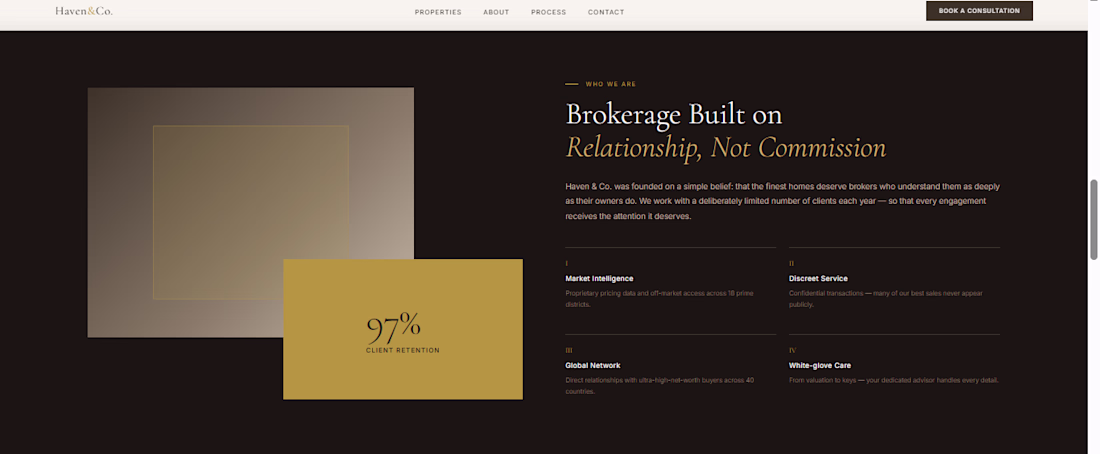
Most real estate websites look like they were built in 2014 and never touched again. Cluttered listings. Stock photos of smiling families. A colour palette that says "we have no idea what we stand for."
But when you're selling £8M penthouses, your website is the first showing. It has to feel as premium as the property.
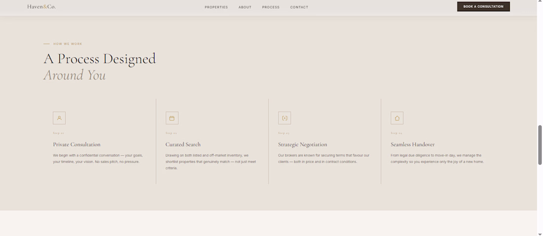
Here's what I focused on for this build:
Typography first: Cormorant Garamond for display, Inter for body. That serif/sans pairing signals luxury without screaming it.
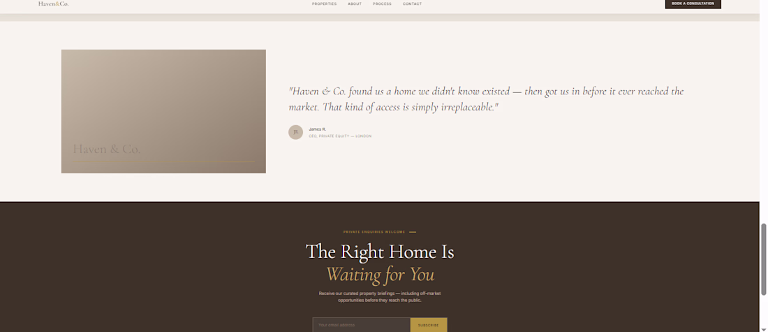
Restraint over decoration: No gradients, no carousels, no stock photo hero. Just confident negative space, a property card with real specificity, and a marquee that communicates market coverage instantly.
The "off-market" angle: High-net-worth buyers don't want to browse Rightmove. They want access. So the messaging leads with exclusivity and the design reinforces it.
The result: a site that feels like it belongs next to Savills or Knight Frank, not like a WordPress template from ThemeForest.
If you run a property business and your website doesn't match the quality of what you sell, that's a conversion problem. DM me.
The network for creativity
Join 1.25M professional creatives like you
Connect with clients, get discovered, and run your business 100% commission-free
Creatives on Contra have earned over $150M and we are just getting started
Trending
Claude
Claude has entered the design space. How are you using Claude Design?
Contra University
Learn from expert creatives how to earn more using next-gen AI tools.
creativeaiflow
Creative AI workflows are evolving. What tools do you use, and what are their strengths and weaknesses?
freelancerlife
Freelancer life is wins, pivots, and everything in between. What’s yours right now?
Related posts
Really excited to share this one. Stay tuned for a video showcasing the whole site, but even better, why don't you just experience it for yourself: https://thebluehorizon.ai/
These guys have received over 1 billion impressions on their videos and they came to us to make their website match the caliber of work they put out at an inhuman rate.
That website is incredible.
This project is my personal portfolio website, built with Squarespace. I created this website to establish my online presence as a freelance designer and create a space where I can share my future projects. The process allowed me to explore Squarespace’s design capabilities while building the foundation of my studio website.I used Finish Layer features throughout the website, including Block Animations and custom font uploads. These tools helped me customize the experience and build the visual direction of the website without using custom code.😊
here my websites link: https://www.slnvisuallab.com/
I like the unique color picks and presentation with animations Selin! And the visual style you picked is amazing. But there is a long white screen at the end just to let you know!
Which layout for Case study highlights grid looks better 🤔
62 voted
67%
31 voted
33%
93 votes
Closed
Option one just flows better.