The network for creativity
Join 1.25M professional creatives like you
Connect with clients, get discovered, and run your business 100% commission-free
Creatives on Contra have earned over $150M and we are just getting started
Back to feedPost

Empathy Engaged Report — Non-Profit Publication & Editorial Layout Design
Project Overview
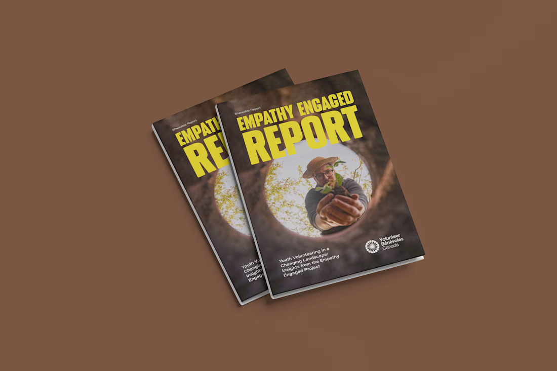
The Empathy Engaged Report (Youth Volunteering in a Changing Landscape) is a research-driven publication developed for Volunteer Canada. The project explores shifts in youth engagement, community impact, and volunteer trends across Canada.
The objective was to transform extensive academic/field research, qualitative interviews, and statistical data into an authoritative, visually structured, and accessible multi-page report adhering strictly to organizational brand guidelines.
Role & Scope of Work
Role: Lead Editorial & Publication Designer
Services:
Editorial Design & Grid Architecture
Typography Hierarchy & Layout Systems
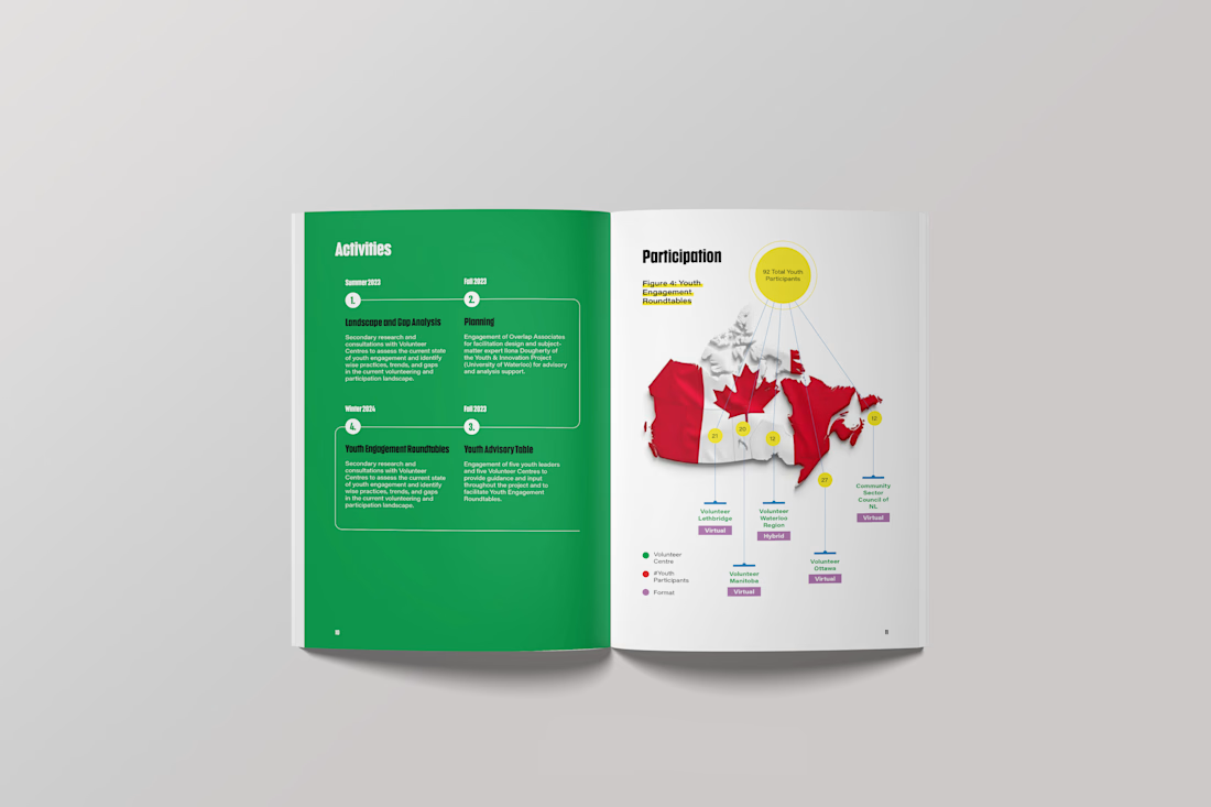
Data Visualization & Infographic Development
Photo Treatment & Visual Curation
Print-Ready Prepress & Interactive Digital Distribution Setup
Design Approach & Execution
Structured Editorial Grid & Hierarchy:
Built on a disciplined multi-column baseline grid in Adobe InDesign to balance narrative flow with data density.
Utilized clear typographic scale (bold editorial display headings paired with highly legible body copy) to ensure effortless readability.
Brand Identity & Color Cohesion:
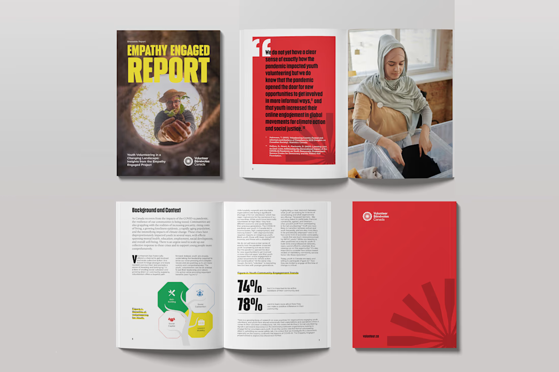
Leveraged Volunteer Canada’s signature red and complementary warm neutrals to create high-contrast callouts, divider spreads, and focal points without overwhelming the content.
Data Visualization & Callouts:
Designed custom diagrams, statistical callouts (e.g., 74% / 78% impact figures), and iconography to break down complex survey findings into scannable takeaways.
Highlighted powerful verbatim quotes on full-spread feature layouts paired with authentic editorial photography.
Production & Accessibility:
Formatted with comprehensive Paragraph/Character Styles for design consistency.
Delivered fully preflighted, print-ready files (CMYK with bleed and crop marks) as well as an optimized, hyperlinked digital PDF for online circulation.
Deliverables
Print-Ready Multi-Page Publication PDF (Bleeds, Slugs & Pre-flighted)
Interactive Digital Screen PDF (Web-optimized)
Reusable Master Page & Style Templates in Adobe InDesign
Tools Used
Adobe InDesign (Editorial Grid, Master Pages & Document Layout)
Adobe Illustrator (Vector Infographics & Data Visuals)
Adobe Photoshop (Photo Retouching & Contrast Grading)
Communication DesignData VisualizationPrint DesignAdobe IllustratorAdobe InDesignMicrosoft PowerPoint


The network for creativity
Join 1.25M professional creatives like you
Connect with clients, get discovered, and run your business 100% commission-free
Creatives on Contra have earned over $150M and we are just getting started





Related posts

I'm excited to share the full case study from our collaboration on the Unik Mindz logo design and branding, completed in August 2026.
Unik Mindz is a creative design studio born from the legacy of the Unik family brand. Founded on the belief that every idea begins with a unique mind, the studio needed an identity that could carry that message and become the face of the brand.
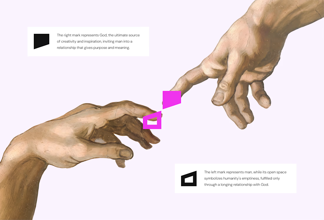
The logo draws inspiration from Michelangelo’s The Creation of Adam, focusing on the idea of connection. It captures the moment two minds meet to create something greater, reflecting the brand’s conviction that meaningful creativity starts with connection.
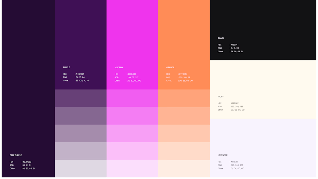
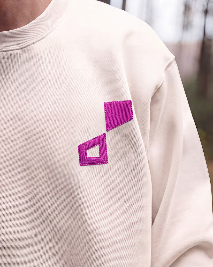
We wrapped the project with a clear system and guide for how the brand assets should be used going forward.
Want to work with us? Send a DM or email to info@donatus.agency



Honestly I never see something like this before I love the uniqueness of the design and it's vibrant color palette great job 🎉🎉

Post
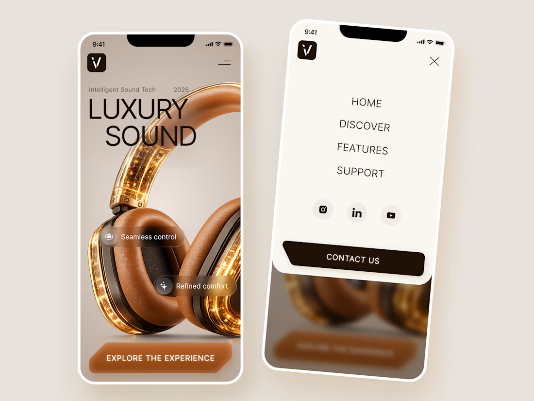
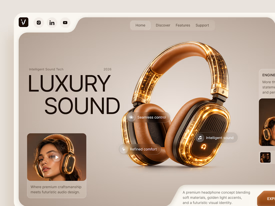
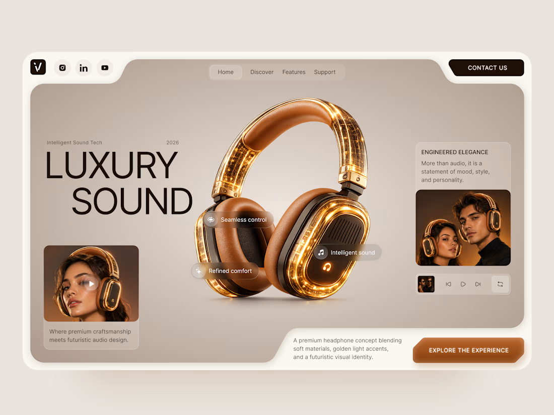
Luxury Sound — Premium Headphones Landing Page 🎧✨
A premium landing page concept for a luxury audio brand, built around a bold headphone design and a refined visual experience
The design combines warm neutral tones, glowing details, oversized product visuals, and minimal typography to create a futuristic yet elegant feel
Special attention was given to:
• Product-first composition
• Premium visual direction
• Feature highlights
• Lifestyle imagery
• Clear CTA placement
• Responsive mobile experience
The result is a clean, immersive product experience that makes the headphones feel like more than tech — they become part of the lifestyle 🔥


The amber glow on the headphones against that warm beige is lovely. How does the mobile menu handle the product image?

Our latest case study is live! 🌿
Meet Calm, an AI-powered wellness app designed to make mood tracking, emotional insights, and healthier daily habits feel simple and approachable.
That's great case study that's really a great job 🎉🎉🔥🔥