The network for creativity
Join 1.25M professional creatives like you
Connect with clients, get discovered, and run your business 100% commission-free
Creatives on Contra have earned over $150M and we are just getting started
Back to feedPost

🚀 Proud Moment for Team Cromp IT Solution!
We are excited to announce the successful launch of the Bible Bllow App Dashboard 🎉
From planning and development to deployment, our team worked with complete dedication to deliver a smooth, scalable, and user-friendly dashboard experience. This milestone reflects our commitment to building reliable digital solutions that create real impact.
A huge thank you to everyone involved in making this project a success. Looking forward to more innovative launches ahead!
#CrompITSolution #AppDevelopment #DashboardDevelopment #SuccessfulLaunch #TechSolutions #SoftwareDevelopment #WebDevelopment #MobileAppDevelopment #Innovation #DigitalTransformation #StartupSuccess #TeamWork #ProjectLaunch #ITCompany #BusinessGrowth
dashboardFramerAI Application DevelopmentReact Native DevelopmentLow-Code/No-Code DevelopmentKajabiWordPresswebsiite


Interesting app! Congrats. What does it do?
It is an administrative dashboard designed to manage the mobile application, including users, payments, subscriptions, analytics, and other SaaS platform functionalities.
Sounds pretty useful 👍

This is Great!
Thanks!
Welcome

Amazing
The network for creativity
Join 1.25M professional creatives like you
Connect with clients, get discovered, and run your business 100% commission-free
Creatives on Contra have earned over $150M and we are just getting started



Related posts


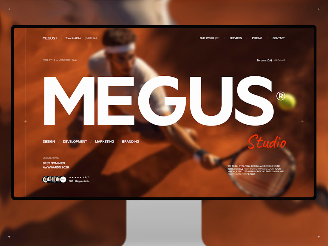
Finally, MEGUS® ⚡️ is live on the @Framer Marketplace! 🚀
After 2 months of focused work, the template is now published and ready.
MEGUS is a complete system for modern brand and portfolio sites — strategy, identity, motion, and development in one cohesive setup. 👾
Explore the full template and see it in action here:
https://www.framer.com/marketplace/templates/megus/
Available now. ⚡️


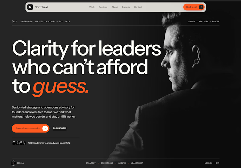
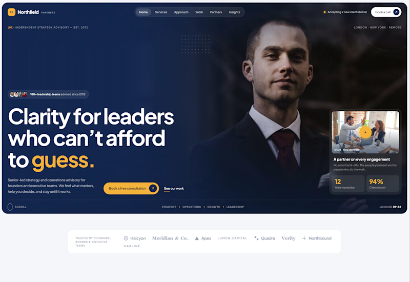
Exploring two different hero directions for a new project.
Same message, two completely different visual approaches.
Which one makes a stronger first impression?
A or B? Curious to hear your thoughts!
36 voted
90%
4 voted
10%
40 votes
Closed

Both are strong. I lean towards the dark version, because the orange accent on the italic "guess." pops and the profile portrait gives it a more editorial, confident feel. The navy one reads a bit more corporate, which could suit a more conservative audience. Nice exploration!

Same projects. Different perspectives.
With INKY, switching between grid and list views changes more than the layout.
The grid gives projects a visual presence. The list offers a more direct way to browse and compare.
Neither is necessarily better.
They're simply two ways of experiencing the same work.
One portfolio. Two perspectives.

Cool 3D assets