The network for creativity
Join 1.25M professional creatives like you
Connect with clients, get discovered, and run your business 100% commission-free
Creatives on Contra have earned over $150M and we are just getting started
Back to feedPost

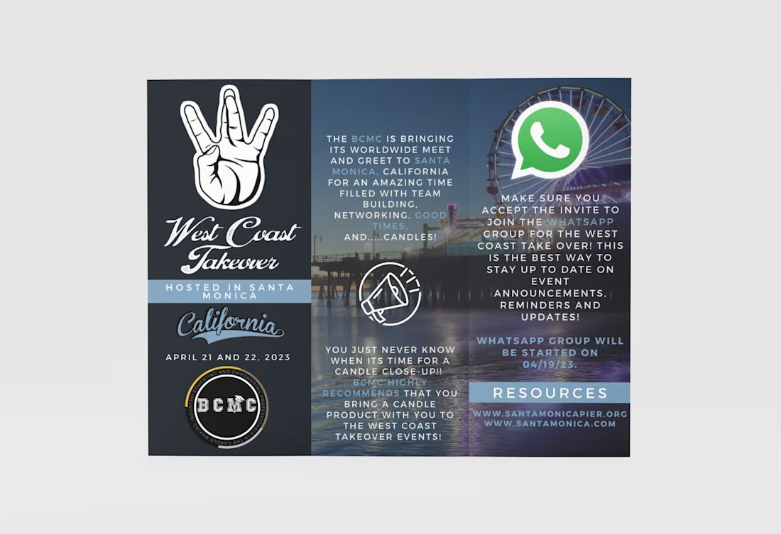
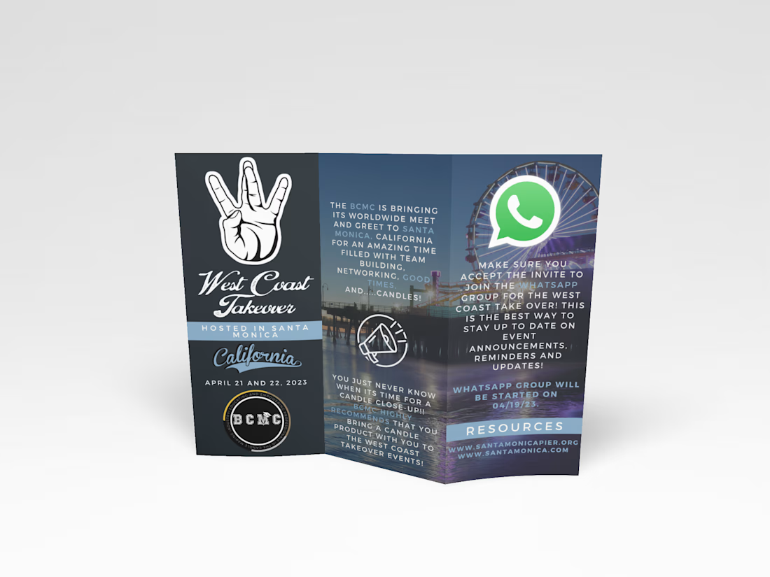
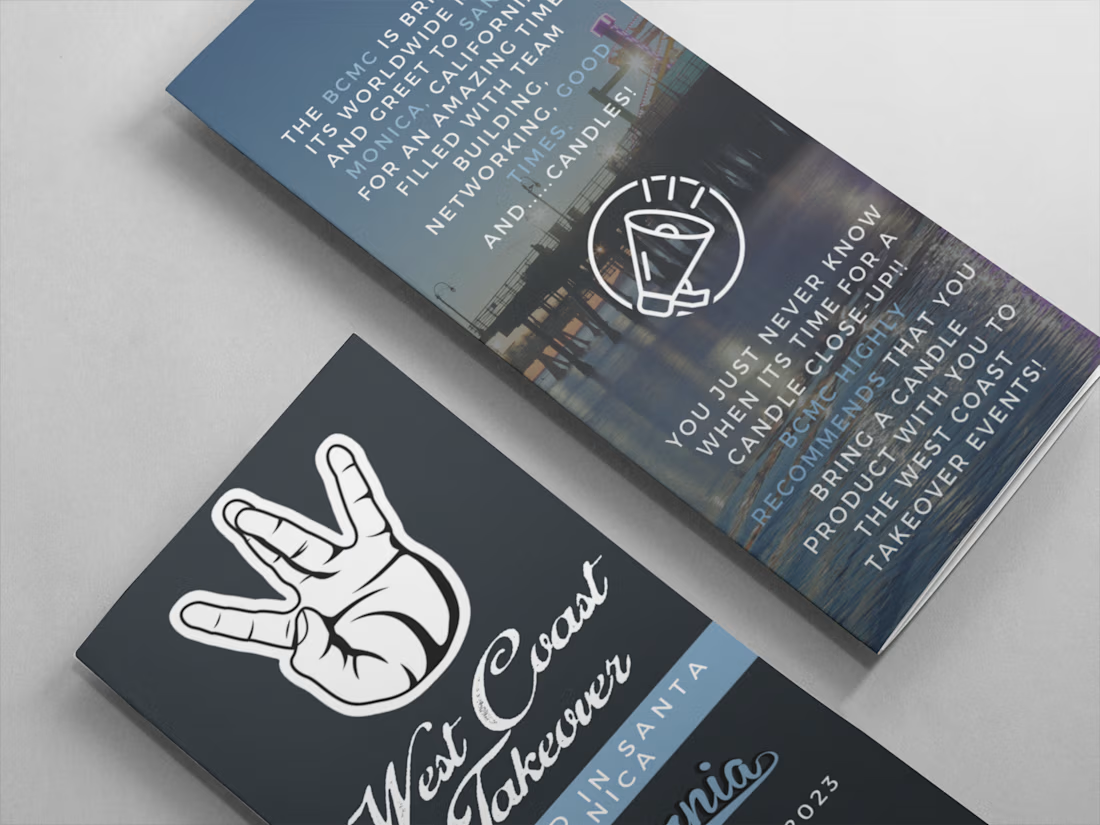
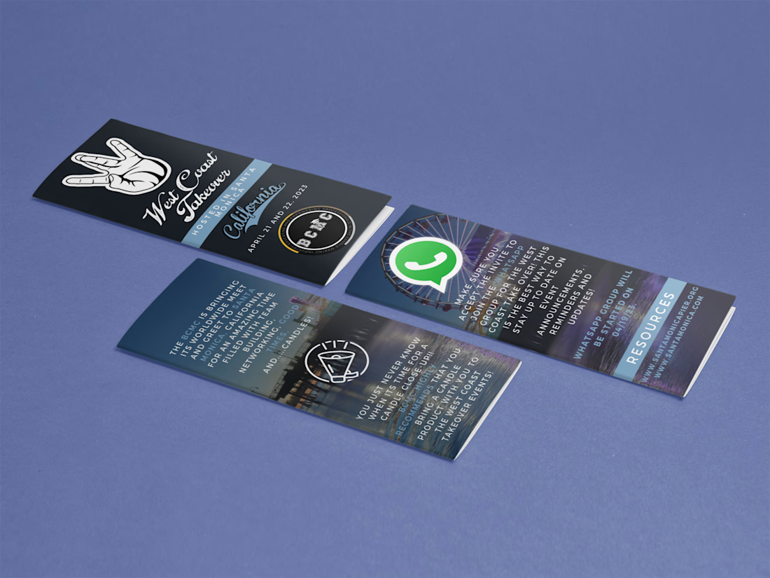
Designed event branding and brochure concepts for BCMC Event in Santa Monica California.
Responsible for graphic design, visual direction, typography, layout, brand presentation, visual storytelling and event-focused promotional storytelling.

The network for creativity
Join 1.25M professional creatives like you
Connect with clients, get discovered, and run your business 100% commission-free
Creatives on Contra have earned over $150M and we are just getting started





Related posts


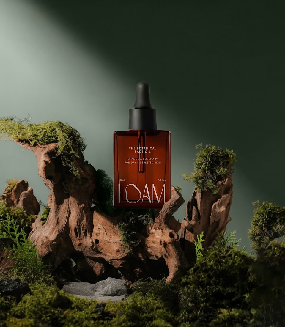
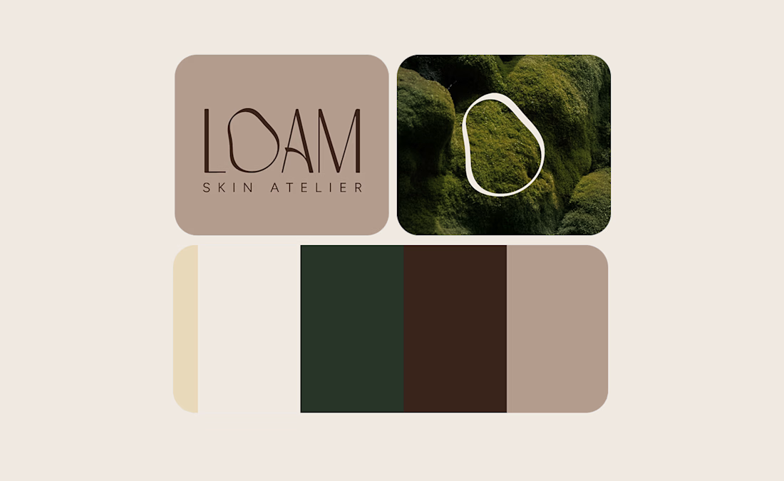
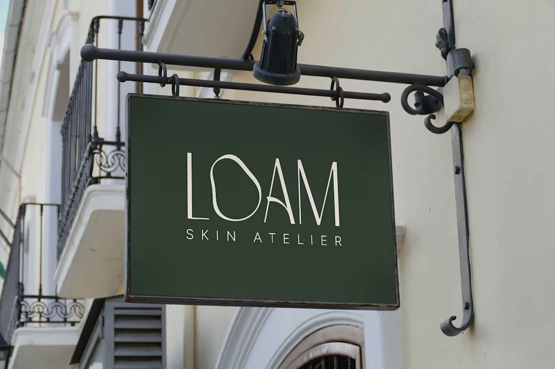
LOAM Skincare Brand Identity by FLM Studio
LOAM is a luxury skin atelier built around a simple belief: skin doesn’t need perfecting, it needs understanding. Named after the rich, fertile soils of the Dolomites, FLM Studio created an identity rooted in nature, individuality and strengthening skin from the ground up.
Earthy tones. Refined typography. Tactile textures. At its heart sits the imperfect O, an organic symbol inspired by the irregular beauty of real human skin.
A complete brand identity balancing clinical precision with ritual luxury, created for a deeply personal and tailored approach to skincare.
#branding #branddesign #brandidentity #skincare #luxurybranding





🔥
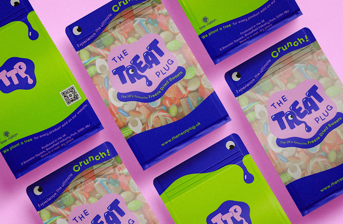
The Treat Plug Brand Identity | The UK's Favourite Freeze-Dried Sweets by FLM Studio
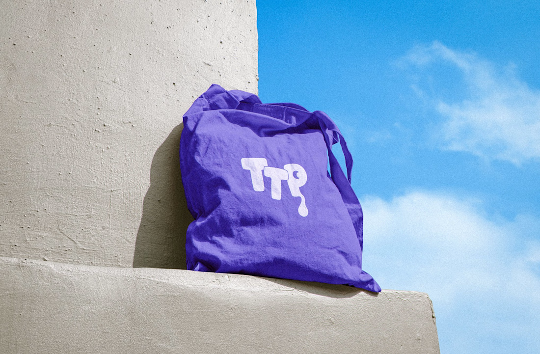
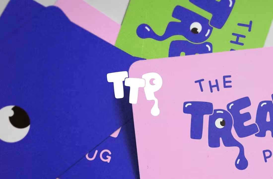
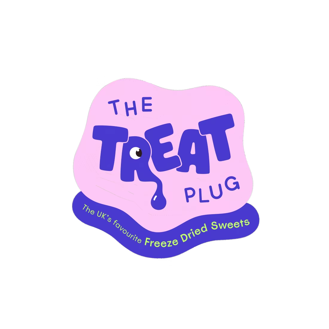
The Treat Plug was born on TikTok back in 2020 with a product people were obsessed with, and a brand that hadn't been built yet. They came with a name, FLM Studio built the rest.
Bold colour. Playful energy. A nostalgic hit with a modern edge. The identity was designed to stop the scroll and own a noisy market.
A full and comprehensive brand identity, custom illustrations, and pouch packaging from the ground up.
#branding #branddesign #brandidentity #packaging #packagingdesign

Impresive work

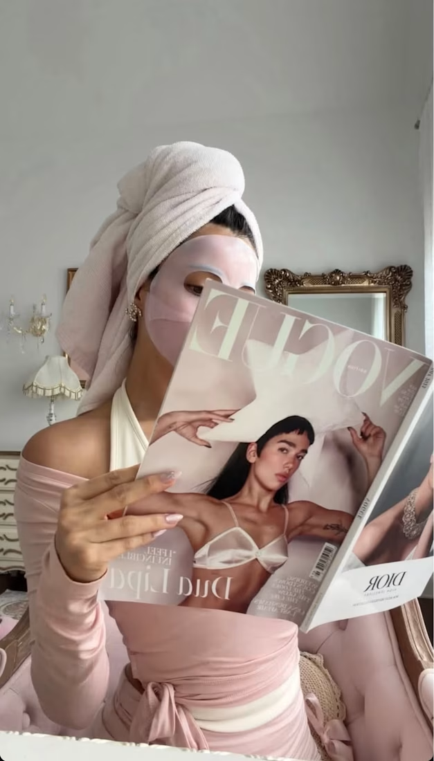
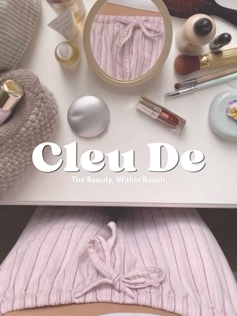
Beauty, within reach.
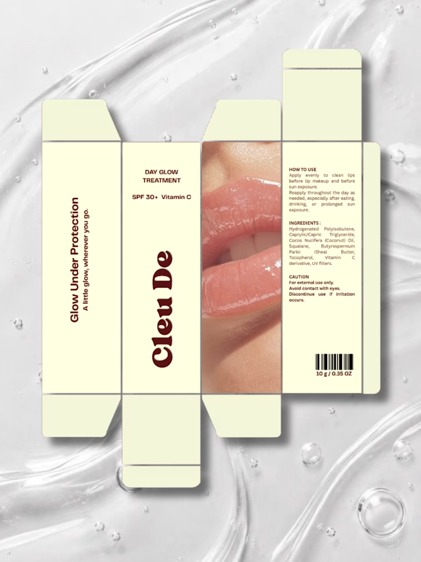
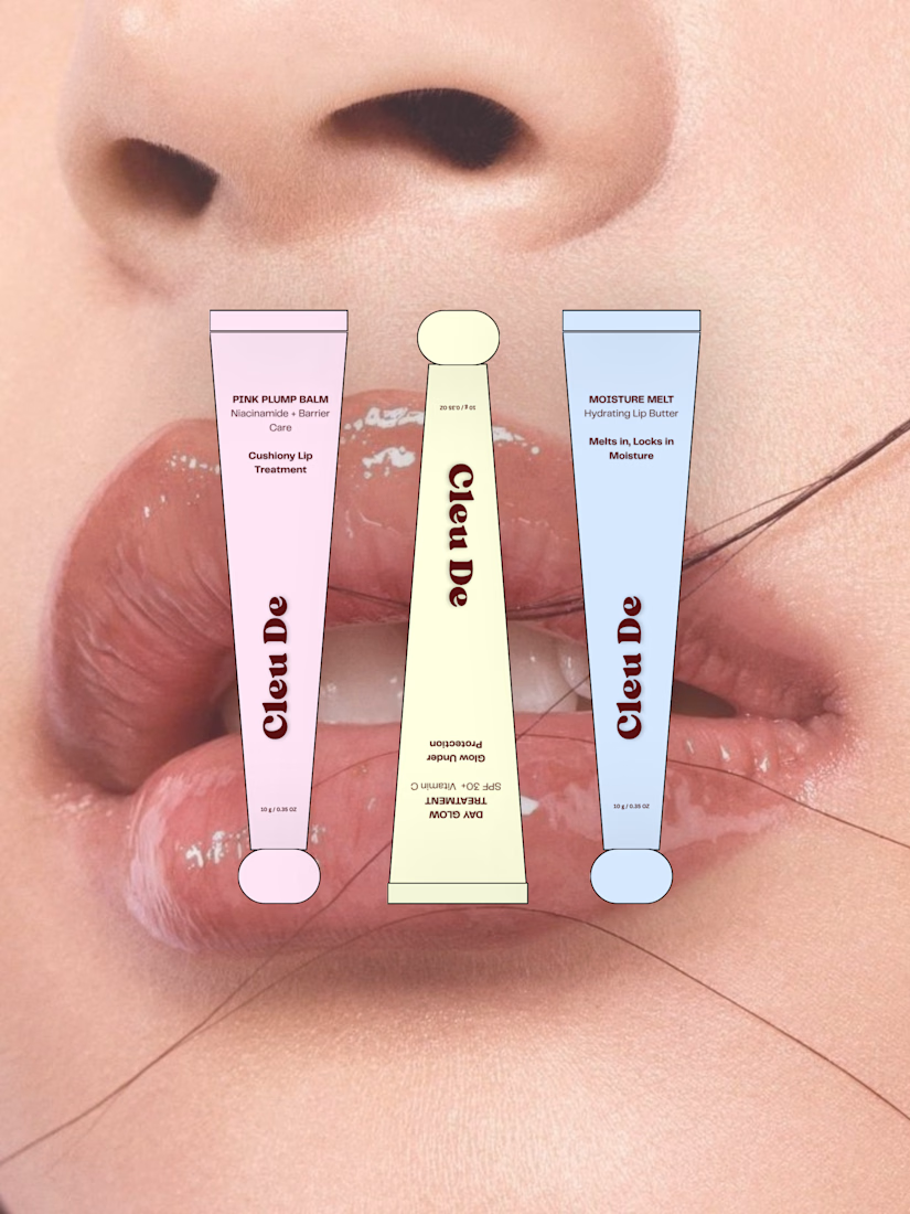
Cleu De was imagined as an everyday lip care brand — something small enough to carry everywhere, but playful enough to become part of your personal style.
The concept explores three lip treatments, soft playful colors, compact packaging, and little everyday moments where beauty naturally fits into your routine.
A little exploration of making beauty feel more personal, playful, and within reach.

Good work 👍🏻