The network for creativity
Join 1.25M professional creatives like you
Connect with clients, get discovered, and run your business 100% commission-free
Creatives on Contra have earned over $150M and we are just getting started
Back to feedPost

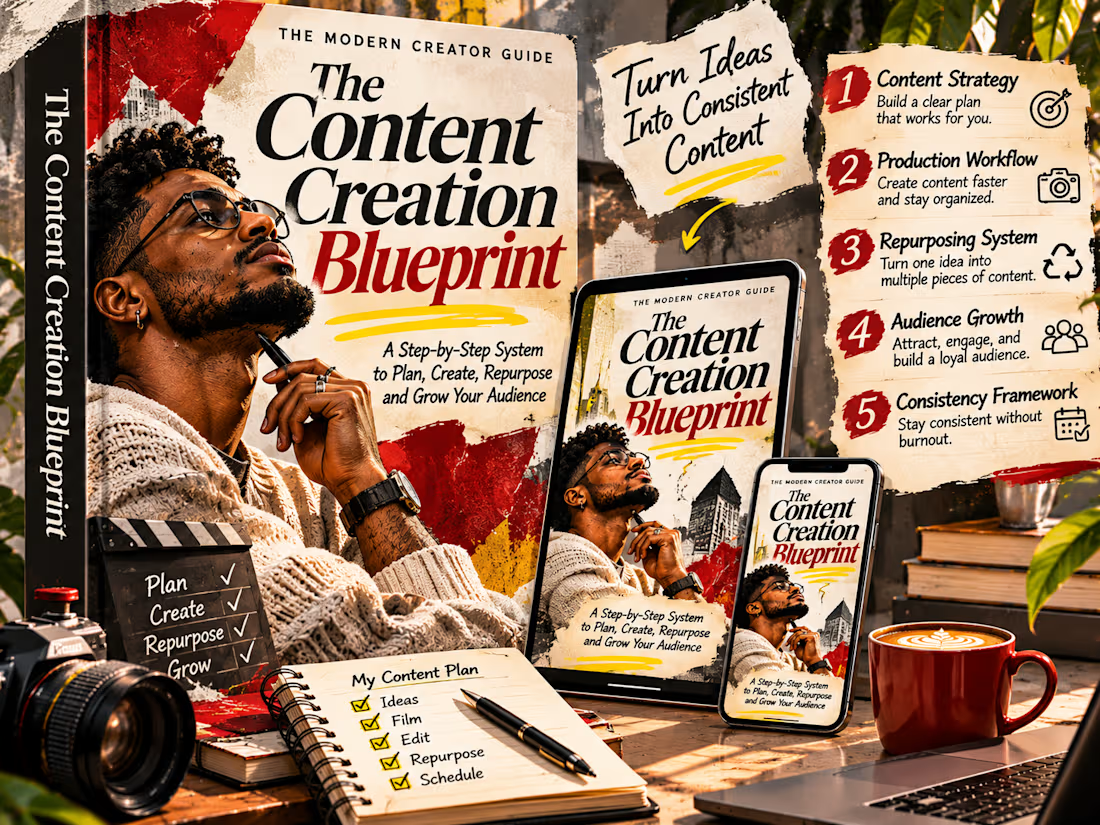
The Content Creation Blueprint — Editorial eBook Cover Design
A bold editorial identity for the next generation of digital creators.
The Content Creation Blueprint is a self-initiated digital publishing concept developed to explore how sophisticated typography, cinematic portraiture, and expressive mixed-media design can transform an educational eBook into a visually distinctive creative product.
Conceived as a practical guide for content creators, the project presents a structured approach to planning, producing, repurposing, and growing digital content. The visual identity reflects this purpose through an energetic editorial aesthetic that communicates creativity, ambition, and forward momentum.
Rather than adopting the restrained layouts commonly associated with instructional digital products, the design embraces a more experimental publishing direction—combining oversized typography, tactile paper textures, dramatic photographic composition, and layered graphic elements.
The objective was to create a cover that feels less like a conventional downloadable guide and more like a collectible contemporary creative publication.
Creative Concept & Art Direction
The central creative idea explores the relationship between inspiration and execution.
Content creation begins with an idea, but meaningful progress requires structure, experimentation, and consistent creative action. This relationship becomes the foundation of the visual narrative.
A confident, contemplative portrait anchors the cover, introducing a human element that represents the creative process. The subject's thoughtful expression establishes a sense of ambition and intentionality, while the surrounding visual treatments communicate the energy of modern digital production.
Layered photographic fragments, torn-paper edges, bold red graphic interventions, and handwritten details evoke the atmosphere of an independent creative magazine.
The resulting design feels expressive and unconventional while remaining connected to the practical purpose of the publication.
Typography & Editorial Identity
Typography is the defining feature of the project.
The title “The Content Creation Blueprint” is presented through oversized, high-contrast editorial serif lettering that immediately establishes the publication's identity.
The words are arranged with deliberate variation in scale and spacing, creating an expressive typographic composition rather than a conventional centered book title.
Deep crimson accents introduce visual tension against the cream-colored background, while black typography provides structure and authority.
Supporting text uses contrasting typographic treatments to establish hierarchy between the publication title, descriptive messaging, and additional content information.
This approach creates a visual language that feels contemporary, sophisticated, and rooted in premium editorial design.
Color, Texture & Composition
The visual identity combines warm ivory, saturated crimson, charcoal black, and carefully controlled yellow accents.
The palette was selected to create immediate contrast while maintaining the tactile richness of printed editorial materials.
Distressed paper surfaces, layered photographic elements, and expressive paint-like details add visual depth and personality.
The cover composition integrates portrait photography with typography rather than treating the two as separate elements.
The subject, lettering, and graphic interventions overlap to create movement and visual tension, producing an intentionally art-directed result.
The design balances boldness with readability, ensuring the publication remains recognizable across physical and digital presentations.
Digital Product Presentation
To demonstrate the versatility of the cover identity, the concept is presented across multiple formats, including a premium hardcover-style book mockup, tablet, and smartphone.
These applications establish a consistent visual system while showing how the cover adapts to different display sizes.
The surrounding presentation introduces content-planning notes, creative equipment, and editorial details that reinforce the publication's subject matter.
Together, the mockups position the guide as a cohesive digital product rather than a standalone graphic.
Communication & Design Outcome
The project demonstrates how strong editorial art direction can elevate educational digital products through visual storytelling, typographic experimentation, and cohesive presentation.
The cover communicates the publication's creative subject matter while maintaining a professional identity suitable for modern creators and digital entrepreneurs.
Its bold composition is designed to attract attention, establish a memorable visual impression, and communicate the value of the publication before a reader explores its contents.
The final concept is a distinctive eBook cover identity that brings together editorial sophistication, expressive typography, and contemporary digital product design.
It showcases an approach to cover design focused on originality, visual hierarchy, brand personality, and the ability to transform information-driven products into compelling creative experiences.
Self-initiated portfolio concept developed to demonstrate eBook cover design, editorial typography, digital product presentation, and creative art direction.


The network for creativity
Join 1.25M professional creatives like you
Connect with clients, get discovered, and run your business 100% commission-free
Creatives on Contra have earned over $150M and we are just getting started
Related posts


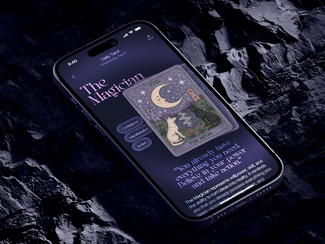
Just in time for Halloween! 🎃🔮 Excited to share this mystical tarot reading app concept, inspired by a little spooky season magic. Would love to hear your thoughts! ✨


Excellent work!

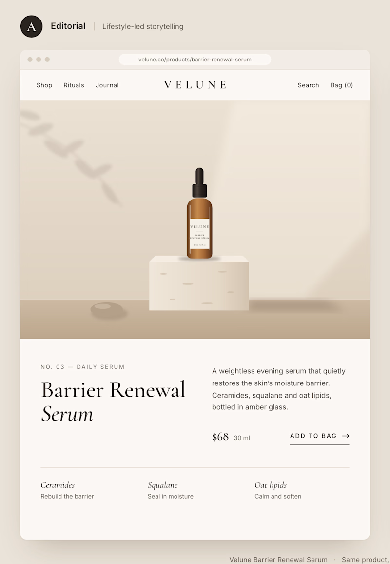
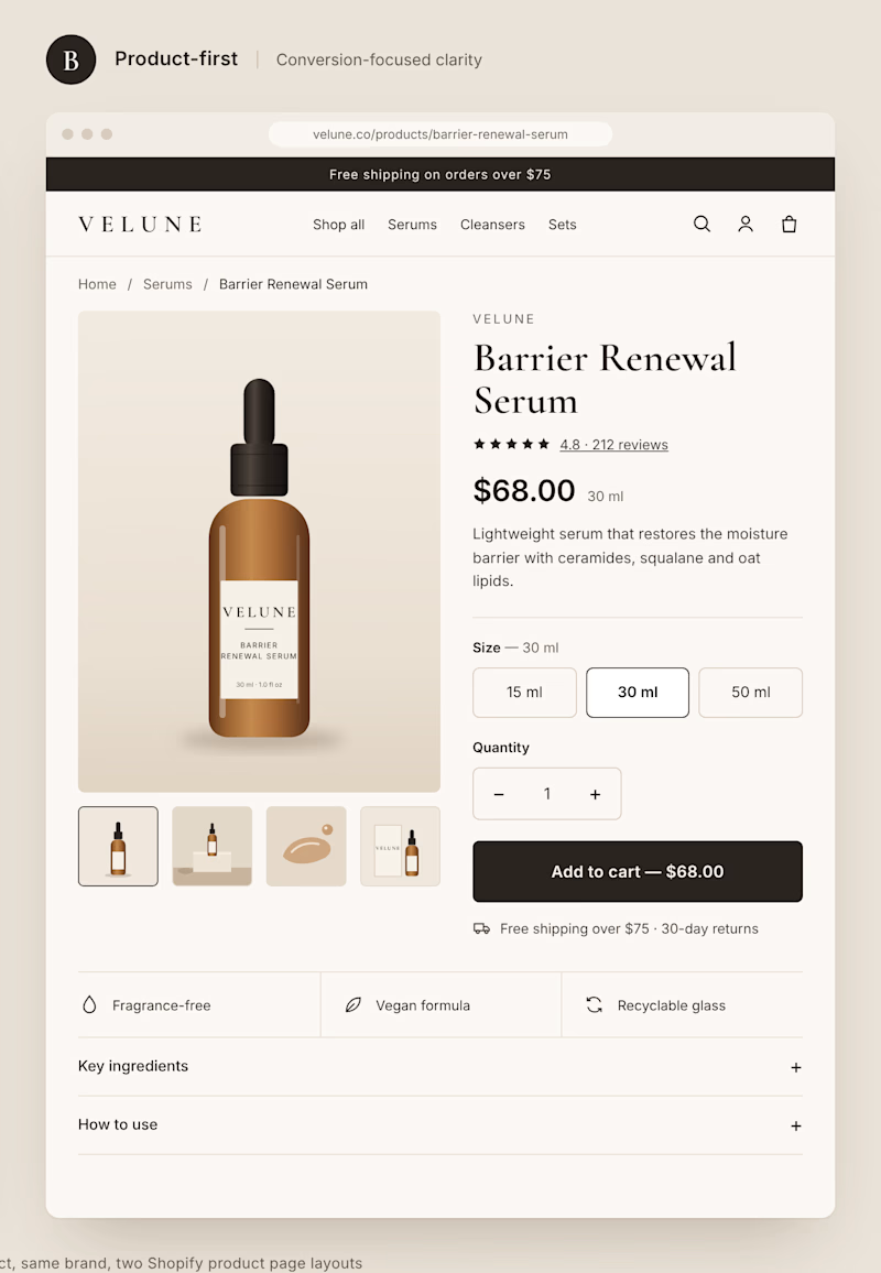
Two different approaches to the same Shopify product page.
Option A: Editorial layout. Large imagery, generous spacing, and a stronger focus on brand storytelling.
Option B: Product-first layout. Clear pricing, visible product options, and a prominent Add to Cart button.
Both can look great, but they create very different shopping experiences.
If you were building a premium DTC brand, which direction would you choose?
A or B? And why?
1 voted
11%
8 voted
89%
9 votes
Closed


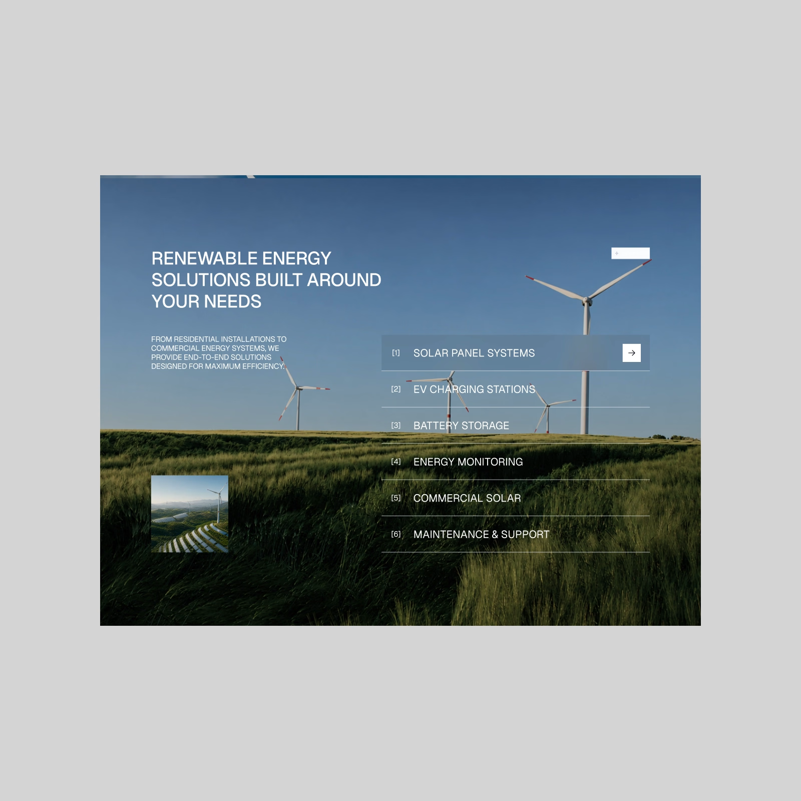
Lumos — Renewable Energy Website. Turning clean energy into clear solutions.
A more visual section built around renewable services, large-scale imagery, and a simple interactive list. Full website coming next.